
When constructing our Tab Bar, multiple Tab instances are used to construct the tabs within the widget— these are the view components which hold the text and icons for the tabs which we are to display to the user. The TabBar constructor allows us to provide multiple fields to its constructor when instantiating a new instance, this allows us to really customise the look and feel of the tab bar in our application. You can check out the documentation for more details, but we have control over:
- tabs — This are the Tab widgets which we wish to display within the tab bar. This is a required property of the constructor.
- controller — The TabController instance that we wish to be used
- indicatorColor — The color to be used by the tab indicator
- indicatorWeight — The weight to be used by the tab indicator
- indicatorPadding — The padding to be used by the tab indicator
- indicator — A decoration reference defining the styling of the indicator
- indicatorSize — The size of the indicator
- labelColor — The color to be used by the text label
- labelStyle — The text style reference to be used for the label styling
- unselectedLabelColor — The color to be used by unselected lbels
- unselectedLabelStyle — The text style reference to be used for unselected label styling
Once the Tab Bar has been created, you’ll likely be providing it to the bottom property of Appbar component, as the tab bar will be a part of your tab bar and placed at the bottom of the widget.
When it comes to implementing the TabBar we can instantiate an instance with its child tabs. This will be done using the tabs property of the TabBar, passing in a list of child Tab widgets:
new TabBar(
    tabs: [
        new Tab(...),
        new Tab(...),
        new Tab(...),
    ],
)
Each tab instance can be instantiated with 3 different properties:
- icon — The widget to be used for the tab icon
- text — The string to be used for the tab label
- child — The widget to be used for the tab label
Again, the documentation can be used to read more details about each of this — whilst the Tab class is pretty minimal in what they instantiated with, as we saw previously it is the TabBar instance which is used to control the look and feel of these widgets.
Now that we have our TabBar and our Tabs setup, we need to provide a TabController to keep a track of the tab bar state. For this example, we’re going to make use of the DefaultTabController class:
new DefaultTabController(
  length: 3,
  initialIndex: 1,
  child: ...
);
This class allows us to provide the following properties:
- length — the number of tabs that our controller is displaying
- initialIndex — the default selected tab, this will be the first tab by default
- child — the widget to be contained
We can manually create out our Tab Controller instance and assign it to the Tab Bar using the controller property during its creation. But for simpler implementation, the Default Tab Controller will likely suffice for your needs.
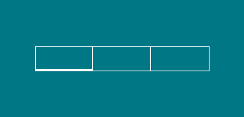
Altogether, we can achieve a simple tab bar implementation with the code snipper below:
new DefaultTabController(
  length: 3,
  child: new Scaffold(
    appBar: new AppBar(
      bottom: new TabBar(
        tabs: [
new Tab(icon: new Icon(Icons.mail)),
new Tab(icon: new Icon(Icons.contacts)),
new Tab(icon: new Icon(Icons.info)),
        ],
      ),
      title: new Text('Sample tabs'),
    ),
  ),
)
Enjoy the other snippets in this publication! Leave a comment below or tweet me if with any questions / suggestions!