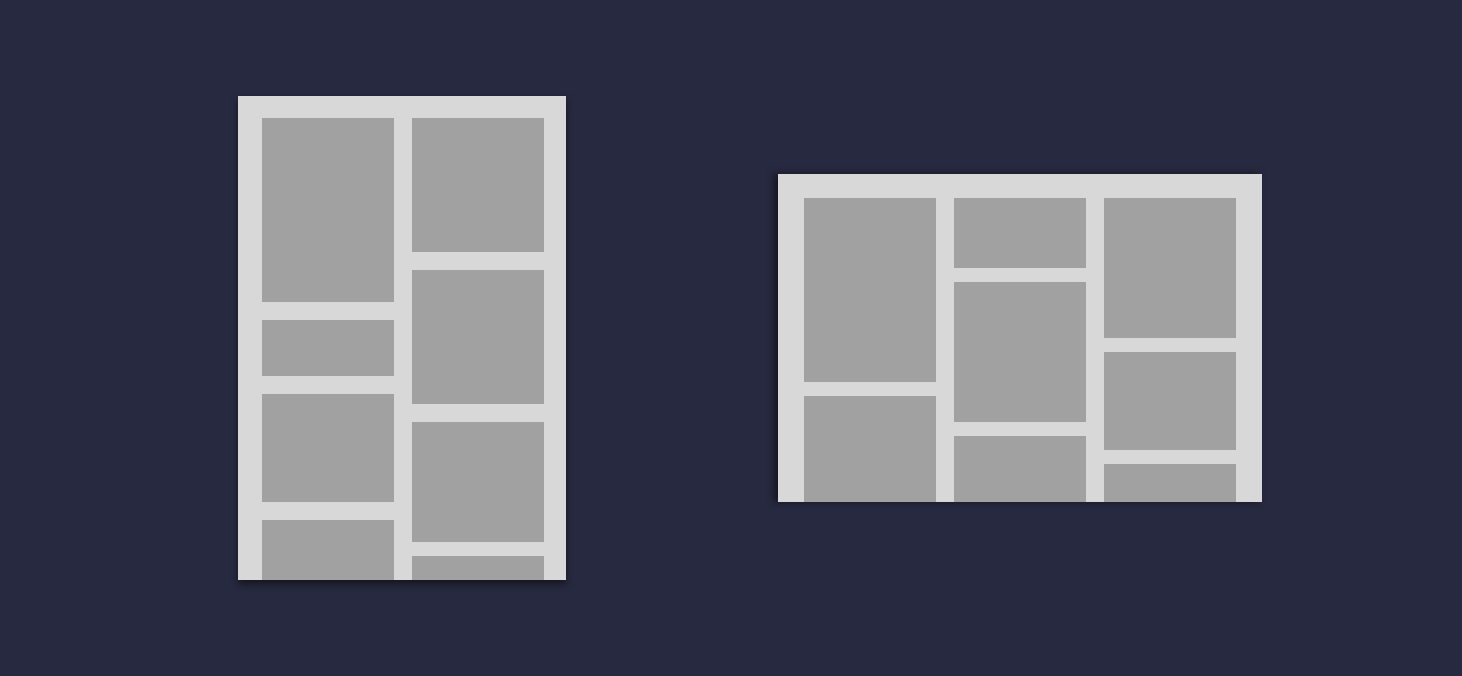
In version 1.3.0 of Jetpack Compose we see the addition of two sought after composables, the LazyVerticalStaggeredGrid and LazyHorizontalStaggeredGrid. Both of these composables allow us to compose lists of content in a staggered fashion, allowing us to easily compose items that have a range of heights / widths while also supporting lazy composition.
In this blog post we’re going to take a look at these new composables, learning what they bring to the composable APIs so that we can use them in our applications.
This post is sponsored by Practical Jetpack Compose.

Why not sponsor this blog and reach thousands of developers every month?
Before we can get started with diving into these grid composables, we need to go ahead and add the compose foundation dependency to our project. Lazy Grid support was added in 1.3.0, which we’ll use for the version when declaring the use of these APIs into our project.
implementation 'androidx.compose.foundation:foundation:1.3.0'Now that we’ve added this to our project we’ll have access to two Lazy Grid composables – the LazyVerticalStaggeredGrid and the LazyHorizontalStaggeredGrid.
@Composable
fun LazyVerticalStaggeredGrid(
    columns: StaggeredGridCells,
    modifier: Modifier = Modifier,
    state: LazyStaggeredGridState = rememberLazyStaggeredGridState(),
    contentPadding: PaddingValues = PaddingValues(0.dp),
    verticalArrangement: Arrangement.Vertical = Arrangement.spacedBy(0.dp),
    horizontalArrangement: Arrangement.Horizontal = Arrangement.spacedBy(0.dp),
    flingBehavior: FlingBehavior = ScrollableDefaults.flingBehavior(),
    userScrollEnabled: Boolean = true,
    content: LazyStaggeredGridScope.() -> Unit
)

@Composable
fun LazyHorizontalStaggeredGrid(
    rows: StaggeredGridCells,
    modifier: Modifier = Modifier,
    state: LazyStaggeredGridState = rememberLazyStaggeredGridState(),
    contentPadding: PaddingValues = PaddingValues(0.dp),
    verticalArrangement: Arrangement.Vertical = Arrangement.spacedBy(0.dp),
    horizontalArrangement: Arrangement.Horizontal = Arrangement.spacedBy(0.dp),
    flingBehavior: FlingBehavior = ScrollableDefaults.flingBehavior(),
    userScrollEnabled: Boolean = true,
    content: LazyStaggeredGridScope.() -> Unit
)
From the source of these composables we can see that the arguments for these composables are pretty much identical. The only difference is the argument name for the StaggeredGridCells argument, which is tailored to the type of grid that is being composed.
- rows / columns – the StaggeredGridCells reference used to configure how the cells of the grid are composed. This is either a fixed number of cells, or a dimension used to calculate how many rows/columns can fit onto the screen for the current configuration
- modifier – the Modifer reference to be applied to the composable
- state – the LazyStaggeredGridState reference that holds the current state of the grid composable
- contentPadding – padding to be applied to the content area of the grid
- verticalArrangement – used to declare how the items of the grid should be composed on the vertical axis
- horizontalArrangement – used to declare how the items of the grid should be composed on the horizontal axis
- flingBehaviour – used to specify the FlingBehaviour for the grid
- userScrollEnabled – whether or not he grid can be scrolled by user input
- content – the content to be composed within the grid
Only the StaggeredGridCells and content arguments are required here, so you can get up-and-running with a lazy grid layout within minimal effort. Throughout the following sections of this post, we’re going to explore most of these arguments and compose a grid that shows the visualisation of the data we provide to it.
Setting up the grid data
Before we can get started with composing out UI, we’re going to setup a simple data class that will be used to hold the information for each cell item that is to be composed. We’ll create a new class, GridItem. This will hold three pieces of information:
- id – a unique identifier that can be used to identify the item
- color – the color to be used when composing the item
- size – the size to be used for the item, either for the height or width
class GridItem(
    val id: String,
    val color: Color,
    val size: Dp
)
Now that we have a data class representing each grid item, we can go ahead and declare the composable that will be used for the visual representation of this item. For this we’ll create a new composable that will simply compose a Box, using the color and size from the GridItem reference to configure the styling of the composable.
@Composable
fun Item(
    modifier: Modifier = Modifier,
    item: GridItem
) {
    Box(
        modifier = modifier
            .background(item.color)
            .height(item.size)
    )
}
At this point we now have a data class to hold information for each item in our grid, along with a composable which will compose this information within our UI.
Note: To keep things simple in this blog post, we won’t be building a list of GridItem instances. This is just here for examples sake.
Composing the Grid
Now that we have the above pieces defined, we can move onto composing the LazyVerticalStaggeredGrid. For now we’re going to provide only the required arguments so that we can get our composable up-and-running. We’ll start here by providing a value for the columns argument, fixing the number of columns to 2 using the StaggeredGridCells.Fixed class.
LazyVerticalStaggeredGrid(
    columns = StaggeredGridCells.Fixed(2)
) {

}
Composing the Grid items
Now that we have the LazyVerticalStaggeredGrid in place, we’re next going to compose the items inside of the grid. For this we’ll use the items function from the LazyStaggeredGridScope, passing the function the list of GridItem references that were passed to the composable function. We’ll then use this reference to compose an Item for each of the cells within our grid.
val items: List<GridItem> = ...
LazyVerticalStaggeredGrid(
columns = StaggeredGridCells.Fixed(2)
) {
items(items) {
Item(item = it)
}
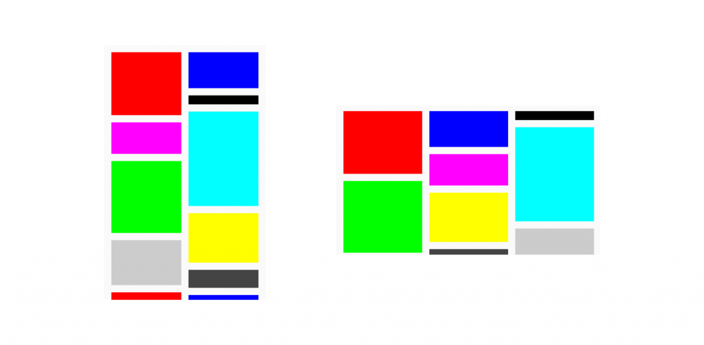
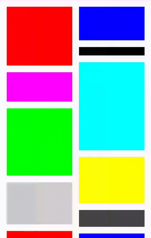
}With these items now being composed, we’ll be able to see a composed grid containing our items – this will be composed in a staggered grid format.
Applying spacing
As we can see from the previous section, the items in the grid have no padding or spacing applied. If this visual representation does not match the designs you are trying to achieve, you may need to apply some additional configuration to your staggered grid. This can be done using the contentPadding, verticalArrangement and horizontalArrangement arguments. We’ll start by using the contentPadding argument to apply padding to the content area of the grid.
LazyVerticalStaggeredGrid(
columns = StaggeredGridCells.Fixed(2),
contentPadding = PaddingValues(16.dp),
verticalArrangement = Arrangement.spacedBy(16.dp),
horizontalArrangement = Arrangement.spacedBy(16.dp),
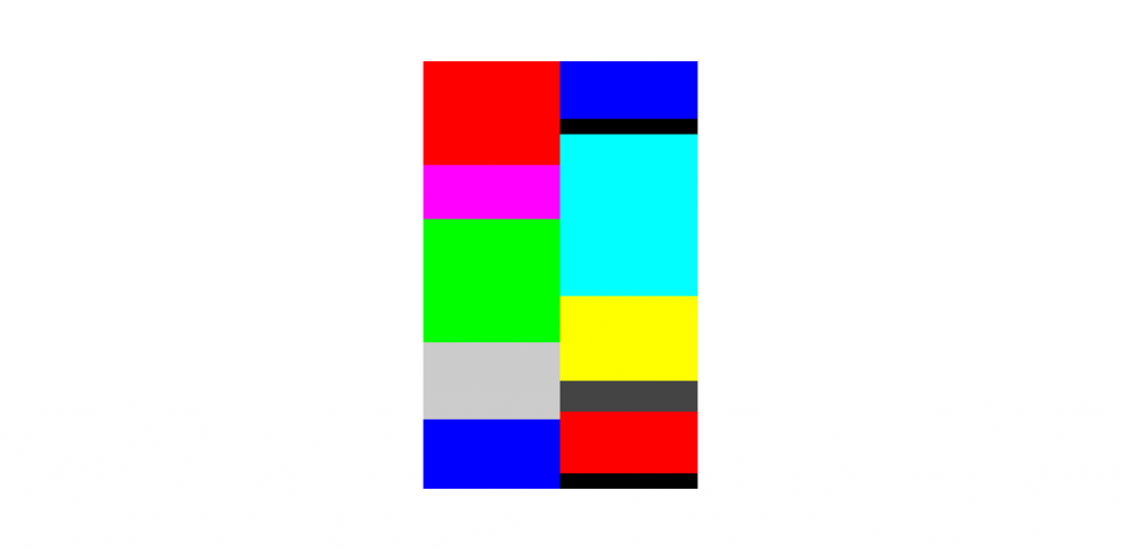
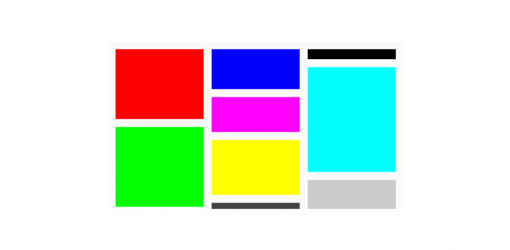
)With this applied, we can see that the outside edges of our content have padding applied – creating some visual space between the edges of the content and the container.
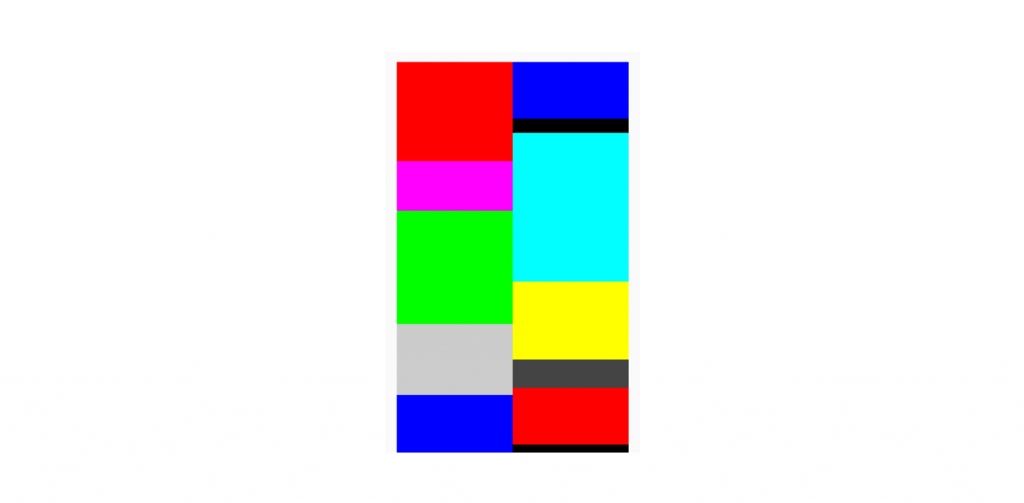
Next, we want to add some spacing within the container itself – allowing the items to have visual gaps between one another so that they are not touching. For this we’re going to utilise the verticalArrangement and horizontalArrangement arguments. For each of these we need to provide an Arrangement reference, which we’ll do so in the form of Arrangement.spacedBy allowing us to specify a dimension value to be used for item spacing.
LazyVerticalStaggeredGrid(
    columns = StaggeredGridCells.Fixed(2),
    contentPadding = PaddingValues(16.dp),
    verticalArrangement = Arrangement.spacedBy(16.dp),
    horizontalArrangement = Arrangement.spacedBy(16.dp)
)
Because we’ve provided values for both the vertical and horizontal axis, we can now see this spacing applied to the children of our grid.
Controlling Cell Configuration
As we previously saw, the lazy grid composables allow you to control the number of rows/columns to be composed using a StaggeredGridCells reference. So far we’ve used this to set a fixed number of columns, but we could use this to dynamically control the number of columns based on the current configuration of the device. This can be done using the Adaptive type for the StaggeredGridCells class, which allows us to specify a minimum size for the cell items. In the case of the LazyVerticalStaggeredGrid this would mean that the grid children need to be at least this size in their width, with the remaining available width distributed between the children.
val cellConfiguration = if (LocalConfiguration.current.orientation == ORIENTATION_LANDSCAPE) {
    StaggeredGridCells.Adaptive(minSize = 175.dp)
} else StaggeredGridCells.Fixed(2)
So in this case, if there was 600dp available, there would be 3 columns composed at 200dp each.
With this configuration in place, we can now pass this over to our grid for its columns argument.
LazyVerticalStaggeredGrid(
    columns = cellConfiguration,
    ...
)
When composing this example, we’ll now be able to see that when in landscape mode, the Adaptive logic is applied and we have multiple columns being composed based on the device configuration.
Composing a Horizontal Grid
Throughout this post we’ve been focused on the LazyVerticalStaggeredGrid and we briefly mentioned the existence of the LazyHorizontalStaggeredGrid. We can switch this composable out and all we need to do is change the name of the columns argument to rows.
val cellConfiguration = if (LocalConfiguration.current.orientation == ORIENTATION_LANDSCAPE) {
    StaggeredGridCells.Adaptive(minSize = 175.dp)
} else StaggeredGridCells.Fixed(2)

LazyHorizontalStaggeredGrid(
    rows = cellConfiguration,
    contentPadding = PaddingValues(16.dp),
    verticalArrangement = Arrangement.spacedBy(16.dp),
    horizontalArrangement = Arrangement.spacedBy(16.dp),
) {
    items(items, key = { it.id }) {
        item(
            item = it
        )
    }
}
We can then see that we now have a horizontal lazy grid being composed on screen, allowing us to scroll through the child items on the horizontal axis.

Wrapping up
In this post we’ve taken a look at the new lazy staggered grid APIs available in Jetpack Compose, consisting of the LazyVerticalStaggeredGrid and LazyHorizontalStaggeredGrid composables. We’ve learnt how we can configure the arrangement of child items inside these containers, along with how we can control the number of rows/columns to be used when composing children.
I personally love seeing the use of staggered grids inside of apps, so I’m looking forward to seeing how these new composables are used in apps!