In the last blog post, we learned how to build an Immersive Preview Card for Android TV using Jetpack Compose. This component allows us to provide an immersive experience while browsing content on Android TV devices. While we covered how to build such a component, we didn’t cover how to utilise this inside of a parent content container. While the composable aims to be pluggable into existing composables, there are a couple of things that we need to configure to ensure that focus state is correctly managed while moving between focused content items. In this blog post, we’ll look at plugging the Preview Card into a parent container, resulting in an immersive content row for previewing selectable items.

Looking to learn more Jetpack Compose? Check out Practical Jetpack Compose now!

To quickly recap from the last post, we built a PreviewCard composable that can be used to show preview clips from a selected media source.
@Composable
fun PreviewCard(
    modifier: Modifier = Modifier,
    cardWidth: Dp,
    cardHeight: Dp,
    videoUrl: String,
    hasFocus: Boolean,
    clipStartPosition: Long = 2000000,
    clipEndPosition: Long = 8000000,
    thumbnailFrame: Long = 5000000,
    thumbnailUrl: String? = null
)
Now that we have this composable, we’re going to want to use it! For this, we need a parent container, for which we’ll use the TvLazyRow. We’re not going to dive into how this composable works, but for some context it works pretty much the same way as the LazyRow that you may have already used within Jetpack Compose, just built specifically for use in TV apps.
We’ll start here by composing the TvLazyRow, followed by adding the use of the itemsIndexed function to iterate over the collection of generated item classes.
@Composable
fun HomeList(
    modifier: Modifier = Modifier
) {
    val items = makeCarouselItems()

    TvLazyRow(
        modifier = modifier.fillMaxSize(),
        horizontalArrangement = Arrangement.spacedBy(16.dp)
    ) {
        itemsIndexed(items) { index, item ->

        }
    }
}
Now that we have the parent composable created, we’re going to need to compose the PreviewCard. We’ll start here by created a new composable function, RowItem. This function is going to take several arguments:
- item – the TvItem instance that we are composing the information for
- focused – whether the item is currently in focus
- onSelected – callback triggered when the item is selected by the user. We need this to update the current focus index
@Composable
fun RowItem(
    item: TvItem,
    focused: Boolean,
    onSelected: (index: Int) -> Unit
) {

}
Within this, we’ll start by composing the PreviewCard and passing the required arguments, some of which have been provided through the RowItem arguments.
@Composable
fun RowItem(
    item: TvItem,
    focused: Boolean,
    onSelected: () -> Unit
) {
    PreviewCard(
        cardWidth = 240.dp,
        cardHeight = 120.dp,
        videoUrl = item.url,
        hasFocus = focused,
        thumbnailUrl = item.image
    )
}
While the above is in place, we haven’t yet made use of the onSelected lambda. For this, we’re going to add a couple of modifiers to our PreviewCard composable. We’ll start by adding the onFocusChanged modifier, triggering the onSelected lambda when the item comes into focus.
@Composable
fun RowItem(
    item: TvItem,
    focused: Boolean,
    onSelected: () -> Unit
)
    PreviewCard(
        modifier = Modifier.onFocusChanged { if (it.hasFocus) onSelected() },
        cardWidth = 240.dp,
        cardHeight = 120.dp,
        videoUrl = item.url,
        hasFocus = focused,
        thumbnailUrl = item.image
    )
}
Next, we’ll need to add the clickable modifier so that the item can be selected using the controller for the TV. In the same way that we do for the focus listener, we’ll trigger the onSelected lambda whenever onClick is triggered.
@Composable
fun RowItem(
    item: TvItem,
    focused: Boolean,
    onSelected: (index: Int) -> Unit
) {
    PreviewCard(
        modifier = Modifier
            .onFocusChanged { if (it.hasFocus) onSelected(index) }
            .clickable(onClick = { onSelected(index) }),
        cardWidth = 240.dp,
        cardHeight = 120.dp,
        videoUrl = item.url,
        hasFocus = focused,
        thumbnailUrl = item.image
    )
}
Now that this composable is in place, we can go ahead and plug it into our TvLazyRow. To support the onSelected lambda we’ll need to add a new piece of state to our composable. focusedIndex will be used to keep track of the currently focused item, which will be updated whenever the onSelected lambda is triggered. We’ll then use this state for the composition of the RowItem, to depict whether the current index being composed matches the focused index.
@Composable
fun HomeList(
modifier: Modifier = Modifier
) {
val items = makeCarouselItem()
var focusedIndex by remember { mutableStateOf(0) }
TvLazyRow(
modifier = modifier.fillMaxSize(),
horizontalArrangement = Arrangement.spacedBy(16.dp)
) {
itemsIndexed(items) { index, item ->
RowItem(
item = item,
focused = focusedIndex == index
) {
focusedIndex = it
}
}
}
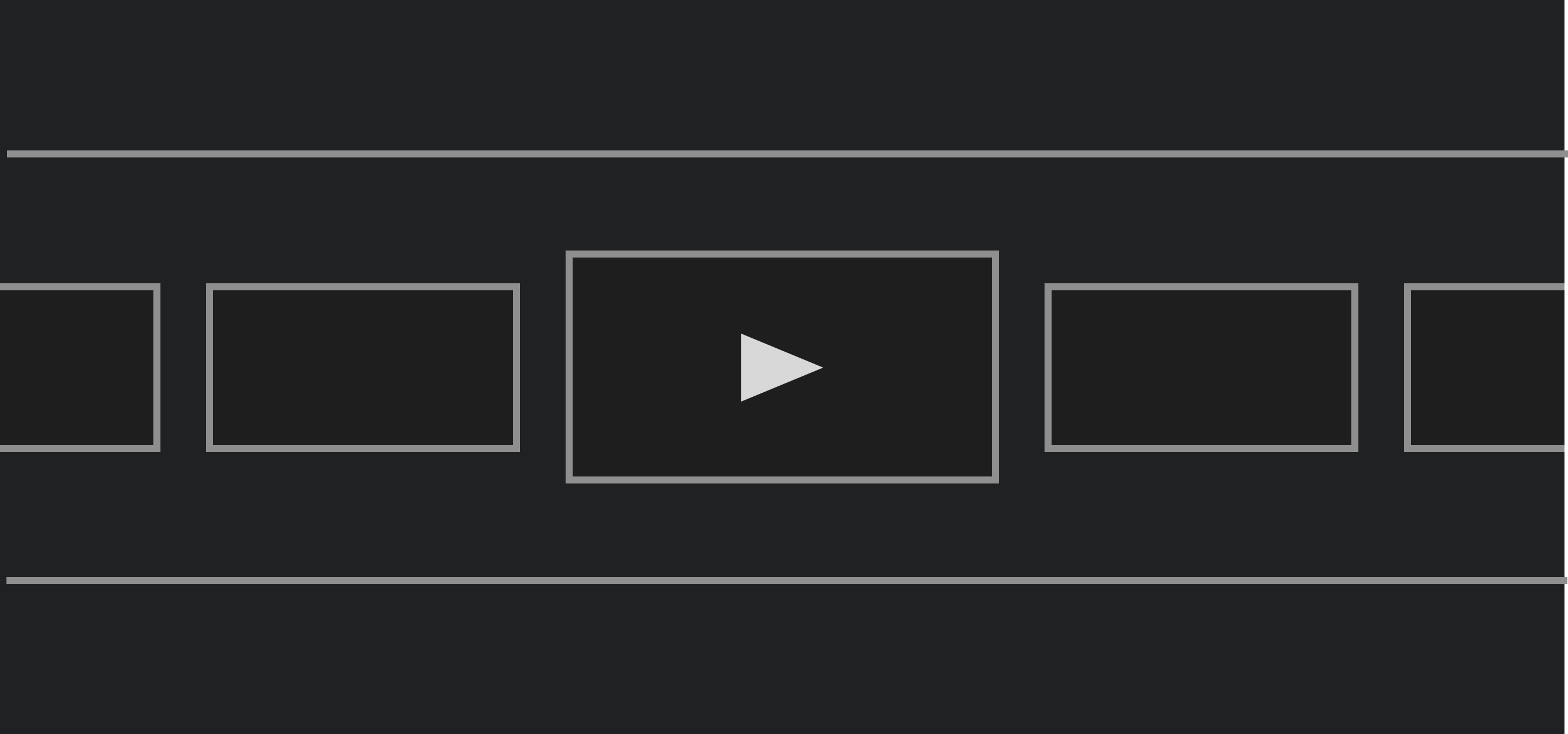
}With this in place, we now have a TvLazyRow that allows us to navigate between the different PreviewCard composables for our child items.
In this post, we’ve explored how to plug the PreviewCard composable into parent composables for use in Android TV apps – managing the focus state to allow for immersive navigation between child composables. We touched briefly on the TvLazyRow, which we’ll dive further into in a future blog post.