For the past few years, we’ve been getting to grips with Jetpack Compose and how we can use it to build apps for Handheld and Wear OS devices. Late last year, Composables built for Android TV apps started to surface as Alpha releases and in this series of blog posts, I want to dive into these composables and learn how they can be used to create apps for Android TV.
Looking to learn Jetpack Compose? Check out my course, Practical Jetpack Compose
When it comes to displaying content in Android TV, we can use Card components to display items within a collection of content. When it comes to displaying these Card composables, the APIs available in the Android TV Compose APIs provide better support for TV specific experiences – such as managing selection and focus states in the context of TV experiences. There are a collection of TV specific card components available, so lets take a look at each of these.
Standard Card Layout
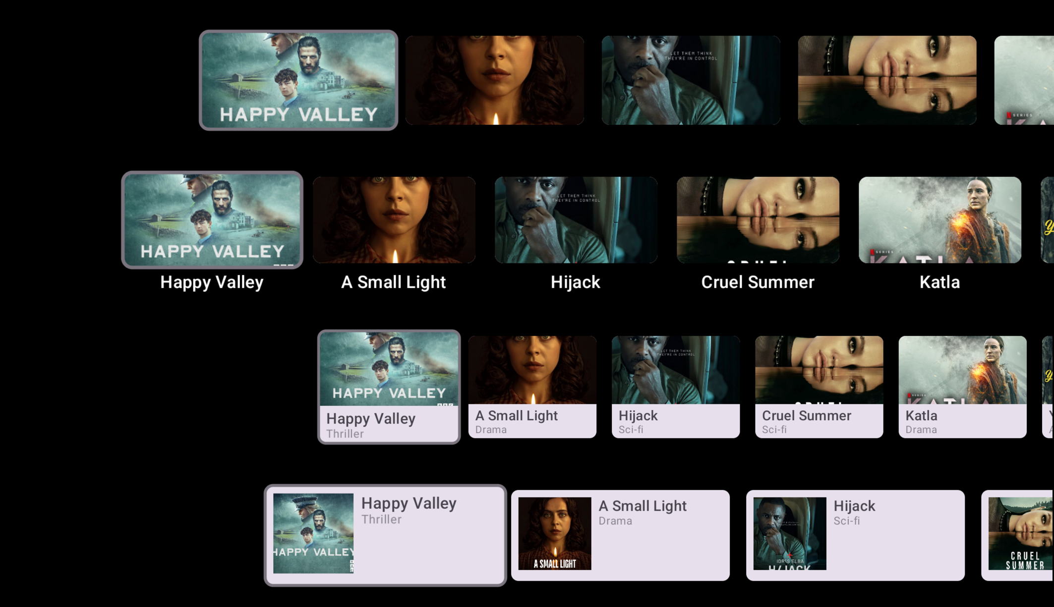
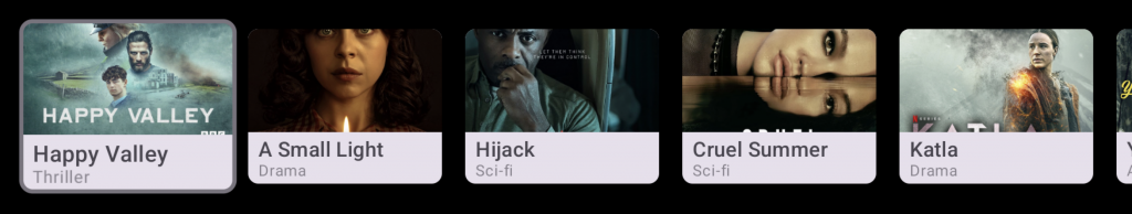
The StandardCardLayout composable is used to display an image, followed by a title beneath. This card uses visual content for its primary element, while also providing extra context via a title attributes. There is no visual card background for this component, creating a more immersive feel against the background of the application.
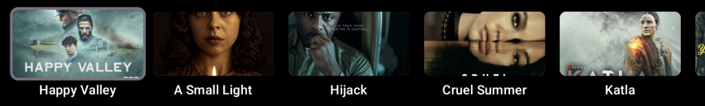
The StandardCardLayout composable supports these 2 properties via the imageCard and title composable arguments, also providing support for an optional subtitle and description. The color of these text components can be set using the contentColor argument.
@Composable
fun StandardCardLayout(
    imageCard: @Composable (interactionSource: MutableInteractionSource) -> Unit,
    title: @Composable () -> Unit,
    modifier: Modifier = Modifier,
    subtitle: @Composable () -> Unit = {},
    description: @Composable () -> Unit = {},
    contentColor: CardLayoutColors = CardLayoutDefaults.contentColor(),
    interactionSource: MutableInteractionSource = remember { MutableInteractionSource() }
)
When it comes to composing the Standard Card, we only need to provide the title and imageCard components to do so. For the title, we can use the Text composable to provide the title. For the imageCard, while we can use any composable here, the ImageCard composable exists for us to compose content inside of a bounded area while also supporting click events out of the box. If using this, we could see something that looks like the following:
@Composable
fun StandardCardLayoutSample() {
    StandardCardLayout(
        modifier = Modifier.size(150.dp, 120.dp),
        imageCard = { interactionSource ->
            CardLayoutDefaults.ImageCard(
                onClick = {
                // handle click
                },
                interactionSource = interactionSource
            ) {
                Box(
                    modifier = Modifier
                        .fillMaxWidth()
                        .height(80.dp)
                        .background(Color.Blue)
                )
            }
        },
        title = { Text("Standard Card") }
    )
}
Wide Card Layout
The WideCardLayout composable is used to primarily display an image and a title, but it also provides support for a subtitle and description. This card uses visual content for its primary element, while also providing extra context via a title attributes. There is no visual card background for this component, creating a more immersive feel against the background of the application. There is no visual card background for this component, creating a more immersive feel against the background of the application.

The WideCardLayout composable supports these properties via composable arguments. At a minimum we must provide the title and imageCard properties, which work the same way as the StandardCardLayout.
@Composable
fun WideCardLayout(
    imageCard: @Composable (interactionSource: MutableInteractionSource) -> Unit,
    title: @Composable () -> Unit,
    modifier: Modifier = Modifier,
    subtitle: @Composable () -> Unit = {},
    description: @Composable () -> Unit = {},
    contentColor: CardLayoutColors = CardLayoutDefaults.contentColor(),
    interactionSource: MutableInteractionSource = remember { MutableInteractionSource() }
)
When providing any of the text composables to the WideCardLayout, they will composed at the end of the imageCard. If providing the subtitle and description, these will be stacked vertically underneath the title.
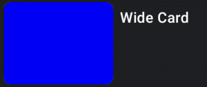
When composing this, we will be able to see something like the following:
@Composable
fun WideCardLayoutSample() {
    WideCardLayout(
        modifier = Modifier.size(180.dp, 100.dp),
        imageCard = { interactionSource ->
            CardLayoutDefaults.ImageCard(
                onClick = {
                    // handle click
                },
                interactionSource = interactionSource
            ) {
                Box(
                    modifier = Modifier
                        .fillMaxWidth()
                        .height(90.dp)
                        .background(Color.Blue)
                )
            }
        },
        title = { Text("Wide Card") }
    )
}
Classic Card
The ClassicCard composable is a 4-slot layout that allows the display of an image, title, subtitle and description stacked in a vertical format. This card allows the focus of visual content, while also providing extra context by textual attributes – all contained within a visible card area. The contents of this composable will be displayed on top of a visual card component.
The ClassicCard composable supports these 4 properties via composable arguments, while also allowing other card properties to be overriden. The arguments here are very different from the previous card composables we saw, due to the content being contained within a Card.
@Composable
fun ClassicCard(
    onClick: () -> Unit,
    image: @Composable BoxScope.() -> Unit,
    title: @Composable () -> Unit,
    modifier: Modifier = Modifier,
    onLongClick: (() -> Unit)? = null,
    subtitle: @Composable () -> Unit = {},
    description: @Composable () -> Unit = {},
    shape: CardShape = CardDefaults.shape(),
    colors: CardColors = CardDefaults.colors(),
    scale: CardScale = CardDefaults.scale(),
    border: CardBorder = CardDefaults.border(),
    glow: CardGlow = CardDefaults.glow(),
    contentPadding: PaddingValues = PaddingValues(),
    interactionSource: MutableInteractionSource = remember { MutableInteractionSource() }
)
While the ClassicCard composable offers all of these properties, only the title, image and onClick are required to compose an instance of this card.
@Composable
fun ClassicCardLayoutSample() {
    ClassicCard(
        modifier = Modifier.size(150.dp, 120.dp),
        title = {
            Text("Standard Card")
        },
        image = {
            Box(
                modifier = Modifier
                    .fillMaxWidth()
                    .height(80.dp)
                    .background(Color.Blue)
            )
        },
        onClick = {
            // handle click event
        }
    )
}
Wide Classic Card
Still keeping with the theme of a visual card, the WideClassicCard allows us to again display an image, title, subtitle and description. The main difference is that with this Card, the image takes less dominance within the layout, giving more space to textual items. The contents of this composable will be displayed on top of a visual card component.

Similar to the ClassicCard, the WideClassicCard supports these 4 properties via composable arguments, while also allowing other card properties to be overriden.
@Composable
fun WideClassicCard(
    onClick: () -> Unit,
    image: @Composable BoxScope.() -> Unit,
    title: @Composable () -> Unit,
    modifier: Modifier = Modifier,
    onLongClick: (() -> Unit)? = null,
    subtitle: @Composable () -> Unit = {},
    description: @Composable () -> Unit = {},
    shape: CardShape = CardDefaults.shape(),
    colors: CardColors = CardDefaults.colors(),
    scale: CardScale = CardDefaults.scale(),
    border: CardBorder = CardDefaults.border(),
    glow: CardGlow = CardDefaults.glow(),
    contentPadding: PaddingValues = PaddingValues(),
    interactionSource: MutableInteractionSource = remember { MutableInteractionSource() }
)
When it comes to composing the WideClassicCard,o nly the title, image and onClick are required to compose an instance of this card.
@Composable
fun WideClassicCardLayoutSample() {
    WideClassicCard(
        modifier = Modifier.size(180.dp, 100.dp),
        image = {
            Box(
                modifier = Modifier
                    .fillMaxWidth()
                    .height(90.dp)
                    .background(Color.Blue)
            )
        },
        title = { Text("Wide Card", Modifier.padding(start = 8.dp)) },
        onClick = {
            // handle click
        }
    )
}
In this blog post we’ve taken a look at the differed Card composables supported by the Android TV compose APIs. These composables were created to provide better support for TV specific experiences, allowing us to automatically handle selected and focused states, along with click events, out of the box.