When interacting with apps on our devices, animations not only add delight to our experience but they also help to create a sense of connection between the destinations being animated. One of the animations on Android which I’ve always enjoyed is the exploding Floating Action Button animation. Here, the user clicks the FAB and it explodes to fill the whole screen, with the next screen being loaded during / once that transition has completed. Before exploding, the FAB shrinks a small amount to account for the press from the user – this, coupled with the explosion, creates a pleasant journey to the next screen.
I’m currently working on Minimise, where for the UI I am using Jetpack Compose. So naturally, I was curious as to how I could recreate this animation. Here’s what I’ve ended up with:

We can see here that there are multiple elements being animated to create a pleasant transition between the two destinations. So we can see better what is happening here, let’s watch the same animation again but this time slowed down:
During this animation, there are a bunch of different things at play:
- When the FAB is pressed, it first shrinks in size
- at this point also, the icon in the FAB fades out
- After shrinking, the FAB then begins to grow to fill the screen
- Whilst the FAB is exploding, the application logo (in the top bar) fades out
- During the FAB explosion, the background color of the FAB changes from the secondary color to the primary color
- Once the FAB has exploded, the next screen needs to be animated in
- This starts with the new FAB scaling into view
- Whilst the FAB is scaling, the icon for the FAB fades into view
- At the same time, the body content is also fading into view
There’s a few different things happening there in sequence, so in this blog post I want to break this down so we can look at how the animation is constructed. This knowledge will help you to not only recreate this yourselves, but also use some learnings from here to create other animations in compose. If you want to view the complete code for this animation, the start destination can be found here, with the second destination here. However, if you’re interested in reading through a breakdown of how this animation is created and how all the little parts come together, let’s get started.
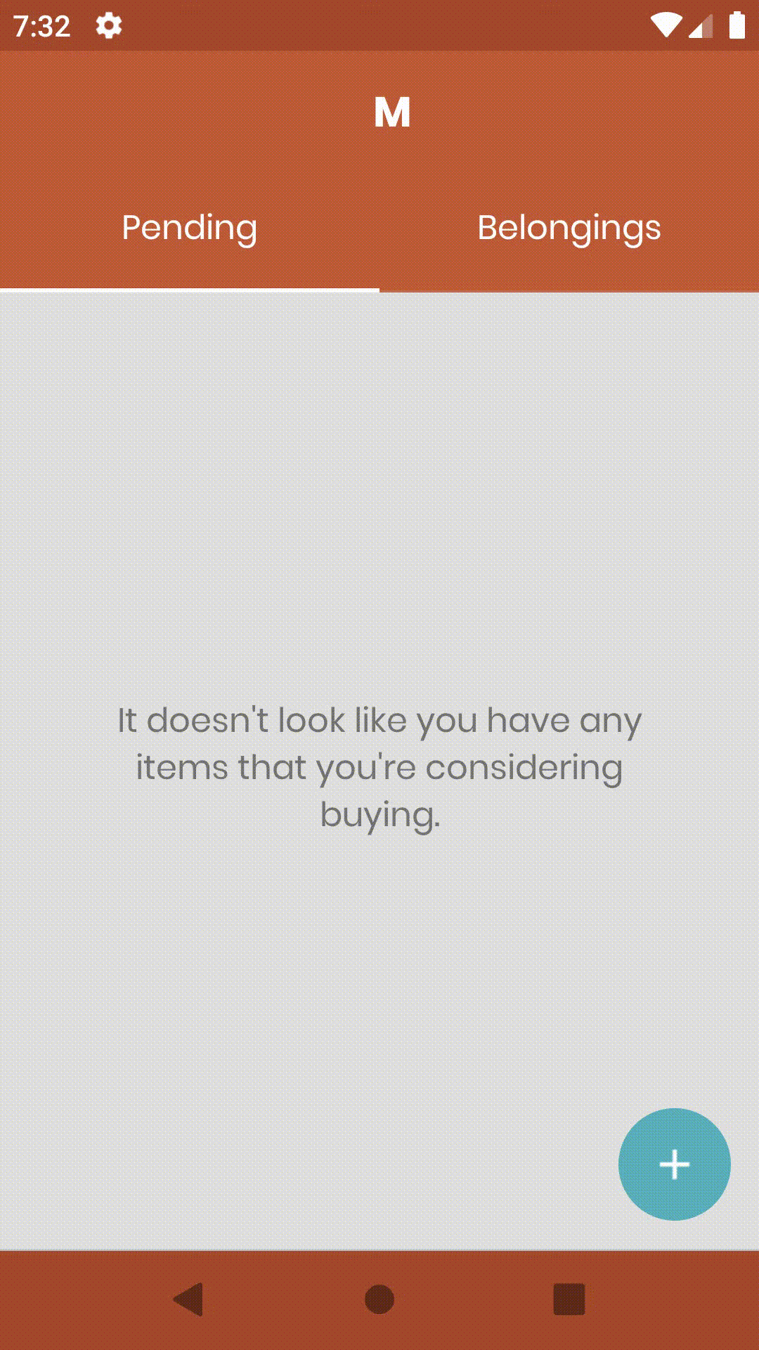
In this post I want to focus on building the animation rather than the composables used to build of the screen, so let’s start with the composable that makes up the UI content for the starting destination:
Scaffold(
    topBar = {
        TopAppBar(title = {
            Text(
                text = "M",
                textAlign = TextAlign.Center,
                modifier = Modifier.fillMaxWidth()
            )
        }, elevation = 0.dp)
    },
    floatingActionButton = {
        FloatingActionButton(onClick = {}) {
            Icon(asset = Icons.Default.Add)
        }
    },
    bodyContent = {
        Column{
            TabRow(
                items = tabTitles,
                selectedIndex = categories.indexOf(currentCategory)
            ) { index, currentTab ->
                Tab(
                    selected = categories.indexOf(currentCategory) == index,
                    onSelected = { updateSelectedCategory(categories[index]) }
                )
                {
                    Text(
                        text = currentTab.title,
                        modifier = Modifier.padding(16.dp)
                    )
                }
            }
            if ((currentCategory == Category.PendingBelongings &&
                        pendingBelongings.isEmpty()) ||
                (currentCategory == Category.Belongings &&
                        pendingBelongings.isEmpty())
            ) {
                emptyView(currentCategory)
            }
        }
    }
)
Above we can see:
- A scaffold to layout the composables of our screen, adhering to a basic material layout
- A TopAppBar
- A Floating Action Button
- A TabRow to house the content tabs
- A Column used for the content body of the selected tab
With this in place we have a static screen which displays the different UI components from our composed content. This acts as the foundation for our animation, so you’ll need this in place before getting started with anything below. With that said, let’s start adding some animations!
Scaling the Floating Action Button
The first thing that stands out in this animation is the scaling of the FAB, so we’re going to start by building the transition that handles this scaling.
val sizeState = FloatPropKey()

enum class FabState {
    Idle, Exploded
}

state(FabState.Idle) {
    this[sizeState] = 80f
}
state(FabState.Exploded) {
    this[sizeState] = 4000f
}

private fun sizeTransitionDefinition() = transitionDefinition {

    transition(fromState = FabState.Idle, toState = FabState.Exploded) {
        sizeState using keyframes<Float> {
            duration = 700
            80f at 0
            35f at 120
            4000f at 700
        }
    }

}
Here define several things which make up the transition:
- The sizeState is a FloatPropKey reference which is used to hold our animated float value. This value is going to represent the size of our FAB and will be changed as our animation transitions.
- Next we define a FabState enum – this enum defines the two different animated states which our FAB can be in. This is Idle (when the FAB is it’s normal size) and Exploded (when the FAB has exploded to fill the screen). When using the compose transition APIs you need to define state values which represent animation states, so these will be used for that. They don’t need to be enums, but it is always good to have some type safety in place
- Finally we have the transition definition. For this transition we’re going to be using the keyframe transition – I originally looked at using the tween transition and having a “Shrunk” state alongside Idle and Exploded, but using keyframes allows us to control the animated float value at specific frames of our animation.
duration = 700 // run for 700 milliseconds
80f at 0 // normal size at frame 0
35f at 120 // shrink at frame 120
4000f at 700 // between frame 120 and 700, animate from size 35f to 4000f
You may notice the 4000f value here – this is just a large value which is more than enough to fill the screen. It would probably be better to get the size of the screen and use that as the final value, but for a proof of concept this works pretty well. If we hop back over to the transition definition, you’ll notice this line when the transition is being defined:
transition(fromState = FabState.Idle, toState = FabState.Exploded)Here we are declaring that our animation will run from the Idle state to the Exploded state. If we pair this up with the values defined within our keyframe animation – Idle will represent the state whilst we are at frame 0, whilst Exploded will represent the state at frame 700. Now that we have our transition defined, we can go ahead and slot it in with our composables:
floatingActionButton = {
    val animatingFab = state { false }
    Transition(
        definition = sizeTransitionDefinition(),
        initState = FabState.Idle,
        toState = if (!animatingFab.value) {
            FabState.Idle
        } else FabState.Exploded
    ) { state ->
        FloatingActionButton(onClick = {
            animatingFab.value = true
        },
        modifier = Modifier.size(state[sizeState].dp)) {
            Icon(asset = Icons.Default.Add)
        }
    }
}
When we use a Transition reference, it needs to to wrap the composable that we want to animate – this is because it provides a state reference which will be used to access the current values for the animation. To control this state, we provide a collection of properties to the Transition:
- definition – this is the transition reference that is to be used for the animation. Here we provide a reference to our previously defined sizeTransitionDefinition()
- initState – this is the state that we want the animation to be initialised with. Because the FAB needs to be in its normal state when the composables are first rendered, we use Idle here
- toState – this is the state that we want the animation to be transitioned to when it is played out. Because we want out FAB to explode here we define this as the Exploded state when the transition is being animated
With this transition defined, we now have access to its state. When it comes to this state reference, we have access to any of the properties that we defined within it. From above this was the sizeState – whilst we set defined values for these for each state, this value will be animated between those two values as the transition progresses.
state(FabState.Idle) {
    this[sizeState] = 80f
}
state(FabState.Exploded) {
    this[sizeState] = 4000f
}
As this sizeState value changes, our Transition will recompose its children – meaning that when we access the value using state[sizeState] we can use this to style our composable to match the current state value. This is exactly what we do above with the size of the Floating Action Button:
FloatingActionButton(modifier = Modifier.size(state[sizeState].dp))If we run the above code and click on our FAB, we’ll see something like the following:

With this animation we can already see a key issue here. When the FAB shrinks and grows, the location at where the FAB is drawn changes – this results in the FAB looking like it is moving whilst it is scaling.
To get around this, we need a FAB that we can draw and scale whilst the central point stays at the same location on the screen – this way, as our FAB expands, the touch from the user feels like a natural animation from the point of interaction. To satisfy this requirement, we’re going to draw our own FAB instead of using the FloatingActionButton component. Drawing our own component gives us much more control over the constraints we are drawing within. This might change in future versions of compose and if so, the rest of the animation logic will remain the same.
floatingActionButton = {
    val resources = ContextAmbient.current.resources
    val fabColor = MaterialTheme.colors.secondary
    Box(
        modifier = Modifier.clickable(
            onClick = {
                animatingFab.value = true
            }
        ).wrapContentSize()
    ) {
        Transition(
            definition = sizeTransitionDefinition(),
            initState = FabState.Idle,
            toState = if (!animatingFab.value) {
                FabState.Idle
            } else FabState.Exploded
        ) { state ->
            Canvas(
                modifier = Modifier.padding(16.dp)
            ) {
                drawCircle(fabColor, state[sizeState])
                val image = imageFromResource(resources, R.drawable.plus)
                drawImage(
                    imageFromResource(resources, R.drawable.plus),
                        topLeft = Offset(
                            (this.center.x) - (image.width / 2),
                            (this.center.y) - (image.width / 2)
                        )
                 )
            }
        }
    }
}
I won’t dive too much into the canvas APIs here, but we can see above there have been a few changes to how our composables are defined. In the code above:
- We define a Box to contain our Canvas reference. This will be used to both contain the FAB (it will also grow as the size is scaled) along with capturing any clicks from the user
- Our transition remains the same, but instead of wrapping the Floating Action Button we instead wrap a Canvas. This Canvas will begin by drawing the circle for the FAB (using the size state reference) along with drawing the FAB icon in the center of the circle
Now if we run this code, we can see that our FAB keeps its initial central point and appears to grow from that location to fill the screen:

Animating the FAB color
Now that our FAB is exploding, we can go ahead and add the color change animation for when the FAB is growing. The great thing is that now we have our transition definition in place, we can build from that to also animate the color of the FAB.
For this we’ll need to add ColorPropKey to keep a reference to the animating color value (similar to the FloatPropKey that we used for the size animation). With that in place we can then set the value of this state for when our animation is in both the Idle and Exploded state – for this we’ll add two arguments to our definition function, one for each of the idle and exploded colors. These will then be used to configure the color to be used when our animation is in either of those states. Our transition will now animate between those two color values, exposing the current state of that animation through the colorState reference.
val colorState = ColorPropKey()

private fun sizeTransitionDefinition(
    idleColor: Color,
    explodedColor: Color
) = transitionDefinition {

    state(FabState.Idle) {
        this[sizeState] = 80f
        this[colorState] = idleColor
    }

    state(FabState.Exploded) {
        this[sizeState] = 4000f
        this[colorState] = explodedColor
    }
    ...
}
When we declare the definition to be used for our Transition reference we will pass in a reference to the colors that are to be used for the animation. Our FAB uses the secondary color from the application theme and we want to animate it to the primary color, so we’ll pass these in when retrieving a reference to our sizeTransitionDefinition:
Transition(
    definition = sizeTransitionDefinition(
        MaterialTheme.colors.secondary,
        MaterialTheme.colors.primary
    ),
    initState = FabState.Idle,
    toState = if (!animatingFab.value) {
        FabState.Idle
    } else FabState.Exploded
)
With that all in place, our state reference from our Transition now exposes the current color state to be used for our FAB, accessed using state[colorState]. We can now use this when drawing the circle for our FAB:
Canvas(
    modifier = Modifier.size(80.dp)
) {
    drawCircle(state[colorState], state[sizeState])
    val image = imageFromResource(resources, R.drawable.plus)
    drawImage(
        imageFromResource(resources, R.drawable.plus),
        topLeft = Offset(
            (this.center.x) - (image.width / 2),
            (this.center.y) - (image.width / 2)
        )
    )
}
With this in place, we can trigger the animation in our app and see the transition between our two colors:

Adding a ripple to the FAB
When the FAB is currently being pressed, you may have noticed that the ripple state doesn’t quite reflect the shape of the FAB:

This doesn’t make the interaction feel quite as natural – as like this, the touch state is outside of the FAB bounds, whilst the FAB shrinks and explodes within the bounds of the FAB. We’re going to fix this by utilising the indication property of the clickable modifier. This allows us to control the click indication of the composable:
Box(
    modifier = Modifier.clickable(
        onClick = {
            animatingFab.value = true
        }, indication = RippleIndication(
            radius = 26.dp,
            bounded = false
        )
    )
) {
    Transition(
        ...
    )
}
Here we use a RippleIndication instance, setting the radius to match that of our floating action button. Now when the FAB is touched we can see that the ripple is contained within the bounds of the FAB, which sets the interaction up for a much smoother journey:

Fading out the FAB icon
Whilst our FAB is now exploding to fill the entire screen, we still have the FAB icon lingering about – this definitely needs to be hidden in some way!
For this, we can add to our transition definition so that the alpha value is animated between the Idle and Exploded states. We’ll add another FloatPropKey (the same approach used for the size of our FAB) – this will then be used to control and expose the current alpha value that is to be used for our FAB icon.
val alphaState = FloatPropKey()

private fun sizeTransitionDefinition(
    startColor: Color,
    endColor: Color
) = transitionDefinition {
    state(FabState.Idle) {
        this[alphaState] = 1f
        this[sizeState] = 80f
        this[colorState] = startColor
    }
    state(FabState.Exploded) {
        this[alphaState] = 0f
        this[sizeState] = 4000f
        this[colorState] = endColor
    }
    ...
}
With the above in place, at FabState.Idle our alpha will have a value of 1f and be completely visible, whilst at FabState.Exploded our FAB will be hidden with an alpha value of 0f. If we hop over to where we draw our image resource, we can assign this state value to the alpha property:
drawImage(
    imageFromResource(resources, R.drawable.plus),
    topLeft = Offset(
        (this.center.x) - (image.width / 2),
        (this.center.y) - (image.width / 2)
    ),
    alpha = state[alphaState]
)
Now, when our transition is animated the FAB icon alpha value will be animated, causing it to fade out during the transition. This gives us the following result:

Fading out the Top App Bar title
We’re getting close now! You may notice in the current state that even after the transition has completed, the Top App Bar content is still visible:
The reason why this is still visible is because we are using the Scaffold container for our screen. The scaffold declares the topAppBar, floatingActionButton and bodyContent as three separate sections of the screen – meaning that the topAppBar is always positioned above the others. There are two options here:
- Don’t use the scaffold container
- Animate out the Top App Bar content
Because our top app bar has the same background color as the color of our next destination, it feels ok here to fade out the content of the Top App Bar. This creates the effect that the exploding FAB merges into the Top App Bar and feels quite seamless when the animation plays out. This approach is also not too much effort for us to achieve. One thing to note here is that we can’t hook into our transition definition, as this is being used inside of our floatingActionButton declaration. We could wrap our entire composable inside of the transition, but for now we can use a single value animation on the opacity of our Text composable to achieve the desired effect.
TopAppBar(title = {
    Text(
        text = "M",
        textAlign = TextAlign.Center,
        modifier = Modifier.fillMaxWidth()
            .drawOpacity(animate(if (animatingFab.value) 0f else 1f))
    )
}, elevation = 0.dp)
If we play this animation out, we can see our Top App Bar title fade out when the animation begins:

One thing we could do to improve this is to hook it into a shared transition definition. This would mean the timings of our animations would be matched, as well as make any maintenance later uninterrupted. For now this doesn’t look too bad, so I’m going to leave it as it is and come back to it at a later date!
Navigate to the next screen
Now that the animations for our starting destination have been wrapped up, we’re ready to go ahead and animate to the second destination in our flow. For this, we’re going to utilise the onStateChangeFinished property which is triggered when the animation has completed:
Transition(
    definition = sizeTransitionDefinition(
        MaterialTheme.colors.secondary,
        MaterialTheme.colors.primary
    ),
    initState = FabState.Idle,
    toState = if (!animatingFab.value) {
        FabState.Idle
    } else FabState.Exploded,
    onStateChangeFinished = {
        navigateToCreation()
    }
)
If we watch this play out, we can see the navigation take place to the second destination. However, you may notice that there is a slight delay in which the screen contents are displayed:

It’s not a huge delay, but enough to drag the feeling of the animation out by a noticeable amount. This is because the onStateChangeFinished callback is not triggered until the animation has completed. So what we’re going to do here is trigger the navigation when the FAB is clicked, but delay the execution of the navigation trigger to align with our animation timing. Because we know the timing of our animation, this is safe to do:
Box(
    modifier = Modifier.clickable(
        onClick = {
            animatingFab.value = true
            Timer().schedule(300) {
                navigateToCreation()
            }
        }, indication = RippleIndication(
            radius = 26.dp,
            bounded = false
        )
    )
) {
    Transition(
        ...
    )
}
With this trigger in place, we can run our code and see that the content of the next screen is now available without a delay. At the moment it may feel like it’s a little too quick – that’s because in the next steps we’re going to animate those composables into view, so here we are compensating for that.

Animating the second destination
Now that we have all of the animations in place for the initial destination, we can make the transition to the second destination even smoother by animating the different composables into view. Currently the screen feels like it appears suddenly, which feels like it doesn’t compliment the efforts made to animate the initial transition to the second destination:
We’ll take a similar approach as we did for the initial destination and add the required transition for the composables in the second screen. Again, let’s start by looking at the composable structure for our second destination:
Scaffold(
    floatingActionButton = {
        val resources = ContextAmbient.current.resources
        val buttonColor = MaterialTheme.colors.secondary

        Box(modifier = Modifier.wrapContentSize().clickable(onClick = {
            animatingFab.value = true
        }), gravity = ContentGravity.BottomEnd,
            children = {
                Canvas(
                    modifier = Modifier
                        .wrapContentSize(align = Alignment.Center)
                        .padding(20.dp)
                ) {
                    drawCircle(buttonColor, 80f)
                    drawImage(
                        imageFromResource(resources, R.drawable.arrow_right),
                        topLeft = Offset(-33.5f, -33.5f),
                        alpha = state[alphaState]
                    )
                }
            })
        }
    },
    bodyContent = {
        Box(modifier = Modifier.fillMaxSize(),
            backgroundColor = MaterialTheme.colors.primary
        ) {

            Column(
                verticalArrangement = Arrangement.Center,
                    modifier = Modifier.gravity(Center).padding(16.dp)
                        .fillMaxHeight()
            ) {
                nameStepComposable(
                    creationState,
                    onNameChanged = onNameChanged,
                    modifier = Modifier.wrapContentHeight()
                )
                ...
            }
        }
    }
)
What we want to do here is:
- Fade in the textual content of the screen
- Scale the FAB from a size of 0 to it’s full size
- Fade in the icon that is displayed within the FAB
We’ll begin by defining the transition that is needed to animate our composables. This is going to be a tiny bit different to our previous transition as here we are going to be animating from a hidden state to an idle state (instead of idle to exploded). We also only need to worry about the alpha and size states, we are not going to be animating the color changes for our fab as we’re just going to animate it into view.
With this in mind, let’s go ahead and define the require PropKey references, along wit the transition definition which will define the transition to be animated for our composables:
val sizeState = FloatPropKey()
val alphaState = FloatPropKey()

private val sizeTransitionDefinition = transitionDefinition {
    state(FabState.Hidden) {
        this[sizeState] = 0f
        this[alphaState] = 0f
    }
    state(FabState.Idle) {
        this[sizeState] = 80f
        this[alphaState] = 1f
    }

    transition(fromState = FabState.Idle, toState = FabState.Exploded) {
        sizeState using tween<Float> {
            duration = 200
            easing = FastOutLinearInEasing
        }
        alphaState using keyframes<Float> {
            duration = 400
            0f at 0
            0.1f at 225
            1f at 400
        }
    }
}
There is one small difference here, you may notice that I am using two different animations for both the size and the alpha tranistions. When the two properties were a part of the same one, the alpha state was not matched with the size transition of the FAB – this meant that the FAB icon was becoming visible before the FAB itself had grown, making the icon extend the bounds of the FAB in its current state. The scaling of the FAB needs to be smooth on this screen (as we are not shrinking and then growing it), so merging this with the keyframe transition didn’t make too much sense. Splitting these two out means that the FAB scaling will be super smooth, whilst also giving us control of the icon alpha state at specific frames in the transition.
With the above in place we can slot this into our code, this is pretty much the same as we had on the previous destination. The two differences here are that:
- We use a single color for our FAB, this is assigned directly when drawing the circle rather than passing it to our transition definition
- We use the onStateChangedFinished callback to detect when the animation has completed. When done so, we set our animation to no longer be happening – unlike the initial destination, we aren’t depending on other transitions to occur so this works here
val animatingFab = state { true }
Scaffold(floatingActionButton = {
    val resources = ContextAmbient.current.resources
    val buttonColor = MaterialTheme.colors.secondary
    Transition(
        definition = sizeTransitionDefinition,
        initState = FabState.Idle,
        toState = FabState.Exploded,
        onStateChangeFinished = {
            animatingFab.value = false
        }
    ) { state ->
        Box(modifier = Modifier.wrapContentSize().clickable(onClick = {
            animatingFab.value = true
        }), gravity = ContentGravity.BottomEnd,
            children = {
                Canvas(
                    modifier = Modifier
                        .wrapContentSize(align = Alignment.Center)
                        .padding(20.dp)
                ) {
                    drawCircle(buttonColor, state[sizeState])
                    drawImage(
                        imageFromResource(resources, R.drawable.arrow_right),
                        topLeft = Offset(
                            (this.center.x) - (image.width / 2),
                            (this.center.y) - (image.width / 2)
                        ),
                        alpha = state[alphaState]
                    )
                 }
             }
         )
    }
})
If we run this code we can see our FAB scale into size, along with the FAB icon alpha transitioning into visibility:

The last step is to animate the alpha of the textual content of our screen. For this we’ll go ahead and wrap this composable in another Transition and use the state[contentAlphaState] to control the alpha of our Column composable, meaning that all the content within the Column will be transitioned into view using the alpha modifier:
bodyContent = {
    Box(
        modifier = Modifier.fillMaxSize(),
        backgroundColor = MaterialTheme.colors.primary
    ) {
        Transition(
            definition = sizeTransitionDefinition,
            initState = FabState.Idle,
            toState = FabState.Exploded
        ) { state ->
            Column(
                verticalArrangement = Arrangement.Center,
                modifier = Modifier.padding(16.dp)
                    .fillMaxHeight()
                    .drawOpacity(state[contentAlphaState])
            ) {
                nameStepComposable(
                    creationState,
                    onNameChanged = onNameChanged,
                    modifier = Modifier.wrapContentHeight()
                )
            }
        }
    }
We can then run this code and watch our textual content fade into view, completing the transition between our destinations:

Wrapping up
With all of the above in place we’ve created a pleasant transition between two different destinations in our application, all using the animation APIs from Jetpack compose.
There are likely some things here which can be improved in the code, but for now these feels like a great experience when using the app and I’m happy with how it’s turned out! If there are any questions or thoughts, please do reach out!