
This post is sponsored by Practical Jetpack Compose.
The Card composable is a surface that can be used to present content and actions focused on a single topic.
When it comes to displaying a Card, there is a single composable function that can be used to do so.
@Composable
fun Card(
    modifier: Modifier = Modifier,
    shape: Shape = MaterialTheme.shapes.medium,
    backgroundColor: Color = MaterialTheme.colors.surface,
    contentColor: Color = contentColorFor(backgroundColor),
    border: BorderStroke? = null,
    elevation: Dp = 1.dp,
    content: @Composable () -> Unit
)
Here we can see that there are a collection of available properties that we can pass to the Slider function:
- modifier: the modifier(s) to be applied to the Card
- shape: the shape to be used when drawing the card
- backgroundColor: the color to be used for the background of the card
- contentColor: the color to be used for the content of the card
- border: the border to be applied to the card
- elevation: the elevation to be applied to the card
- content: the composable to be displayed as the content of the card
Display a Card
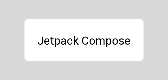
When it comes to displaying a Card composable, we can do so by using the provided composable function, along with the minimal required arguments. The Card only has a single required argument, which is the content argument – this is used as the body of the Card.
Card {
    Text(
        text = "Jetpack Compose"
    )
}
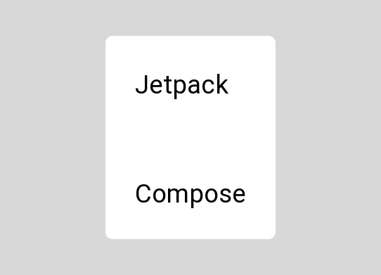
Because the Card only takes a single composable for the content argument, when displaying multiple children we will need to provide a layout composable for the content, which will in turn contain the collection of children that we want to display.
Card {
    Column {
        Text(
            text = "Jetpack"
        )
        Spacer(modifier = Modifier.preferredHeight(8.dp))
        Text(
            text = "Compose"
        )
    }
}
Styling the Card
Once we’ve composed a Card, it might be the case that we’re going to want to apply some styling to override the default which is provided by the theme of our application. In these cases, the Card composable offers several arguments which can be used to control the look and feel.
Setting the shape
We can set the shape to be used for the card by using the shape argument and providing a Shape reference. If not provided then this will default to the medium shape from the theme of our application.
Card(
    shape = RoundedCornerShape(3.dp)
) {
    Text(
        text = "Jetpack Compose",
        modifier = Modifier.padding(16.dp)
    )
}
Setting the background color
We can set the color to be used for the background of the card by using the backgroundColor argument and providing a Color reference. If not provided then this will default to the surface color from the theme of our application.
Card(
    backgroundColor = Color.LightGray
) {
    Text(
        text = "Jetpack Compose",
        modifier = Modifier.padding(16.dp)
    )
}
Setting the content color
We can set the color to be used for the background of the card by using the contentColor argument and providing a Color reference. If not provided then this will default to a color calculated from the background color of the card.
Card(
    contentColor = Color.Black
) {
    Text(
        text = "Jetpack Compose",
        modifier = Modifier.padding(16.dp)
    )
}
Adding a border
We can add a border to the card by using the border argument and providing a dp value. If not provided then this will default to null and no border will be applied to the card.
Card(
    border = BorderStroke(2.dp, Color.Black)
) {
    Text(
        text = "Jetpack Compose",
        modifier = Modifier.padding(16.dp)
    )
}
Applying elevation to the card
We can apply elevation to the card by using the elevation argument and providing a BorderStroke reference. If not provided then this will default to the value of 1 dp.
Card(
    elevation = 12.dp
) {
    Text(
        text = "Jetpack Compose",
        modifier = Modifier.padding(16.dp)
    )
}
In this post we’ve learned about the Card composable, exploring how we can create and customise it for display within our User Interface. Stay tuned for more jetpack compose articles and check out compose.academy to learn more about Jetpack Compose!