
This post is sponsored by Practical Jetpack Compose.
The ability to Preview Jetpack Compose composables within Android Studio is possibly one of my favorite things about this new way of building apps. Previews allow us to build, style and polish our composables without needing to run our app. The annotation offers a range of ways in which our previews can be configured, so I wanted to take a few moments to show you exactly what it can do so that we can be more productive with how we build applications.
If we jump into the source for the Preview annotation, we can see that there are a collection of arguments which can be provided when using the annotation:
@Repeatable
annotation class Preview(
    val name: String = "",
    val group: String = "",
    @IntRange(from = 1) val apiLevel: Int = -1,
    val widthDp: Int = -1,
    val heightDp: Int = -1,
    val locale: String = "",
    @FloatRange(from = 0.01) val fontScale: Float = 1f,
    val showDecoration: Boolean = false,
    val showBackground: Boolean = false,
    val backgroundColor: Long = 0,
    @UiMode val uiMode: Int = 0,
    @Device val device: String = Devices.DEFAULT
)
Displaying a Preview
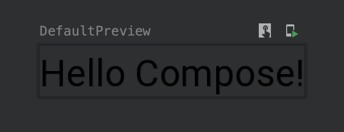
Let’s start with a minimal @Preview example. Here we’ll use this annotation without providing any configuration – this results in the provided composable being displayed in the preview area within Android Studio.
@Preview
@Composable
fun DefaultPreview() {
    Text(text = "Hello Compose!")
}
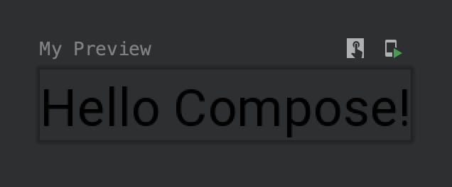
Assigning a Preview Title
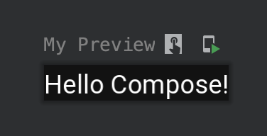
Now that we have our Preview showing, we can see that the preview has been assigned a title that matches the name of our composable. Whilst we can strive to create function names that are descriptive, this might not always be the best format for a preview title. In these cases we can utilise the name argument and provide a string to be used for the title of the preview.
@Preview(
    name = "My Preview"
)
@Composable
fun DefaultPreview() {
    Text(text = "Hello Compose!")
}
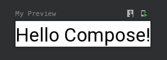
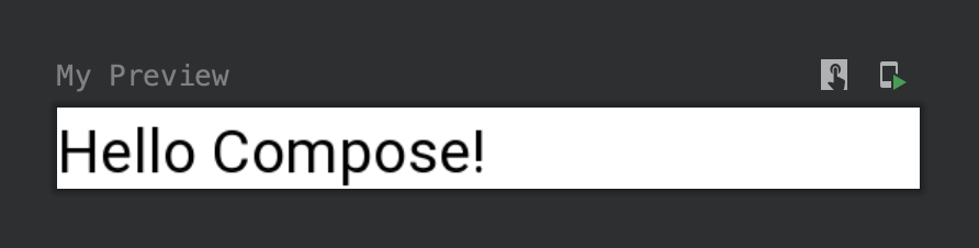
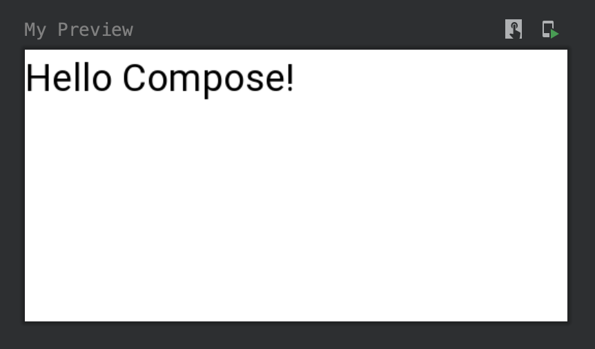
Showing the Preview Background
Now that we have a title, it feels like the composable within our preview isn’t too visible – this is because we’re just rendering a Text composable without any additional style, and we don’t want to change our Composable just for the sake of the preview! In these cases we can utilise the showBackground argument which takes a boolean value to depict whether a background should be shown for the preview area.
@Preview(
    name = "My Preview",
    showBackground = true
)
@Composable
fun DefaultPreview() {
    Text(text = "Hello Compose!")
}
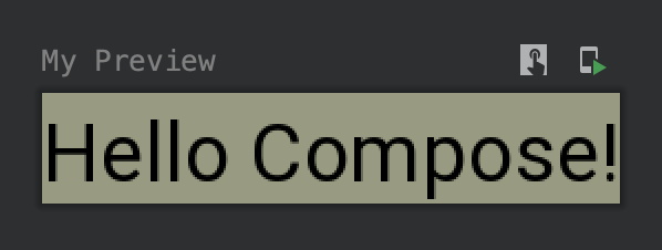
Setting the Preview Background Color
Whilst we’re showing a background, we might want to configure the background to better compliment that content of the composable. For example, if the text here was white then we wouldn’t be able to see the composable content. Here we can use the backgroundColor argument to provide a 32-bit ARGB color int to use for the background color. Hopefully in future this will support Color or resource values!
@Preview(
    name = "My Preview",
    showBackground = true,
    backgroundColor = 0x989a82
)
@Composable
fun DefaultPreview() {
    Text(text = "Hello Compose!")
}
Displaying a Preview Decoration
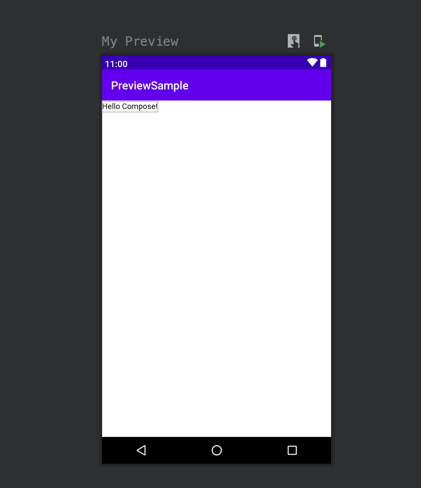
Now that we have our preview showing and style, we might want to take things a bit further visually. In these cases we may want to display our composable preview inside of a device frame. We can achieve this by using the showDecoration argument, which takes a Boolean value to depict this state.
@Preview(
    name = "My Preview",
    showDecoration = true
)
@Composable
fun DefaultPreview() {
    Text(text = "Hello Compose!")
}
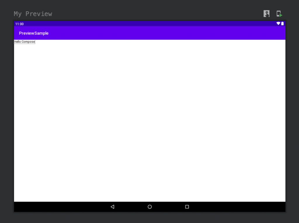
Configuring the Preview Decoration
When showing the composable preview inside of a decoration we can also control the device that should be used for the decoration. Here we can use the device argument, passing one of the androidx.ui.tooling.preview.Devices values.
@Preview(
    name = "My Preview",
    showDecoration = true,
    device = Devices.PIXEL_C
)
@Composable
fun DefaultPreview() {
    Text(text = "Hello Compose!")
}
Configuring the Preview Dimensions
There might be certain cases where we wish to configure the dimensions used by the preview. We can set the width of the preview by using the widthDp argument:
@Preview(
    name = "My Preview",
    showBackground = true,
    widthDp = 200
)
@Composable
fun DefaultPreview() {
    Text(text = "Hello Compose!")
}
Alongside the width, the heightDp argument can be used to configure the height of the preview:
@Preview(
    name = "My Preview",
    showBackground = true,
    widthDp = 200,
    heightDp = 200
)
@Composable
fun DefaultPreview() {
    Text(text = "Hello Compose!")
}
Grouping Previews
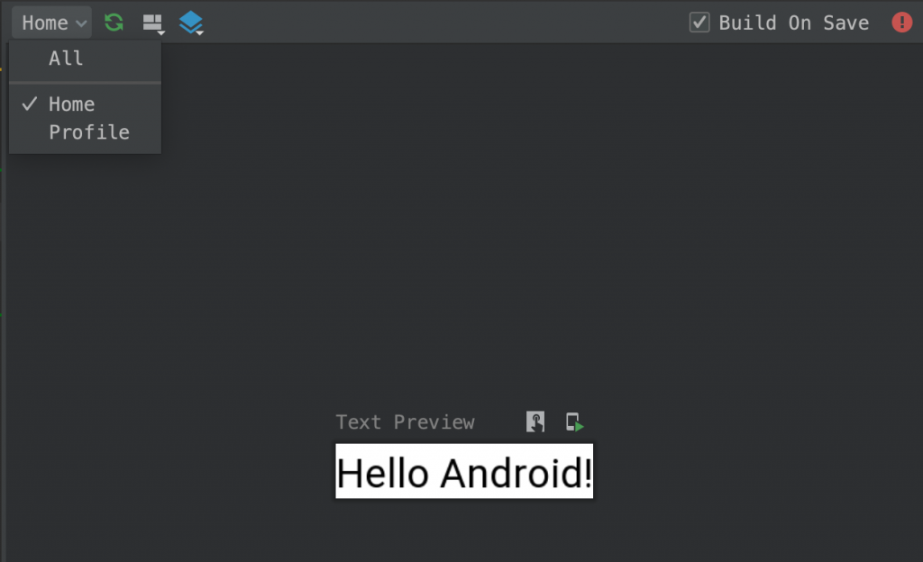
When creating Previews for our composables, it’s likely that we’re going to end up with many different previews in the IDE. This would this end up being hard to navigate around our previews, so to improve this we can group our previews into related responsibilities. For this we can use the group argument – this takes string value and is used to group together all previews with the same group name. We can then switch between preview groups using the group filter.
@Preview(
    name = "My Preview",
    showBackground = true,
    group = "Profile"
)
@Composable
fun DefaultPreview() {
    Text(text = "Hello Compose!")
}

@Preview(
    name = "Text Preview",
    group = "Home",
    showBackground = true
)
@Composable
fun SecondPreview() {
    Box {
        Text(text = "Hello Android!")
    }
}
Configuring the UI Mode
When previewing composables we might want to preview them under certain UI conditions. For this we can use the uiMode argument – this takes an android.content.res.Configuration.uiMode value to be used when rendering the preview. So for example, we could render the preview with night configured:
@Preview(
    name = "My Preview",
    showBackground = true,
    uiMode = UI_MODE_NIGHT_YES
)
@Composable
fun DefaultPreview() {
    Text(
        text = "Hello Compose!",
        color = Color.White
    )
}
In this post we’ve learn about the @Preview annotation and how it can be used to improve our productivity when it comes to building UI components for our applications. Stay tuned for the next article on Jetpack Compose!