This post is sponsored by Practical Jetpack Compose.
The Column Composable provides us with the functionality of displaying a collection of composables in a vertically sequenced format, where each composable is displayed simultaneously one after the other.
If you’re enjoying my posts on Jetpack Compose, check out some details on the book I’m writing on Compose!
When it comes to declaring a Column, there are four arguments which the constructor can take:
@Composable
inline fun Column(
    modifier: Modifier = Modifier,
    verticalArrangement: Arrangement.Vertical = Arrangement.Top,
    horizontalAlignment: Alignment.Horizontal = Alignment.Start,
    children: @Composable ColumnScope.() -> Unit
)- modifier: the modifiers to be applied to the Column
- verticalArrangement: how the children should be arranged on the vertical axis
- horizontalAlignment: how the children should be arranged on the horizontal axis
- children: the children to be displayed inside of the Column. (required)
Declaring Children
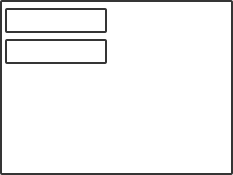
When it comes to declaring a Column, children are required. We can declare a collection of any composables for the children argument.
Column {
Text(text = “Hello”)
Text(text = “World”)
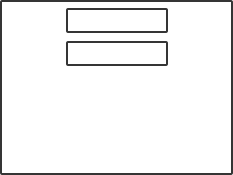
}With this in place, these will then be displayed in a vertical sequence. We can note here that the column is wrapping the size of the children that it contains.
Column Modifiers
We can apply modifiers to the column by using the modifier parameter. Here we can use any global modifiers that we would apply to any other composables, with the addition of modifiers that are specifically defined by the Column composable. When children are added to the composable, they are labelled as having the Column Scope – this gives them access to the modifiers that are defined for use with the Column.
For examples sake, because the column will wrap the height and width of its children, let’s have our column fill the available space within the screen.
Column(
    Modifier = Modifier.fillMaxSize()
) {
    Text(text = “Hello”)
    Text(text = “World”)
}
With this in place we can see that the column now fills the available space on screen.

Align Modifier
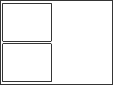
The first of these Column modifiers is align, this can be used to apply align to an individual child inside of the Column. Because the Column itself handles the vertical layout of our children, align allows us to have some control over the horizontal space which is available to each child row. The Align will only be effective if there is a wider space available than the width of the child component, otherwise the align will be ineffective. We can set the align using the available modifier:
fun Modifier. align(align: Alignment.Horizontal)The align that we set here will be applied to child that it has been directly set to – this allows us to have control over the individual align of children inside of our column. By default the align will be set to Alignment.Start – you don’t need to set this as it is the default value.
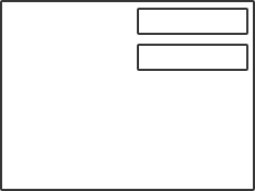
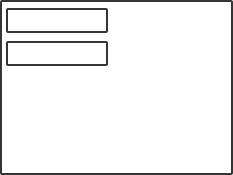
Column {
    Text(
        text = "First item",
        modifier = Modifier. align(align = Alignment.Start)
    )
    Text(
        text = "Second item"
    )
}
As shown below, the child with the align applied does not have any visual difference than the default align of the second child.
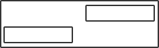
If we want a align different than the default one that is applied then we can use one of the other two values that are available. The first is used to center the child horizontally in the available space – CenterHorizontally.
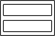
Column {
    Text(
        text = "First item",
        modifier = Modifier.align(align = Alignment.CenterHorizontally)
    )
    Text(
        text = "Second item"
    )
}
As shown below, the first child is positioned in the center of the view whilst the second child remains in place with the default align applied.

Aside from entering the child horizontally, we can also align the child to the end of the column width.
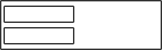
Column {
    Text(
        text = "First item",
        modifier = Modifier.align(align = Alignment.End)
    )
    Text(
        text = "Second item"
    )
}
Weight Modifier
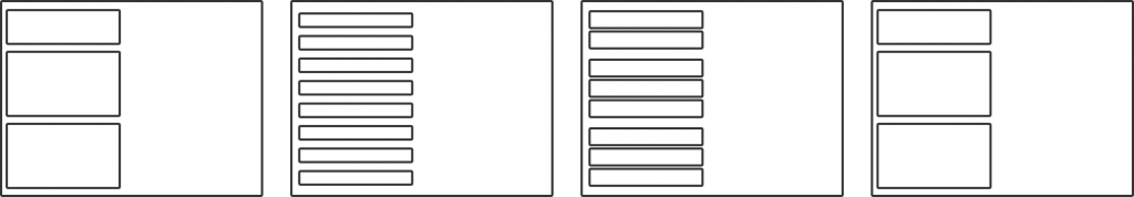
When it comes to laying out the child composables within a Column, we may want to control how much space each child is to occupy without having to define a fixed height. In these cases we can utilise the Weight modifier to build fluid and dynamic layouts – the Weight modifier is also a part of the Column Scope. The weight defines how much of the available height the composable should get – so let’s imagine that there are three composables within a container, two of which have a weight of 3 and the third has a weight of 2. This totals to 8 – meaning that the available height will be divided by 8 and distributed amongst the children for their corresponding weight.
The weight modifier takes two arguments:
- weight – the weight to be applied to the composable
- fill – whether the content of the composable should fill the whole height that is available to it. This defaults to true, but if set to false then the weighted space will not be redistributed to other children. Instead, it will be removed from the Columns height.
fun Modifier.weight(
    @FloatRange(from = 0.0, to = 3.4e38, fromInclusive = false)
    weight: Float,
    fill: Boolean = true
)
Without applying the weight modifier, each child will occupy the height constraints of the composable.
Column(modifier = Modifier.fillMaxSize()) {
    Text(
        text = "First item"
    )
    Text(
        text = "Second item"
    )
}
However, if we set an equal weight to each of the composables then the available space will be distributed amongst their heights.
Column(modifier = Modifier.fillMaxSize()) {
    Text(
        text = "First item",
        modifier = Modifier.weight(1f)
    )
    Text(
        text = "Second item",
        modifier = Modifier.weight(1f)
    )
}
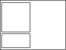
If we assign a greater weight to one of the children, then it will be given more of the container height than the others:
Column(modifier = Modifier.fillMaxSize()) {
    Text(
        text = "First item",
        modifier = Modifier.weight(2f)
    )
    Text(
        text = "Second item",
        modifier = Modifier.weight(1f)
    )
}
In some cases we may want to declare a weight for a child, but not have the child consume that whole area – this would become unusable weight to other children. In these cases we can use the fill argument for the weight modifier. This will mean that this height will not be available for use by any other children, and the specified child will not be required to use that whole weight when its height is being calculated. In these cases, the empty space will be added to the bottom of the Column as unoccupied space.
Column(modifier = Modifier.fillMaxSize()) {
    Text(
        text = "First item",
        modifier = Modifier.weight(2f, fill = false)
    )
    Text(
        text = "Second item",
        modifier = Modifier.weight(1f)
    )
}
Arranging Children
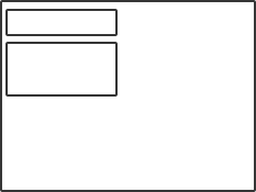
For the children of a column, they can be arranged on the vertical axis using the verticalArrangement parameter. This allows us to declare how composables should be positioned given the available vertical space. Provided there is available additional space within the column, the children can be positioned vertically as a group within the column. When adding children to a column, by default they are laid out to be arranged at the top of the column. This arrangement property can be set to one of:
- Top – align children to the top of the column
- Center – align children at the centre of the column
- Bottom – align children to the bottom of the column
- Space Around – evenly distribute the children within the column. As well as adding space before the first child and after the last child, half of that spacing will also be added between each consecutive child
- Space Between – evenly distribute the children within the column, without adding space before the first child or after the last child
- Space Evenly – evenly distribute the children within the column, also adding space before the first child and after the last child
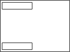
By default, the Column will use Top Arrangement to lay out its children. You don’t need to set this manually, but this is the same as doing the following:
Column(
    modifier = Modifier.fillMaxSize(),
    verticalArrangement = Arrangement.Top
) {
    Text(
        text = "First item"
    )
    Text(
        text = "Second item"
    )
}
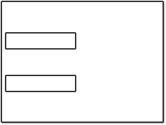
If we want to position the children vertically within the Column, we can use Arrangement.Center:
Column(
    modifier = Modifier.fillMaxSize(),
    verticalArrangement = Arrangement.Center
) {
    Text(
        text = "First item"
    )
    Text(
        text = "Second item"
    )
}
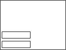
If we want to position the children at the bottom of the Column, Arrangement.Bottom can be used:
Column(
    modifier = Modifier.fillMaxSize(),
    verticalArrangement = Arrangement.Bottom
) {
    Text(
        text = "First item"
    )
    Text(
        text = "Second item"
    )
}
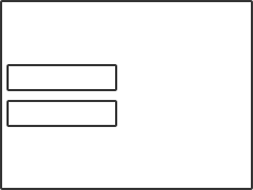
In some cases we may want to evenly distribute children across the vertical axis. In these cases we can use Arrangement.SpaceEvenly. This will take the available space within a column and distribute it between each child, as well as before the first and after the last one.
Column(
    modifier = Modifier.fillMaxSize(),
    verticalArrangement = Arrangement.SpaceEvenly
) {
    Text(
        text = "First item"
    )
    Text(
        text = "Second item"
    )
}
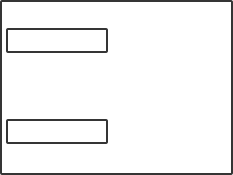
Similarly, we can distribute children across the vertical axis, distributing available space between each child, without distributing any before the first or after the last child.
Column(
    modifier = Modifier.fillMaxSize(),
    verticalArrangement = Arrangement.SpaceBetween
) {
    Text(
        text = "First item"
    )
    Text(
        text = "Second item"
    )
}
Finally, SpaceAround offers a slightly different way to distribute space to the gaps between children. This is very similar to SpaceEvenly where space is distributed both before the first and after the last child. However, when it comes to adding space between each of the children, only half of the amount of space is allocated between each of the child.
Column(
    modifier = Modifier.fillMaxSize(),
    verticalArrangement = Arrangement.SpaceAround
) {
    Text(
        text = "First item"
    )
    Text(
        text = "Second item"
    )
}
Child Alignment
Whilst Column arrangement allows us to organise children along the vertical axis and the align modifier lets us horizontally align individual children, we may also want to position children on the horizontal axis as a collective group. To do this we can utilise the horizontalAlignment parameter for the Column – this allows us to position all of the Column children on the horizontal axis.
The horizontalAlignment parameter can be assigned on of three values:
- Start – align the children to the start of the horizontal axis
- CenterHorizontally – align the children at the center of the horizontal axis
- End – align the children at the end of the horizontal axis
By default the Alignment.Start value will be used. Whilst we don’t need to set this manually, this would be the same as doing:
Column(
    modifier = Modifier.fillMaxSize(),
    horizontalAlignment = Alignment.Start
) {
    Text(
        text = "First item"
    )
    Text(
        text = "Second item"
    )
}
If we want to align child group in the center of the horizontal axis, then we can use Alignment.CenterHorizontally as the value for horizontalAlignment:
Column(
    modifier = Modifier.fillMaxSize(),
    horizontalAlignment = Alignment.CenterHorizontally
) {
    Text(
        text = "First item"
    )
    Text(
        text = "Second item"
    )
}
Finally, Alignment.End can be used to position the child group at the very end of the Column on the horizontal axis:
Column(
    modifier = Modifier.fillMaxSize(),
    horizontalAlignment = Alignment.End
) {
    Text(
        text = "First item"
    )
    Text(
        text = "Second item"
    )
}