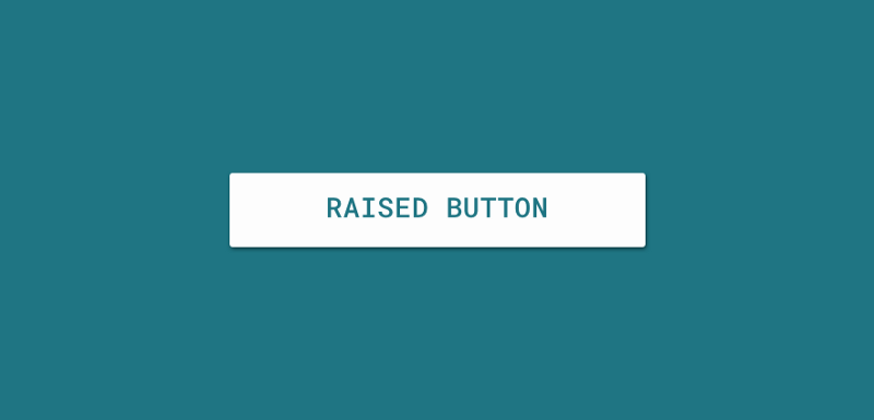
new RaisedButton(
  child: const Text('Connect with Twitter'),
  color: Theme.of(context).accentColor,
  elevation: 4.0,
  splashColor: Colors.blueGrey,
  onPressed: () {
    // Perform some action
  },
),
The above gives us a simple button used to capture click events from user input. You can notice that the child property allows us to pass in a text widget that is used to define the text displayed on the button.
As well as the above, we also have the ability to set the following properties when creating a RaisedButton using the classes constructor.
const RaisedButton({
  Key key,
  @required this.onPressed,
  this.color,
  this.highlightColor,
  this.splashColor,
  this.disabledColor,
  this.elevation: 2.0,
  this.highlightElevation: 8.0,
  this.disabledElevation: 0.0,
  this.colorBrightness,
  this.child
}) : super(key: key);
The properties above are used to declare the following:
- color — This is the color used for the background color of the button whilst it is in it’s default, unpressed state
- disabledColor — This is the color used for the button when it is in it’s disabled state
- disabledElevation — This is the float value used for the elevation of the button when it is in it’s disabled state
- elevation — This is the float value used for the elevation of the button when it is in it’s default state
- enabled — This declares whether or not the button is currently enabled
- highlightColor — This is the secondary color of the button when it is in a pressed state
- highlightElevation — This is the float value used for the elevation of the button when it is in a pressed state
- onPressed — This is the callback used to receive events when the button is pressed
- splashColor — This is the primary color used for the button when it is in a pressed state
Enjoy the other snippets in this publication! Leave a comment below or tweet me if with any questions / suggestions!
