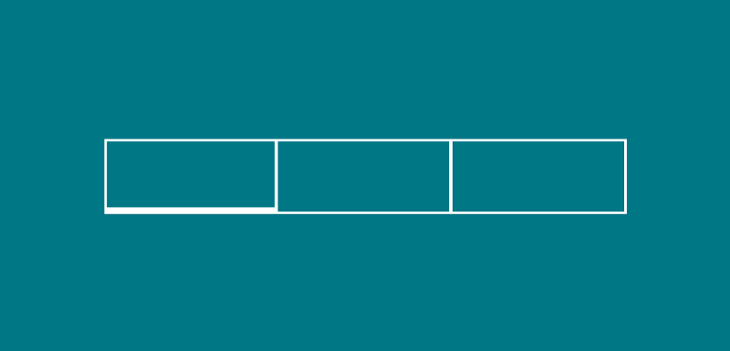
The TabBar widget can be used to display a collection of tabs to the user in a horizontal format. The user would then select the desired tab, which would then change the content being displayed on the screen to match the currently selected tab. It is likely that you have already used tabs in an… Continue reading
Posts Tagged → Widget
Widgets: Hero
The Hero widget allows us to define that two widgets are related, allowing the system to automatically perform transitional animations for us as we navigate between screens. This allows us to provide a greater experience when transporting users through navigational context, making our app both easier and more pleasant to use. As displayed in the… Continue reading
Widgets: Raised Button
The RaisedButton widget allows us to create a Button that matches the specification defined in the Material Guidelines here. The RaisedButton has a single constructor that allows us to instantiate the widget with a number of different properties. new RaisedButton( child: const Text(‘Connect with Twitter’), color: Theme.of(context).accentColor, elevation: 4.0, splashColor: Colors.blueGrey, onPressed: () { //… Continue reading
Widgets: Image
The Image widget allows us to display an image within our user interface via a number of different means. This is done via the use of several different constructors, we can do this by using: Image() — Used to load an image from an ImageProvider. Here we simply provide an ImageProvider instance for the image parameter for… Continue reading