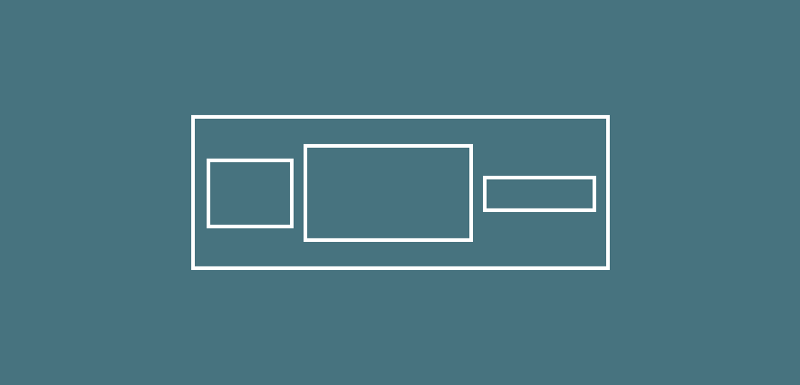
For example, if we wished to display three text widgets within a row we can create a Row widget like below:
new Row(
    children: <Widget>[
    new Text(‘The first text widget’, textAlign: TextAlign.center),
    new Text(‘The first text widget’, textAlign: TextAlign.center),
    new Text(‘The first text widget’, textAlign: TextAlign.center)
 ],
)
A row lays out it’s widget by giving space priority in the order that widgets are laid out. Here is another example layout:
new Row(
    children: <Widget>[
const FlutterLogo(),
new Text("This is a text widget to be
    displayed on the screen, as you can see it is a pretty long text
    widget, right?"),
const FlutterLogo()
 ],
)
This widget will be laid out in the following way:
- The FlutterLogo will be laid out at whatever size this icon is, let’s say in this case it is 24 pixels square.
- Next, our text is laid out. The issue here is that the text is pretty long, so it’s just going to be given the space horizontally to be shown on the screen.
- Finally, our second FlutterLogo is to be laid out. However, because of the Text that was laid out (and took up all of the horizontal space) there is no room left over for our last icon.

If we’re using multiple children within our Row that use more than the available screen width, then the Row will turn red in these cases to indicate that there contents of the Row are wider than the available space. This would look a little like the screenshot to the left hand side here.
We can get around this by using an Expanded widget. This Widget will be covered in another post, but it’s purpose is to essentially causes the child views to fill the available horizontal space.
This can be fixed with the following approach and the use of the Expanded Iwdget:
new Row(
  children: <Widget>[
const FlutterLogo(),
const Expanded(child: const Text("This is a text widget to be
    displayed on the screen, as you can see it is a pretty long text
    widget, right?")),
const FlutterLogo()
  ],
)
Now with this layout, the following occurs:

- The FlutterLogo will be laid out at whatever size this icon is, let’s say in this case it is 24 pixels square.
- Next, our second FlutterLogo is laid out. Because this uses the Icon theme, this is always going to be 24 pixels. So our layout knows how much space these require.
- Finally, our layout knows how much room is left over and our Text widget is assigned to this size because we are using the Expanded widget. We’ll come onto this widget soon, but it’s important to remember how it has been used here. And because the width of the widget is less width than out text is on a single line, our Text wraps to multiple lines.
When it comes to the Row, there are a collection of properties which we can assign to the Widget:
- children — This property consists of a List of Widget instances that are contained within this Row
children: <Widget>[ ... ]
- textBaseline — The baseline to be used if aligning items according to their baseline
textBaseline: TextBaseline.alphabetic
- textDirection — The order in which children are to be laid out horizontally
textDirection: TextDirection.ltr
- verticalDirection — The order in which children are to be laid out vertically
verticalDirection: VerticalDirection.down
More properties are visible on the full documentation: https://docs.flutter.io/flutter/widgets/Row-class.html
Enjoy the other snippets in this publication! Leave a comment below or tweet me if with any questions / suggestions!
