When working with tabs in Jetpack Compose, we have two options available to us out of the box – the TabRow and the ScrollableTabRow. The TabRow provides us with a fixed-width row where each tab where the available width is split equally between each of the tabs, while the ScrollableTabRow provides a horizontally scrollable row where each tab only uses the width that it requires for its content. While both of these serve their purpose, there are situations where we don’t know which one we need until runtime.
This means that in some cases we may end up with not enough space to display out tabs (resulting in text getting cut-off or spanning multiple lines), or too much empty space from using scrollable tabs when we don’t really need them (as in this case, tabs will default to align at the start). Unfortunately the tab rows does not handle any of this for us, so to get around this problem we can build a ResponsiveTabRow that makes this decision for us automatically – this means that regardless of the information that is being shown for the given tabs, we can ensure that its always displayed correctly.
In this post, we’ll walk through how we can build a ResponsiveTabRow composable and learn how it uses SubcomposeLayout to measure content before deciding which tab row to use.
If you’re enjoying my posts on Jetpack Compose, check out my Jetpack Compose book!
The SubcomposeLayout
When we need to display tabs in our app, we’re likely going to use one of the available TabRow or ScrollableTabRow. This works fine when we have a known number of short, predictable labels. However, this can become a problem if we have either dynamic lables or a larger number of tabs with non-short labels – this becomes an issue because we don’t have control over what these look like when it comes to localisation or text size.
Because of this, we can’t always know which component we need until we see the actual content on the actual screen. To solve this issue, we need a component that measures the preferred width of each tab’s content, compares this against the required space for each tab a fixed TabRow, and opt to use a ScrollableTabRow if any tab would be cramped.
One way for us to solve this issue is to use the SubcomposeLayout, this allows us to compose and measure UI elements in phases. This means that we can measure the content and then use these measurements to compose the optimal layout based on those decisions
When it comes to the subcompose layout, the general approach to doing something like this would look like the following:
SubcomposeLayout(modifier = modifier) { constraints ->
    // Measure something
    val measurements = subcompose("MEASURE_PHASE") {
        // Content to measure
    }.map { it.measure(...) }

    // Use measurements to decide what to render
    val content = subcompose("LAYOUT_PHASE") {
        // Our actual UI, informed by the measurements
    }.map { it.measure(constraints) }

    // Place the components
    layout(width, height) {
        content.forEach { it.placeRelative(0, 0) }
    }
}
This approach means that we start by measuring our content before we draw any UI, we then draw the UI once we have decided what it is we want to compose.
Building the ResponsiveTabRow
To build out custom component, we’re going to start by defining a new composable function, the ResponsiveTabRow. We can see here that the arguments look very similar to that of a TabRow and ScrollableTabRow and that’s because once we’ve performed the measurements, we’re going to pass these values directly to these child composables.
@Composable
fun ResponsiveTabRow(
    selectedTabIndex: Int,
    tabTitles: List<String>,
    modifier: Modifier = Modifier,
    onTabClick: (Int) -> Unit,
    containerColor: Color = MaterialTheme.colorScheme.surface,
    contentColor: Color = MaterialTheme.colorScheme.onSurface,
    indicator: @Composable (tabPositions: List<TabPosition>) -> Unit = { tabPositions ->
        if (tabPositions.isNotEmpty() && selectedTabIndex < tabPositions.size) {
            TabRowDefaults.SecondaryIndicator(
                Modifier.tabIndicatorOffset(tabPositions[selectedTabIndex])
            )
        }
    },
    divider: @Composable () -> Unit = {},
    tabTextStyle: TextStyle = LocalTextStyle.current,
    tabContentHorizontalPadding: Dp = 16.dp,
    tabCounts: List<Int?>? = null
)
When it comes to these arguments, let’s take a quick look at their responsibilities:
- selectedTabIndex – the index of the currently selected tab
- tabTitles – the list of titles to display for each tab
- modifier – the modifier to be applied to the tab row
- onTabClick – callback invoked when a tab is clicked, providing the index of the clicked tab
- containerColor – the color used for the background of the tab row
- contentColor – the color used for the content of the tab row
- indicator – the composable used to indicate the currently selected tab
- divider – the composable used to display a divider below the tab row
- tabTextStyle – the text style to be applied to the tab titles
- tabContentHorizontalPadding – the horizontal padding applied to each tab’s content
- tabCounts – optional list of counts to display as badges next to each tab title
Inside of this ResponsiveTabRow we’re going to start by composing the SubcomposeLayout.
SubcomposeLayout(modifier = modifier) { constraints ->
  val availableWidthPx = constraints.maxWidth
  val numberOfTabs = tabTitles.size
}
Here we use the provided constraints to get the maximum width that is available for drawing, followed by storing the number of tabs that are to be displayed (based on the provided titles).
Next, we’re going to want to measure how wide each tab wants to be. We do this by composing the content of each tab and then measuring it using unbounded width constraints. You’ll notice here that we also apply any provided tabContentHorizontalPadding so that the measurement takes this into account.
SubcomposeLayout(modifier = modifier) { constraints ->
    val availableWidthPx = constraints.maxWidth
    val numberOfTabs = tabTitles.size

    val tabPreferredWidths = mutableListOf<Int>()
    subcompose("MEASURE_INDIVIDUAL_TABS") {
        tabTitles.forEachIndexed { index, title ->
            Box(
                modifier = Modifier.padding(horizontal = tabContentHorizontalPadding),
                contentAlignment = Alignment.Center
            ) {
                TabContent(
                    title = title,
                    count = tabCounts?.getOrNull(index),
                    style = tabTextStyle
                )
            }
        }
    }.forEach { measurable ->
        tabPreferredWidths.add(
            measurable.measure(
                Constraints(minWidth = 0, maxWidth = Constraints.Infinity)
            ).width
        )
    }
}
After composing each tab, we’re measuring the content and then storing it in a collection of widths. We can then take these widths and use them to determine which tab row should be used. To determine this we’ll simply calculate how much each tab would be given for fixed width tabs, and then use this to check if this if any of the tab widths exceed the available space given for a fixed tab.
val widthPerTabIfFixed = availableWidthPx / numberOfTabs
val useScrollable = tabPreferredWidths.any { preferredWidth ->
    preferredWidth > widthPerTabIfFixed
}
If any content for a tab is wider than the available width it would be given within a TabRow, this check fails and we fallback to using the ScrollableTabRow. With this check in place, we can now compose the appropriate component.
val layoutContent = @Composable {
    if (useScrollable) {
        ScrollableTabRow(
            selectedTabIndex = selectedTabIndex,
            containerColor = containerColor,
            contentColor = contentColor,
            edgePadding = 0.dp,
            indicator = indicator,
            divider = divider,
        ) {
            tabTitles.forEachIndexed { index, title ->
                Tab(
                    selected = selectedTabIndex == index,
                    onClick = { onTabClick(index) },
                    text = {
                        TabContent(
                            title = title,
                            count = tabCounts?.getOrNull(index),
                            style = tabTextStyle
                        )
                    }
                )
            }
        }
    } else {
        TabRow(
            selectedTabIndex = selectedTabIndex,
            containerColor = containerColor,
            contentColor = contentColor,
            indicator = indicator,
            divider = divider
        ) {
            tabTitles.forEachIndexed { index, title ->
                Tab(
                    selected = selectedTabIndex == index,
                    onClick = { onTabClick(index) },
                    text = {
                        TabContent(
                            title = title,
                            count = tabCounts?.getOrNull(index),
                            style = tabTextStyle
                        )
                    }
                )
            }
        }
    }
}

val placeables = subcompose("LAYOUT_ACTUAL_ROW", layoutContent)
    .map { it.measure(constraints) }

val mainPlaceable = placeables.firstOrNull()
if (mainPlaceable != null) {
    layout(mainPlaceable.width, mainPlaceable.height) {
        mainPlaceable.placeRelative(0, 0)
    }
} else {
    layout(0, 0) {}
}
TabContent is a separate composable that contains the information to be displayed within this tab. This is split out into its own function to keep things within our structure tidy.
@Composable
private fun TabContent(title: String, count: Int?, style: TextStyle) {
    Row(
        horizontalArrangement = Arrangement.spacedBy(8.dp),
        verticalAlignment = Alignment.CenterVertically
    ) {
        Text(text = title, style = style, maxLines = 1)
        if (count != null && count > 0) {
            Box(
                modifier = Modifier
                    .background(
                        color = MaterialTheme.colorScheme.tertiaryContainer,
                        shape = RoundedCornerShape(12.dp)
                    )
                    .padding(horizontal = 8.dp, vertical = 2.dp),
                contentAlignment = Alignment.Center
            ) {
                Text(
                    text = count.toString(),
                    style = MaterialTheme.typography.labelSmall,
                    color = MaterialTheme.colorScheme.onTertiaryContainer
                )
            }
        }
    }
}
Composing the ResponsiveTabRow
When it comes to composing the ResponsiveTabRow, we would use it in the same way that we do the TabRow and ScrollableTabRow.
var selectedTab by remember { mutableIntStateOf(0) }
ResponsiveTabRow(
selectedTabIndex = selectedTab,
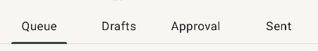
tabTitles = listOf("Posts", "Following", "Followers"),
onTabClick = { selectedTab = it }
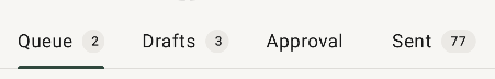
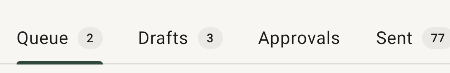
)The counts were an optional piece of functionality that is available, which is used to display an additional count from within the tab. This is specific to my use case, but I am providing it here for full context!
ResponsiveTabRow(
    selectedTabIndex = selectedTab,
    tabTitles = listOf("Inbox", "Sent", "Drafts"),
    tabCounts = listOf(12, null, 3),
    onTabClick = { selectedTab = it }
)
With this in place, the responsive logic is completely isolated from this point of composition. The ResponsiveTabRow handles everything for us including the measuring, deciding, and rendering of the tab row that should be composed.
From this post we’ve seen how we can use SubcomposeLayout to build a ResponsiveTabRow that automatically decides between TabRow and ScrollableTabRow based on the content being composable. This approach to measuring content before we decide on a layout strategy can be applied to many other use cases in Jetpack Compose, allowing us to use the optimal components based on the content itself.