As part of the Material 3 Expressive update, Google has introduced a collection of new components designed to bring more personality and interactivity to Android apps. One of these components is the ButtonGroup which allows us to display a collection of buttons in a horizontal arrangement, offering built-in support for animations and overflow handling.
In this post, we’ll dive into this new Composable and learn how we can use it in our own applications.
If you’re enjoying my posts on Jetpack Compose, check out my Jetpack Compose course!
The ButtonGroup composable is a layout component that places its children in a horizontal sequence. Supporting animated width changes out of the box allows us to automatically adhere to the expressive feeling of Material 3. Using a combination of the animateWidth modifier and MutableInteractionSource, the button group can listen to interactions and expand the width of the pressed child element while compressing the neighbouring children.
Note: The ButtonGroup is currently a part of the experimental Material 3 Expressive APIs, meaning it will require opt-in to utilise it:
@OptIn(ExperimentalMaterial3ExpressiveApi::class)When it comes to declaring a ButtonGroup, the composable takes several arguments:
@Composable
@ExperimentalMaterial3ExpressiveApi
fun ButtonGroup(
    overflowIndicator: @Composable (ButtonGroupMenuState) -> Unit,
    modifier: Modifier = Modifier,
    @FloatRange(0.0) expandedRatio: Float = ButtonGroupDefaults.ExpandedRatio,
    horizontalArrangement: Arrangement.Horizontal = ButtonGroupDefaults.HorizontalArrangement,
    verticalAlignment: Alignment.Vertical = Alignment.Top,
    content: ButtonGroupScope.() -> Unit,
)
As we can see, there are a collection of arguments that we can provide when composing the ButtonGroup.
- modifier – the modifier to be applied to the button group
- overflowIndicator – the composable to be displayed at the end of the button group when items have overflown
- expandedRatio – the percentage of the childs width to be used to expand it by, which will compress the neighbouring children. Passing 0f will remove this functionality.
- horizontalArrangement – the horizontal arrangement of the button group’s children
- verticalAlignment – the vertical alignment of the button group’s children
- content – the content displayed in the button group
When children are added to the ButtonGroup, they exist within the ButtonGroupScope. This scope provides access to helper functions that handle any animations for us:
- clickableItem() – for standard clickable buttons
- toggleableItem() – for buttons that can be toggled
- customItem() – for custom button implementations
These helper functions will automatically apply the animateWidth modifier, giving us expressive press animations out of the box.
Composing the ButtonGroup
Let’s start with a simple example that displays a collection of clickable buttons:
@OptIn(ExperimentalMaterial3ExpressiveApi::class)
@Composable
fun BasicButtonGroup() {
val numButtons = 10
ButtonGroup(
overflowIndicator = { menuState ->
FilledIconButton(
onClick = {
if (menuState.isExpanded) {
menuState.dismiss()
} else {
menuState.show()
}
}
) {
Icon(
imageVector = Icons.Filled.MoreVert,
contentDescription = "More options"
)
}
}
) {
for (i in 0 until numButtons) {
clickableItem(onClick = {}, label = "$i")
}
}
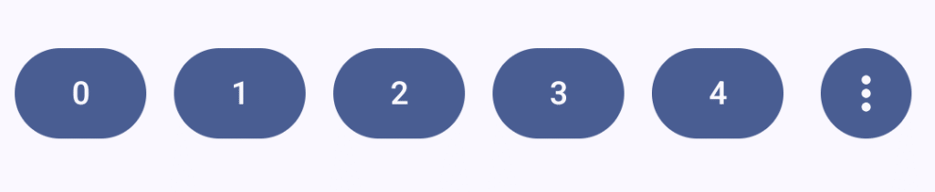
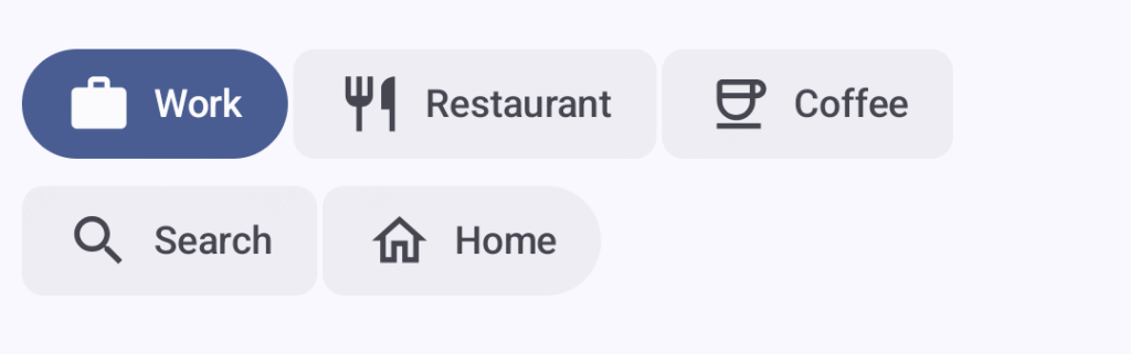
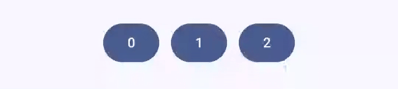
}In this example, we’re creating a ButtonGroup with 10 buttons. When there isn’t enough space to display all the buttons, the overflow indicator will appear, allowing users to access the remaining options through a menu. The ButtonGroupMenuState provides us with isExpanded, show(), and dismiss() to manage the overflow menu state.
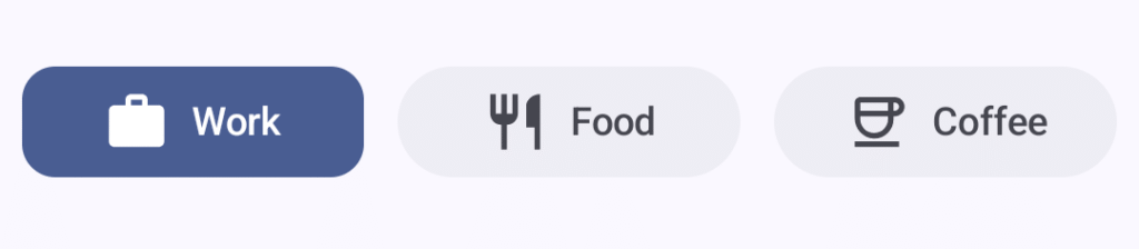
Single-Select Toggle Buttons
One common use case for button groups is to allow the user to select a single option from a collection. We can achieve this using the toggleableItem() function:
@OptIn(ExperimentalMaterial3ExpressiveApi::class)
@Composable
fun SingleSelectButtonGroup() {
    val options = listOf("Work", "Food", "Coffee")
    val icons = listOf(
        Icons.Outlined.Work,
        Icons.Outlined.Restaurant,
        Icons.Outlined.Coffee
    )
    val selectedIcons = listOf(
        Icons.Filled.Work,
        Icons.Filled.Restaurant,
        Icons.Filled.Coffee
    )
    var selectedIndex by remember { mutableIntStateOf(0) }

    ButtonGroup(
        modifier = Modifier
            .padding(horizontal = 8.dp)
            .fillMaxWidth(),
        overflowIndicator = {}
    ) {
        options.forEachIndexed { index, label ->
            toggleableItem(
                weight = 1f,
                checked = selectedIndex == index,
                onCheckedChange = { selectedIndex = index },
                label = label,
                icon = {
                    Icon(
                        imageVector = if (selectedIndex == index)
                            selectedIcons[index]
                        else
                            icons[index],
                        contentDescription = null
                    )
                }
            )
        }
    }
}
Here we’re managing the selected state using selectedIndex and updating it whenever a button’s checked state changes. The toggleableItem() function can be used to declare a child item of the group that is represented by a toggled state – this allows our button group to become a row of selectable items, with the currently selected item clearly styled. This function will handle thethe visual feedback and animations for us when it comes to this toggled state, using the checked and onCheckedChange arguments to handle this.
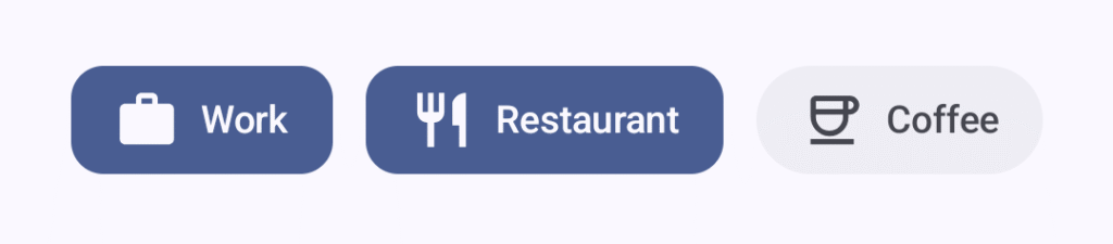
Multi-Select Toggle Buttons
For scenarios where users can select multiple options, we can use the same toggleableItem component that we saw in the previous example. The difference here is that we just need to track the checked state for each button individually:
@OptIn(ExperimentalMaterial3ExpressiveApi::class)
@Composable
fun MultiSelectButtonGroup() {
    val options = listOf("Work", "Restaurant", "Coffee")
    val uncheckedIcons = listOf(
        Icons.Outlined.Work,
        Icons.Outlined.Restaurant,
        Icons.Outlined.Coffee
    )
    val checkedIcons = listOf(
        Icons.Filled.Work,
        Icons.Filled.Restaurant,
        Icons.Filled.Coffee
    )
    val checked = remember { mutableStateListOf(false, false, false) }

    ButtonGroup(
        modifier = Modifier.padding(horizontal = 8.dp),
        overflowIndicator = {}
    ) {
        options.forEachIndexed { index, label ->
            toggleableItem(
                checked = checked[index],
                onCheckedChange = { checked[index] = it },
                label = label,
                icon = {
                    Icon(
                        if (checked[index]) checkedIcons[index] else uncheckedIcons[index],
                        contentDescription = null
                    )
                }
            )
        }
    }
}
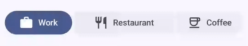
Connected Button Groups
Material 3 Expressive also introduces the concept of connected button groups, which is particularly useful for creating segmented controls. The segmented button from previous Material versions has been deprecated in favour of this approach.
To create a connected button group, we use ToggleButton composables directly within a Row, applying specific shapes from ButtonGroupDefaults:
@OptIn(ExperimentalMaterial3ExpressiveApi::class)
@Composable
fun ConnectedButtonGroup() {
    val options = listOf("Work", "Restaurant", "Coffee")
    val uncheckedIcons = listOf(
        Icons.Outlined.Work,
        Icons.Outlined.Restaurant,
        Icons.Outlined.Coffee
    )
    val checkedIcons = listOf(
        Icons.Filled.Work,
        Icons.Filled.Restaurant,
        Icons.Filled.Coffee
    )
    var selectedIndex by remember { mutableIntStateOf(0) }

    Row(
        Modifier.padding(horizontal = 8.dp),
        horizontalArrangement = Arrangement.spacedBy(
            ButtonGroupDefaults.ConnectedSpaceBetween
        )
    ) {
        val modifiers = listOf(
            Modifier.weight(1f),
            Modifier.weight(1.5f),
            Modifier.weight(1f)
        )
        options.forEachIndexed { index, label ->
            ToggleButton(
                checked = selectedIndex == index,
                onCheckedChange = { selectedIndex = index },
                modifier = modifiers[index].semantics { role = Role.RadioButton },
                shapes = when (index) {
                    0 -> ButtonGroupDefaults.connectedLeadingButtonShapes()
                    options.lastIndex -> ButtonGroupDefaults.connectedTrailingButtonShapes()
                    else -> ButtonGroupDefaults.connectedMiddleButtonShapes()
                }
            ) {
                Icon(
                    if (selectedIndex == index) checkedIcons[index] else uncheckedIcons[index],
                    contentDescription = null
                )
                Spacer(Modifier.size(ToggleButtonDefaults.IconSpacing))
                Text(label)
            }
        }
    }
}
The key here is the use of ButtonGroupDefaults.connectedLeadingButtonShapes(), ButtonGroupDefaults.connectedMiddleButtonShapes(), and ButtonGroupDefaults.connectedTrailingButtonShapes() to create the visual connection between buttons. Within the shapes argument of the ToggleButton we use these functions to depict the specific shape to use for the unselected state of the button, based on the positioning. We can see here that the center button uses a rectangle shape, while the outer buttons use a rounded shape on their edges that are on the outside of the button. The selected button will always use a fully rounded shape.
Connected Button Groups with FlowRow
For cases where you have more options than can fit on a single line, you can use FlowRow to allow the buttons to wrap across multiple lines.
@OptIn(ExperimentalMaterial3ExpressiveApi::class)
@Composable
fun ConnectedButtonGroupWithFlowLayout() {
    val options = listOf("Work", "Restaurant", "Coffee", "Search", "Home")
    val uncheckedIcons = listOf(
        Icons.Outlined.Work,
        Icons.Outlined.Restaurant,
        Icons.Outlined.Coffee,
        Icons.Outlined.Search,
        Icons.Outlined.Home
    )
    val checkedIcons = listOf(
        Icons.Filled.Work,
        Icons.Filled.Restaurant,
        Icons.Filled.Coffee,
        Icons.Filled.Search,
        Icons.Filled.Home
    )
    var selectedIndex by remember { mutableIntStateOf(0) }

    FlowRow(
        Modifier.padding(horizontal = 8.dp).fillMaxWidth(),
        horizontalArrangement = Arrangement.spacedBy(
            ButtonGroupDefaults.ConnectedSpaceBetween
        ),
        verticalArrangement = Arrangement.spacedBy(2.dp)
    ) {
        options.forEachIndexed { index, label ->
            ToggleButton(
                checked = selectedIndex == index,
                onCheckedChange = { selectedIndex = index },
                shapes = when (index) {
                    0 -> ButtonGroupDefaults.connectedLeadingButtonShapes()
                    options.lastIndex -> ButtonGroupDefaults.connectedTrailingButtonShapes()
                    else -> ButtonGroupDefaults.connectedMiddleButtonShapes()
                },
                modifier = Modifier.semantics { role = Role.RadioButton }
            ) {
                Icon(
                    if (selectedIndex == index) checkedIcons[index] else uncheckedIcons[index],
                    contentDescription = null
                )
                Spacer(Modifier.size(ToggleButtonDefaults.IconSpacing))
                Text(label)
            }
        }
    }
}
When using this approach, the buttons will follow the same styling based on the styling provided through the shape argument, with the key difference being that the buttons will span onto multiple rows with no extra changes required.
Customising the Expansion Ratio
If we need to control the space taken up by the buttons when in their expanded state, the expandedRatio parameter controls how much the pressed button expands. By default, this uses ButtonGroupDefaults.ExpandedRatio, but you can customise this:
ButtonGroup(
    expandedRatio = 0.5f, // 50% expansion
    overflowIndicator = { /* ... */ }
) {
    // content
}
Setting this to 0f will disable the expansion animation entirely, while setting it to 1f will cause the pressed button to expand to twice its original width.
The ButtonGroup composable from Material 3 Expressive provides a powerful way to display collections of related buttons with built-in support for animations and overflow handling. Whether you’re creating simple clickable button groups, single or multi-select toggle groups, or connected button groups for segmented controls, this composable offers a flexible solution that adheres to the expressive feeling of Material 3.
It’s worth noting that this API is still experimental, so there may be changes as it matures. However, even in its current state, ButtonGroup demonstrates the direction Material 3 is heading – towards more expressive, animated, and delightful user interfaces. I’m looking forward to seeing how this component evolves and finding opportunities to use it in my own projects!