Let’s not kid ourselves – TVs play a huge part in our lives, with living areas in our homes often centred around them. Immersive experiences in the form of video, music and games provide a way for us to relax and bond with those around us and now with Jetpack Compose, we can build modernised apps for the TV platform.
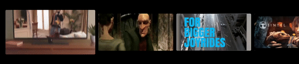
While a lot of the Android TV menus provide an immersive experience in the form of Hero Images and dynamic content, I couldn’t help but feel the items within content rows felt very static. I decided to revisit an old project of mine and create a Composable that will play a short preview of the currently selected item. This is has been open-sourced as the PreviewCard composable.
This composable can be used inside of a content list, using the provided information to display a short preview of the currently selected item.
@Composable
fun PreviewCard(
    modifier: Modifier = Modifier,
    cardWidth: Dp,
    cardHeight: Dp,
    videoUrl: String,
    hasFocus: Boolean,
    clipStartPosition: Long = 2000000,
    clipEndPosition: Long = 8000000,
    thumbnailFrame: Long = 5000000,
    thumbnailUrl: String? = null
)
In this blog post, I’m going to show you how this composable works so that you can understand how to use it in your projects, as well as think about building your own immersive components for your Android TV apps. Here we’ll focus on how we can build this component, with the next blog post focusing on how to use it inside of Android TV components.
Looking to learn more Jetpack Compose? Check out Practical Jetpack Compose now!
We’re going to start by creating our composable function, PreviewCard.
@Composable
fun PreviewCard(
    modifier: Modifier = Modifier,
    cardWidth: Dp,
    cardHeight: Dp,
    videoUrl: String,
    hasFocus: Boolean,
    clipStartPosition: Long = 2000000,
    clipEndPosition: Long = 8000000,
    thumbnailFrame: Long = 5000000,
    thumbnailUrl: String? = null
) {
We can see here that this has a collection of arguments that can be provided to the composable, so lets run through what each of these is doing:
- modifier – provide a Modifier used for applying constraints to the composable
- cardWidth – the width to be used for the card
- cardHeight – the height to be used for the card
- videoUrl – the URL of the video for the current item
- hasFocus – whether the item is currently focused in the list of content
- clipStartPosition – the starting position to be used for the preview
- clipEndPosition – the end position to be used for the preview
- thumbnailFrame – the position of the clip to be used for the video thumbnail
- thumbnailUrl – if you don’t want a thumbnail to be loaded from the file, provide an existing thumbnail URL
With this function now defined, we can start to build out its content. We’ll start by adding a parent composable in the form of a Card. When composing this Card, we’ll use the hasFocus, cardWidth and cardHeight arguments to configure the width and height of the composable. When the composable is in focus, we’ll increase the width by 20%, otherwise we’ll apply the default height and width that is provided via the arguments. Doing this brings attention to the currently selected item, creating a more immersive experience during browsing.
Card(
    modifier = modifier
        .width(if (hasFocus) cardWidth.times(1.2f) else cardWidth)
        .height(if (hasFocus) cardHeight.times(1.2f) else cardHeight)
 ) {


}
Showing a Video Thumbnail
Next, we’re going to build the component that will show the thumbnail in the item – this is the default state for the card when it is not currently in focus within the list of content. We’re going to place this inside of a new composable, PreviewThumbnail.
@Composable
fun PreviewThumbnail(
    thumbnail: String?,
    thumbnailBitmap: Bitmap?,
    thumbnailFrame: Long,
    videoUrl: String,
    isLoadingVideo: Boolean,
    onBitmapLoaded: (bitmap: Bitmap?) -> Unit
) {

}
This composable takes some arguments which are used to configure the thumbnail state.
- thumbnail – the thumbnail URL used to load the thumbnail
- thumbnailBitmap – a bitmap of the downloaded thumbnail, retrieved from the video source
- thumbnailFrame – the frame to be used when loading the video thumbnail
- videoUrl – the url of the video being used for the thumbnail
- isLoadingVideo – whether the video is currently being loaded, indicates whether it is available for use
- onBitmapLoaded – lambda to be triggered when the bitmap has been loaded by the preview thumbnail
We can see a few different arguments here – this combination is used to decide what should be used when displaying the thumbnail. We’ll move on to implementing this composable and cover the different scenarios as we do so.
To begin with, if there is no thumbnail available yet (one hasn’t been provided by the parent, and one hasn’t been downloaded yet), then we’ll want to do two things:
- Download a thumbnail using the provided video URL
- show a loading indicator to signify that things are still loading
Downloading a thumbnail of the provided video is a blocking operation, so we’ll launch this using the LaunchedEffect composable. Within this block, we’ll use the MediaDataRetriever class to retrieve information for the provided video URL. Using the provided thumbnailFrame, we’ll fetch the frame for that given time and then pass the result up to the parent using the onBitmapLoaded lambda.
While this is happening, we’ll also want to compose a progress indicator to let the user know that something is going on. For this we’ll compose a CircularProgressIndicator – we’ll do this using the Box composable so that we can have this fill the parent and position the progress indicator in the center of the card.
if (thumbnail == null && thumbnailBitmap == null) {
    LaunchedEffect(videoUrl) {
        withContext(Dispatchers.IO) {
            MediaMetadataRetriever().apply {
                setDataSource(videoUrl, HashMap())
            }.also {
                val result = it.getFrameAtTime(
                    thumbnailFrame,
                    MediaMetadataRetriever.OPTION_CLOSEST_SYNC
                )
                onBitmapLoaded(result)
                it.release()
            }
        }
    }
    Box(
        modifier = Modifier
            .fillMaxSize()
            .background(Color.Black)
            .border(2.dp, Color.White.copy(alpha = 0.4f)),
        contentAlignment = Alignment.Center
    ) {
        CircularProgressIndicator()
    }
}
In cases where we do have a thumbnail source available, we don’t need to do download a thumbnail, we can instead compose the thumbnail that has been provided to the composable. This will be the case when:
- A thumbnail has already been downloaded
- A thumbnail URL has been provided to the composable
After the if block above, we’ll add an else clause that will contain this logic. If the provided thumbnailBitmap is not null, then we’ll use the Image composable to simply load this thumbnail into the body of the composable. Otherwise, we’ll use the provided thumbnail source URL to load a thumbnail image using the coil AsyncImage composable.
In either case, if we’re currently downloading a video (indicated by the isLoadingVideo flag) then we’ll show a progress indicator. This is because if the item comes into focus but the video is not ready yet, we’ll show the indicator on top of the thumbnail so the user is aware that the preview clip is not ready to show yet.
if (...) {
    ...
} else {
    Box(
        modifier = Modifier
            .fillMaxSize(),
        contentAlignment = Alignment.Center
    ) {
        if (thumbnailBitmap != null) {
            Image(
                painter = rememberAsyncImagePainter(thumbnailBitmap),
                contentDescription = null,
                contentScale = ContentScale.Crop,
                alignment = Alignment.Center,
                modifier = Modifier.fillMaxSize()
            )
        } else {
            AsyncImage(
                model = thumbnail,
                contentDescription = null,
                contentScale = ContentScale.Crop,
                alignment = Alignment.Center,
                modifier = Modifier.fillMaxSize()
            )
        }
        if (isLoadingVideo) {
            CircularProgressIndicator(strokeWidth = 4.dp)
        }
    }
}
With this composable in place, we can now compose it inside of the parent composable. We’ll need to start by adding some state that will be used to hold the downloaded bitmap. We’ll initialise this with a default value of null, as initially there will not be a bitmap loaded from the composable.
Next, we’ll want to compose the PreviewThumbnail composable. For this, we’re going to wrap this inside of the Crossfade composable – this is so that we can fade between the video preview and thumbnail. For this, we’ll use the hasFocus flag to depict what composable should be displayed. When the composable is not in focus, we’ll compose the PreviewThumbnail. When doing so, we’ll pass the corresponding arguments, finalised by a false value for the isLoadingVideo flag. this is because in this case, we don’t care if the video has loaded as we are always going to show the thumbnail and no other content when the item is not in focus.
Card(
    modifier = modifier
        .width(if (hasFocus) cardWidth.times(1.2f) else cardWidth)
        .height(if (hasFocus) cardHeight.times(1.2f) else cardHeight)
 ) {

    var thumbnailBitmap by rememberSaveable {
        mutableStateOf<Bitmap?>(null)
    }

    Crossfade(targetState = hasFocus, animationSpec = tween(durationMillis = 700)) { focused ->
        if (focused) {
            ...
        } else {
            PreviewThumbnail(thumbnailUrl, thumbnailBitmap, thumbnailFrame, videoUrl, false) {
                thumbnailBitmap = it
            }
        }
    }
}
With this in place, we’ll now have a thumbnail composed for the preview item when it is not currently in focus.
Showing a Video Preview
To display a video preview, we’re going to be using ExoPlayer. We’ll need to start here by initiliasing a new instance of ExoPlayer, wrapping this in a remember block so that the instance is remembered cross compositions. We’ll also configure some properties so that the video preview is looped, does not play any sound and scales to fit the available space.
Card(...) {

    val exoPlayer = remember {
        ExoPlayer.Builder(context).build().apply {
            repeatMode = REPEAT_MODE_ONE
            volume = 0f
            videoScalingMode = VIDEO_SCALING_MODE_SCALE_TO_FIT_WITH_CROPPING
        }
    }

}
Next, we need to load the video. For this we’re going to use the LaunchedEffect composable, providing the videoUrl as the key so that this is only triggered once for the current video. Within the block of this composable we’re going to need to configure a few details.
- We’ll create a new MediaSource for the provided video URL
- Next, we’ll create a new ClippingMediaSource using this MediaSource, providing the clip start/end position alongside it
- We’ll then assign this source to our ExoPlayer instance, followed by calling prepare to load the video
- We’ll also apply a listener to the ExoPlayer instance, so that we can keep track of when the video is being buffered
Card(...) {

    ....


    LaunchedEffect(key1 = videoUrl) {
        val dataSourceFactory: DataSource.Factory = DefaultHttpDataSource.Factory()
        val mediaSource: MediaSource = ProgressiveMediaSource.Factory(dataSourceFactory)
            .createMediaSource(MediaItem.fromUri(videoUrl))
        val clip = ClippingMediaSource(mediaSource, clipStartPosition, clipEndPosition)
        exoPlayer.setMediaSource(clip)
        exoPlayer.prepare()
        exoPlayer.playWhenReady = true

        exoPlayer.addListener(object : Listener {
            override fun onPlaybackStateChanged(playbackState: Int) {
                super.onPlaybackStateChanged(playbackState)
                isBuffering = playbackState == Player.STATE_BUFFERING
            }
        })
    }
}
Next, we’ll need to manage our ExoPlayer reference based on the lifecycle of the composable. Within this block, we’ll essentially want to manage the playWhenReady state based on whether the lifecycle is in a paused/resumed state. If the lifecycle enters a destroyed state, then we’ll stop and release the instance – this is to avoid ExoPlayer continuing to play once the composition has exited and prevent leaks from occurring.
Card(...) {

    ...

    val lifecycleOwner by rememberUpdatedState(LocalLifecycleOwner.current)
        DisposableEffect(lifecycleOwner) {
            val lifecycle = lifecycleOwner.lifecycle
            val observer = LifecycleEventObserver { _, event ->
                when (event) {
                    Lifecycle.Event.ON_PAUSE -> {
                        exoPlayer.playWhenReady = false
                    }

                    Lifecycle.Event.ON_RESUME -> {
                        exoPlayer.playWhenReady = true
                    }

                    Lifecycle.Event.ON_DESTROY -> {
                        exoPlayer.run {
                            stop()
                            release()
                        }
                    }
                    else -> {}
                }
            }
            lifecycle.addObserver(observer)
            onDispose {
                lifecycle.removeObserver(observer)
            }
        }
}
With the above in place, our ExoPlayer reference is ready to use! Within our CrossFade composable we’ll want to compose the video preview when the item is in its focused state. Here we’ll want to utilise the AndroidView composable to display an ExoPlayer PlayerView instance. There is not a PlayerView composable equivalent yet, so we use the AndroidView composable to use an Android View inside of our composable.
When creating this PlayerView instance, we’ll need to assign our ExoPlayer reference as well as configure it to hide any of its controls. Finally, if the isBuffering flag is true then we’ll want to compose our PreviewThumbnail composable – this is because the item might come into focus before the video has been loaded, which means no preview will be able to be displayed until buffering has completed. This is going to be pretty much the same as when we previously composed this, except we’ll be passing a true value for the isLoadingVideo flag. This is because in this case, the video has not yet been loaded – which will affect how the thumbnail is composed.
Card(...) {

    Crossfade(targetState = hasFocus, animationSpec = tween(durationMillis = 700)) { focused ->
        if (focused) {
            Box {
                AndroidView(
                    modifier = Modifier
                        .fillMaxSize(),
                    factory = {
                        PlayerView(context).apply {
                            player = exoPlayer
                            useController = false
                            resizeMode = AspectRatioFrameLayout.RESIZE_MODE_FILL
                            controllerAutoShow = false
                            setKeepContentOnPlayerReset(true)
                            setShowBuffering(PlayerView.SHOW_BUFFERING_ALWAYS)
                        }
                    }
                )
                if (isBuffering) {
                    PreviewThumbnail(
                        thumbnailUrl,
                        thumbnailBitmap,
                        thumbnailFrame,
                        videoUrl,
                        true
                    ) {
                        thumbnailBitmap = it
                    }
                }
            }
        } else {
            ...
        }
    }
}
With this in place, we now have a composable that will play a video preview clip when in focus, and a thumbnail of the video when the item moves out of focus.
In this post we’ve seen how the PreviewCard composable has been built, learning how we can utilise ExoPlayer and other composables to display immersive content inside of Android TV content Rows. In the next post, we’ll look at how we can utilise this composable inside of Android TV content lists to display immersive content rows within our app.