
When it comes to providing users with quick access to multiple related actions, we need to be mindful of the screen estate that we are using – on mobile devices this can often be a challenge. In many cases, a single FloatingActionButton might not be enough to accommodate all the actions we want to expose to our users. This is where the new FloatingActionButtonMenu from Material 3 Compose comes into play, allowing us to utilise a single expanding FAB to expose multiple menu actions to users.
Looking to learn Jetpack Compose? Check out my course, Practical Jetpack Compose.
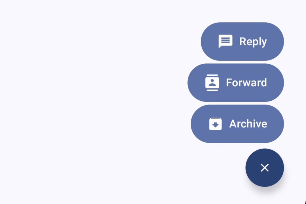
The FloatingActionButtonMenu allows us to show 2–6 related actions floating on screen, providing users access to a collection of related actions without sacrificing screen estate. When it comes to this composable we see it made up of three components:
- FloatingActionButtonMenu – the root composable which holds the nested child elements
- ToggleFloatingActionbutton – this is the FAB itself, used to compose the initial button that that the user will see on screen
- FloatingActionButtonMenuItem – this is the composable used to display a clickable menu item, multiple instances of these will be composed as part of the menu
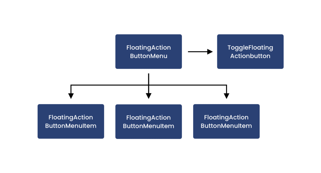
The combination of these provides us with a decoupled API for composing the floating action button along with the menu items which it will display. This follows the principles of Jetpack Compose APIs and is a pattern you are likely familiar with from working with other composables.
The FloatingActionButtonMenu is a component that allows us to create expandable floating action buttons that reveal additional menu items when triggered. This is different from the standard approach that we are familiar with for Floating Action Buttons, allowing us to provide access to multiple primary actions.
@Composable
fun FloatingActionButtonMenu(
    expanded: Boolean,
    button: @Composable () -> Unit,
    modifier: Modifier = Modifier,
    horizontalAlignment: Alignment.Horizontal = Alignment.End,
    content: @Composable FloatingActionButtonMenuScope.() -> Unit,
)
With this functionality we can expose multiple actions to our users outside of a single primary action. So for example, instead of just providing a single “create” action, we could have multiple actions such as “Create Note”, “Create Task”, “Create Event” etc. This helps us to avoid cluttering our UI with multiple buttons and instead places all actions in a centralised place, only revealing them when they are requested by the user.
We can get started with a simple composition of the FloatingActionButtonMenu, passing a reference to an expanded state.
var fabMenuExpanded by remember {
  mutableStateOf(false)
}

FloatingActionButtonMenu(
  expanded = fabMenuExpanded,
  button = {

  },
  content = {

  }
)
The FloatingActionButtonMenu uses this state to control the visibility and animation of the menu items. For now we’ve placed this as a simple state reference next to the composable – when running this code, we’d be able to see our menu toggled between visibility states. However, we need to implement the button and content sections of our composable.
We’ll start here with the button component, this is the composable that will be displayed as the Floating Action Button in our composable – this is what will be used to trigger the display of our menu. This will take the form of the ToggleFloatingActionButton – this composable takes a similar form to the standard FloatingActionButton, with the key difference being the support for a checked state.
@Composable
fun ToggleFloatingActionButton(
    checked: Boolean,
    onCheckedChange: (Boolean) -> Unit,
    modifier: Modifier = Modifier,
    containerColor: (Float) -> Color = ToggleFloatingActionButtonDefaults.containerColor(),
    contentAlignment: Alignment = Alignment.TopEnd,
    containerSize: (Float) -> Dp = ToggleFloatingActionButtonDefaults.containerSize(),
    containerCornerRadius: (Float) -> Dp =
        ToggleFloatingActionButtonDefaults.containerCornerRadius(),
    content: @Composable ToggleFloatingActionButtonScope.() -> Unit,
)
This checked state allows us to depict whether the Floating Action Button is currently in a selected state, and therefore if the menu for the button should be displayed. Let’s take a look at a composition of the ToggleFloatingActionButton composable.
ToggleFloatingActionButton(
    checked = fabMenuExpanded,
    onCheckedChange = { fabMenuExpanded = !fabMenuExpanded },
) {
    Icon(
        painter = rememberVectorPainter(if (fabMenuExpanded) Icons.Filled.Close else Icons.Filled.Add),
        contentDescription = null
    )
}
Here, we are using the fabMenuExpanded state value that we previously defined to represent our checked status, and we’re also toggling the value of the fabMenuExpanded state when the onCheckedChange lambda is triggered. For the content of our button we’re simply using an Icon composable, setting its painter reference based on whether the menu is currently expanded or not.
With this in place, we can then slot this into the button of our FloatingActionButtonMenu.
FloatingActionButtonMenu(
  expanded = fabMenuExpanded,
  button = {
    ToggleFloatingActionButton(...)
  },
  content = {

  }
)
When it comes to the menu, each item is represented by a FloatingActionButtonMenuItem. This composable allows us show floating flat-style buttons that stack vertically above the floating action button, responding to click events to trigger actions.
@Composable
fun FloatingActionButtonMenuScope.FloatingActionButtonMenuItem(
    onClick: () -> Unit,
    text: @Composable () -> Unit,
    icon: @Composable () -> Unit,
    modifier: Modifier = Modifier,
    containerColor: Color = MaterialTheme.colorScheme.primaryContainer,
    contentColor: Color = contentColorFor(containerColor),
)
We’ll compose an instance of this FloatingActionButtonMenuItem, focusing on keeping things simple:
FloatingActionButtonMenuItem(
    onClick = { fabMenuExpanded = false },
    icon = { Icon(Icons.Default.Create, contentDescription = null) },
    text = { Text(text = "Create item") },
)
Here we provide some text and supporting icon to be displayed in our floating menu item, along with using the onClick lambda to collapse the menu by setting our fabMenuExpanded reference to false. We would then compose the FloatingActionButtonMenuItem inside of the content block for our FloatingActionButtonMenu. We would likely have some kind of type that represents our menu items, so a simple loop to compose this could look something like the following:
FloatingActionButtonMenu(
  expanded = fabMenuExpanded,
  button = {
    ToggleFloatingActionButton(...)
  },
  content = {
    menuitems.forEach {
      FloatingActionButtonMenuItem(
        onClick = { fabMenuExpanded = false },
        icon = { Icon(it.icon, contentDescription = null) },
        text = { Text(text = it.label) },
      )
    }
  }
)
In a real world scenario, we would also use the onClick lambda of our FloatingActionButtonMenuItem to trigger some kind of action from this click event (such as navigating to the selected screen).
With the above examples in place, we’ll have a simple implementation of the FloatingActionButtonMenu in place, allowing us to display a selection of actions to the user above our floating action button. It’s important to remember that these actions should be related to each other and within the context of the floating action button, along with displaying between 2-6 menu items as an optimal number.
The FloatingActionButtonMenu is a great additional to the Material 3 component library, making it even easier for us to build these experiences into our apps with compose, or port existing implementations to from the view system to compose.
Have you started experimenting with the FloatingActionButtonMenu in your projects? I’d love to hear about any interesting use cases or implementations that you have in place!