For the past few years, we’ve been getting to grips with Jetpack Compose and how we can use it to build apps for Handheld and Wear OS devices. Late last year, Composables built for Android TV apps started to surface as Alpha releases and in this series of blog posts, I want to dive into these composables and learn how they can be used to create apps for Android TV.
Looking to learn Jetpack Compose? Check out my course, Practical Jetpack Compose
When it comes to navigating in apps, we frequently see the use of navigation drawers. In Jetpack Compose, we have access to composables such as the ModalDrawer and BottomDrawer. However, when it comes to building TV apps, we have alternative drawer composables that have been built specifically for TV experience apps. In this blog post, we’ll explore the additional APIs here, how we can use them and why they should be used over the traditional drawer composable APIs.
When it comes to using a navigation drawer from the compose for Android TV packages there are two options available, the Navigation Drawer and Modal Navigation Drawer. They mostly work the same, but the way they are presented to the user is very different. To understand how each one operates, let’s dive into each one.
Navigation Drawer
The standard NavigationDrawer composable allows us to display a drawer alongside the content of our app. This means that the drawer will be stacked horizontally, sharing space with the other components being displayed within the UI.
@Composable
fun NavigationDrawer(
    drawerContent: @Composable (DrawerValue) -> Unit,
    modifier: Modifier = Modifier,
    drawerState: DrawerState = rememberDrawerState(DrawerValue.Closed),
    content: @Composable () -> Unit
)
This composable takes four different arguments:
- drawerContent – the content to be displayed within the drawer, usually the navigation items that you want the user to be able to select
- modifier – the modifier to be applied to the composable
- drawerState – the current state of the navigation drawer in the form of a DrawerState reference
- content – the content to be displayed in the body of your application, outside of the navigation drawer
The only two required arguments here are the content and drawerContent arguments, this is because the composable needs to know what to display in both the drawer and the body of your app.
When it comes to the DrawerState, this is only required if you need a reference to the current state of the drawer. Otherwise, the composable will manage this by default for you and then provide you with a reference to the current value as an argument to the drawerContent composable.
Modal Navigation Drawer
On the other hand, we also have the ModalNavigationDrawer composable, which allows us to display a drawer alongside the content of our app while closed, overlaying it on top of the content of our app when it is displayed in its expanded state. This means that the drawer will be stacked on the z-axis, overlapping the other components being displayed within the UI.
@Composable
fun ModalNavigationDrawer(
    drawerContent: @Composable (DrawerValue) -> Unit,
    modifier: Modifier = Modifier,
    drawerState: DrawerState = rememberDrawerState(DrawerValue.Closed),
    scrimColor: Color = LocalColorScheme.current.scrim.copy(alpha = 0.5f),
    content: @Composable () -> Unit
)
As we can see from this composable, the arguments are mostly the same, other than the addition of the scrimColor. This argument can be provided to override the color used for the scrim when the navigation drawer is opened, defaulting the scrim color from the theme (with applied alpha).
Composing a Drawer
So that we can see a navigation drawer in action, lets take a look out how we can compose one within our UI.
So that we can display navigation items in our drawer, we’re going to start by defining a composable that will be used to show a selectable item within our navigation drawer. We’ll create a new composable, NavigationItem, that will take several arguments:
- drawerValue – the current DrawerValue to represent whether the drawer is currently opened or closed
- icon – the icon to be used for the navigation item
- text – the label to be used for the navigation item
- selected – whether the navigation item is currently selected
@Composable
fun NavigationItem(
    drawerValue: DrawerValue,
    icon: ImageVector,
    text: String,
    selected: () -> Unit
) { }
We’ll next build out our composable by composing an OutlinedButton, adding an Icon and Text composable as children. We’ll use the icon and text arguments provided to our composable when composing these.
@Composable
fun NavigationItem(
    drawerValue: DrawerValue,
    color: ImageVector,
    text: String,
    selected: () -> Unit
) {
    OutlinedButton(
        modifier = Modifier
            .padding(16.dp)
            .wrapContentWidth(),
        onClick = { selected() }
    ) {
        Icon(
            imageVector = color,
            contentDescription = null,
            modifier = Modifier.padding(end = 4.dp),
            tint = Color.White
        )
        Text(
            modifier = Modifier.padding(end = 4.dp),
            text = text,
            softWrap = false,
            textAlign = TextAlign.Start,
            color = Color.White
        )
    }
}
While this works, we’re going to level things up a bit by adding a simple animation to our menu item. We’re passing in a DrawerValue to access the current state of the drawer, so we’re going to use this to decide whether the label of the navigation item should be shown. We’ll wrap our navigation item in the AnimatedVisibility composable so that we can control the label visibility based on whether the drawer is currently open. That way we will only show the label of the navigation item when the drawer is in its expanded state.
@Composable
fun NavigationItem(
    drawerValue: DrawerValue,
    color: ImageVector,
    text: String,
    selected: () -> Unit
) {
    OutlinedButton(
        modifier = Modifier
            .padding(16.dp)
            .wrapContentWidth(),
        onClick = { selected() }
    ) {
        Icon(
            imageVector = color,
            contentDescription = null,
            modifier = Modifier.padding(end = 4.dp),
            tint = Color.White
        )
        AnimatedVisibility(visible = drawerValue == DrawerValue.Open) {
            Text(
                modifier = Modifier.padding(end = 4.dp),
                text = text,
                softWrap = false,
                textAlign = TextAlign.Start,
                color = Color.White
            )
        }
    }
}
With this in place, we now have a composable to represent the navigation items of our drawer – we just need a place to compose them! For this, we’ll define a new composable, Drawer.
@Composable
fun Drawer(
    modifier: Modifier = Modifier
) {

}
Within this composable, we’re going to compose the NavigationDrawer – you could also use the ModalNavigationDrawer here, they are composed the same but the behaviour is different based on what we explored above.
@Composable
fun Drawer(
modifier: Modifier = Modifier
) {
NavigationDrawer(
modifier = modifier,
drawerContent = {
}
) {
}
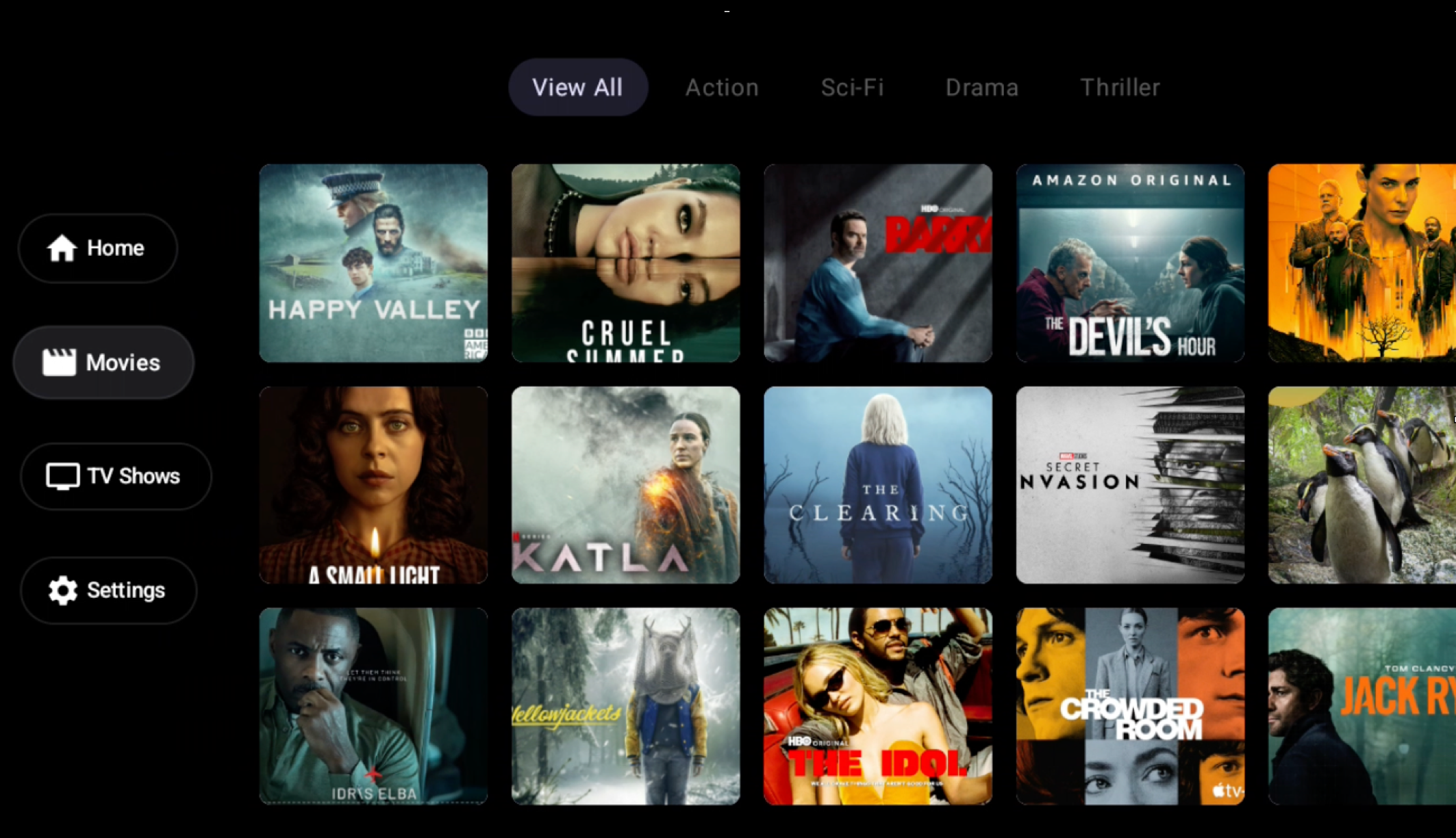
}When it comes to composing the drawer, we need to provide two composable blocks – the drawerContent and content, which are both composable arguments. We’ll start here with the drawerContent that will be used to compose the NavigationItem composables that we defined in the last section. Here we’ll simply define a Column and compose a collection of NavigationItem composables – for these we’ll also pass some icons and labels that will be displayed in each of the composables.
Note: Please remember to use resources for strings in your app, I’ve hardcoded these for simplicity!
@Composable
fun Drawer(
    modifier: Modifier = Modifier
) {
    NavigationDrawer(
        modifier = modifier.background(Color.Black),
        drawerContent = {
            Column(
                modifier = Modifier.fillMaxHeight(),
                verticalArrangement = Arrangement.Center
            ) {
                NavigationItem(it, Icons.Default.Home, "Home") {

                }
                NavigationItem(it, Icons.Default.Movie, "Movies") {

                }
                NavigationItem(it, Icons.Default.Tv, "TV Shows") {

                }
                NavigationItem(it, Icons.Default.Settings, "Settings") {

                }
            }
        }
    ) {

    }
}
When it comes to handling the selected callback of the navigation items, we’re going to want to navigate the user to the corresponding part of our app. One way of doing this would be to trigger a navigation event for the navigation controller of your app. If using the compose navigation component, we could do this by simply creating a new reference to a NavController and then triggering its navigate function within each of the selected callbacks.
@Composable
fun Drawer(
    modifier: Modifier = Modifier
) {
    val navController = rememberNavController()
    NavigationDrawer(
        modifier = modifier.background(Color.Black),
        drawerContent = {
            Column(
                modifier = Modifier.fillMaxHeight(),
                verticalArrangement = Arrangement.Center
            ) {
                NavigationItem(it, Icons.Default.Home, "Home") {
                    navController.navigate("home")
                }
                NavigationItem(it, Icons.Default.Movie, "Movies") {
                    navController.navigate("movies")
                }
                NavigationItem(it, Icons.Default.Tv, "TV Shows") {
                    navController.navigate("shows")
                }
                NavigationItem(it, Icons.Default.Settings, "Settings") {
                    navController.navigate("settings")
                }
            }
        }
    ) {

    }
}
With this in place, we now just need to provide a composable for the content argument of the NavigationDrawer. This is where you’ll want to compose the content for your app, which in our case is contained within a NavHost composable. I won’t be showing all of the details for the contained composables within this navigation graph, but this would look something like the following:
@Composable
fun Drawer(
    modifier: Modifier = Modifier
) {
    val navController = rememberNavController()
    NavigationDrawer(
        modifier = modifier.background(Color.Black),
        drawerContent = {
            Column(
                Modifier
                    .fillMaxHeight(),
                verticalArrangement = Arrangement.Center
            ) {
                NavigationItem(it, Icons.Default.Home, "Home") {
                    navController.navigate("home")
                }
                NavigationItem(it, Icons.Default.Movie, "Movies") {
                    navController.navigate("movies")
                }
                NavigationItem(it, Icons.Default.Tv, "TV Shows") {
                    navController.navigate("shows")
                }
                NavigationItem(it, Icons.Default.Settings, "Settings") {
                    navController.navigate("settings")
                }
            }
        }
    ) {
        NavHost(navController = navController, startDestination = "root") {
            navigation(startDestination = "home", route = "root") {
                composable("home") { Home() }
                composable("movies") { Movies() }
                composable("shows") { Shows() }
                composable("settings") { Settings() }
            }
        }
    }
}
Now, the NavHost within the content of our drawer will be used to display the content of our app, while the callbacks of our NavigationItem composables will be used to control the current state of the NavHost.
This is just one way to achieve the implementation of a navigation drawer within your Android TV app, so please do explore other ways that might work better for your project!