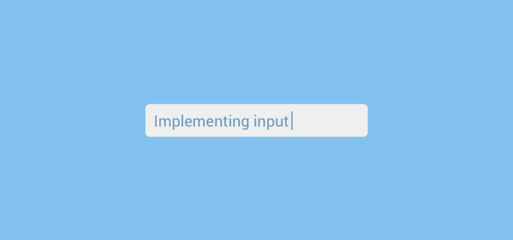
When it comes to textual input in Flutter apps there is one two widgets that you’re probably going to use — this is the TextField and the TextFormField. The TextFormField is simply a wrapped TextField that provides us with some extra functionality such as input validation. However, in this post we’re just going to look at the TextField. This widget is pretty simple to add to your widget tree:
new TextField(
  onChanged: ...,
  decoration: ...,
  autofocus: true|false,
)
The Widget takes a number of arguments which we can use to control the visuals and functionality:
- onChanged — a function that is invoked when the content of the widget changes
- decoration — an instance of the InputDecoration used to style the widget
- autofocus — controls whether the widget should automatically gain focus
When passing in an instance of the InputDecoration class to the decoration argument we can supply a number of additional properties to control the look and feel of the widget. For example, we can display a hint to the user:

new InputDecoration(
    hintText: 'This is a hint')
We can also fill the TextField to give it a background color:

new InputDecoratio(
  filled: true,
    fillColor: Colors.grey[300],
    hintText: 'This is a hint'),
Or do other things such as add a counter:

new InputDecoration(
    counterText: "100",
    filled: true,
    fillColor: Colors.grey[300],
    hintText: 'This is a hint')
Check out the documentation for the InputDecoration class for full specs on what you can decorate here.
You can also achieve other stylistic things from the TextField itself, for example you can mask the text input by using the obscure argument:
new TextField(
  obscure: true,
  onChanged: ...,
  decoration: ...,
  autofocus: true|false,
)

Now in my application I needed to enabled a button when text was entered, and disable it when the field was empty. I also needed to be able to retrieve the test from the input field when that button was pressed — to do this I needed to make use of the controller argument for the TextField widget. To begin with you need to create a new instance of a TextEditingController:
final myController = new TextEditingController();
Then when creating you TextField widget you can pass this in as the controller argument:
new TextField(
  onChanged: ...,
  decoration: ...,
  autofocus: true|false,
  controller: myController
)
Now that the controller has been set, there are two key things that you can use this for:
- Retrieve the input text from the widget. This can be done using:
myController.text
- Observe changes to the widget. You can do this using the onChanged argument, or you can also offload this onto the controller. If you use the controller for this, you simply set the corresponding function as the listener:
myController.addListener(_someFunction);The TextEditingController also has other capabilities that come out of the box. For example, you can provide a text value in its constructor to be used as a default value for the text field.
I hope this has given a little insight into how we can add suer input to our applications when building with Flutter. If you have any questions or comments, then please get in touch!