Within Flutter, the visual components that you declare are widgets, as well as the layout elements also.The Flutter Framework builds its layout via the composition of widgets, everything that you construct programatically is a widget and these are compiled together to create the user interface.
For an example of this, let’s take a look at the TabLayout component that is a common view component used within android applications:

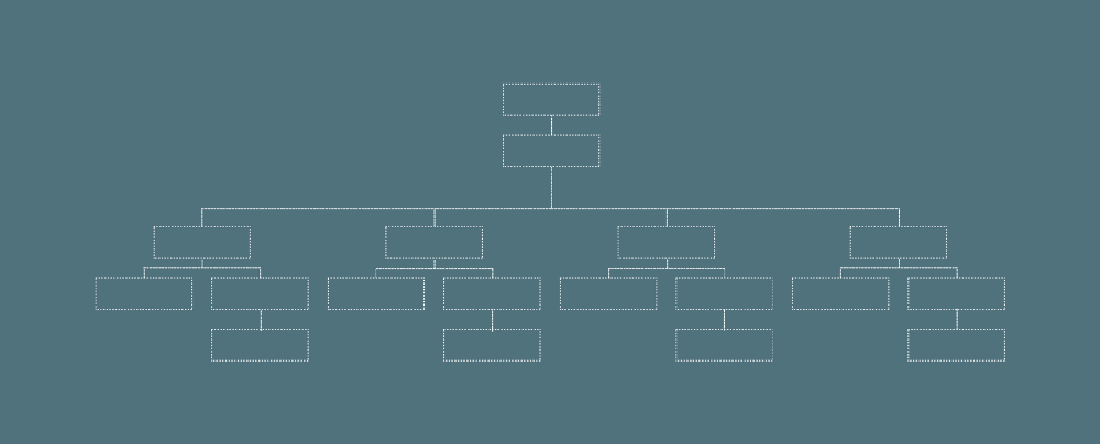
If we were to manually build this layout within a Flutter application, then the structure of the layout file would be made up like so:

I know this feels a little confusing to look at at first, so let’s break it down a bit.
A Container is a widget that is, well, a container for child widgets. It gives the ability to add styling properties to the children that are contained within it, this can be things such as padding, margins, background colour etc.
In the case of our TabLayout component, our entire layout is placed within a Container so that the layout is encapsulated into it’s own separate container. But in the case of the Container that we use for the image (the selected indicator in the TabLayout) we can use this container to add a margin to the top of our selected indicator image.
In Flutter, a common way of laying out widgets is composing them into groups of columns and row — this allows us to easily layout our components in a vertical / horizontal manner. When you wish to layout components in a Horizontal manner, then you will use a Row and for Vertical layout you will use a Column. There is also a Stack Widget for overlapping content, but we won’t be covering that in this post.
So in this tab layout, we only need one Row for our parent container, as all of the child components are composed into this single row. If we move into this Row to the child components, we can see that four Columns have been used — this is because we have four tab layout options that we wish to distribute within this column.

Then, within each of these columns we have placed child widgets in the form of some text and another container to contain an Image for the selected indicator. We don’t necessarily have to have this container here, it’s more just for example. This Text and Container component are then contained within our defined Column which is used to display these widgets in their vertical manner.

As you can see, the layout widgets used to compose our user interface is intuitive and simple to use. Why not take a look at some other common layouts in application you use and think how these would be composed using the Flutter framework?
Enjoy the other snippets in this publication! Leave a comment below or tweet me if with any questions / suggestions!