In most applications on your device, there’s likely to be some kind of input field that requires a user to input some textual content. This could be a name, a location or some other kind of specific detail that is used to tailor their experience with your app. With any kind of text input, there can often be friction – as a user of an app I don’t want to have to spend time making mistakes or getting stuck for words while typing content. I want to focus on using an app for its intended purpose, so any way that we can improve the experience of text input for users is a huge win. In this post, I will be taking a look into Fleksy, an SDK that allows you to create custom keyboard experiences for your Android and iOS apps. In this post we’ll be focusing solely on the Android SDK.
This blog post is a sponsored post by Fleksy. Want a post written about your technology? Please reach out via the contact form here.
As mentioned at the start of this post, the Fleksy SDK can be used to create custom keyboard experiences.The way the SDK is structured allows us to define how custom the experience is – we don’t need to build a fully customised keyboard experience, we might just want to improve one aspect of the input experience such as predictions or theming. The functionality of the SDK is split into eight different parts:
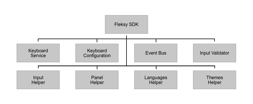
- Keyboard Service – Used to create the custom keyboard
- Keyboard Configuration – Used for configuring the custom keyboard
- Event Bus – Used to observe events that are triggered from the keyboard
- Input validator – Used to perform validation on the text that is input using the keyboard
- Input Helper – Used to modify text that is input using the keyboard
- Panel Helper – Used for displaying views inside of the keyboard
- Languages Helper – Used to manage the languages used by the keyboard
- Themes Helper – Used to modify the theming of the keyboard
We can see here that there is a lot that makes up the SDK. In this post we’re not going to be diving into everything that is offered, but we’ll take a look at some of the things we can do with the SDK to create custom keyboard experiences
Setting up the Sample App
When starting out with the Fleksy SDK, you have two options to help you get started:
- Follow the getting started guide to setup your own Keyboard Service
- Clone the sample app and add your own API key + secret
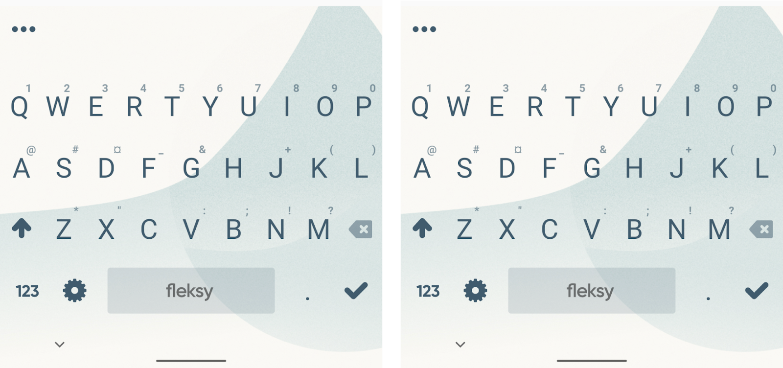
Once you’ve done either of the above, you’ll be able to install the app on a device and set it as an available virtual keyboard within the input settings on your device. If supported, when using the virtual keyboard on your device, you’ll then be able to toggle between selected keyboards when the virtual keyboard is showing.
Configuring the Keyboard
When it comes to the Fleksy SDK, there are a collection of properties that can be used to configure the keyboard. We’ll start here by running through some of the key options that are available to control the behaviour and visual representation of the keyboard. This configuration is done via the use of the KeyboardConfiguration class, which is provided using the createConfiguration function within the Fleksy KeyboardService class.
override fun createConfiguration() = KeyboardConfiguration()Because each of the property arguments for the configuration class are optional arguments, the above code will compile. However, we’re not providing any customisation for our keyboard – so let’s take a look at some of the options that are available.
data class KeyboardConfiguration(

   val language: LanguageConfiguration,

   val typing: TypingConfiguration,

   val privacy: PrivacyConfiguration,

   val style: StyleConfiguration,

   val features: FeaturesConfiguration,

   val predictions: PredictionsConfiguration,

   val legacy: LegacyConfiguration,

   val capture: CaptureConfiguration,

   val monitor: MonitorConfiguration,

   val emoji: EmojiConfiguration,

   val feedback: FeedbackConfiguration

)
Licence
We’ll start at the licence argument, which takes the form of the LicenseConfiguration class. You’ll need to provide a reference to this that connects your application to the Fleksy API, otherwise your keyboard implementation won’t work. Within the Fleksy API Dashboard you’ll be able to see a licence key and secret once you have registered an application. You’ll need to provide each of these to the LicenseConfiguration class, followed by passing this reference to the KeyboardConfiguration class.
license = LicenseConfiguration(
  licenseKey = "your_licence_key",
  licenseSecret = "your_licence secret"
)
Language
One we’ve configured the licence, we can start to look at how we can configure the behaviour and visual representation of our keyboard. We’re going to start here with the LanguageConfiguration class – this is used to provide information on the language to be used by the keyboard.
data class LanguageConfiguration(

   var current: KeyboardLanguage = DEFAULT_KEYBOARD_LANGUAGE,

   val userLanguages: List<KeyboardLanguage> = listOf(current),

   val automaticDownload: Boolean = false,

   val repository: LanguageRepository = LanguageRepository.PRODUCTION

)
We’ll start here by configuring the language to be used by the keyboard, which is done using the current argument of the LanguageConfiguration class. This argument takes a KeyboardLanguage class that requires keys to be used for the locale and layout of the keyboard. For examples sake, we could pass some hard-coded values here:
language = LanguageConfiguration(
  current = KeyboardLanguage("en-US", "QWERTY")
)
However, we could also use this current property to provide a personalised experience for our keyboard.
– It’s likely that we’ll want to set this based on the users device. This would be their current locale and system keyboard layout
– For some applications, customising the language of the keyboard on some other constraints might make more sense. For example, a language learning app might wish to adjust the keyboard based on the current lesson, or an application might apply a locale based on some user configuration.
When setting the current language to be used, we’ll also need to be sure that all supported languages are configured with the keyboard. These supported languages are passed using the userLanguages argument, which should consist of all languages that the keyboard supports.
language = LanguageConfiguration(
  userLanguages = listOf(
    KeyboardLanguage("en-US", "QWERTY")
  )
)
Typing
Alongside the language used for the keyboard, we can also control a range of properties related to the typing interactions with the keyboard. This is done via the TypingConfiguration class, which has many different properties that can be configured. Many of these are quite self-explanatory, so we’ll take a look at one of the properties for the class to get some familiarity with it.
With the Fleksy keyboard there is the concept of the Magic Button – this is a button which can be used to navigate to other panels within the keyboard. For users who navigate the keyboard via swipes, this is a powerful feature for accessing extended keyboard functionality.
The great thing is that using the SDK we can customise this magic button using two properties, magicButtonIcon and magicButtonActions.
– magicButtonIcon – this allows us to customise the icon that is used for the magic button within the keyboard.
– magicButtonActions – this allows us to state the magic buttons which are to be displayed within the magic buttons panel. This argument takes a list of Icon instances, allowing us to display a collection of shortcuts in the form of magic buttons.

typing = TypingConfiguration(
  magicButtonIcon = Icon.SETTINGS,
  magicButtonActions = listOf(
     Icon.KEYBOARD, Icon.EMOJI, Icon.SETTINGS,
     Icon.DICTIONARY, Icon.STICKERS
  )
)
Once these buttons are in place, our user can quickly perform navigation via the magic buttons panel. At this point though, not all of the magic button requests are going to be handled. To handle these button interactions, we need to use the EventBus provided by the Fleksy SDK to listen for events coming from magic buttons.
Within our custom keyboard service class we have access to the EventBus instance, which we can use to subscribe to activity events – this is where the magic button events are emitted. Here we can observe these events, triggering any desired logic when a supported Icon has been interacted with. This could be opening another activity, modifying the keyboard content or some other modification that makes sense based on the magic button interaction.
// CustomKeyboardService.kt

override fun onCreate() {
  super.onCreate()
  eventBus.activity.subscribe { event ->
     if (event is ActivityEvent.MagicHold) {
        when (event.icon) {
           Icon.EMOJI -> { }
           Icon.STICKERS -> { }
        }
     }
  }
}
The EventBus class is worth checking out if you need to observe further events that are coming from the keyboard. The use-case of magic buttons is just one example where they are useful, but we can also observe events that come from the configuration and prediction logic of the keyboard.
Style
We can further customise the visual aspects of the keyboard via the use of the style property. This takes a StyleConfiguration reference for its value, which has a range of arguments that can be used to customise the style of the keyboard.
For example, we can modify the size of the keyboard using one of the predefined KeyboardSize values. In a lot of cases we might not need to modify this, but it might be the case that you offer customisation for this in your apps – allowing you to use a dynamic value when configuring the size of the keyboard.
style = StyleConfiguration(
  keyboardSize = KeyboardSize.BIG
)
If desired, we can also control the typeface to be used for the keyboard. This argument takes a TypeFace reference to be applied to the keyboard keys, again allowing further customisation for the visual representation of the keyboard.
style = StyleConfiguration(
  keyboardSize = KeyboardSize.BIG,
  keyboardTypeface = Typeface.SANS_SERIF
)
One other neat thing with the StyleConfiguration class is the ability to customise the spacebar. Here we can provide a drawable for the spacebarLogo argument to be displayed within the spacebar, followed by using the fitSpacebarLogo argument to depict whether the logo should be scaled to fit within the bounds of the spacebar.
style = StyleConfiguration(
  keyboardSize = KeyboardSize.BIG,
  keyboardTypeface = Typeface.SANS_SERIF,
  spacebarLogo = getDrawable(
    R.drawable.ic_fleksy_watermark),
  fitSpacebarLogo = true
)
The StyleConfiguration class offers a range of properties that can be used to customise the keyboard, be sure to check out the documentation to discover how else you can customise the visual representation of your keyboard.
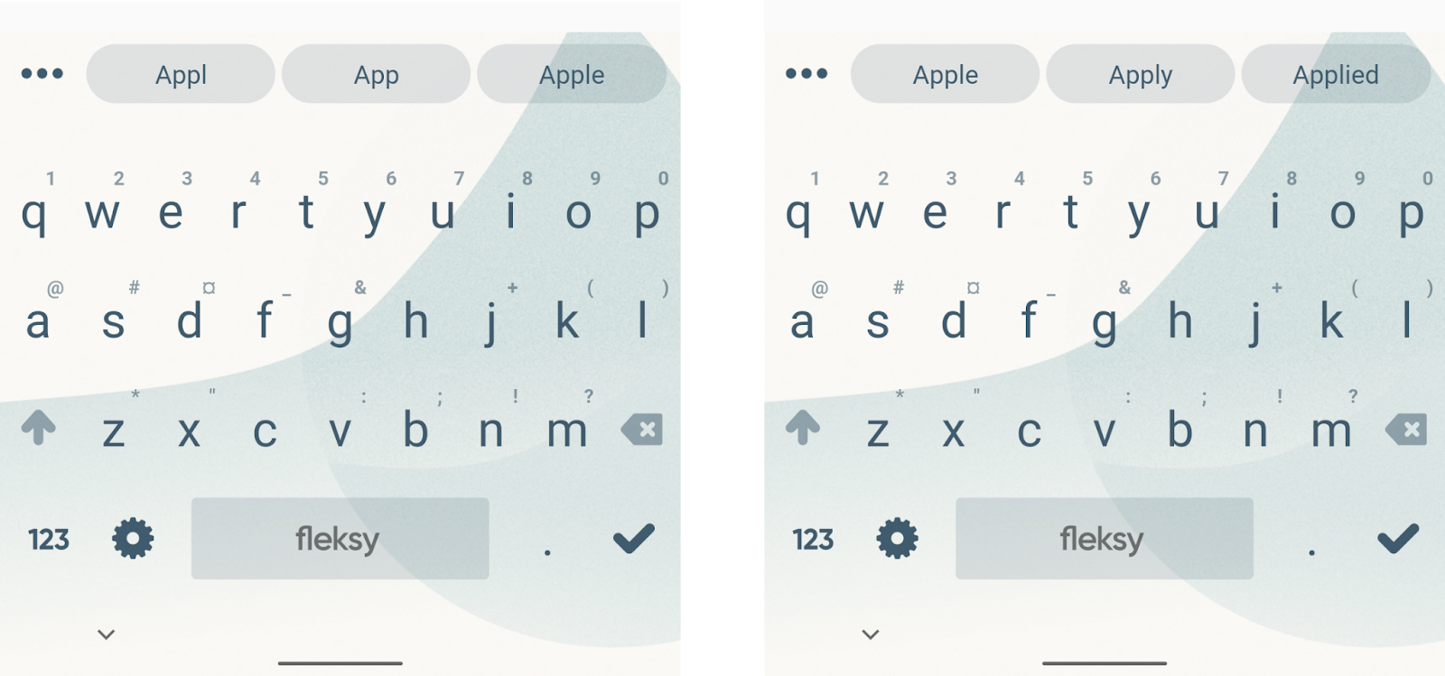
Predictions
The Fleksy keyboard supports customisation of the keyboard prediction logic, allowing you to control how predictions are calculated and displayed within the keyboard area.
To customise predictions we can use the PredicationsConfiguration class, which supports four arguments:
data class PredictionsConfiguration(
val predictionTypes: List<PredictionModelType> =
listOf(PredictionModelType.WORD),
val predictionStrategy: PredictionStrategy = CoreContainerStrategy(),
val showEnteredText: Boolean = true,
val showEmojiSuggestions: Boolean = false
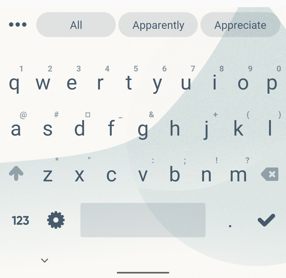
)Using these arguments we can control the predictions that are displayed as the user interacts with the keyboard. We’ll start with the predictionTypes argument – this allows us to provide a list of prediction models that are used when calculating the predictions to be displayed within the keyboard. For our example, we’re going to support words and emojis – you can check out the PredictionModelType class to view the different models that are supported for prediction.
predictions = PredictionsConfiguration(
predictionTypes = listOf(PredictionModelType.WORD, PredictionModelType.EMOJI)
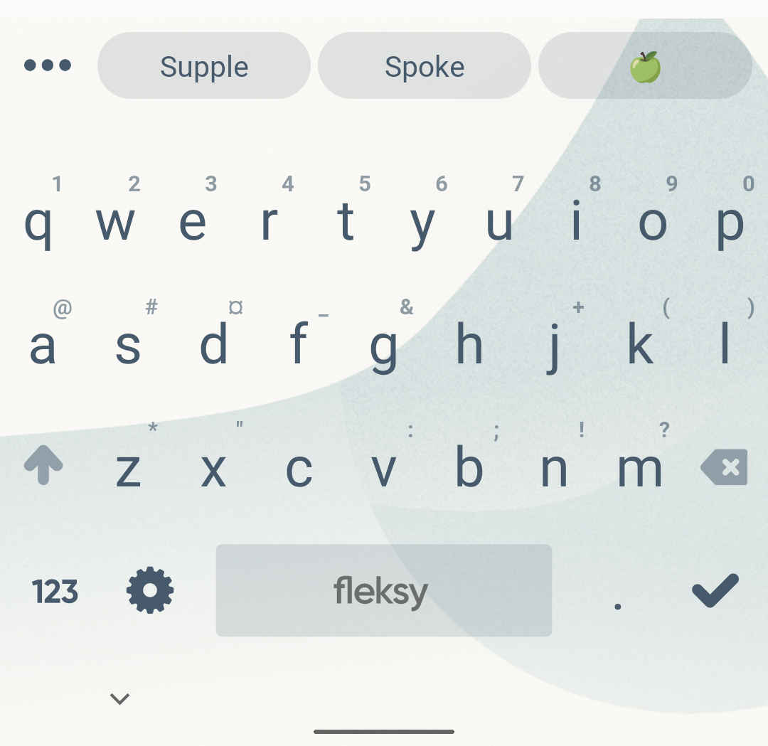
)When it comes to displaying predictions, we can also filter out certain types of content from the displayed predictions. If we want to filter out emojis from being displayed within the predications bar, we can use the showEmojiSuggestions argument to depict whether emojis should be shown as suggestions.
predictions = PredictionsConfiguration(
  predictionTypes = listOf(PredictionModelType.WORD, PredictionModelType.EMOJI),
  showEmojiSuggestions = true
)
Alongside this, if we don’t wish to display the currently entered text as a suggestion, using the showEnteredText flag allows us to control this. This allows us to display an extra prediction to the user, as opposed to the word that is currently being entered via the keyboard.
predictions = PredictionsConfiguration(
  predictionTypes = listOf(PredictionModelType.WORD, PredictionModelType.EMOJI),
  showEmojiSuggestions = true,
  showEnteredText = false
)
The PredictionsConfiguration class also supports a PredictionStrategy argument – this allows us to have full control over how the predictions are rendered.
interface PredictionStrategy {

   fun setNextWordPredictionEnabled(enabled: Boolean)

   fun init(parent: FrameLayout, listener: PredictionListener)

   fun onPredictionsChanged(predictions: List<PredictionModel>)

   fun addNextSearch(search: PredictionModel.Search)

   fun reset()

   fun onThemeChanged(theme: KeyboardTheme)

}
We won’t dive into building this out ourselves in this post, but you can use this interface if you really need to have control over predictions. For example, utilising the onPredicationsChanged to react to prediction changes within the keyboard, or control whether predictions should be enabled using setNextWordPredicationEnabled. The use of this interface really depends on the use-case for your keyboard, but having the option to customise it at a low-level opens up many opportunities.
Emoji
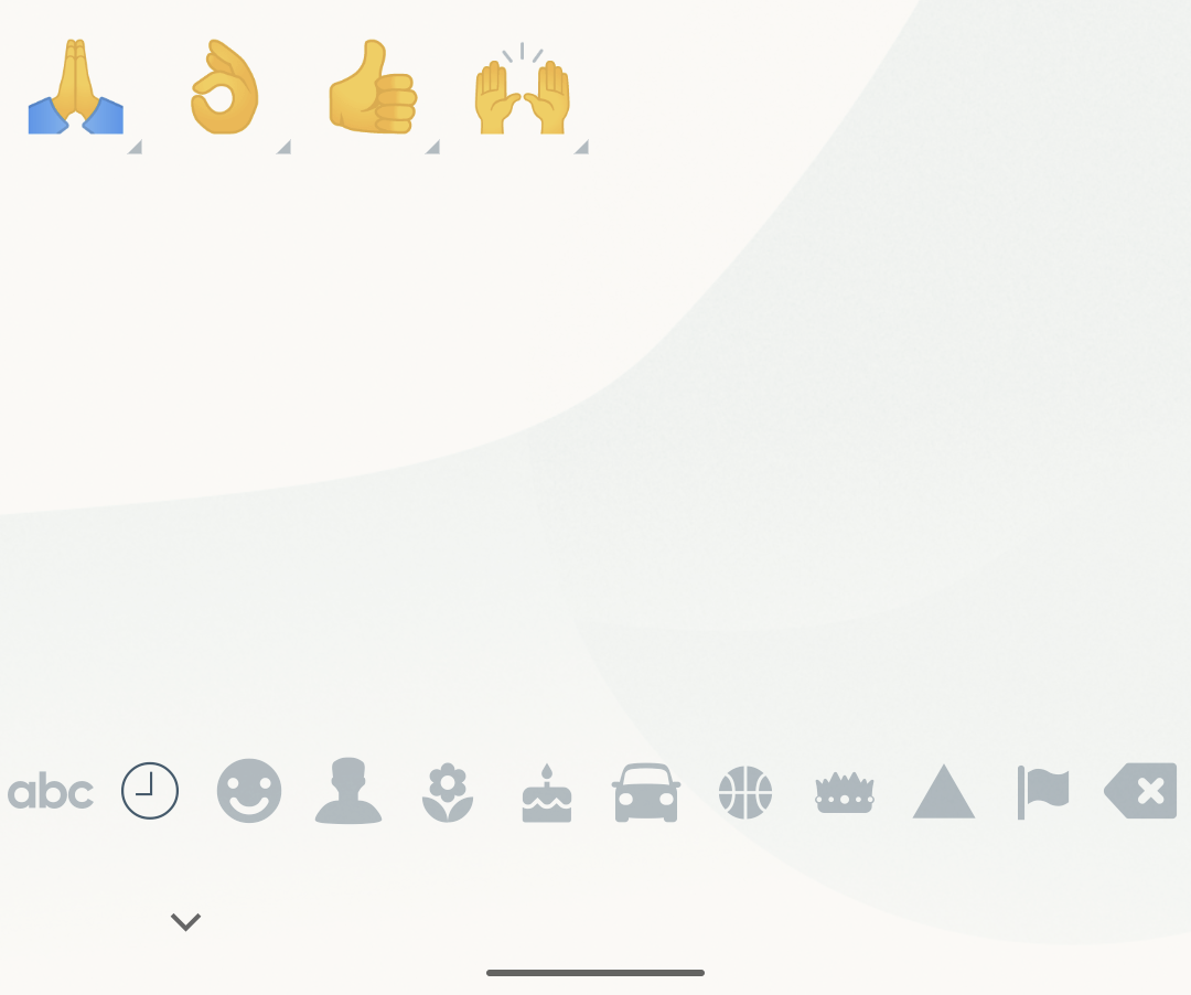
While we touched on emojis briefly for predictions, we can go further here and provide configuration details for how emojis should be handled by our keyboard. This customization is done using the EmojiConfiguration class – this provides a collection of arguments that can be used to customise how emojis are handled by our keyboard. We won’t cover all of these arguments here, but let’s take a look at some fundamental settings that are used to configure the keyboard.
When the emoji picker is launched, the keyboard will show a collection of default emojis – this is most often recently used emojis. When using the EmojiConfiguration, we can use the recent argument to provide a set of emojis to be displayed within this recents panel. If you don’t provide this as an argument, then a blank recents panel will be displayed. Your best bet here is to either persist the recently used emojis to be loaded here, or use the panel to display emojis that are most applicable to the current context of your application.
emoji = EmojiConfiguration(
  recent = setOf("🙏", "👌", "👍", "🙌")
)
Alongside customising the recently used emojis, we can also control the default skintone and gender that are used for emojis. For example sake here we’ll pass the NEUTRAL skin-tone type, but this can be customised based on any user preference that might be set within your application.
emoji = EmojiConfiguration(
  defaultSkinTone = EmojiSkinTone.NEUTRAL,
  defaultGender = EmojiGender.NEUTRAL
)
Note: The user can still select different skin-tone + genders within the emoji picker. The default type allows you to set the values to be used within the emoji selector.
Aside from the above properties, we can also configure the keyboard to only display supported emojis. Google is already doing a lot of work to improve emoji compatibility across android versions, so we’ll also want to ensure that we are doing the same in our keyboard implementation. Using the androidOnly property, we can specify that the keyboard should only show emojis that are compatible with the Android version that is being run on the device.
emoji = EmojiConfiguration(
  androidOnly = true
)
Aside from the above configurations, there are further properties that can be provided through various other configuration classes. Be sure to check out the SDK documentation to learn about how else you can configure your custom keyboard.
Keyboard Panels
Another interesting part of the Fleksy SDK that I want to take a look at are what are known as Panels. Panels allow us to display content within the bounds of the keyboard, which is done using the PanelHelper class. Panel support comes in two different forms:
– A Panel known as the Frame View, this is displayed above the keyboard prediction bar
– A Panel known as the Full View, this is displayed over the entirety of the keyboard bounds
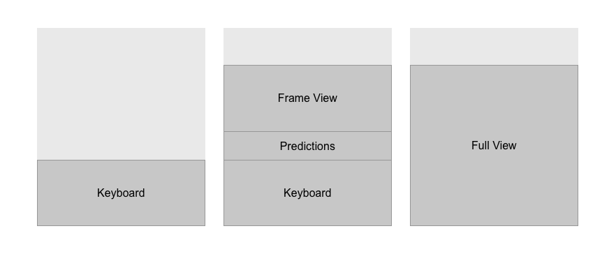
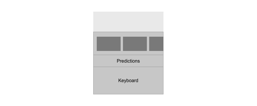
These Panels provide a way for us to display content within the keyboard area,which can be useful for injecting content that can be useful within the context of a virtual keyboard. The Frame View gives us space above the predictions bar to display content, which can be displayed using the PanelHelper class and its showFrameView function. When calling this we simply need to pass a view that we want to be displayed, which will then be rendered in the Frame View space within the keyboard bounds.
PanelHelper.showFrameView(MyCustomView())For example, we might want to display a scrollable collection of media items that can be inserted via the keyboard (and are maybe generated based on the current predictions).
Alongside the Frame View we also have the Full View, which allows us to display content that fills the entirety of the keyboard bounds. Similar to the Frame View, we can use the showFullView function to pass the view that we wish to occupy the Full View bounds.
PanelHelper.showFullView(MyCustomView())This can be used for similar reasons to the frame view, except we can create a more focused experience within the context of the keyboard. For the frame view we used the example of an inline media picker, whereas for the full view we could create the same use-case but have more space available to do so.
Note: While these PanelHelper functions only currently support view classes, we can use the ComposeView class to inject composables directly into the keyboard area.
In this blog post we’ve been able to learn how the Fleksy SDK can be used to create custom keyboard experiences for our applications. While the SDKs have a range of functionality, we’ve covered some of the key concepts that can be used to create these customised experiences.
Aside from the above features, there are further things which I’d love to explore more with the support of documentation from the team. The Fleksy SDK allows for you to provide custom keyboard themes, but this isn’t really covered within the documentation – which makes it hard to learn and test the possibilities here. The same also goes for the PanelHelper class – the documentation is quite lightweight here. While there is enough to get you started, it’s a little tricky to really understand the possibilities here and get an up-and-running sample.
Update: The team have now added documentation for theming 🙌
With the above said, it’s definitely worth checking out the Fleksy SDK if you’re looking to create custom keyboard experiences. With its range of feature support, you’ll be able to create the input experiences that your app deserves.