

Material Tabbed Navigation
When it comes to creating tabbed navigation with a Material approach, we make use of what is known as a TabBar — typically this will be placed within an AppBar as the bottom component:
return new AppBar(
  bottom: new TabBar(..)
);
Then within this TabBar we will display a collection of Tab widgets that represent the selectable options for the navigation, we’ll assign our tabs to the tabs argument for the TabBar.
bottom: TabBar(
    tabs: _buildsTabs(),
),
Each of these tabs can contain text, icons or even both. For now we’ll create some simple Tab widgets that just contain a text label for each:
List<Widget> _buildTabs() {
return <Widget>[
Tab(text: "One"),
Tab(text: "Two"),
Tab(text: "Three"),
];
}
Finally, we need to make use of a TabController — this will synchronise the selected tab along with the content that is going to be shown. For this example sake we’re going to make use of the DefaultTabController class — this simplifies this process as we just need to provide the number of tabs we are displaying, along with a child widget representing our tabs. This child should consist of an AppBar containing our TabBar widget:
DefaultTabController(
length: tabs.length,
child: Scaffold(
appBar: AppBar(
bottom: TabBar(
tabs: _buildsTabs(),
),
),
),
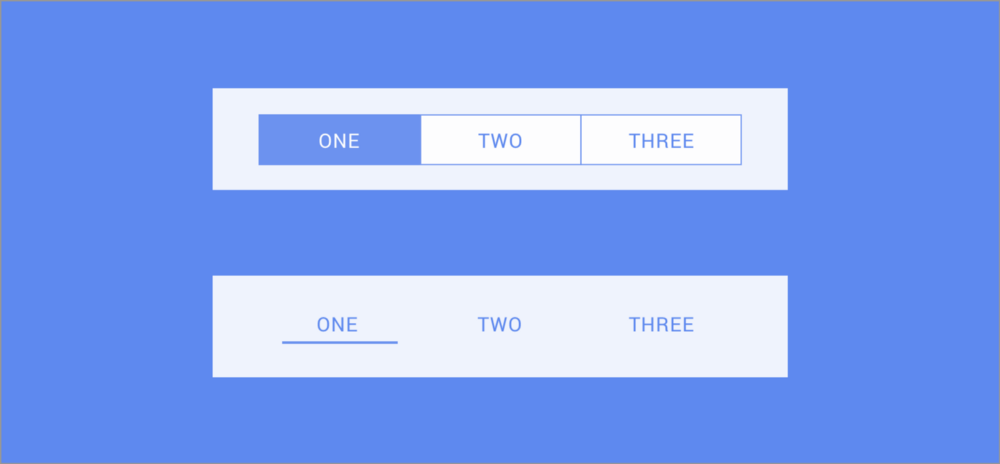
);At this point we have a Tabbed navigation bar that allows our users to navigate between pages of our app:

There are some important interaction features when it comes to the TabBar that the native implementation on iOS does not display:
- The TabBar allows users to swipe between the child content. So taking the TabBar above as an example — I would be able to navigate to the UK section by simply swiping the content body at the currently selected USA option.
- When selecting a TabBar navigation item, the content views should appear to automatically swipe to the selected content body. This is a transition style that is specific to the material implementation of tabbed navigation.
Cupertino Segmented Navigation
When it comes to creating tabbed navigation with a Cupertino approach, we make use of what is known as a CupertinoSegmentedControl — typically this will be placed within an CupertinoNavigationBar and displayed as the middle component:
CupertinoNavigationBar(
    middle: CupertinoSegmentedControl(),
);
At this point we have a segmented control display, but not items or handling of the selected items. When providing items for the control to display, they come in a slightly different format than the material TabBar:
final Map<int, Widget> children = const <int, Widget>{
    0: Text('One'),
    1: Text('Two'),
    2: Text('Three'),
};
The segment control takes a Map<int, Widget> which essentially an indexed collection of tab items, so if you wish to share tabs between the two implementations then you will need to do some mapping to switch between the two formats.
Now that we have our navigation items that we wish to display, we can start to piece together our CupertinoSegmentedControl. Along with these items we’re also going to provide two other arguments when building the component:
CupertinoSegmentedControl(
  onValueChanged: _onTapped,
  children:  children,
  groupValue: selectedItemIndex,
))
The onValueChanged argument is a listener that allows us to receive selection events on the navigation items and groupValue allows us to provide the index of the currently selected navigation item.
As well as these properties we can also further style our segment controls with some optional arguments when constructing our controls:
CupertinoSegmentedControl(
  selectedColor: VoiceTheme.blaze_orange,
  borderColor: VoiceTheme.blaze_orange,
  onValueChanged: _onTapped,
  pressedColor: VoiceTheme.light_orange,
  children: children,
  groupValue: selectedCollection,
)
- selectedColor — The color of the segment that is currently marked as selected using selectedCollection
- borderColor — The color used for the border of each segment
- pressedColor — The color to be used for a segment when it is being pressed
Now that we have our items and styling in place, we get something like this within our application:

In comparison with the material TabBar, the CupertinoSegmentedControl behaves slightly differently when it comes to the native UX.
- The CupertinoSegmentedControl does not allow users to swipe between the different screens displayed by the segment controller.
- When selecting a segment, the content view should appear to reload the content with the currently selected segment in mind. With that said, there is no swiping transition like the material TabBar.
With all of that in mind, I hope this has shed some light into the two different native components available when it comes to tabbed navigation. Whilst your application may have it’s own theming in place, if you are trying to build native look-and-feel applications then it’s important to bear these different implementations in mind! if you have any questions about the use of these components then please feel free to reach out!