At Google I/O this year we saw the introduction of Firebase MLKit, a part of the Firebase suite that intends to give our apps the ability to support intelligent features with more ease. With this comes the barcode scanning feature, giving us the ability to scan barcodes and QR codes to retrieve data from the… Continue reading
Learn Clean Architecture for Android at Caster.io
Last year I opened sourced a collection of Clean Architecture boilerplate repositories over at my works’ GitHub page. Whilst these were experiments and me exploring to find a balance between abstraction and maintainable code, these all gathered quite a bit of attention and with this attention came a lot of questions. These questions were all… Continue reading
Implementing text input in Flutter apps
In an app I’m working on I needed to allow the user to input some data before sending it off to a server. This is quite a common task for applications to implement, so in this post lets take a look at how we can do this in our Flutter apps. When it comes to… Continue reading
Exploring Android P: Priority Buckets
At Google I/O there were a lot of new announcements around the latest version of Android, P. One of these announcements were Priority Buckets — a battery management update to Android where the system will prioritise resources based on both how recently, and how frequently, the application in question is used. In this article we’re going to… Continue reading
Bottom sheets in Flutter
Bottom sheets are views which we can display at the bottom of the screen to display content to the user — this may be to prompt further interaction or display some form of other content to the user. These are always anchored at the bottom of the screen and be easily hidden from view by the user…. Continue reading
Exploring Firebase MLKit on Android: Face Detection (Part Two)
At Google I/O this year we saw the introduction of Firebase MLKit, a part of the Firebase suite that intends to give our apps the ability to support intelligent features with more ease. With this comes the face recognition feature, giving us the ability to recognise faces along with the ‘landmarks’ (nose, eyes etc) and… Continue reading
Stateful or Stateless widgets?
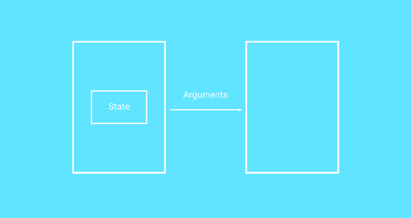
When building Flutter applications we use widgets to construct our User Interface. When it comes to these widgets there is one of two types which it can be — either stateful or stateless. In this post I want to take a look at these different types of widgets so that we can get a better understanding of… Continue reading
Exploring Firebase MLKit on Android: Introducing MLKit (Part one)
At Google I/O this year we saw the introduction of Firebase MLKit, a part of the Firebase suite that intends to give our apps the ability to support intelligent features with more ease. The SDK currently comes with a collection of pre-defined capabilities that are commonly required in applications — you’ll be able to implement these in… Continue reading
Introducing the FlutterDoc publication
Flutter is a UI framework from Google that can be used to build native experiences that works across popular platforms. When I first discovered Flutter last year I decided to take a bit of a look into it. Now, to be honest, I’ve always been skeptical of frameworks that off cross-platform support —unfortunately I feel… Continue reading
Animating App Bars in Flutter
Several months ago I played around with animating app bars in Flutter using the SliverAppBar Widget — this is a really great way of adding a nice touch to your flutter screens that are making use of the AppBar widget. For that reason, I thought I’d put together this post in the hope it will help you… Continue reading
