This blog post is a preview of the Authentication Form project from Practical Jetpack Compose. Pick up the course and learn how to build 11 other projects 🚀
Part one of this preview will teach you how to build an Authentication Form with Jetpack Compose. Next week, I’ll be publishing the second part of the preview where you’ll learn how to write automated UI tests for the Authentication Form.
When building apps, it’s often that we’ll be working with some kind of user account – meaning that we’ll need to provide a way for users to create a new account or access an existing one. The ability to be able to achieve this will be provided through an authentication screen, providing a way for users to sign-up or sign-in using one of the methods that your application offers. While many apps offer authentication via third-party sites (such as social accounts), a common requirement is email authentication – not only does this decouple users accounts from third-party sites, but it also offers a common authentication method for connecting with your application.
With this in mind, we’re going to build out an email authentication screen using jetpack compose. While an email form isn’t visually the most exquisite experience to be building, it offers a collection of ways for us to think about state management and is a perfect example of how different an implementation may be when compared to the existing Android UI toolkit.
When it comes to this screen, we need to configure and handle several different things.
- Add the UI for user interaction to perform authentication
- Persist the state for the entered email and password
- Manage the UI state based on the entered credentials, such as disabling the button when no credentials have been entered
- Handle the state change when the authentication mode toggle button is pressed
- Correctly support IME actions, allowing field focus to be changed and the form to be submitted via the software keyboard
We can see here that when it comes to the authentication screen, there is more to it than a minimal form that is used for credential entry. The management of state and recomposition of the UI based on those state changes gives us some good foundations to really start to explore the concept of state within Jetpack Compose.
Defining the Authentication State
Within our authentication form, we’re going to be dealing with many different pieces of state that depict how the UI is going to be displayed to the user. This state will be used to compose our UI, allowing us to control how our composables look and behave to the user. Within our UI we’re going to need to show the following things:
- A title that will tell the user that they need to sign-in or sign-up
- An input field which will be used to enter an email address
- An input field which will be used to enter a password
- A password validation indicator to notify the user whether their password meets the minimum requirements
- A button that will allow the user to trigger the authentication flow. This button will also be disabled when there is no content input into the email and password fields
- A button that will allow the user to toggle between sign-in and sign-up
- A progress indicator which will display when the sign-in or sign-up operation is being performed
With the above set out, we can start to see that there are going to be several pieces of state that we need to hold. With that in mind, let’s start to take the above statements and build a class that will represent the state of our composable UI. Let’s create a new class, AuthenticationState.
// AuthenticationState.kt
data class AuthenticationState(

)
Modelling the user credentials
We’ll start with the content that is going to be input by the user – the email address and password. Because this is something that the user will enter and will be displayed within our UI, each of these is going to represent a piece of our state. For this, we’ll go ahead and add two string references to our state class.
data class AuthenticationState(
    val email: String? = null,
    val password: String? = null
)
Modelling the password requirements
Alongside the user being able to enter their password, we’re also going to enforce some requirements for that password. We’ll represent these requirements in the form of an enum – this allows us to enforce the length and content of the password that is entered.
enum class PasswordRequirements {
    CAPITAL_LETTER, NUMBER, EIGHT_CHARACTERS
}
For each of the requirements we’re going to want to show a message, this will be used to communicate what the requirement is to the user. For this, we’ll need to start by adding some new strings to our strings.xml file.
<string name="password_requirement_characters">
	At least 8 characters
</string>

<string name="password_requirement_capital">
	At least 1 upper-case letter
</string>

<string name="password_requirement_digit">
	At least 1 digit
</string>
We’ll then adjust the PasswordRequirement to contain a label in the form of a string resource integer, setting a resource for each of the requirement enums values that we previously defined.
enum class PasswordRequirement(
    @StringRes val label: Int
) {
    CAPITAL_LETTER(R.string.requirement_capital),
    NUMBER(R.string.requirement_digit),
    EIGHT_CHARACTERS(R.string.requirement_characters)
}
Within the state, we’ll need the current PasswordRequirements that are satisfied so that we can communicate this to the user. For this reason, we’ll add a new passwordRequirements field to our state that represents a list of requirements that have been met.
data class AuthenticationState(
    val email: String? = null,
    val password: String? = null,
    val passwordRequirements: List = emptyList()
)
Modelling the authentication mode
The above gives us the key parts of the state that we need to allow the user to sign-up or sign-in to our application. However, we’re going to be doing a little more than that! Because a user can sign-up and sign-in to our application, we need to allow the form to be toggle-able between these two modes. To be able to represent this in our state we’re going to start by defining a new enum that will be used to signify whether the form is currently being used to sign up or sign in.
enum class AuthenticationMode {
    SIGN_UP, SIGN_IN
}
Now we can go ahead and add this to our state – this will then allow us to easily toggle between these two modes and have our UI recompose whenever the selected mode changes.
data class AuthenticationState(
    val authenticationMode: AuthenticationMode = AuthenticationMode.SIGN_IN,
    val email: String? = null,
    val password: String? = null,
    val passwordRequirements: List = emptyList()
)
Modelling the loading state
Now that our state represents both a sign-in and sign-up flow, we’re going to want to be able to handle the state when a user reaches the point of performing those operations. While we won’t be hitting an API in our UI example, in the real world this would be an asynchronous operation – meaning that we would have to wait a second or two for it to complete. In this scenario, we would want to show a progress indicator to the user so that they know a request is taking place. We’ll represent this in our state by adding a loading flag to the state class.
data class AuthenticationState(
    val authenticationMode: AuthenticationMode = AuthenticationMode.SIGN_IN,
    val email: String? = null,
    val password: String? = null,
    val passwordRequirements: List = emptyList(),
    val isLoading: Boolean = false
)
Modelling the error state
Once the loading of the request has been completed, we’ll want to handle the response that would come back from our API. In the case of success, we would navigate onto the next part of our application, but things might not always go as planned. In these cases, we’ll want to show an error to the user, usually in the form of the error that has come back from the API. To allow for this, we’ll add a new field to our state class which will represent if an error has occurred and at the same time, the content of that error.
data class AuthenticationState(
    val authenticationMode: AuthenticationMode =
        AuthenticationMode.SIGN_IN,
    val email: String? = null,
    val password: String? = null,
    val passwordRequirements: List = emptyList(),
    val isLoading: Boolean = false,
    val error: String? = null
)
Modelling the valid state
As well as the content that can be entered into the input fields, the user can also delete this content. These fields themselves will also start blank, so in both of these states, we don’t want the user to be able to submit the form. We also want to block the form from being submitted if the password requirements have not been satisfied. To handle these cases we’ll add a new function to our state – this will return a boolean value that represents whether the form content is valid. We’re using a function for this so that the place that has the access to this state can easily check if the current state allows the user to proceed, instead of adding another value within our state.
data class AuthenticationState(
    val authenticationMode: AuthenticationMode = AuthenticationMode.SIGN_IN,
    val email: String? = null,
    val password: String? = null,
    val passwordRequirements: List = emptyList(),
    val isLoading: Boolean = false,
    val error: String? = null
) {
    fun isFormValid(): Boolean {
        return password?.isNotEmpty() == true &&
            email?.isNotEmpty() == true &&
            (authenticationMode == AuthenticationMode.SIGN_IN
                || passwordRequirements.containsAll(
                    PasswordRequirements.values().toList()))
    }
}
With that in place, we now have a class that can be used to represent the state of our UI. Over the next few sections of this chapter, we’ll utilise this state when building out our UI, modifying its values as interactions with composables take place, triggering recompositions to reflect any state changes.
Creating the Authentication ViewModel
Now that we have the state modelled for our Authentication screen, we can start thinking about the ViewModel that will be used to manage that state and provide a way to orchestrate it to the user interface.
Setting up the ViewModel
Before we can get started here, we’re going to add a new dependency to our project that will give us access to the Android Lifecycle ViewModel class:
implementation "androidx.lifecycle:lifecycle-viewmodel-compose:2.4.0"💡 You aren’t required to use a ViewModel when working with compose. For the sake of these exercises, it helps us to keep things simple and follow an approach that many developers are familiar with.}
Next, we’ll create a new ViewModel, called AuthenticationViewModel.
// AuthenticationViewModel.kt
class AuthenticationViewModel : ViewModel() {

}
This ViewModel is going to need to hold a reference to the state of our screen. For this we’re going to utilise StateFlow – this allows us to create a state-holder observable flow that will emit the default state we provide to it, along with any updates that occur during its lifetime. Here we’ll create a new MutableStateFlow instance, providing a reference to our AuthenticationState class as the default value for our StateFlow:
class AuthenticationViewModel : ViewModel() {
	val uiState = MutableStateFlow(AuthenticationState())
}
With this in place, we now have a StateFlow reference that is holding a reference to our authentication state, initialising it with a new instance of the state class and relying on the defaults that the constructor provides.
Manipulating state using events
While this state is now in place, we need to start thinking about the different ways in which it can be manipulated – whenever something is changed in our UI (text edited, button pressed), we’ll want to update the state within our ViewModel so that the observing UI can reflect those changes.
For when this is the case, we’re going to model some events that can be triggered in our composable UI and in turn these events will be used to manipulate the state within the view model. This allows us to have a single way of our composable UI communicating with the ViewModel, rather than needing to pass the entire ViewModel or many references to separate functions which could be used to trigger state changes. Instead, we can pass a single function reference to our composable UI which can then be used to trigger these events in the ViewModel. For these events we’re going to need to define different types that can be triggered, so we’ll go ahead and create a new sealed class to represent these.
// AuthenticationEvent.kt
sealed class AuthenticationEvent {

}
Handling authentication mode toggling
With this sealed class in place, we can start to think about using it to represent the different events that can occur. We’re going to start by handling the scenario where the authentication mode can be toggled between sign-up and sign-in. For this, we’ll create a new event called ToggleAuthenticationMode.
sealed class AuthenticationEvent {

    object ToggleAuthenticationMode: AuthenticationEvent()

}
With this event in place, this can now be triggered from our composable UI to cause a state change within our view model. For that to happen though, we need to write this logic inside of our ViewModel. We’ll start here by creating a new function that will be used to ‘flip’ the current authentication mode – switching it between sign-up and sign-in.
private fun toggleAuthenticationMode() {
    val authenticationMode = uiState.value.authenticationMode
    val newAuthenticationMode = if (
		authenticationMode == AuthenticationMode.SIGN_IN
	) {
    	AuthenticationMode.SIGN_UP
    } else {
      	AuthenticationMode.SIGN_IN
    }
    uiState.value = uiState.value.copy(
      authenticationMode = newAuthenticationMode
    )
}
With this code above, we take the current authentication mode within our authentication state and set it to the opposite value. We then use this to copy our existing authentication state, setting the authentication mode to reflect the newly calculated value. When this is done, the new value will be emitted to the observer of our live data – allowing our UI to be recomposed to reflect this new state.
💡 The copy function in Kotlin copies the existing class reference, replacing any values that have been provided as arguments to the function.
Now that we have this function available to handle the state change of the authentication mode, we need to go ahead and add support for triggering it from outside of our ViewModel. For this, we’ll add a new function to our ViewModel that will take a reference to an AuthenticationEvent.
fun handleEvent(authenticationEvent: AuthenticationEvent) {
	when (authenticationEvent) {

	}
}
This function takes an AuthenticationEvent reference and then can use that to trigger the desired outcome, based on the event which has been provided to it. So in this case of the authentication mode toggle event, we’re going to trigger the toggleAuthenticationMode function.
fun handleEvent(authenticationEvent: AuthenticationEvent) {
    when (authenticationEvent) {
        is AuthenticationEvent.ToggleAuthenticationMode -> {
            toggleAuthenticationMode()
        }
    }
}
While we’re not going to implement the call to handleEvent until the next section of this chapter, our composable UI will be able to make the following call to trigger the authentication mode toggle:
viewmodel.handleEvent(
	AuthenticationEvent.ToggleAuthenticationMode
)
Handling input field changes
With the authentication mode toggle in place, we can start thinking about the other events that we want to trigger from outside of our ViewModel. If we take a look at the authentication state model then we can see the other pieces of the state that we need to manipulate. Two key pieces of this state are the email address and password, these will represent the data that has been input by the user and will need to be reflected in our state whenever they change. For this, we’re going to add two more events to our Authentication Event sealed class.
sealed class AuthenticationEvent {

    object ToggleAuthenticationMode: AuthenticationEvent()

    class EmailChanged(val emailAddress: String):
      AuthenticationEvent()

    class PasswordChanged(val password: String):
      AuthenticationEvent()

}
Here, we’ve added an EmailChanged event, along with a PasswordChanged event. These will allow the UI to trigger these events whenever the input of the email and password fields are changed. For that to be possible, we’ll go ahead and implement some functions in our ViewModel that allow for this state change to be reflected. We’ll start with a function, updateEmail, that will simply be used to update our state reference with the provided email address.
private fun updateEmail(email: String) {
    uiState.value = uiState.value.copy(
    	email = email
	)
}
When it comes to updating the password, we’ll need to create another new function, updatePassword, that will be used to update the password reference within our state.
private fun updatePassword(password: String) {
    uiState.value = uiState.value.copy(
		password = password
	)
}
However, whenever the password is updated we’ll always want to update the validity of the password requirements. For this, we’re going to create a new list that consists of PasswordRequirements, for which we’ll add references for the requirements that have been met. This list can then be set on our state so that the UI layer can be aware of the requirements that have been satisfied. When building this list of satisfied requirements, we’ll need to base this on several different constraints.
- When the length of the password is greater than 7, this means that the minimum password length has been met. This means that we can add the
PasswordRequirements.EIGHT_CHARACTERSto the list.
if (password.length > 7) {
    requirements.add(PasswordRequirements.EIGHT_CHARACTERS)
}- When the password contains an uppercase character, this means another one of our minimum requirements has been met. In this case, we’ll add the
PasswordRequirements.CAPITAL_LETTERto the list.
if (password.any { it.isUpperCase() }) {
	requirements.add(PasswordRequirements.CAPITAL_LETTER)
}- Finally, if the password contains any digit, this means that this requirement has been satisfied. In this case, we’ll add the
PasswordRequirements.NUMBERvalue to the list.
if (password.any { it.isDigit() }) {
	requirements.add(PasswordRequirements.NUMBER)
}
With this logic now defined, we can slot this into our updatePassword function and assign the result to the passwordRequirements within our AuthenticationState reference.
private fun updatePassword(password: String) {

	val requirements = mutableListOf<PasswordRequirements>()
    if (password.length > 7) {
    	requirements.add(PasswordRequirements.EIGHT_CHARACTERS)
    }
    if (password.any { it.isUpperCase() }) {
    	requirements.add(PasswordRequirements.CAPITAL_LETTER)
    }
    if (password.any { it.isDigit() }) {
        requirements.add(PasswordRequirements.NUMBER)
    }
    uiState.value = uiState.value.copy(
		password = password,
        passwordRequirements = requirements.toList()
	)
}
With these email and password functions in place, these can now be triggered via an event whenever the input is changed for either of those fields. We can then go ahead and add these function calls to our handleEvent function – now when the event is triggered outside of the ViewModel, the state can be updated based on the corresponding event.
fun handleEvent(authenticationEvent: AuthenticationEvent) {
    when (authenticationEvent) {
        is AuthenticationEvent.ToggleAuthenticationMode -> {
            toggleAuthenticationMode()
        }
        is AuthenticationEvent.EmailChanged -> {
            updateEmail(authenticationEvent.emailAddress)
        }
        is AuthenticationEvent.PasswordChanged -> {
            updatePassword(authenticationEvent.password)
        }
    }
}
Handling authentication triggers
Now that users can toggle between authentication modes and enter their account credentials, naturally, the next step would be to allow the UI to trigger authentication. For this event we don’t need to send any data from the UI – this is because the entered email address and password are already reflected within our Authentication State. So here we can simply add another event type to our Authentication Event sealed class.
sealed class AuthenticationEvent {

    object ToggleAuthenticationMode: AuthenticationEvent()

    class EmailChanged(val emailAddress: String): AuthenticationEvent()

    class PasswordChanged(val password: String): AuthenticationEvent()

    object Authenticate: AuthenticationEvent()

}
With this in place, we can next add a function that this event will be used to trigger. For this example, we won’t be triggering a network request, but instead will be responding to the authentication request from the UI and reflecting this via the loading property within the authentication state.
private fun authenticate() {
    uiState.value = uiState.value.copy(
		isLoading = true
	)
    // trigger network request
}
With this function in place, we now have something that will simulate the network request taking place within our application. We can now also add this event type to our handleEvent function, allowing the Authenticate event to be triggered and handled from outside of our ViewModel.
fun handleEvent(authenticationEvent: AuthenticationEvent) {
    when (authenticationEvent) {
        is AuthenticationEvent.ToggleAuthenticationMode -> {
            toggleAuthenticationMode()
        }
        is AuthenticationEvent.EmailChanged -> {
            updateEmail(authenticationEvent.emailAddress)
        }
        is AuthenticationEvent.PasswordChanged -> {
            updatePassword(authenticationEvent.password)
        }
        is AuthenticationEvent.Authenticate -> {
            authenticate()
        }
    }
}
Handling authentication errors
With the above in place, we have a ViewModel that can handle the different required state properties and events that allow the user to enter their credentials, toggle between authentication modes and then proceed with triggering the authentication process.
However, we still have a final property from our Authentication State to handle – and that is the error. This property defaults to null within our state, so in that case, our UI won’t need to display any kind of error. But when this is not null, the UI will represent that error in some way and then also provide a way for it to be dismissed from view. So that we can simulate this scenario and then manage the expected state we will modify our authenticate function.
After we have emitted the loading state we’ll add a delay to simulate a network request, followed by removing the loading status and emitting an error message in the authentication state.
private fun authenticate() {
    uiState.value = uiState.value.copy(
		isLoading = true
	)
    viewModelScope.launch(Dispatchers.IO) {
        delay(2000L)

        withContext(Dispatchers.Main) {
            uiState.value = uiState.value.copy(
				isLoading = false,
				error = “Something went wrong!”
			)
        }
    }
}
You’ll notice here that we’re hopping between coroutine dispatchers – while we’re not making a real network request there, this is to simulate a real scenario and ensure that the asynchronous work and live data emissions happen using the expected dispatchers. With this in place, the error will be emitted as part of the authentication state for the UI to reflect. While we haven’t created the UI yet, this error will be composed in the form of an alert dialog – this means that we will also need to be able to dismiss this dialog. To support this, the error of our state will need to be cleared so that the UI is recomposed the alert dialog is not a part of the composition. So that this can be cleared from our state from our UI, we’re going to add a new AuthenticationEvent called ErrorDismissed.
sealed class AuthenticationEvent {

    object ToggleAuthenticationMode: AuthenticationEvent()

    class EmailChanged(val emailAddress: String): AuthenticationEvent()

    class PasswordChanged(val password: String): AuthenticationEvent()

    object Authenticate: AuthenticationEvent()

	 object ErrorDismissed: AuthenticationEvent()
}
With this in place, we are now able to receive error dismissal events from our UI layer, meaning that we also need to implement the state change for when this occurs. Here we’ll create a new function that will be used to simply clear the error
private fun dismissError() {
    uiState.value = uiState.value.copy(
		error = null
	)
}
The last thing to do here is trigger this function whenever the ErrorDismissed event is triggered. For this, we’ll add a final check to our handleEvent when clause to trigger our function.
fun handleEvent(authenticationEvent: AuthenticationEvent) {
    when (authenticationEvent) {
        is AuthenticationEvent.ToggleAuthenticationMode -> {
            toggleAuthenticationMode()
        }
        is AuthenticationEvent.EmailChanged -> {
            updateEmail(authenticationEvent.emailAddress)
        }
        is AuthenticationEvent.PasswordChanged -> {
            updatePassword(authenticationEvent.password)
        }
        is AuthenticationEvent.Authenticate -> {
            authenticate()
        }
        is AuthenticationEvent.ErrorDismissed -> {
            dismissError()
        }
    }
}
With this implemented, we are now managing the state of our authentication screen and providing the required entry points for our UI layer to manipulate the state based on user interaction. Our view model is now ready to be plugged into a composable UI, which we’ll create in the next section of this chapter!
Creating the Authentication UI
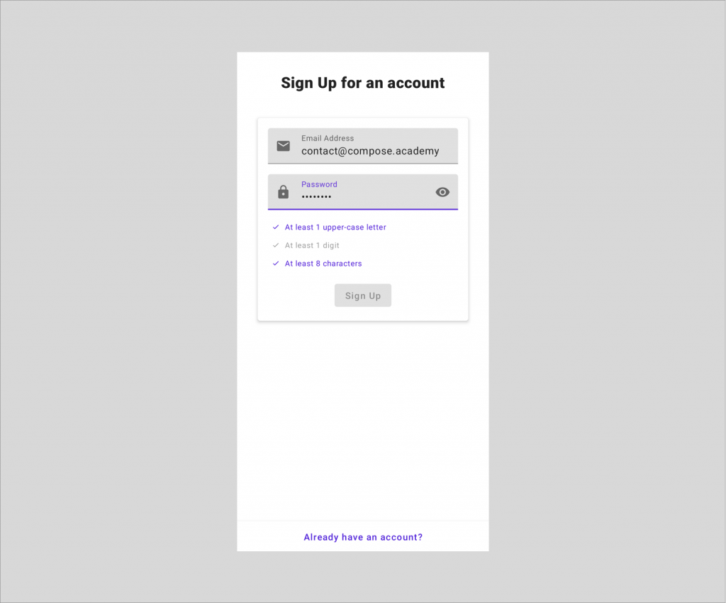
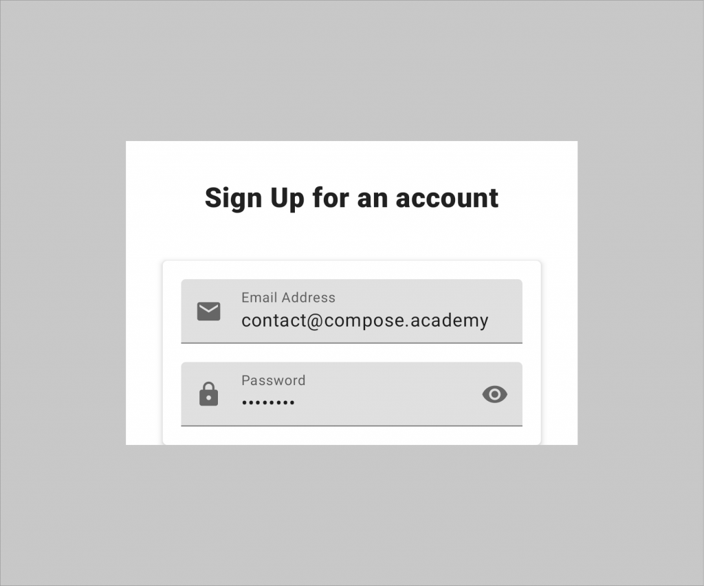
With the ViewModel and state management all in place, we’re ready to move on and start implementing the composable UI for our authentication screen. When we’re finished building this UI, we’re going to end up with something that looks like the following:
This UI will give our users a screen that can be used to log in to an application – giving the option of performing either a sign-in or sign-up operation. While building this UI we’ll dive into the specifics of how the composables can be configured, along with adding some nice touches to improve the User Experience of our Authentication screen.
Setting up the entry point
Before we can get start building our project, we’re going to need to add a couple of dependencies that we’re going to need. We’ll start here by adding these to the build.gradle file for our new project:
// provides access to the `ComponentActivity` class that can be used to compose UI components
implementation 'androidx.activity:activity-compose:1.4.0'

// foundational classes from the Compose APIs
implementation
	"androidx.compose.foundation:foundation:$compose_version"

// UI components from the Compose APIs
implementation "androidx.compose.ui:ui:$compose_version"

// Material Design components from the Compose APIs
implementation
	"androidx.compose.material:material:$compose_version"

// Provides an extended collection of Material Iconography
implementation
	"androidx.compose.material:material-icons-extended:$compose_version"

// Tooling functionality for Composables, such as previews
implementation "androidx.compose.ui:ui-tooling-preview:$compose_version"
debugImplementation "androidx.compose.ui:ui-tooling:$compose_version"
The current release of this book is building against 1.1.0 of compose – be sure to check compatibly if using a newer version.
With these added to our project, we’re now ready to start building out our UI. We’re going to start here by building the access point to our feature – this is how the messaging feature will initially be composed within our user interface.
Here we’ll begin by building a root composable function, Authentication that will be used to house all of our Composable UI for the Authentication screen. For this, we’ll create a new Kotlin file called Authentication.kt (to keep our composables nicely organised), followed by creating a new composable function, Authentication:
// Authentication.kt
@Composable
fun Authentication() { }
This composable is going to be the entry point to our Authentication screen – so we don’t want this function to have to take any arguments. The point that is navigating to authentication will be able to just compose this function, and this composable will handle everything else. While you won’t see anything visual just yet, you’ll want to compose this Authentication composable within the setContent block of the activity that was created through the project wizard. Then as we build out the project, we’ll be able to visualise the Authentication when running the project.
Within this root level composable we’re going to want to force our application theme on the composables that are contained inside of it, so we’ll add a MaterialTheme composable declaration here.
@Composable
fun Authentication() {
    MaterialTheme {

    }
}
💡Wrapping your composable hierarchy in a theme allows all components to be consistently styled. In most cases, this can happen at the highest point of composition – even within the setContent function of the parent activity that is composing the UI.
This now means that for any of the composables that are composed in the content block of our MaterialTheme, these will be themed according to the colors and styles that are declared within our theme.
Saying that though, we don’t currently have any composables that are going to make up the content of our authentication form. We’ll go ahead and create a new composable function here, AuthenticationContent. The difference here is that this composable is going to be responsible for composing our UI based on the state of the screen, meaning that this function is going to take some form of argument. Because it’s composing UI based on our state, it’s also going to need to propagate any events so that the state can be updated accordingly. For this reason, it’s also going to need to be able to handle the AuthenticationEvent types that we previously defined. We’ll need to define two additional arguments for our composable to satisfy these requirements.
@Composable
fun AuthenticationContent(
	modifier: Modifier = Modifier,
  	authenticationState: AuthenticationState,
  	handleEvent: (event: AuthenticationEvent) -> Unit
) {

}
💡 It’s good practice to allow a modifier to be passed into a composable, this means that the parent who is composing the child can control the composition to some extent. This also helps to keep your composable functions re-usable across your UI.
This composable will take an AuthenticationState that represents the state of our screen, along with an event handler that allows us to pass up AuthenticationEvent instances when they are triggered.
So, why can’t this just be the entry point to our authentication screen? One clear thing here is that this decouples the composable with being concerned about how the state is provided – passing in the state via an argument makes it simpler, as in, it gets passed a state and composes UI based on it. This also makes it much easier to write tests our composable – because we can simply pass it a state object and perform assertions based on that, rather than needing to simulate user actions and perform mocking to produce expected states.
With this composable defined, we can then hop up to the root Authentication that we defined and compose the AuthenticationContent within our theme block.
@Composable
fun Authentication() {

    MaterialTheme {
        AuthenticationContent(
			modifier = Modifier.fillMaxWidth(),
            authenticationState = ...,
            handleEvent = ...
        )
    }
}
Things aren’t quite satisfied here yet though, we need to provide both the state and event handler to our AuthenticationContent. We’ll be using our AuthenticationViewModel that we created in the previous sections to satisfy these arguments, so we’ll first need to retrieve an instance of this. So that we can access this information, we’re going to need to obtain an instance to this ViewModel inside of our composable. Here we’ll use the viewModel function from the lifecycle-viewmodel-compose package. This will retrieve an instance of the desired ViewModel, creating one if it does not currently exist.
val viewModel: AuthenticationViewModel = viewModel()We can then use this ViewModel within our root composable for our required arguments.
- We’ll use
collectAsState()to collect the emissions of ourStateFlowreference from our ViewModel as composable state. We’ll then pass the value of this emission as the state reference to our composable. - For event handling, our ViewModel contains a function that matches the requirements of our lambda function argument. We can pass this function reference directly to our composable using
viewModel::handleEvent.
@Composable
fun Authentication() {
    val viewModel: AuthenticationViewModel = viewModel()

    MaterialTheme {
        AuthenticationContent(
			modifier = Modifier.fillMaxWidth(),
            authenticationState =
				viewModel.uiState.collectAsState().value,
            handleEvent = viewModel::handleEvent
        )
    }
}
With this in place, we have a composable function that will house the composables making up our authentication UI. As you might remember from when we created the AuthenticationState, there’s a lot to take into account when it comes to the UI. While there is plenty of space for there to be more complexity and conditions to think about in regards to the state, we have plenty to think about here when it comes to building the actual UI. When it comes to this, we’re going to need to break that down into a Composable representation.
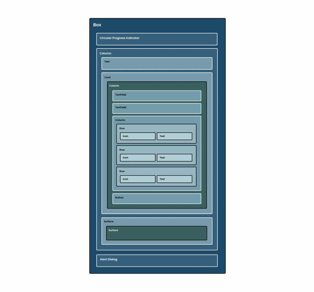
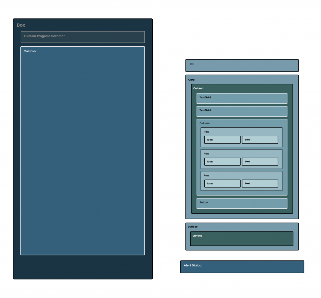
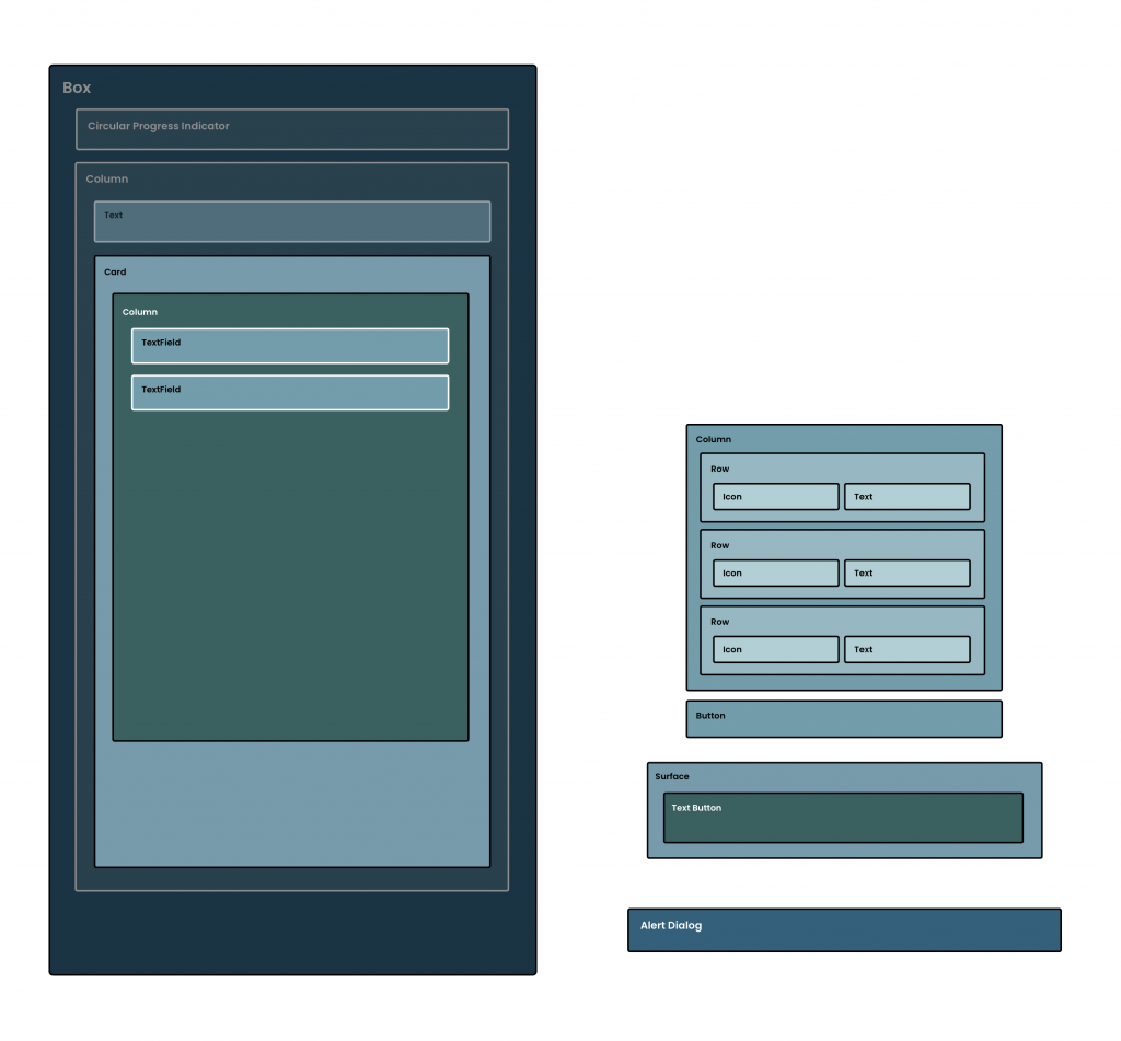
• A Parent Box to hold the different composables that make up our authentication screen
• A Progress Indicator to signify the loading state of the screen
• An authentication form composable that will hold the input fields, buttons and other form components
• An Alert Dialog used to display authentication error messages
With the above in mind, we can start building out our Composable UI to represent our authentication screen. We’re going to build a collection of composable functions, all of which can be plugged together to create the complete screen.
Defining the Parent Container
We begin at the start of the above illustration, the parent Box composable. Because our UI can show three different child composables, we need a container to house those. Other than the authentication form, we’re going to be displaying either a progress indicator (which needs to be displayed in the center of the parent) or an alert dialog (which will be shown over the top of the authentication form), we need these to be placed in a container to allow support for these different scenarios. The Box composable provides support for the alignment of child composables, as well as the ability to show overlapping composables – which makes it perfect for what we need.
// AuthenticationContent.kt
@Composable
fun AuthenticationContent(
	modifier: Modifier = Modifier
) {
	Box {

	}
}
Here we’ve defined an empty Box, which is enough to allow us to display child composables inside of it. However, we need to provide some properties to have the Box fill the entire available space on-screen, while also providing alignment for any children that it displays.
Box(
  modifier = modifier,
  contentAlignment = Alignment.Center
) {

}
Here we use the fillMaxSize modifier to have the Box fill all of the available space on the screen (both the width and height within its parent), along with using the contentAlignment argument to align all of its children in the center of the Box.
Display a Progress State
Before we go ahead and start showing content to users, we’re going to think about the state that occurs beforehand – which is when a loading indicator will be displayed to users. We’re going to start here by using the isLoading property from our AuthenticationState reference. Using this we’re either going to want to show a progress indicator or go on to display content to the user. To handle these different scenarios, we’ll start by adding an if statement that checks the status of this loading flag.
Box(
  modifier = modifier,
  contentAlignment = Alignment.Center
) {
	if (authenticationState.isLoading) {

	} else {

	}
}
With this in place, we can now decide whether to compose the loading state or the content state. Here we’re just going to tackle the loading state of our UI, so we’ll go ahead and utilise one of the available progress indicator composables – the CircularProgressIndicator.
if (authenticationState.isLoading) {
  CircularProgressIndicator()
} else {

}
If we do not provide a progress value to the CircularProgressIndicator then the indicator is composed as an indeterminate indicator, meaning that it will spin indefinitely while it is displayed on the screen. This is fine for our requirements, as we’re just going to show it on screen until the content is loaded. If you need to display a specific progress value on the indicator, you can provide this progress value to the composable so that the indicator can be composed to represent that current progress.
Displaying the Login Content
Even though now we have a progress indicator in place for our login screen, this isn’t something we’re going to be displaying until the user has triggered the authentication flow. So that we can have this be triggered, we’re now going to go ahead and build out the authentication form UI. We’ll need to start here by creating a new composable function that will be used to house our authentication form.
// AuthenticationForm.kt
@Composable
fun AuthenticationForm(
	modifier: Modifier = Modifier
)
Inside of this, we’re going to start here by defining a Column composable – our authentication form is going to represent a vertical stack of components, so a Column is most appropriate for this. When composing this Column, we’ll pass the Modifier reference that was provided to our AuthenticationForm composable to apply the provided constraints to this parent composable.
@Composable
fun AuthenticationForm(
	modifier: Modifier = Modifier
) {
    Column(modifier = modifier) {

	}
}
Looking at the design of the screen, we’re also going to want all of the child composables to be positioned in the center horizontally. For this we’ll utilise the horizontalAlignment argument, providing CenterHorizontally as the value to be used for alignment.
@Composable
fun AuthenticationForm(
	modifier: Modifier = Modifier
) {
	Column(
		modifier = modifier,
  		horizontalAlignment = Alignment.CenterHorizontally
	) {

	}
}
With this in place, we now have a Column that will be used to house the contents of our login form.
Adding the Authentication Title
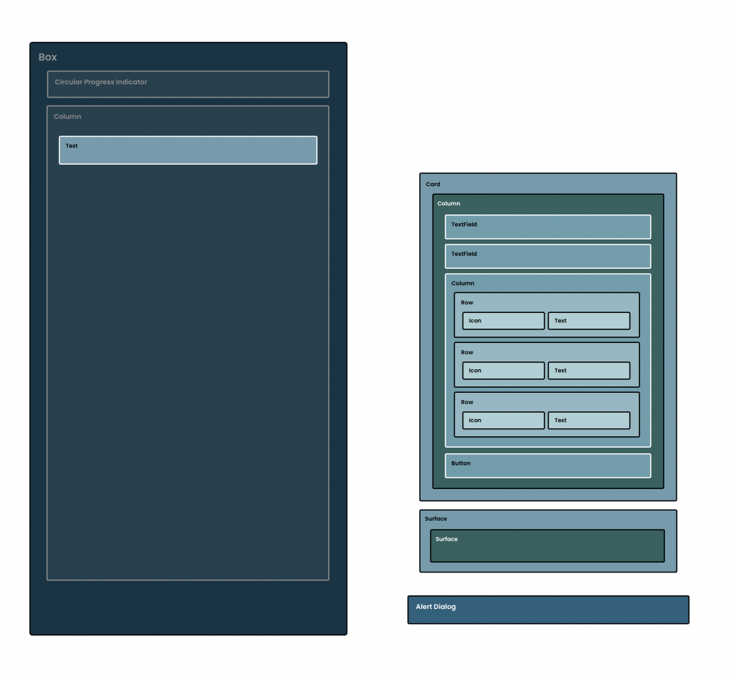
We’ll start first by adding the title for our authentication form – this will display a header that will state that the user can either sign in or ** sign up**, depending on the current state of the screen. So that we can display this title, we’ll need to begin by adding two new strings to our strings.xml file:
<string name="label_sign_in_to_account">
	Sign In to your account
</string>
<string name="label_sign_up_for_account">
	Sign Up for an account
</string>
We’re not going to use these just yet, but at least they’re now in place for when it comes to slotting them into our UI. So that we can start building out our authentication title, we’ll need to create a new composable function, AuthenticationTitle.
// AuthenticationTitle.kt
@Composable
fun AuthenticationTitle(
	modifier: Modifier = Modifier
)
And so that this knows what title needs to display, it’s going to need to know the current AuthenticationMode of the screen – which we’ll pass in as an argument to the composable function.
@Composable
fun AuthenticationTitle(
	modifier: Modifier = Modifier,
	authenticationMode: AuthenticationMode
)
Next, we’ll build out a minimal Text composable using a string retrieved from one of the previously added string resources. The AuthenticationMode reference we have depicts whether the user is currently signing-in or signing-up. Based on this mode we want to set the title of the screen, so it is clear to the user whether they are signing-in or signing-up. Using the provided AuthenticationMode we’ll set the resource to be used for our Text composable.
@Composable
fun AuthenticationTitle(
	modifier: Modifier = Modifier,
	authenticationMode: AuthenticationMode
) {
	Text(
        text = stringResource(
            if (authenticationMode == AuthenticationMode.SIGN_IN) {
                R.string.label_sign_in_to_account
            } else {
                R.string.label_sign_up_for_account
            }
        )
    )
}
Our title will now be displaying a string based on the AuthenticationMode that is provided to the function.

Because this Text composable is the title of the screen, we’re going to want to style the text according to the theme of our application. Here we’re going to apply a fontSize to our Text composable that feels a bit more fitting for a title. We’ll do this by passing the value of 24.sp to the fontSize argument of the composable.
Text(
	text = stringResource(
    	if (authenticationState.authenticationMode ==
        	AuthenticationMode.SIGN_IN) {
      		R.string.label_sign_in_to_account
    	} else {
      		R.string.label_sign_up_for_account
    	}
  	),
	fontSize = 24.sp
)
We’ll also adjust the fontWeight of our composable – this will help to make it stand out a bit more at the top of our UI. We don’t want this to be too bold when displayed, so we’ll apply the weight as the FontWeight.Black value.
Text(
	text = stringResource(
    	if (authenticationState.authenticationMode ==
        	AuthenticationMode.SIGN_IN) {
      		R.string.label_sign_in_to_account
    	} else {
      		R.string.label_sign_up_for_account
    	}
  	),
	fontSize = 24.sp,
	fontWeight = FontWeight.Black
)
Now that our title is styled, we can go ahead and compose it within our UI. Before we go ahead and compose it inside of our AuthenticationForm, we need to ensure there is access to an AuthenticationMode reference that our title can use. We’re going to be passing this from our state, so we’ll need to first add this as an argument to our AuthenticationForm composable.
// AuthenticationForm.kt
@Composable
fun AuthenticationForm(
	modifier: Modifier = Modifier,
	authenticationMode: AuthenticationMode
)
Followed by passing this into our AuthenticationForm function at the point of composition.
// AuthenticationContent.kt
@Composable
fun AuthenticationContent(
	modifier: Modifier = Modifier,
    authenticationState: AuthenticationState,
    handleEvent: (event: AuthenticationEvent) -> Unit
) {
	...

	AuthenticationForm(
		modifier = Modifier.fillMaxSize(),
		authenticationMode = authenticationState.authenticationMode
	)

	...
}
Hopping back over to our AuthenticationForm composable, we can then compose our AuthenticationTitle and pass in the required AuthenticationMode reference that is now accessible from the authentication form.
@Composable
fun AuthenticationForm(
	modifier: Modifier = Modifier,
	authenticationMode: AuthenticationMode
) {
    Column(
        modifier = modifier
    ) {
		AuthenticationTitle(
			authenticationMode = authenticationMode
		)
	}
}
To create a bit of visual spacing at the top of our UI, we’ll also add a Spacer composable, sized with a height of 32dp via the use of the height modifier.
@Composable
fun AuthenticationForm(
	modifier: Modifier = Modifier,
	authenticationMode: AuthenticationMode
) {
    Column(
        modifier = modifier
    ) {
		Spacer(modifier = Modifier.height(32.dp))
		AuthenticationTitle(
			authenticationMode = authenticationMode
		)
	}
}
With this in place, the title for our authentication form is now being composed within our UI – this title is then composed based on the current AuthenticationMode that is within our state.

Creating the input container
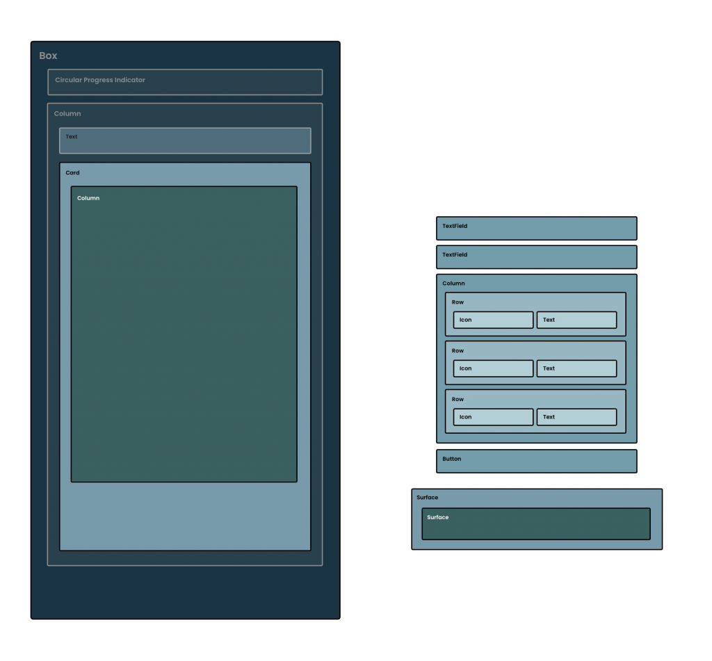
With our title now in place, we can go ahead and start putting together the area that will be used to hold the components for the form input area. As seen in the end goal of our design, and the composable structure in the diagram above, this is all going to be contained within a Card component. The Card is a composable used to hold child components in a Card shaped container, often elevated from the surface that it is displayed on top of.
We’re still going to be working within the AuthenticationForm composable that we previously defined, continuing composition from where we last added the AuthenticationTitle. Before we add our Card, we’re going to start by adding another Spacer composable, this time beneath our AuthenticationTitle declaration – this is so that our Card does not end up pressed up right against the bottom of our title.
// AuthenticationForm.kt
@Composable
fun AuthenticationForm(
	modifier: Modifier = Modifier,
	authenticationMode: AuthenticationMode
) {
    Column(
        modifier = modifier
    ) {
		Spacer(modifier = Modifier.height(32.dp))
		AuthenticationTitle(
			modifier = Modifier.fillMaxWidth(),
			authenticationMode = authenticationMode
		)

		Spacer(modifier = Modifier.height(40.dp))
	}
}
With this in place, we can now add the declaration for our Card composable.
@Composable
fun AuthenticationForm(
	modifier: Modifier = Modifier,
	authenticationMode: AuthenticationMode
) {
    Column(
        modifier = modifier
    ) {
		Spacer(modifier = Modifier.height(32.dp))
		AuthenticationTitle(
			modifier = Modifier.fillMaxWidth(),
			authenticationMode = authenticationMode
		)

		Spacer(modifier = Modifier.height(40.dp))

		Card {
			Column(
				modifier = Modifier.padding(16.dp),
				horizontalAlignment = Alignment.CenterHorizontally
			) {

			}
		}
	}
}
The Card composable only has one required argument, which is the content of the composable. Under the hood, the Card utilises a Surface which in turn uses a Box to contain the content that we provide it with. However, we are going to be stacking content vertically – something that we can’t achieve from relying on the Box here. We’ll compose a Column within the content of our Card composable, which will allow us to then compose our children inside of the Column, achieving the result of vertically stacked composables. When adding this we’ll also apply some styling so that the Column has some padding applied to it, along with aligning its children horizontally in the center via the use of its horizontalAlignment argument.
Next, we’re going to add some constraints to our Card using modifiers. As seen in the design, we want the Card to fill the maximum width of our screen, but with some spacing around the outside so that it isn’t pressing against the edges of the screen. To fill the width of the area we’ll use the fillMaxWidth modifier, along with the padding modifier to apply horizontal padding to the composable.
Card(
	modifier = Modifier
		.fillMaxWidth()
		.padding(horizontal = 32.dp)
) {
	Column(
		modifier = Modifier.padding(16.dp),
		horizontalAlignment = Alignment.CenterHorizontally
	) {

	}
}
Currently, our card won’t look like much, but we’d be able to see something like the following currently.

By default the Card uses an elevation value of 1dp, which we can see doesn’t make our card too visible on the surface background. Here we’re going to increase this to 4dp by overriding the default value by passing in our own value via the elevation argument of the Card.
Card(
	modifier = Modifier
		.fillMaxWidth()
		.padding(horizontal = 32.dp),
	elevation = 4.dp
) {

}
We can see now that our Card has greater padding applied to it.

With this in place, we now have an area that is configured for our form input area. At this point, our AuthenticationForm composable should look something like the following.
@Composable
fun AuthenticationForm(
	modifier: Modifier = Modifier,
	authenticationMode: AuthenticationMode
) {
    Column(
        modifier = modifier
    ) {
		Spacer(modifier = Modifier.height(32.dp))
		AuthenticationTitle(
			authenticationMode = authenticationMode
		)
		Spacer(modifier = Modifier.height(40.dp))
		Card(
			modifier = Modifier
				.fillMaxWidth()
				.padding(horizontal = 32.dp),
			elevation = 4.dp
		) {
			Column(
				modifier = Modifier.padding(16.dp),
				horizontalAlignment = Alignment.CenterHorizontally
			) {

			}
		}
	}
}
Displaying the Email Address Input Field
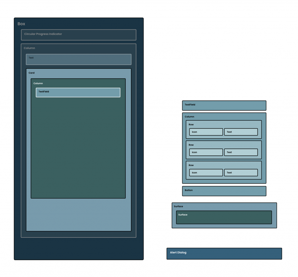
Now that we have the Card in place to hold our input form, we can now think about moving ahead with adding the first of our input fields – the Email Input. We’ll start here by creating a new composable, EmailInput.
// EmailInput.kt
@Composable
fun EmailInput(
	modifier: Modifier = Modifier
)
For the email input, we’re going to explore the use of the TextField composable, which we can add directly to our composable function.
@Composable
fun EmailInput(
	modifier: Modifier = Modifier
) {
	TextField(modifier = modifier)
}
You’ll notice at this point the IDE will give you a warning, that’s because the TextField requires two arguments for the function to be satisfied. These are the value (that represents the current value to be displayed in the textfield) and the value change handler (triggered when the input changes and used to update the composable state). We’ll need to satisfy these before we can continue, so let’s start by focusing on the required value argument.
Within our authentication state, we have an email address property, which represents the currently entered email address from the user. We’re going to need to use this piece of state for our email input field – so we’ll need to pass it into our EmailInput composable and assign it to the value argument of the Textfield.
@Composable
fun EmailInput(
	modifier: Modifier = Modifier,
    email: String?
) {
	TextField(
		modifier = modifier,
        value = email ?: ""
	)
}
When present, this will be shown as the current input value in our email address field and if this state changes, then the TextField value will be updated to reflect that change. However, we are not currently providing a way for our state to be changed – so this recomposition is never going to occur. To fix this, let’s implement an argument in the form of a lambda function that allows us to hoist the latest entered email up out of our composable function.
@Composable
fun EmailInput(
	modifier: Modifier = Modifier,
    email: String?,
    onEmailChanged: (email: String) -> Unit
)
We can then use this lambda to trigger the state hoisting, providing a function call within the onValueChange block.
@Composable
fun EmailInput(
	modifier: Modifier = Modifier,
    email: String?,
    onEmailChanged: (email: String) -> Unit
) {
	TextField(
		modifier = modifier,
        value = email ?: "",
		onValueChange = { email ->
            onEmailChanged(email)
        }
	)
}
This means that our email address will be passed up and out of our composable function, allowing us to update the state of our screen when it comes to implementing that part of the project.
At this point, we have an email input field that is being displayed inside of our composable function. It’s very minimal, but it’s enough to allow user input.
Adding a label to the email input field
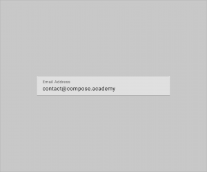
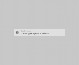
At the moment out input field looks a little blank, and it isn’t too clear what the input field is to be used for. To add some clarity here, we’re going to utilise the label argument to provide a composable that will act as a label. We’re going to want this to simply read “Email Address”, so we’ll need to add a new string resource to our project:
<string name="label_email">Email Address</string>We can then go ahead and compose a Text composable for the label of our TextField, passing this string resource as the content of that composable.
@Composable
fun EmailInput(
	modifier: Modifier = Modifier,
    email: String?,
    onEmailChanged: (email: String) -> Unit
) {
	TextField(
		modifier = modifier,
        value = email ?: "",
		onValueChange = { email ->
            onEmailChanged(email)
        },
		label = {
			Text(text = stringResource(
				id = R.string.label_email)
			)
		}
	)
}
With this in place, our TextField is now displaying a label that adds clarity for what the field is to be used for.
Enforcing the supported number of lines
If we have a little play with the input field, we might notice that if we provide an input that exceeds the length of the input field, the text will start to expand onto multiple lines.
We don’t want this as it’s not an expected behaviour for this kind of form. We can fix this by utilising the singleLine argument of the composable, allowing us to enforce all entered text to remain on a single line – the composable will allow horizontal navigation to move through an entered string when this is enabled.
@Composable
fun EmailInput(
	modifier: Modifier = Modifier,
    email: String?,
    onEmailChanged: (email: String) -> Unit
) {
	TextField(
		modifier = modifier,
        value = email ?: "",
		onValueChange = { email ->
            onEmailChanged(email)
        },
		label = {
			Text(text = stringResource(
				id = R.string.label_email)
			)
		},
		singleLine = true
	)
}
We can see now that with this being enforced, our TextField behaves in a much more expected way.
Adding some iconography
Our Email Input is feeling good at this point, but we’re going to add a small piece of visual decoration by utilising the leadingIcon. This argument allows us to provide a composable that will be displayed at the start of the input field. For this, we’re going to use an Icon composable to display an email icon – this won’t serve any real purpose other than being a visual decoration.
@Composable
fun EmailInput(
	modifier: Modifier = Modifier,
    email: String,
    onEmailChanged: (email: String) -> Unit
) {
    TextField(
		modifier = modifier,
        value = email,
        onValueChange = { email ->
            onEmailChanged(email)
        },
		label = {
			Text(text = stringResource(
				id = R.string.label_email)
			)
		},
		singleLine = true,
        leadingIcon = {
            Icon(
				imageVector = Icons.Default.Email,
				contentDescription = null
			)
        }
    )
}
Because this is just a visual decoration, we don’t need to provide a contentDescription for our Icon. The email input field also has a label that describes the purpose of the field, so we can rely on that for describing the component to the user. With this in place, we can now see an email icon is displayed at the start of the input field.
Composing the Email Input field
Now that our email input is complete, we can go ahead and compose it within our UI. Before we go ahead and compose it inside of our AuthenticationForm, we need to ensure there is access to both an email and onEmailChange reference that the composable can use. We’re going to be passing this from our state, so we’ll need to first add these as arguments to our AuthenticationForm composable.
// AuthenticationForm.kt
@Composable
fun AuthenticationForm(
	modifier: Modifier = Modifier,
	authenticationMode: AuthenticationMode,
	email: String,
    onEmailChanged: (email: String) -> Unit
)
Along with then passing this into our AuthenticationForm function at the point where it is being composed. For the email field we can pass the email address reference from within our screen state, while for the onEmailChange we’ll need to trigger an AuthenticationEvent by using our handleEvent lambda. When calling this, we’ll utilise the EmailChanged event type – instantiating a reference by providing the email address that is passed through the callback.
// AuthenticationContent.kt
@Composable
fun AuthenticationContent(
	modifier: Modifier = Modifier,
    authenticationState: AuthenticationState,
    handleEvent: (event: AuthenticationEvent) -> Unit
) {
	...

	AuthenticationForm(
		modifier = Modifier.fillMaxSize(),
		authenticationMode = authenticationState.authenticationMode,
		email = authenticationState.email,
    	onEmailChanged = { email ->
			handleEvent(
				AuthenticationEvent.EmailChanged(email))
		}
	)

	...
}
Hopping back over to our AuthenticationForm composable, we can then compose our EmailInput and pass in the required email and onEmailChanged references that are now accessible from the authentication form.
@Composable
fun AuthenticationForm(
	modifier: Modifier = Modifier,
    email: String?,
    authenticationMode: AuthenticationMode,
    onEmailChanged: (email: String) -> Unit
) {
    Column(
        modifier = modifier,
        horizontalAlignment = Alignment.CenterHorizontally
    ) {
        Spacer(modifier = Modifier.height(32.dp))
        AuthenticationTitle(
			authenticationMode = authenticationMode)

        Spacer(modifier = Modifier.height(40.dp))
        Card(
            modifier = Modifier
                .fillMaxWidth()
                .padding(horizontal = 32.dp),
            elevation = 4.dp
        ) {
            Column(
                modifier = Modifier.padding(16.dp),
                horizontalAlignment =
					Alignment.CenterHorizontally
            ) {
                EmailInput(
					modifier = Modifier.fillMaxWidth(),
					email = email ?: "",
					onEmailChanged = onEmailChanged
				)
            }
        }
    }
}
We’re going to make a small tweak here to customise how the EmailInput is composed within our UI. When creating the composable, we added support for an optional modifier. We’re going to utilise this argument so that we can force the email input field to fill the available width, which is the width of the parent Column. For this, we’ll utilise the fillMaxWidth modifier.
EmailInput(
	modifier = Modifier.fillMaxWidth(),
	email = email ?: "",
	onEmailChanged = onEmailChanged
)
With this in place, the email input field for our authentication form is now being composed within our UI – the content of this is then composed based on the current email that is within our state, which in turn is then updated via the use of our onEmailChanged lambda function.

Displaying the Password Input Field
Now that we have our email input field, we’re going to want to create a similar component, except this time for the entry of a password. A lot of this component is going to be the same as our previously created composable, so we’re going to start by duplicating what we have so far, adapting it for password entry.
@Composable
fun PasswordInput(
    modifier: Modifier = Modifier,
    password: String,
    onPasswordChanged: (email: String) -> Unit
) {
	TextField(
        modifier = modifier,
        value = password,
        onValueChange = {
            onPasswordChanged(it)
        },
		singleLine = true,
		label = {
			Text(text = stringResource(id = R.string.label_password)
			)
		}
        leadingIcon = {
            Icon(
				imageVector = Icons.Default.Lock,
				contentDescription = null
			)
        }
	)
}
We can see a couple of differences here:
- We pass some slightly different arguments into the composable. This time in the form of a
passwordandonPasswordChangedcallback. - We now call this
onPasswordChangedwhenever the password entry has changed - The
leadingIonfor our composable is utilising theLockicon
We are also using a slightly different label for our input field, which will need to be added to our strings.xml resource file before we can continue.
<string name="label_password">Password</string>At this point we’ll have a simple input field that can be used for our password:

Now that we have the similarities implemented, we can go ahead and think about the things that make our input field slightly different from the email input.
Toggling password visibility
One common thing in password input fields is the ability to toggle between visibilities of the entered password. We’re going to implement this for our PasswordInput composable, but to do so we’re going to need some form of state that allows our composable to know how the password field should be composed. We’ll need to add a piece of mutable state to our composable, isPasswordHidden. We’ll default this to false for security reasons, followed by wrapping this in remember so that the value is persisted across recompositions.
@Composable
fun PasswordInput(
    modifier: Modifier = Modifier,
    password: String?,
    onPasswordChanged: (email: String) -> Unit
) {

	var isPasswordHidden by remember {
        mutableStateOf(true)
    }

	TextField(
        modifier = modifier,
        value = password ?: "",
        onValueChange = {
            onPasswordChanged(it)
        },
		singleLine = true,
		label = {
			Text(text = stringResource(id = R.string.label_password)
			)
		}
        leadingIcon = {
            Icon(
				imageVector = Icons.Default.Lock,
				contentDescription = null
			)
        }
	)
}
💡 Not all pieces of our state need to be declared at a global level. This password visibility state is specific to this composable function, so coupling this here is something that makes sense for us to do.
With this state in place, we can now utilise this to compose our UI. The first thing we’re going to do is utilise the trailingIcon of the TextField composable. We’ll start by composing a new Icon, whose content will depend on the current state of isPasswordHidden When the password is being hidden we want to show an icon that indicates the visibility is disabled, while on the other hand, we want to indicate that the password is currently visible. For now, we’ll use a null contentDescription, as we’ll be implementing that piece of logic shortly.
Icon(
	imageVector = if (isPasswordHidden) {
		Icons.Default.Visibility
	} else Icons.Default.VisibilityOff,
	contentDescription = null
)
So that this icon is intractable by the user, we’re going to want to enable click events. Using the clickable modifier we can toggle the isPasswordHidden state so that when the icon is clicked, this state flag is flipped to the opposite value.
Icon(
	modifier = Modifier.clickable {
		isPasswordHidden = !isPasswordHidden
	},
	imageVector = if (isPasswordHidden) {
		Icons.Default.Visibility
	} else Icons.Default.VisibilityOff
)
This means that now when our Icon is clicked, the state flag will be flipped and our Icon will be recomposed to reflect this state change.

With this in place, we have a functioning icon that can be interacted with by the user. However, at this point are icon isn’t very accessible – the click event is in place has no form of description, meaning that accessibility services will not be aware of the purpose of this component. What we’ll do here is utilise the onClickLabel of the clickable modifier so that we can provide a description based on the current isPasswordHidden state. We’ll need to start here by adding two new string resources to our strings.xml resources:
<string name="cd_show_password">Show Password</string>
<string name="cd_hide_password">Hide Password</string>
With these in place, we can now apply a label to our click modifier. We’ll utilise the stringResource composable function here to provide a string resource based on the current value of our state.
Icon(
	modifier = Modifier.clickable(
		onClickLabel = if (isPasswordHidden) {
			stringResource(id =
				R.string.cd_show_password)
			} else stringResource(id =
				R.string.cd_hide_password)
		) {
			isPasswordHidden = !isPasswordHidden
		},
	imageVector = if (isPasswordHidden) {
		Icons.Default.Visibility
	} else Icons.Default.VisibilityOff,
		contentDescription = null
)
With this description applied, we now have a completed Icon composable that can be slotted into the trailingIcon block of our TextField.
@Composable
fun PasswordInput(
    modifier: Modifier = Modifier,
    password: String?,
    onPasswordChanged: (email: String) -> Unit
) {
    var isPasswordHidden by remember {
        mutableStateOf(true)
    }
    TextField(
        modifier = modifier,
        value = password ?: "",
        singleLine = true,
        onValueChange = {
            onPasswordChanged(it)
        },
        leadingIcon = {
            Icon(
				imageVector = Icons.Default.Lock,
				contentDescription = null
			)
        },
        trailingIcon = {
            Icon(
                modifier = Modifier.clickable(
                    onClickLabel = if (isPasswordHidden) {
                        stringResource(id =
							R.string.cd_show_password)
                    } else stringResource(id =
							R.string.cd_hide_password)
                ) {
                    isPasswordHidden = !isPasswordHidden
                },
                imageVector = if (isPasswordHidden) {
                    Icons.Default.Visibility
                } else Icons.Default.VisibilityOff,
                contentDescription = null
            )
        },
        label = {
			Text(text = stringResource(id = R.string.label_password))
		}
    )
}
While we’ve implemented the functionality to now toggle this state flag, it’s not being used yet to affect the visibility of the password field content. For these scenarios, the TextField contains a visualTransformation property that can be used to provide a class that can provide a transformation to the input content. Compose comes with a password transformation out of the box in the form of the PasswordVisualTransformation class, which can be provided for the visualTransformation property.
Here we’re going to want to provide the PasswordVisualTransformation when the password should be masked, and VisualTransformation.None otherwise.
visualTransformation = if (isPasswordHidden) {
	PasswordVisualTransformation()
} else VisualTransformation.None
We can then slot this into our TextField composable.
@Composable
fun PasswordInput(
    modifier: Modifier = Modifier,
    password: String?,
    onPasswordChanged: (email: String) -> Unit
) {
    var isPasswordHidden by remember {
        mutableStateOf(true)
    }
    TextField(
        modifier = modifier,
        value = password ?: "",
        singleLine = true,
        onValueChange = {
            onPasswordChanged(it)
        },
        leadingIcon = {
            Icon(
				imageVector = Icons.Default.Lock,
				contentDescription = null
			)
        },
        trailingIcon = {
            Icon(
                modifier = Modifier.clickable(
                    onClickLabel = if (isPasswordHidden) {
                        stringResource(id =
							R.string.cd_show_password)
                    } else stringResource(id =
							R.string.cd_hide_password)
                ) {
                    isPasswordHidden = !isPasswordHidden
                },
                imageVector = if (isPasswordHidden) {
                    Icons.Default.Visibility
                } else Icons.Default.VisibilityOff,
                contentDescription = null
            )
        },
        label = {
			Text(text = stringResource(id = R.string.label_password))
		}
    )
}
When toggling this, we will now be able to see the password content flipping from visible to masked.

Now that our password input is complete, we can go ahead and compose it within our UI. Before we go ahead and compose it inside of our AuthenticationForm, we need to ensure there is access to both a password and onPasswordChanged reference that the composable can use. We’re going to be passing this from our state, so we’ll need to first add these as arguments to our AuthenticationForm composable.
// AuthenticationForm.kt
@Composable
fun AuthenticationForm(
	modifier: Modifier = Modifier,
	authenticationMode: AuthenticationMode,
	email: String,
	password: String,
    onEmailChanged: (email: String) -> Unit,
	onPasswordChanged: (password: String) -> Unit
)
Along with then passing this into our AuthenticationForm function at the point where it is being composed. For the password we can pass the password reference from within our screen state, while for the onPasswordChanged we’ll need to trigger an AuthenticationEvent by using our handleEvent lambda. When calling this, we’ll utilise the PasswordChanged event type – instantiating a reference by providing the email address that is passed through the callback.
// AuthenticationContent.kt
@Composable
fun AuthenticationContent(
	modifier: Modifier = Modifier,
    authenticationState: AuthenticationState,
    handleEvent: (event: AuthenticationEvent) -> Unit
) {
	...

	AuthenticationForm(
		modifier = Modifier.fillMaxSize(),
		authenticationMode = authenticationState.authenticationMode,
		email = authenticationState.email,
		password = authenticationState.password,
    	onEmailChanged = {
			handleEvent(AuthenticationEvent.EmailChanged(it))
		},
		onPasswordChanged = {
       	 	handleEvent(
				AuthenticationEvent.PasswordChanged(it))
        }
	)

	...
}
Hopping back over to our AuthenticationForm composable, we can then compose our PasswordInput and pass in the required password and onPasswordChanged references that are now accessible from the authentication form. Here we’ll also add a Spacer composable so that there is some visual space between the email and password input fields.
@Composable
fun AuthenticationForm(
	modifier: Modifier = Modifier,
    authenticationMode: AuthenticationMode,
	email: String,
	password: String,
    onEmailChanged: (email: String) -> Unit,
	onPasswordChanged: (password: String) -> Unit
) {
    Column(
        modifier = modifier,
        horizontalAlignment = Alignment.CenterHorizontally
    ) {
        Spacer(modifier = Modifier.height(32.dp))
        AuthenticationTitle(
			authenticationMode = authenticationMode)

        Spacer(modifier = Modifier.height(40.dp))
        Card(
            modifier = Modifier
                .fillMaxWidth()
                .padding(horizontal = 32.dp),
            elevation = 4.dp
        ) {
            Column(
                modifier = Modifier.padding(16.dp),
                horizontalAlignment =
					Alignment.CenterHorizontally
            ) {
                EmailInput(
					modifier = Modifier.fillMaxWidth(),
					email = email ?: "",
					onEmailChanged = onEmailChanged
				)
				Spacer(modifier = Modifier.height(16.dp))
				PasswordInput(
                    password = password ?: "",
                    onPasswordChanged = onPasswordChanged
                )
            }
        }
    }
}
We’re going to make a small tweak here to customise how the PasswordInput is composed within our UI. When creating the composable, we added support for an optional modifier. We’re going to utilise this argument so that we can force the password input field to fill the available width, which is the width of the parent Column. For this, we’ll utilise the fillMaxWidth modifier.
PasswordInput(
	modifier = Modifier.fillMaxWidth(),
	password = password ?: "",
	onPasswordChanged = onPasswordChanged
)
With this in place, the password input field for our authentication form is now being composed within our UI – the content of this is then composed based on the current password that is within our state, which in turn is then updated via the use of our onPasswordChanged lambda function.
Handling Keyboard Actions
When interacting with multiple input fields, you can provide a good user experience by allowing the fields to be navigated through by using buttons that are provided on the keyboard. In Android development these have always been referred to as IME actions, something that we still have access to in Jetpack Compose under the name of Keyboard Options. In our authentication screen we’re going to want to utilise some of these options to allow:
- Customisation of the keyboard depending on the expected input content
- Navigation from the email address field to the password field
- Submission of the form when the password field is in focus
These options together will allow the user to navigate and submit the form, seamlessly completing the authentication flow without needing to specifically interact with the UI components via touch. To add these functionalities we’ll start by customising the options provided by the email address Text Field. For this, we’ll use the Keyboard options class to specify the keyboard type that is to be used for the email input field. This means that if supported, our keyboard will be laid out specifically for email input (showing the ‘@‘ symbol and clipboard options).
TextField(
  …,
  keyboardOptions = KeyboardOptions(
    keyboardType = KeyboardType.Email
  )
)
Once the input of the email address has been completed, the user is going to want to continue to the next input field for password entry. At this point we’re going to want to allow this to be done using the keyboard, so we’ll add an IME action to our keyboard options in the form of the Next action.
TextField(
  …,
  keyboardOptions = KeyboardOptions(
    imeAction = ImeAction.Next,
    keyboardType = KeyboardType.Email
  )
)
We’ll be able to see now that the previously shown ‘return’ icon has now been replaced with a ‘next’ icon.

With this now displayed within the keyboard, we’re going to want to add some form of handling so that the interaction with the IME action triggers an event for the user. For this, we’re going to utilise the keyboardActions property of our TextField composable, providing an instance of the KeyboardActions class to handle the required IME action. This class allows us to provide function handlers for any required keyboard actions, which in turn will be triggered when the corresponding imeAction is interacted with. When the onNext action is interacted with, we’re going to want to change the current focus on the screen – taking this from the currently focused email address text field, requesting focus on the password text field.
To implement this behaviour we’re going to need to utilise the FocusRequester class. This can be assigned to a composer via a modifier, and then used elsewhere to request the focus on the given composable. We’ll start here by defining a reference to a FocusRequester for our password text field.
AuthenticationTitle(
	modifier = Modifier.fillMaxWidth(),
	authenticationMode = authenticationMode
)
Spacer(modifier = Modifier.height(40.dp))
val passwordFocusRequester = FocusRequester()
Card(
	modifier = Modifier
    	.fillMaxWidth()
    	.padding(horizontal = 32.dp),
	elevation = 4.dp
) { ... }
With this defined, we’re now going to need to assign it to our password text field. This can be done using the focusRequester modifier, which allows for the FocusRequester reference to be used to request focus for the composable that it is assigned to.
TextField(
  …,
  modifier = modifier.focusRequester(passwordFocusRequester)
)
With this FocusRequester now in place we’re going to need to trigger the focus request, this is going to happen when the user interacts with the next IME action that we’ve enabled via the keyboard options. While we’ve provided this option, we haven’t provided any form of handler for it – this is done using the keyboardActions property of the TextField. This property takes a KeyboardActions instance, used to provide handlers for each of the available IME actions. In our case for the email address text field, we’re just going to provide an implementation for the onNext action.
TextField(
  …,
  keyboardActions = KeyboardActions(
    onNext = {

    }
  )
)
At this point though, we don’t have anything that we can trigger from within this onNext block. We could pass the focus requester reference into the EmailInput composable, but it’ll make for a cleaner (and more testable) composable if we pass this event up to the parent composable. For this, we’ll add a new argument-less lambda argument to our composable function.
@Composable
fun EmailInput(
    modifier: Modifier = Modifier,
    email: String?,
    onEmailChanged: (email: String) -> Unit,
    onNextClicked: () -> Unit
)
Within the onNext block of our KeyboardActions instance we’re going to trigger the onNextClicked lambda.
TextField(
  …,
  keyboardActions = KeyboardActions(
    onNext = {
      onNextClicked()
    }
  )
)
We’re now going to need to hop over to the parent composable and implement this required onNextClicked argument. Within this implementation, we’re then going to use our FocusRequester to trigger the resuestFocus() function.
EmailInput(
	modifier = Modifier.fillMaxWidth(),
	email = email,
	onEmailChanged = onEmailChanged
) {
	passwordFocusRequester.requestFocus()
}
When this function call is triggered, the focus will be requested for our password TextField, which is the composable that our FocusRequester is attached to. If the request is successful, this TextField will come into focus, allowing the user to move between the Email Address and Password text fields without needing to manually interact with either of the composables.
Supporting form submissions via IME actions
As well as using IME actions to navigate between input fields, there is a range of other events which can be handled. For example, we can also use them to submit forms that the user has entered data into – this is done in the form of the Done IME Action. This can be handled in a very similar way to the Next action that we just handled, instead of providing the ImeAction.Done action type to our KeyboardOptions – assigning this to our PasswordInput TextField.
TextField(
  …,
  keyboardOptions = KeyboardOptions(
    imeAction = ImeAction.Done
  )
)
We’ll be able to see now that the previously shown ‘return’ icon has now been replaced with a ‘done’ icon.

We then again need to provide a KeyboardActions implementation to our textfield, this time implementing the onDone handler. In most cases the password field will be visited after the email address field, meaning that the form will be complete and the user can move forward to authenticate their credentials.
TextField(
  …,
  keyboardActions = KeyboardActions(
    onDone = {

    }
  )
)
At this point though, we don’t have anything that we can trigger from within this onDone block. For this, we’ll add a new argument-less lambda argument to our composable function.
@Composable
fun PasswordInput(
    modifier: Modifier = Modifier,
    password: String,
    onPasswordChanged: (email: String) -> Unit,
    onDoneClicked: () -> Unit
)
With that in mind, within this handler, we’ll use our onDoneClicked() function to trigger the callback.
TextField(
  …,
  keyboardActions = KeyboardActions(
    onDone = {
		onDoneClicked()
      handleEvent(AuthenticationEvent.Authenticate)
    }
  )
)
We’re now going to need to hop up to the parent composable and implement this required onDoneClicked argument.
PasswordInput(
	modifier = Modifier.fillMaxWidth()
		.focusRequester(passwordFocusRequester),
	password = password,
	onPasswordChanged = onPasswordChanged,
	onDoneClicked = {

	}
)
Even though we’ve now implemented this callback, we want to trigger the authentication flow but we don’t have any way of triggering that yet. To be able to achieve this, we’ll need to add an argument to our AuthenticationForm composable – this is going to work in the same way as the email + password change handlers.
// AuthenticationForm.kt
@Composable
fun AuthenticationForm(
	modifier: Modifier = Modifier,
	authenticationMode: AuthenticationMode,
    email: String?,
    password: String?,
    onEmailChanged: (email: String) -> Unit,
    onPasswordChanged: (password: String) -> Unit,
	onAuthenticate: () -> Unit
)
We’ll then also need to hop up again into the AuthenticationContent composable so that we can satisfy this new required argument. At this point within the AuthenticationContent.kt file, we have access to the handleEvent function – we’re now going to utilise this to trigger the Authenticate event.
// AuthenticationContent.kt

AuthenticationForm(
	modifier = Modifier.fillMaxSize(),
	email = authenticationState.email,
	password = authenticationState.password,
	authenticationMode = authenticationState.authenticationMode,
	onEmailChanged = {
    	handleEvent(AuthenticationEvent.EmailChanged(it))
    },
	onPasswordChanged = {
    	handleEvent(AuthenticationEvent.PasswordChanged(it))
	},
	onAuthenticate = {
    	handleEvent(AuthenticationEvent.Authenticate)
	}
)
Hopping back down into the AuthenticationForm.kt file, we can now utilise the onAuthenticate function that is passed into our AuthenticationForm composable. Here we can directly pass this to our PasswordInput composable, this is because the function signatures match – so there’s no need for us to re-implement the callback.
PasswordInput(
	modifier = Modifier.fillMaxWidth()
		.focusRequester(passwordFocusRequester),
	password = password,
	onPasswordChanged = onPasswordChanged,
	onDoneClicked = onAuthenticate
)
Now, when the IME Action for the password field is pressed, the authentication flow will be triggered. One final thing we can do here for the password field is provide a keyboard type to our Keyboard Options instance. Similar to how we did for the Email Address text field, this will allow the keyboard to be customised based on the type of content that is being entered.
TextField(
  …,
  keyboardOptions = KeyboardOptions(
    imeAction = ImeAction.Done,
    keyboardType = KeyboardType.Password
  )
)
When compared the email input type that we defined for our email address text field, we can see here now that the keys available on the keyboard differ slightly, focusing on numbers and letters, removing the use of some special characters and clipboard options.
Password Requirements
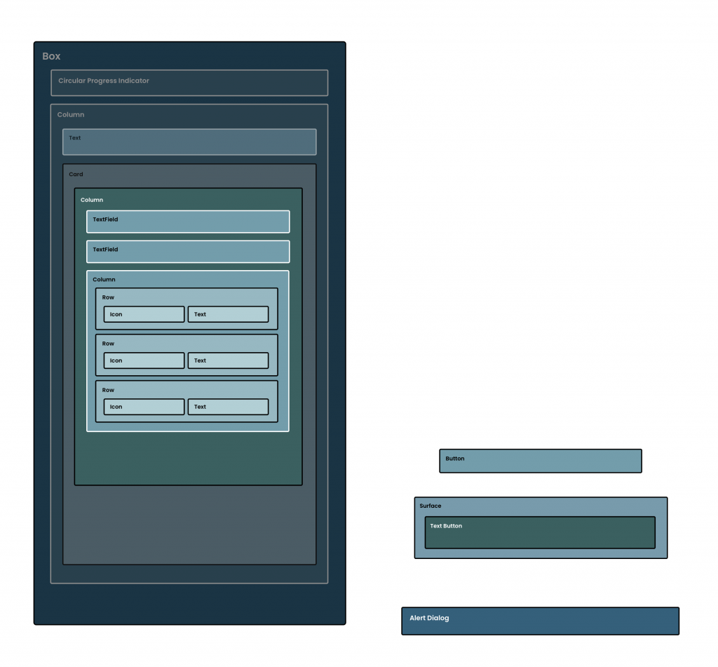
At this point, our user can enter their credentials into our authentication form. When we defined some of the business logic for our state, we defined an enum, PasswordRequirements. Within our state class, we also defined a list of these PasswordRequirements, allowing us to enforce certain requirements on the entered password. To recap, these requirements were:
enum class PasswordRequirements {
    CAPITAL_LETTER, NUMBER, EIGHT_CHARACTERS
}
This means that the password must contain a capital letter, a number and be at least 8 characters long. While we have these requirements defined, we need to let the user know about them – so we’re going to create a composable that displays the requirements during sign-up, marking the requirements visually as satisfied when they have been met.
Creating the Requirement Composable
We’re going to start here by looking at the composable that will be used to represent each of the requirements that we’ve stated in our enum.
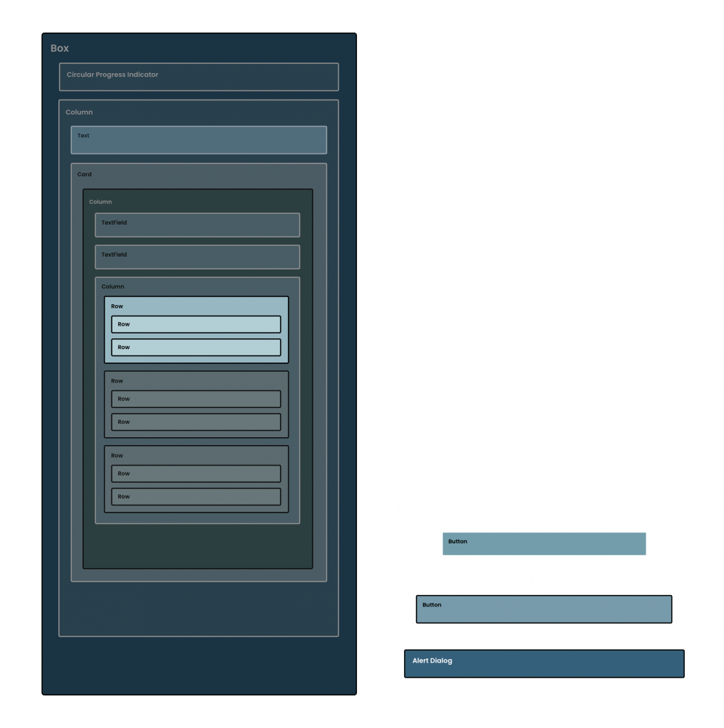
For this composable, we’re going to display a simple UI component that will display a label for the requirement, along with an icon that will indicate if this requirement has been satisfied. We’ll start by creating a new composable function that takes our default modifier as an argument.
@Composable
fun Requirement(
	modifier: Modifier = Modifier
)
We mentioned above about the two requirements for this composable function – the message to be displayed, along with whether the requirement is currently satisfied. We’ll add more two arguments – a string resource that will be used for the label of our requirement composable, along with a boolean flag to support the satisfied status.
@Composable
fun Requirement(
	modifier: Modifier = Modifier,
    message: String,
    satisfied: Boolean
)
With these arguments in place, we can start to build out the content of our composable. Here we’ll add a Row composable so that we can layout the children horizontally next to one another, along with adding some modifiers to customise the behaviour + display of content. We’ll chain from the modifier that is passed into the composable function, using the padding modifier to add some padding to our composable. We’ll also use the verticalAlignment argument to align the children in the vertical center – because we’re showing an icon with a text label to the side of it, we want these to be aligned on the Y axis which can be achieved via the use of Alignment.CenterVertically.
@Composable
fun Requirement(
    modifier: Modifier = Modifier,
    message: String,
    satisfied: Boolean
) {
    Row(
        modifier = modifier.padding(6.dp),
        verticalAlignment = Alignment.CenterVertically
    ) {

    }
}
We’ll now go ahead and add an Icon composable which will be used to show a Check icon using the Icons.Default.Check icon from the compose package. We’ll use the size modifier to fix this size to 12.dp, along with setting null as the content description. While we will be using this to signify the current status of the requirement, we’re going to focus on the accessibility of this component after the foundations are in place.
@Composable
fun Requirement(
    modifier: Modifier = Modifier,
    message: String,
    satisfied: Boolean
) {
    Row(
        modifier = Modifier.padding(6.dp),
        verticalAlignment = Alignment.CenterVertically
    ) {
        Icon(
            modifier = Modifier.size(12.dp),
            imageVector = Icons.Default.Check,
            contentDescription = null
        )
    }
}
💡 It’s important to remember that null should only be used in cases where a description is not applicable for the composable. This could be either because the composable is purely decorative, or because you are providing a description some other way – such as through the parent composable when merging semantics.
With our icon now in place, let’s add the label that will describe what the requirement is. For this, we’ll use the Text composable and assign the message from the composable function arguments.
@Composable
fun Requirement(
    modifier: Modifier = Modifier,
    message: String,
    satisfied: Boolean
) {
    Row(
        modifier = Modifier.padding(6.dp),
        verticalAlignment = Alignment.CenterVertically
    ) {
        Icon(
            modifier = Modifier.size(12.dp),
            imageVector = Icons.Default.Check,
            contentDescription = null
        )
        Text(
			text = message
		)
    }
}
Currently, we’ll have something that looks like this composed:

We can improve the appearance of this slightly by making two small tweaks. We’ll first add a Spacer composable between the Icon and Text to create some visual space (using the width modifier to set the width of this as 8dp). Next, we’ll override the default fontSize of the Text composable – the text size is currently quite big in the screenshot above, so we’ll use 12sp so that this feels a bit more in style with the icon.
@Composable
fun Requirement(
    modifier: Modifier = Modifier,
    message: String,
    satisfied: Boolean
) {
    Row(
        modifier = Modifier.padding(6.dp),
        verticalAlignment = Alignment.CenterVertically
    ) {
        Icon(
            modifier = Modifier.size(12.dp),
            imageVector = Icons.Default.Check,
            contentDescription = null
        )
        Spacer(modifier = Modifier.width(8.dp))
        Text(
			text = stringResource(id = message),
			fontSize = 12.sp
		)
    }
}
💡 When modifying the fontSize, it’s important to not make the font too small – it still needs to remain readable for users. It can be helpful in these cases to use the typography values from the theme to help prevent these issues from occurring.
We can see now, that things look a little bit better here.

Currently, we have this satisfied flag within our composable, but we’re not doing anything with it. We’re going to utilise this here to visually represent the status of the requirement – which we’ll do by using a color for the icon and text based on whether the requirement is satisfied. Here we’ll use the theme of our application to create a color reference.
val tint = if (satisfied) {
    MaterialTheme.colors.primary
} else MaterialTheme.colors.onSurface.copy(alpha = 0.4f)
We use the primary color in our satisfied scenario, as this will stand out to the user during the authentication process. For the case where the password does not meet the requirements, we copy the onSurface color from our theme, modifying the alpha value so that the color appears slightly faded out in our UI. Using this color reference, we can then apply this to the Icon using the tint argument, along with applying it to the label using the color argument on the Text composable.
@Composable
fun Requirement(
    modifier: Modifier = Modifier,
    message: String,
    satisfied: Boolean
) {
    val tint = if (satisfied) {
        MaterialTheme.colors.onSurface
    } else MaterialTheme.colors.onSurface.copy(alpha = 0.4f)
    Row(
        modifier = Modifier.padding(6.dp),
        verticalAlignment = Alignment.CenterVertically
    ) {
        Icon(
            modifier = Modifier.size(12.dp),
            imageVector = Icons.Default.Check,
            contentDescription = null,
            tint = tint
        )
        Spacer(modifier = Modifier.width(8.dp))
        Text(
			text = stringResource(id = message),
			fontSize = 12.sp,
			color = tint
		)
    }
}
With this in place, we now have a composable that will display a requirement, along with theming it to represent the current state of the satisfied flag.
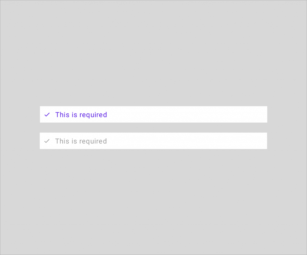
Improving the requirement accessibility
While we have the above composable function in place to compose a requirement, we can improve things here when it comes to the use of accessibility services. Currently, the label of the requirement will be read – but we are relying on a color representation to signify whether the requirement is satisfied or not. This isn’t very accessible, so we’ll apply some modifications to improve things here. What we’ll do is add a description to the requirement, so that when the accessibility service is describing the element, it can be described whether or not the requirement is currently satisfied.
We’ll start here by adding two new string resources to our strings.xml resource file.
<string name="password_requirement_satisfied">
	%s, satisfied
</string>
<string name="password_requirement_needed">
	%s, needed
</string>
We use %s as a placeholder for a string that we will be replacing it with, this will be the label for the requirement. This means that the accessibility services will describe this as “At least 8 characters, satisfied” or “At least 8 characters, needed”. Within our Requirement composable we can now build our description by accessing this resource via the use of the stringResource composable function.
@Composable
fun Requirement(
    modifier: Modifier = Modifier,
    message: String,
    satisfied: Boolean
) {
    val requirementStatus = if (satisfied) {
        stringResource(id =
			R.string.password_requirement_satisfied, message)
    } else {
        stringResource(id =
			R.string.password_requirement_not_satisfied, message)
    }
}
You’ll notice here that we pass the message argument from our composable function as an argument to the stringResource function. This is because we are using the %s placeholder, so any arguments that are provided here will be used as the replacement. With this in place, we can now go ahead and apply the semantics modifier to our Row composable. When doing this we’ll want to set the mergeDescendants flag as true (as we don’t need the child composables to be described individually), along with setting the text semantics as the requirementStatus that we generated above. This property requires the AnnotatedString type, so we’ll instantiate an instance by providing our requirementStatus.
Row(
	modifier = Modifier.padding(6.dp)
		.semantics(mergeDescendants = true) {
			text = AnnotatedString(requirementStatus)
		},
	verticalAlignment = Alignment.CenterVertically
)
Because we’re now setting the semantics for our Row and merging the content of the container, we can go ahead and clear the semantics on the child Text composable, using the clearAndSetSemantics modifier to do so. This will avoid any descriptions from being duplicated with the semantics tree.
Text(
	modifier = Modifier.clearAndSetSemantics { },
	text = message,
	fontSize = 12.sp,
	color = tint
)
With this in place, we now have an updated composable function that has improved accessibility support.
@Composable
fun Requirement(
    modifier: Modifier = Modifier,
    message: String,
    satisfied: Boolean
) {
    val tint = if (satisfied) {
    	MaterialTheme.colors.primary
	} else MaterialTheme.colors.onSurface.copy(alpha = 0.4f)
    val requirementStatus = if (satisfied) {
        stringResource(id =
			R.string.password_requirement_satisfied, message)
    } else {
        stringResource(id =
			R.string.password_requirement_not_satisfied, message)
    }
    Row(
        modifier = Modifier.padding(6.dp)
			.semantics(mergeDescendants = true) {
                text = AnnotatedString(requirementStatus)
            },
        verticalAlignment = Alignment.CenterVertically
    ) {
        Icon(
            modifier = Modifier.size(12.dp),
            imageVector = Icons.Default.Check,
            contentDescription = null,
            tint = tint
        )
        Spacer(modifier = Modifier.width(8.dp))
        Text(
			modifier = Modifier.clearAndSetSemantics { },
			text = message,
			fontSize = 12.sp,
			color = tint
		)
    }
}
Building the Requirement items
At this point, we now have a Requirement composable function, but we’re not building these within our UI. We’ll start here by defining a new composable function, PasswordRequirements, that takes a list of satisfied requirements – we have this value within our state, so this will simply be provided from there when the time comes to implementing that.
Within this function, we’ll also compose a Column, as we’re going to be showing a vertical list of the requirement composables.
@Composable
fun PasswordRequirements(
	modifier: Modifier = Modifier,
    satisfiedRequirements: List<PasswordRequirements>
) {
	Column(modifier = modifier) {

	}
}
Composing the requirements is a very minimal process. We previously defined the PasswordRequirements enum, with each value having a label property in the form of a string resource. That means that within this composable we can simply loop through the values of the PasswordRequirements enum, composing a Requirement using the current item in the loop. Here we’ll use the label property to retrieve a string that can be passed for the message argument of the Requirement, along with using the PasswordRequirements reference to check whether the requirement is currently satisfied.
@Composable
fun PasswordRequirements(
	modifier: Modifier = Modifier,
    satisfiedRequirements: List<PasswordRequirements>
) {
    Column(
		modifier = modifier
	) {
        PasswordRequirements.values().forEach { requirement ->
            Requirement(
                message = stringResource(
					id = requirement.label),
                satisfied = satisfiedRequirements.contains(
                    requirement
                )
            )
        }
    }
}
With this, we can now compose a collection of requirements and their current satisfied status.

Composing the Requirement items
With the PasswordRequirements composable now in place, we’re going to want to slot this into our UI. However, we’re only going to want to show this to the user when they are signing up – a user who has signed in will know their password and have a valid password, so this validation within the UI does not make too much sense. We could simply compose this based on our AuthenticationMode reference within our screen state, but instead, we’re going to utilise the AnimatedVisibility composable to animate our composable in and out, based on its visible flag. This means we could define, anAnimatedVisibility composable, setting the visible flag using an assertion against the AuthenticationMode.SIGN_UP value, and provide our PasswordRequirements composable as the content.
// AuthenticationForm.kt

AnimatedVisibility(
	visible = authenticationMode == AuthenticationMode.SIGN_UP
) {
	PasswordRequirements(...)
}
This would mean that when the current AuthenticationMode within our state is not equal to SIGN_UP, the PasswordRequirements would animated out of view – animating into view when that state is toggled by the user (something that we have not implemented yet!).
While the above would work, we need to compose it within our UI. For the AuthenticationForm composable function, we already have access to an AuthenticationMode reference – we’ll just need to add a new argument to the function in the form of List<PasswordRequirements>.
//AuthenticationForm.kt

@Composable
fun AuthenticationForm(
	modifier: Modifier = Modifier,
    authenticationMode: AuthenticationMode,
	email: String,
	password: String,
	completedPasswordRequirements: List<PasswordRequirements>,
    onEmailChanged: (email: String) -> Unit,
	onPasswordChanged: (password: String) -> Unit
)
We’ll then also need to hop over to our AuthenticationContent.kt file to modify the composition of our AuthenticationForm composable. We’ll need to pass a value for the completedPasswordRequirements – the state reference that we are using for the other arguments here has the current requirements within it, so we’ll simply need to pass that here.
// AuthenticationContent.kt

AuthenticationForm(
	modifier = Modifier.fillMaxSize(),
	email = authenticationState.email,
	password = authenticationState.password,
	completedPasswordRequirements = authenticationState.passwordRequirements,
    authenticationMode =
		authenticationState.authenticationMode,
    onEmailChanged = {
    	handleEvent(AuthenticationEvent.EmailChanged(it))
    },
	onPasswordChanged = {
   		handleEvent(AuthenticationEvent.PasswordChanged(it))
    }
)
Heading back over to our AuthenticationForm composable, we can now compose our AnimatedVisibility and PasswordRequirements composables. Here we’ll also add a Spacer composable so that there is some visual space between UI components.
// AuthenticationForm.kt

@Composable
fun AuthenticationForm(
	modifier: Modifier = Modifier,
    authenticationMode: AuthenticationMode,
	email: String,
	password: String,
	completedPasswordRequirements: List<PasswordRequirements>,
    onEmailChanged: (email: String) -> Unit,
	onPasswordChanged: (password: String) -> Unit
) {
	Column(
		modifier = modifier,
		horizontalAlignment = Alignment.CenterHorizontally
	) {
		EmailInput(
			modifier = Modifier.fillMaxWidth(),
			email = email,
			onEmailChanged = onEmailChanged
		) {
			passwordFocusRequester.requestFocus()
    	}
		Spacer(modifier = Modifier.height(16.dp))
		PasswordInput(
			modifier = Modifier.fillMaxWidth()
				.focusRequester(passwordFocusRequester),
            password = password,
            onPasswordChanged = onPasswordChanged,
            onSubmitForm = onAuthenticate
        )
        Spacer(modifier = Modifier.height(12.dp))

        AnimatedVisibility(
            visible = authenticationMode ==
            	AuthenticationMode.SIGN_UP
        ) {
        	PasswordRequirements(completedPasswordRequirements)
        }
}
With this in place, we now have our PasswordRequirements composed within our authentication UI. When signing up, entering a password will now modify the requirements UI to display the currently satisfied requirements.
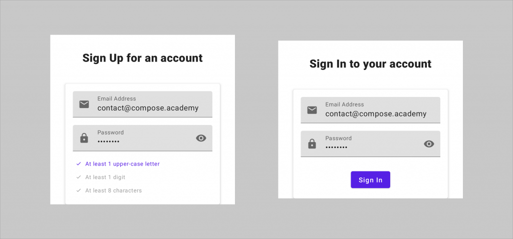
Triggering the Authentication flow
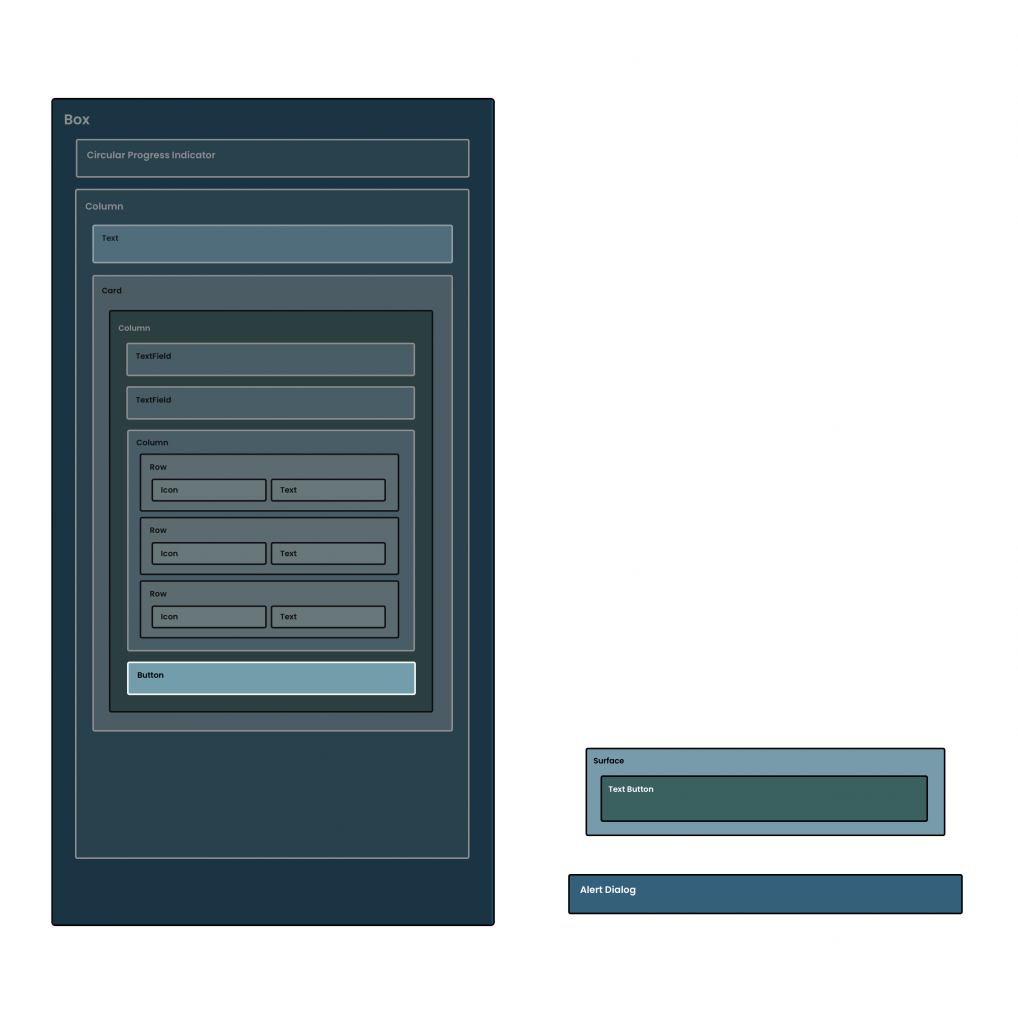
In our UI the user can now enter their email address and password, but they can’t yet trigger the authentication flow to allow them to proceed in our app. To make this possible, we’re now going to add a button that allows them to perform this authentication flow using the credentials that they have entered into the form. While this is possible using the IME action that we added in the last section, a button to trigger this flow would be expected by a lot of users. We’ll start here by creating a new composable function, AuthenticationButton with a default Modifier argument.
// AuthenticationButton.kt

@Composable
fun AuthenticationButton(
	modifier: Modifier = Modifier
)
Next, we’ll add a Button composable, this requires two of its properties to be provided – an onClick callback handler and a composable that represents the body of the Button.
@Composable
fun AuthenticationButton(
	modifier: Modifier = Modifier
) {
    Button(
        modifier = modifier
    ) {

    }
}
As it is, this Button isn’t too much use to us as it’s not showing or triggering anything. To change this we’ll add a composable for the body of the button, this will represent either a “Sign in” or “Sign up” message, depending on the current authenticationMode from our authentication state reference. We’ll need to start by adding a couple of string resources for the button text:
<string name="action_sign_up">Sign Up</string>
<string name="action_sign_in">Sign In</string>
So that we know what one of these strings to show within our button, the composable function is going to need to know what AuthenticationMode is currently selected. For this, we’re going to need to pass this into our composable function.
@Composable
fun AuthenticationButton(
	modifier: Modifier = Modifier,
    authenticationMode: AuthenticationMode
)
Next, we’ll use an if statement check to handle what the message should be depending on the state, then set this as the content of a Text composable within the body of our Button.
@Composable
fun AuthenticationButton(
	modifier: Modifier = Modifier,
    authenticationMode: AuthenticationMode
) {
    Button(
        modifier = modifier
    ) {
        Text(
            text = stringResource(
                if (authenticationMode ==
					AuthenticationMode.SIGN_IN) {
                    R.string.action_sign_in
                } else {
                    R.string.action_sign_up
                }
            )
        )
    }
}
With this Text in place, we’ll now be able to see a button on-screen whose body represents the current authentication mode that is set within our state.

At this point, we can now think about handling the onClick trigger from our Button. What we want to do here is trigger an event that will start the authentication flow – similar to how else we have handled events in this project, we’re going to allow the parent composable to handle this event for us. With this in mind, we’ll add a lambda function argument to our composable function, onAuthenticate. We’ll then want to trigger this lambda within the onClick argument of our Button composable.
@Composable
fun AuthenticationButton(
	modifier: Modifier = Modifier,
    authenticationMode: AuthenticationMode,
    onAuthenticate: () -> Unit
) {
    Button(
        modifier = modifier,
		onClick = {
            onAuthenticate()
        }
    ) {
        Text(
            text = stringResource(
                if (authenticationMode ==
					AuthenticationMode.SIGN_IN) {
                    R.string.action_sign_in
                } else {
                    R.string.action_sign_up
                }
            )
        )
    }
}
Now when our Button is pressed, the authentication flow will be triggered and the credentials from our TextFields will be used during this process. However, these fields might not always contain valid data – we have an enableAuthentication property within our authentication state reference. While this only checks if both the email address and password are not empty, this helps to avoid the flow being triggered when data might not have been entered yet. We can handle this via the Button by disabling the button from being interacted with when the form content is not valid. For this we’ll use the enabled property of the Button, assigning theenableAuthentication value to it.
@Composable
fun AuthenticationButton(
	modifier: Modifier = Modifier,
    authenticationMode: AuthenticationMode,
	enableAuthentication: Boolean,
    onAuthenticate: () -> Unit
) {
    Button(
        modifier = modifier,
        onClick = {
            onAuthenticate()
        },
        enabled = enableAuthentication
    ) {
        Text(
            text = stringResource(
                if (authenticationMode ==
					AuthenticationMode.SIGN_IN) {
                    R.string.action_sign_in
                } else {
                    R.string.action_sign_up
                }
            )
        )
    }
}
Now that our button composable is implemented, we can go ahead and compose it within our AuthenticationForm composable. We’ll need to start by adding a new argument to our AuthenticationForm composable, this will be enableAuthentication in the form of a Boolean value.
@Composable
fun AuthenticationForm(
	modifier: Modifier = Modifier,
    authenticationMode: AuthenticationMode,
	email: String,
	password: String,
	completedPasswordRequirements: List<PasswordRequirements>,
	enableAuthentication: Boolean,
    onEmailChanged: (email: String) -> Unit,
	onPasswordChanged: (password: String) -> Unit
)
We’ll then also need to hop over to our AuthenticationContent.kt file to modify the composition of our AuthenticationForm composable. We’ll need to pass a value for the enableAuthentication – our state reference that we are using for the other arguments here has the current enabled state within it, so we’ll simply need to pass that here.
// AuthenticationContent.kt

AuthenticationForm(
	modifier = Modifier.fillMaxSize(),
	email = authenticationState.email,
	password = authenticationState.password,
	completedPasswordRequirements = authenticationState.passwordRequirements,
    authenticationMode =
		authenticationState.authenticationMode,
	enableAuthentication = authenticationState.isFormValid(),
    onEmailChanged = {
    	handleEvent(AuthenticationEvent.EmailChanged(it))
    },
	onPasswordChanged = {
   		handleEvent(AuthenticationEvent.PasswordChanged(it))
    },
	onAuthenticate = {
        handleEvent(AuthenticationEvent.Authenticate)
    }
)
Heading back over to our AuthenticationForm composable, we can now compose our AuthenticationButton. Here we’ll also add a Spacer composable so that there is some visual space between UI components.
// AuthenticationForm.kt

@Composable
fun AuthenticationForm(
	modifier: Modifier = Modifier,
    authenticationMode: AuthenticationMode,
	email: String,
	password: String,
	completedPasswordRequirements: List<PasswordRequirements>,
    onEmailChanged: (email: String) -> Unit,
	onPasswordChanged: (password: String) -> Unit
) {
	Column(
		modifier = modifier,
		horizontalAlignment = Alignment.CenterHorizontally
	) {
		EmailInput(
			modifier = Modifier.fillMaxWidth(),
			email = email,
			onEmailChanged = onEmailChanged
		) {
			passwordFocusRequester.requestFocus()
    	}
		Spacer(modifier = Modifier.height(16.dp))
		PasswordInput(
			modifier = Modifier.fillMaxWidth()
				.focusRequester(passwordFocusRequester),
            password = password,
            onPasswordChanged = onPasswordChanged,
            onSubmitForm = onAuthenticate
        )
        Spacer(modifier = Modifier.height(12.dp))

        AnimatedVisibility(
            visible = authenticationMode ==
            	AuthenticationMode.SIGN_UP
        ) {
        	PasswordRequirements(completedPasswordRequirements)
        }

		Spacer(modifier = Modifier.height(12.dp))

        AuthenticationButton(
        	enableAuthentication = enableAuthentication,
            authenticationMode = authenticationMode,
            onAuthenticate = onAuthenticate
        )
	}
}
With this in place, our AuthenticationButton is now being composed inside of our authentication form – this now allows the user to trigger the authentication flow.
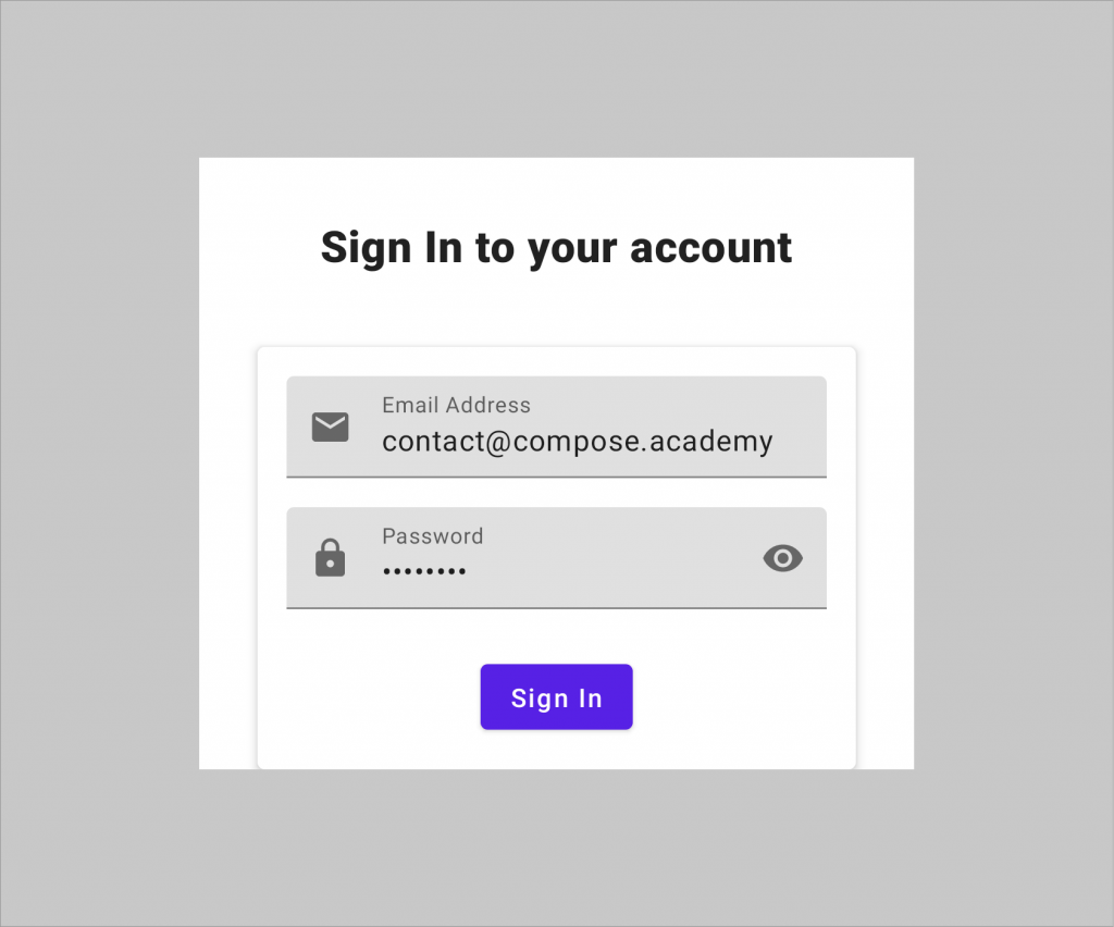
Toggling the Authentication mode
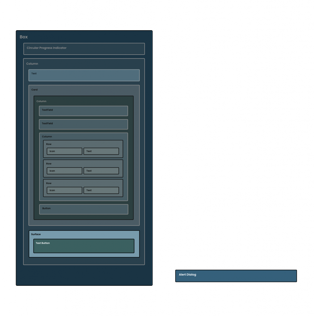
With all of the above in place, our user can perform authentication using the provided fields. However, the UI only currently supports the default authentication type – which is currently configured to be sign in. This means that if the user does not currently have an account, they won’t be able to create one using our authentication form. In this section we’re going to go ahead and define a Button that allows the user to toggle between sign up and sign in, recomposing our authentication form to reflect the current mode. We’ll start here by creating a new composable function, ToggleAuthenticationMode with a default Modifier argument.
@Composable
fun ToggleAuthenticationMode(
	modifier: Modifier = Modifier
)
With this composable function in place, we can build out the content required to display our toggle button. We’re going to start by defining the use of a Surface, which act as the container for our toggle composable. The Surface composable will compose the provided body inside of a Box composable. It will also theme itself use the surface color from the application theme, which is what we want to be applied to our settings item in terms of styling. This saves us from using a Box composable and applying a collection of styling ourselves when this component already exists to do it for us. When composing this, we’ll apply the modifier from the argument of our composable function, along with overriding the default elevation of the service with the value of 8dp.
@Composable
fun ToggleAuthenticationMode(
	modifier: Modifier = Modifier
) {
    Surface(
        modifier = modifier,
        elevation = 8.dp
    ) {

    }
}
Next, we’re going to add a button to our Surface, and for this, we will use the TextButton composable. This is a composable offered by the compose material package which allows us to compose a flat button that displays some composable content for its body. When composing a TextButton we will need to provide an onClick handler and some content body to be displayed within the composable button
@Composable
fun ToggleAuthenticationMode(
	modifier: Modifier = Modifier
) {
    Surface(
        modifier = modifier
            .padding(top = 16.dp),
        elevation = 8.dp
    ) {
        TextButton(
            onClick = {

            }
		) {

        }
    }
}
Now that we have the composable defined, we need to go ahead and populate these properties of the composable. Before we add this composable, we’ll go ahead and add some additional resources to be used for the body of the composables.
<string name="action_need_account">
	Need an account?
</string>
<string name="action_already_have_account">
	Already have an account?
</string>
Next, we’ll use the content property of the TextButton so that we can see some form of visual result on our screen. Now we can add a Text composable to the body of our TextButton, this will display the content of a string resource, depending on the current authentication mode represented by our state. Before we can do this though, we’ll need to know the AuthenticationMode which should be used when composing this composable. We’ll add this as an argument for our composable function so that it can be passed in from the parent.
@Composable
fun ToggleAuthenticationMode(
	modifier: Modifier = Modifier,
    authenticationMode: AuthenticationMode
)
With this in place, we can now utilise this to compose the button content. Inside of our button, we’re going to compose a Text composable, setting the content based on the provided AuthenticationMode.
@Composable
fun ToggleAuthenticationMode(
	modifier: Modifier = Modifier,
    authenticationMode: AuthenticationMode
) {
    Surface(
        modifier = modifier
            .padding(top = 16.dp),
        elevation = 8.dp
    ) {
        TextButton(
            onClick = {

            }
		) {
            Text(
                text = stringResource(
                    if (authenticationMode ==
						AuthenticationMode.SIGN_IN) {
                        R.string.action_need_account
                    } else {
                        R.string.action_already_have_account
                    }
                )
            )
        }
    }
}
Finally, we use need to handle the onClick callback for our TextButton. When the button is clicked we want to trigger an event that will change the authentication mode for the state of our screen. – this will be an event in the form of ToggleAuthenticationMode, which we created in an earlier section. Again we’ll want to pass this event up to the parent, so we’ll need to add a new lambda argument to our composable function.
@Composable
fun ToggleAuthenticationMode(
	modifier: Modifier = Modifier,
    authenticationMode: AuthenticationMode,
	toggleAuthentication: () -> Unit
)
When this event is triggered, our ViewModel will flip the value of our authentication mode, allowing us to switch between the sign in and sign up state. So this will occur, we’ll go ahead and trigger this within the onClick handler for our TextButton composable.
@Composable
fun ToggleAuthenticationMode(
	modifier: Modifier = Modifier,
    authenticationMode: AuthenticationMode,
    toggleAuthentication: () -> Unit
) {
    Surface(
        modifier = modifier
            .padding(top = 16.dp),
        elevation = 8.dp
    ) {
        TextButton(
            modifier = Modifier
                .background(MaterialTheme.colors.surface)
                .padding(8.dp),
            onClick = {
                toggleAuthentication()
            }
		) {
            Text(
                text = stringResource(
                    if (authenticationMode ==
						AuthenticationMode.SIGN_IN) {
                        R.string.action_need_account
                    } else {
                        R.string.action_already_have_account
                    }
                )
            )
        }
    }
}
Within our UI, this toggle button was pushed right to the bottom of the screen – this isn’t something that can be configured within the properties of the parent Column container.
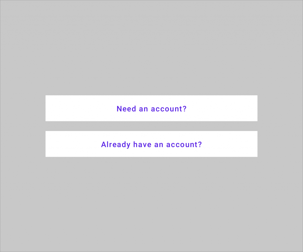
Composing the Toggle Button
Now that our button is implemented, we can go ahead and compose it within our AuthenticationForm composable. We’ll need to start by adding a new argument to our AuthenticationForm composable, this will be onToggleMode in the form of a lambda function.
@Composable
fun AuthenticationForm(
	modifier: Modifier = Modifier,
    authenticationMode: AuthenticationMode,
	email: String,
	password: String,
	completedPasswordRequirements: List<PasswordRequirements>,
	enableAuthentication: Boolean,
    onEmailChanged: (email: String) -> Unit,
	onPasswordChanged: (password: String) -> Unit,
	onToggleMode: () -> Unit
)
We’ll then also need to hop over to our AuthenticationContent.kt file to modify the composition of our AuthenticationForm composable. We’ll need to pass an argument for the onToggleMode – for this, we’ll implement a lambda function that will be used to trigger handleEvent. For this call, we’re going to need to pass an AuthenticationEvent, which we’ll do so in the form of the ToggleAuthenticationMode type. When this is triggered and handled by our ViewModel, the current AuthenticationMode will be toggled to the opposite value and emitted to our UI.
// AuthenticationContent.kt

AuthenticationForm(
	modifier = Modifier.fillMaxSize(),
	email = authenticationState.email,
	password = authenticationState.password,
	completedPasswordRequirements = authenticationState.passwordRequirements,
    authenticationMode =
		authenticationState.authenticationMode,
	enableAuthentication = authenticationState.isFormValid(),
    onEmailChanged = {
    	handleEvent(AuthenticationEvent.EmailChanged(it))
    },
	onPasswordChanged = {
   		handleEvent(AuthenticationEvent.PasswordChanged(it))
    },
	onAuthenticate = {
        handleEvent(AuthenticationEvent.Authenticate)
    },
	onToggleMode = {
        handleEvent(
			AuthenticationEvent.ToggleAuthenticationMode)
	}
)
Heading back over to our AuthenticationForm composable, we can now compose our AuthenticationButton using the existing authenticationMode reference, along with the now provided onToggleMode lambda function.
// AuthenticationForm.kt

@Composable
fun AuthenticationForm(
	modifier: Modifier = Modifier,
    authenticationMode: AuthenticationMode,
	email: String,
	password: String,
	completedPasswordRequirements: List<PasswordRequirements>,
    onEmailChanged: (email: String) -> Unit,
	onPasswordChanged: (password: String) -> Unit,
	onToggleMode: () -> Unit
) {
	Column(
		modifier = modifier,
		horizontalAlignment = Alignment.CenterHorizontally
	) {
		EmailInput(
			modifier = Modifier.fillMaxWidth(),
			email = email,
			onEmailChanged = onEmailChanged
		) {
			passwordFocusRequester.requestFocus()
    	}
		Spacer(modifier = Modifier.height(16.dp))
		PasswordInput(
			modifier = Modifier.fillMaxWidth()
				.focusRequester(passwordFocusRequester),
            password = password,
            onPasswordChanged = onPasswordChanged,
            onSubmitForm = onAuthenticate
        )
        Spacer(modifier = Modifier.height(12.dp))

        AnimatedVisibility(
            visible = authenticationMode ==
            	AuthenticationMode.SIGN_UP
        ) {
        	PasswordRequirements(completedPasswordRequirements)
        }

		Spacer(modifier = Modifier.height(12.dp))

        AuthenticationButton(
        	enableAuthentication = enableAuthentication,
            authenticationMode = authenticationMode,
            onAuthenticate = onAuthenticate
        )

        ToggleAuthenticationMode(
            modifier = Modifier.fillMaxWidth(),
            authenticationMode = authenticationMode,
            toggleAuthentication = {
                onToggleMode()
            }
        )
	}
}
We’ll notice here now that our ToggleAuthenticationMode composable is pressed against the bottom of our AuthenticationButton composable.
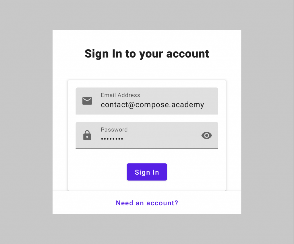
As per the design, we want the ToggleAuthenticationMode to be pushed against the bottom of the parent composable. Between these buttons we essentially want a large amount of white space – this white spice needs to fill the available space between these two buttons, which in effect will push our toggle button to the bottom of our UI. For this, we’re still going to use the Spacer composable for creating space between these two composables, with the addition of the weight modifier.
Spacer(modifier = Modifier.weight(1f))Applying a weight of 1f to this Spacer will cause it to take up all of the available height to it within the Column – which in this case will be all of the space between the Authenticate and toggle buttons. We are not applying any weighting to any other composables so that the remaining weight here does not need to be distributed between multiple composables. If we were to assign some weighting to one of those buttons also, we would see a different result as the weight would become distributed. But because we are only assigning weight here to the Spacer composable, it takes the available space for itself.
// AuthenticationForm.kt

@Composable
fun AuthenticationForm(
	modifier: Modifier = Modifier,
    authenticationMode: AuthenticationMode,
	email: String,
	password: String,
	completedPasswordRequirements: List<PasswordRequirements>,
    onEmailChanged: (email: String) -> Unit,
	onPasswordChanged: (password: String) -> Unit,
	onToggleMode: () -> Unit
) {
	Column(
		modifier = modifier,
		horizontalAlignment = Alignment.CenterHorizontally
	) {
		EmailInput(
			modifier = Modifier.fillMaxWidth(),
			email = email,
			onEmailChanged = onEmailChanged
		) {
			passwordFocusRequester.requestFocus()
    	}
		Spacer(modifier = Modifier.height(16.dp))
		PasswordInput(
			modifier = Modifier.fillMaxWidth()
				.focusRequester(passwordFocusRequester),
            password = password,
            onPasswordChanged = onPasswordChanged,
            onSubmitForm = onAuthenticate
        )
        Spacer(modifier = Modifier.height(12.dp))

        AnimatedVisibility(
            visible = authenticationMode ==
            	AuthenticationMode.SIGN_UP
        ) {
        	PasswordRequirements(completedPasswordRequirements)
        }

		Spacer(modifier = Modifier.height(12.dp))

        AuthenticationButton(
        	enableAuthentication = enableAuthentication,
            authenticationMode = authenticationMode,
            onAuthenticate = onAuthenticate
        )

		Spacer(modifier = Modifier.weight(1f))

        ToggleAuthenticationMode(
            modifier = Modifier.fillMaxWidth(),
            authenticationMode = authenticationMode,
            toggleAuthentication = {
                onToggleMode()
            }
        )
	}
}
With this change, we can now see the toggle button is pushed to the bottom of the parent composable, via the usage of the Spacer composable with its assigned weight.
With these composables now added, our authentication form is functionally complete – offering a way for users to both sign up and sign in to our application.
Displaying Authentication Errors
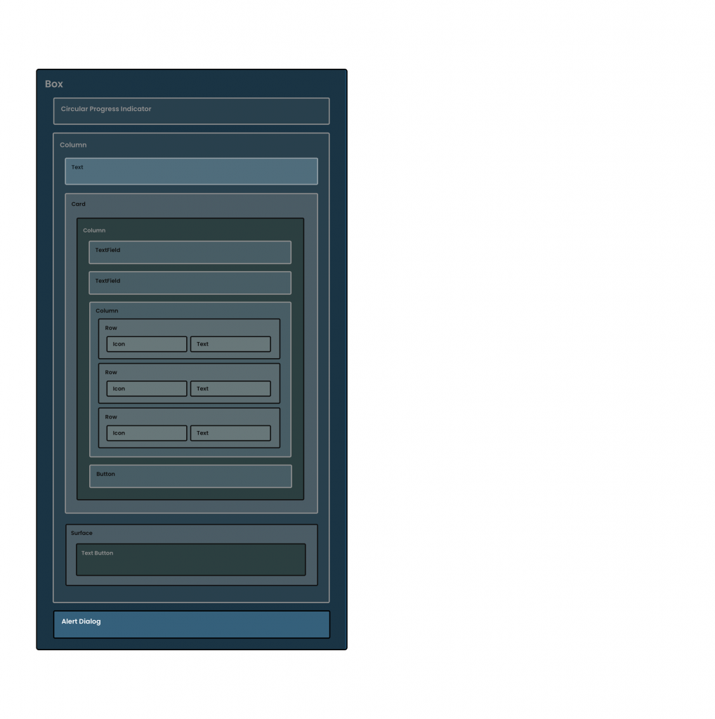
With everything we’ve done previously in this section, the user can enter some credentials and perform either a sign-in or sign-up operation. While this operation can succeed and allow the user to continue into our application, sometimes that request may fail. In these cases, we’ll want to reflect this state to the user so they know something has gone wrong. Our authentication state has an error property within it, so we’ll be able to use this property to display an alert dialog to the user.
Within our AuthenticationState class there is an error property, which is used to depict that an error has occurred during the authentication process. While this error might be set during the authentication flow, we’re not currently utilising this within our UI to communicate this to the user. To handle this scenario, we’re going to create a new composable, AuthenticationErrorDialog, which is going to take this error value and compose it within our UI.
// AuthenticationErrorDialog.kt

@Composable
fun AuthenticationErrorDialog(
	modifier: Modifier = Modifier,
    error: String
)
Within this composable function, we’re then going to compose an AlertDialog. There are two AlertDialog composable functions available, we’re going to use the one with the following set of arguments.
@Composable
fun AuthenticationErrorDialog(
	modifier: Modifier = Modifier,
    error: String,
    dismissError: () -> Unit
) {
    AlertDialog(
        modifier = modifier,
        onDismissRequest = {

        },
        confirmButton = {

        },
        title = {

        },
        text = {

        }
    )
}
As we can see here, there are a collection of arguments that we need to provide to the composable function:
- modifier: this is optional, but allows us to provide constraints to be applied to the composable
- onDismissRequest: triggered when the dialog is requested to be dismissed, which we’ll need to use to trigger an update to our state so that the dialog is not composed
- confirmButton: a composable that represents the button used to confirm the request of the dialog, with the intention to dismiss it
- title: the composable to be used as the title of the dialog
- text: the composable to be used for the content body of the dialog
With that in mind, let’s start building out the composables for each of these arguments. We’ll start with the title, which we’ll need to start by adding a new string to our strings.xml resource file.
<string name="error_title">Whoops</string>Then using the stringResource composable function, we’ll compose a Text composable providing this string for the text argument. Because we’re working with a title here, we’ll override the default fontSize of the composable and assign a value of 18sp – this is so that is styled larger than the message of the dialog.
// AuthenticationErrorDialog.kt

@Composable
fun AuthenticationErrorDialog(
	modifier: Modifier = Modifier,
    error: String
) {
    AlertDialog(
        modifier = modifier,
        onDismissRequest = {

        },
        confirmButton = {

        },
        title = {
            Text(
                text = stringResource(
					id = R.string.error_title),
                fontSize = 18.sp
            )
        },
        text = {

        }
    )
}
At this point, we can see this text being used for the title of our dialog.

Next, we’ll use another Text composable, but this time for the text argument of the AlertDialog composable. Here we will simply provide the error that is passed to our composable function for the text argument of the composable.
// AuthenticationErrorDialog.kt

@Composable
fun AuthenticationErrorDialog(
	modifier: Modifier = Modifier,
    error: String
) {
    AlertDialog(
        modifier = modifier,
        onDismissRequest = {

        },
        confirmButton = {

        },
        title = {
            Text(
                text = stringResource(
					id = R.string.error_title),
                fontSize = 18.sp
            )
        },
        text = {
            Text(
                text = error
            )
        }
    )
}
With this in place, we can now see the title of our AlertDialog being accompanied by our error message.

Next, we need to compose the button that will be used to dismiss the AlertDialog – this will be provided using the button argument of our composable. We’ll first start by composing a TextButton to be used for this action. This allows us to compose a flat button that is visually represented as some text. The difference with this, when compared to a Text composable, is that the TextButton has the expected touch target sizing of an intractable component, making it accessible to all of our users.
There are two required arguments for the TextButton – the onClick callback and the content, which is used to provide the composable body of our button.
TextButton(
	onClick = {

	}
) {

}
We’ll start by composing the body of our button, for which we’ll need to add a new resource to our strings.xml file.
<string name="error_action">OK</string>We can then use this to compose a Text composable for the content of our button.
TextButton(
	onClick = {

	}
) {
	Text(text = stringResource(id = R.string.error_action))
}
Next up we’ll need to add some action to our onClick callback. When our button is clicked we’re simply going to want to dismiss the dialog, so we’ll need to communicate this action back up to the parent so that our state can be updated and in turn, the dialog will no longer be composed. For this, we’ll need to add a new lambda argument to our composable function.
@Composable
fun AuthenticationErrorDialog(
	modifier: Modifier = Modifier,
    error: String,
	dismissError: () -> Unit
)
With this lambda in place, we can now trigger this from within the onClick of our TextButton composable.
// AuthenticationErrorDialog.kt

@Composable
fun AuthenticationErrorDialog(
	modifier: Modifier = Modifier,
    error: String,
	dismissError: () -> Unit
) {
    AlertDialog(
        modifier = modifier,
        onDismissRequest = {

        },
        confirmButton = {
			TextButton(
				onClick = {
					dismissError()
				}
			) {
				Text(text = stringResource(
					id = R.string.error_action))
			}
        },
        title = {
            Text(
                text = stringResource(
					id = R.string.error_title),
                fontSize = 18.sp
            )
        },
        text = {
            Text(
                text = error
            )
        }
    )
}
At this point, we’ll now have a visually complete error dialog that displays the title, message and actions to the user.

The last thing to do here is to add some implementation to the onDismissRequest lambda body of the AlertDialog. In the previous step, we added the dismissError argument to our composable function, so we’ll now want to trigger this within the onDismissRequest lambda.
// AuthenticationErrorDialog.kt

@Composable
fun AuthenticationErrorDialog(
	modifier: Modifier = Modifier,
    error: String,
	dismissError: () -> Unit
) {
    AlertDialog(
        modifier = modifier,
        onDismissRequest = {
            dismissError()
        },
        buttons = {
            Box(
                modifier = Modifier
                    .fillMaxWidth(),
                contentAlignment = Alignment.CenterEnd
            ) {
                TextButton(
                    onClick = {
                        dismissError()
                    }
                ) {
                    Text(text = stringResource(
						id = R.string.error_action))
                }
            }
        },
        title = {
            Text(
                text = stringResource(
					id = R.string.error_title),
                fontSize = 18.sp
            )
        },
        text = {
            Text(
                text = error
            )
        }
    )
}
With the composable in place, we’ll now want to compose this within our UI. One thing to note here is that we want to conditionally compose this, so it will only be composed when there is an error present within our state. When performing composition, we can wrap the composition of the AuthenticationErrorDialog within a kotlin let block, allowing us to assert the nullability of the error property. This way the block will only be run if error is not null, so our composable will only ever be composed if it should be.
// AuthenticationContent.kt

authenticationState.error?.let { error ->
	AuthenticationErrorDialog(
		...
	)
}
We can slot this into our AuthenticationContent composable, providing the error from our authentication state for the error argument, along with implementing the dismissError lambda. Within this lambda we’ll want to utilise the handleEvent lambda that is provided to our composable function, using the ErrorDismissed AuthenticationError to trigger our state being updated and removing the error (and in turn, the alert dialog will no longer be composed).
// AuthenticationContent.kt

@Composable
fun AuthenticationContent(
	modifier: Modifier = Modifier,
    authenticationState: AuthenticationState,
    handleEvent: (event: AuthenticationEvent) -> Unit
) {
    Box(
        modifier = modifier,
        contentAlignment = Alignment.Center
    ) {
        if (authenticationState.isLoading) {
            CircularProgressIndicator()
        } else {
            AuthenticationForm(
				modifier = Modifier.fillMaxSize(),
                email = authenticationState.email,
                password = authenticationState.password,
                completedPasswordRequirements =
					authenticationState.passwordRequirements,
                authenticationMode =
					authenticationState.authenticationMode,
                enableAuthentication =
					authenticationState.isFormValid(),
                onEmailChanged = {
            		handleEvent(
						AuthenticationEvent.EmailChanged(it))
                },
                onPasswordChanged = {
                    handleEvent(
						AuthenticationEvent
							.PasswordChanged(it))
                },
                onAuthenticate = {
                    handleEvent(
						AuthenticationEvent.Authenticate)
                },
                onToggleMode = {
                    handleEvent(AuthenticationEvent
						.ToggleAuthenticationMode)
                }
            )
			authenticationState.error?.let { error ->
                AuthenticationErrorDialog(
                    error = error,
                    dismissError = {
                        handleEvent(
							AuthenticationEvent.ErrorDismissed)
                    }
                )
            }
		}
    }
}
At this point we now have an AlertDialog that will be composed within our UI whenever the state represents an error state, allowing us to communicate any authentication errors to the user.
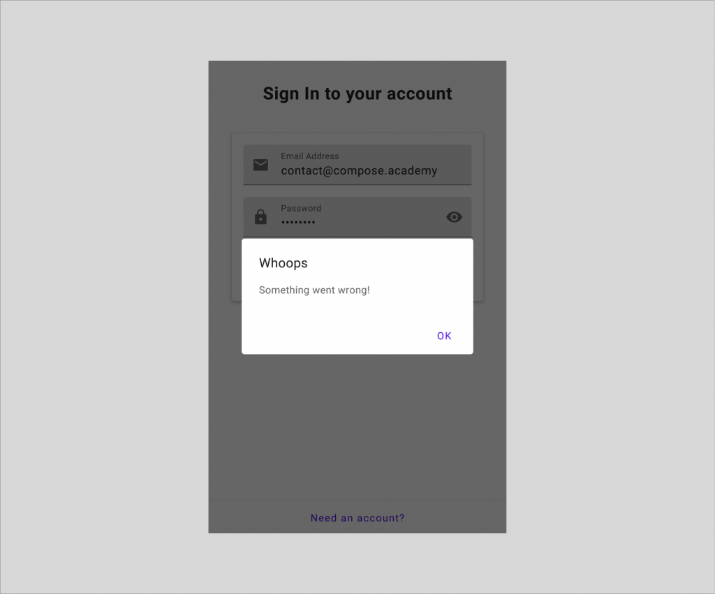
Wrapping Up
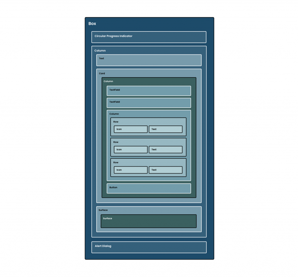
Throughout this project, we’ve now fully implemented our authentication feature – allowing our users to sign-up or sign-in to our application, with the ability to toggle between the two authentication modes. With this toggling, we’ve been able to explore the composition of different states and components within our UI, on top of the management of state when it comes to our authentication form.

With all of this in place, we’ll want to ensure these components remain functional within our app. In the next chapter, we’re going to explore writing automated UI tests for these composables.
Congratulations on making it through to the end of this tutorial! If you enjoyed this, stay tuned for the second part of the preview next week where we’ll learn how to write automated tests for the Authentication Form. Remember, you can pick up the full Practical Jetpack Compose course here!