This post is sponsored by Practical Jetpack Compose.
When it comes to developing Android applications, ensuring or applications remain stable is vital to providing a good user experience. One of things we can do to help achieve this is by writing automated tests that run checks against the user interface of our application. When it comes to Jetpack Compose, things currently look a little different to how we might be used to writing these kind of tests. In this post, I want to dive into a small user flow for an app I’m building and look at how we can write automated UI tests for the screens involved.
Note: Jetpack Compose is still in developer preview, meaning that things here are likely to change. I will be updating the blogpost accordingly with any changes that take place.
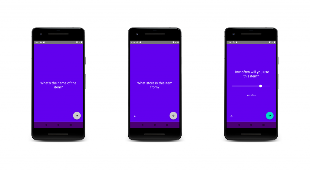
The feature I’m currently working on for my app is the item creation screen. If you haven’t read about my Minimise app yet, the idea is to add items to a pending inventory in-order to question and reflect on the purchases we are making, before making them – think of it as a mindful inventory. The first few screens of this (so far) allow the user to add the name of the item, the name of the store they are purchasing from, along with the frequency in wish they will be using the item.
When it comes to the state of this screen, it is essentially a form split across different pages.
class CreationData(
    var name: TextFieldValue = TextFieldValue(),
    var store: TextFieldValue = TextFieldValue(),
    var frequencyCount: Float = 2f,
    var selectedStep: CreationStep = CreationStep.NAME
)

class CreationState(val creationData: CreationData = CreationData())
Here there are several pieces of data that make up the state, these are:
- name – the name of the item that is being added to the inventory
- store – the nam of the store that the item is being purchases from
- frequencyCount – the frequency in which the item is intended to be used
- selectedStep – the currently selected form step (name, store or frequency)
For the composable of this screen, there is a @Composable function which takes an instance of this state which is then used to build the UI.
@Composable
internal fun CreationContent(creationState: CreationState = CreationState()) {

}
I won’t go too much into the code that makes up this UI, but we’ll dip in where context is required. With this state in place, it means that our UI can be built off a single source of truth, as well as providing access to the state of the form when the form is submitted by the user.
For this form there are a collection of different UI states which can exist – for example, the next buttons are not enabled until text is entered into the input fields, the back button only shows after the first form screen, along with some other conditional aspects. Because of this, it makes sense for us to write some UI tests so that we can ensure this form always behaves as expected.
To get started adding tests, we need to add the required dependency:
androidTestImplementation "androidx.ui:ui-test:0.1.0-dev10"Next we’ll go ahead and create a new test class which will hold the tests for this screen:
@RunWith(JUnit4::class)
class CreationContentTest {

}
When previously writing tests for current android applications, we may be familiar with the use of rules. For Jetpack Compose, we can make use of the ComposeRule – when running our tests on Android, this rule will utilise a default activity that will house our provided composable, allowing us to test our composable in isolation.
@get:Rule
val composeTestRule = createComposeRule()
With this rule in place, we can now utilise this to set the composable content for our screen. We’re going to want to configure our composable before each of our tests are run, so we’ll utilise the @Before annotation to trigger this configuration before each test:
@Before
fun setup() {
    composeTestRule.setContent {
        MaterialTheme {
            Surface {
                CreationContent()
            }
        }
    }
}
Here we’re using the ComposeRule to set the content that should be loaded into the default activity from the rule. This is done using setContent, providing a reference to the DashboardContent() composable that we mentioned previously. Now when each of our tests are run, our composable will be loaded into the screen, ready to perform some tests on.
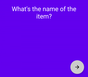
For our first test, let’s go ahead and check that when the form is launched, the item name input is the first form step that is displayed. We’ll do this by asserting that hint for our item name is displayed.
@Test
fun productNameHintDisplayedByDefault() {
    InstrumentationRegistry.getInstrumentation().context
        .getString(R.string.hint_product_name)
        .also { hint ->
            findByText(hint).assertIsDisplayed()
        }
}
Here we utilise the findByText function from the compose test api that allows us to provide a string. This will return as a reference to a SemanticsNodeInteraction which we can then perform assertions on. Here, we’ll use assertIsDisplayed to ensure that the string is displayed within our composable.
When a name for the item is entered, the FAB that will take the user to the next screen will enabled its click functionality. When there is no name entered, this FAB will not do anything when interacted with – this is because an item requires a name for us to continue. In the content composable, when it comes to the FAB there is currently not a way to reference the component from the tests without the use of a TestTag.
TestTag(tag = "NextButton") {
    FloatingActionButton(...)
}
This tag allows us to obtain a reference to a composable that may not have any text or other identifiable content attached to it. From our tests, we can then access this component via its tag using the findByTag function. With this SemanticsNodeInteraction reference we can then trigger the doClick function to perform a click on this composable. For this test we will click on our FAB and assert that the product name hint is still displayed, signifying that the form did not move to the next step.
@Test
fun nextStepButtonDisabledWithoutProductNameEntered() {
    findByTag("NextButton").doClick()

    InstrumentationRegistry.getInstrumentation().context
        .getString(R.string.hint_product_name)
        .also { hint ->
            findByText(hint).assertIsDisplayed()
        }
}
Ideally here I would like to assert that the FAB is not enabled, but the FAB composable does not currently support an enabled property – this is why here I am using the content of the screen to assert that the state is as expected.
Naturally, for the next test we’re going to want to check that when there is content entered for the name of our item, the FAB is enabled and the next step of the form is progressed to. However, in-order to do this we need to have a name entered into our input field – this is where I first hit a snag. In Espresso testing we may be familiar with typeText to enter content into our input fields – currently with the Compose test APIs, there isn’t something similar available. However, because our composables are built from state this means that we can provide a state that already has this name property populated. I can see why being able to dynamically type text creates a real-life simulation of user interaction, but with keyboards on devices this can create flakey tests and also adds a runtime overhead to our tests. So here, we’re going to provide a state to our composable that represents the ability to move to the next step. If we remember from above, our composable for the form takes a state for when it is to render content:
@Composable
internal fun CreationContent(creationState: CreationState = CreationState()) {

}
This means that from our tests we can pass a state that is to be rendered, allowing our tests to have a composed state to perform assertions on – allowing us to essentially remove any manual operations. For this, we’re going to need to tweak the use of our compose test rule. Currently, we’re automatically launching this in an @Before function – if we want to provide a state to our composable, then we’re going to have to trigger this as part of each test itself so that we can provide the state that is required for each test. For this we’ll create a setContent function will be used to configure the composable for our screen:
private fun setContent(
    creationData: CreationData = CreationData()
) {
    composeTestRule.setContent {
        MaterialTheme {
            Surface {
                CreationContent(CreationState(creationData))
            }
        }
    }
}
Here we can provide a CreationData instance that represents the state of our screen. Now from each of our tests we can utilise this to provide a state that our composable will render. With this in place, let’s go ahead and write the test to assert that the form continues to the next screen.
In this test we’re going to want to compose our content so that there is a product name entered. Here we’ll create our CreationData with a product name, meaning that our composable will be rendered with this name populating the name text field. The expected case here is that the FAB will have its click state activated and when clicked, the next step in the form is navigated to. We will perform these checks by using the tag on our FAB that we used in the previous tests, along with asserting that the hint for our store name input is displayed.
@Test
fun canProgressToSecondStepAfterProductNameEntered() {
    launchContent(AppData(data = CreationData(TextFieldValue("PixelBook"))))

    findByTag("NextButton").doClick()

    InstrumentationRegistry.getInstrumentation().context
        .getString(R.string.hint_store_name)
        .also { hint ->
            findByText(hint).assertIsDisplayed()
        }
 }
Now that we’ve covered the successful navigation to the second step in our form, we can start thinking about the back button that takes the user to the previous step.
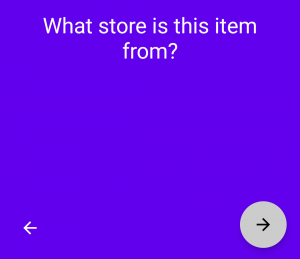
We can see above that this is displayed on the second step, allowing the user to navigate back to the first step. We’ll add a test to assert that this is displayed – we’ll start by rendering our composable to lay out the second step in our form, followed by using the findByTag function to assert that the component wrapped in this tag is within our composed tree.
@Test
fun backButtonDisplayedAfterFirstStep() {
    launchContent(CreationData(selectedStep = CreationStep.STORE))
    findByTag("PreviousStep").assertExists()
}
When the user is on the first step, this PreviousStep tagged composable is not displayed.
We’ll add another test here to assert that the previous step option is not displayed here:
@Test
fun firstStepDoesNotShowBackButton() {
    launchContent()
    findByTag("PreviousStep").assertDoesNotExist()
}
With that test in place, I feel like we have a good coverage of everything involved when moving two and from the first -> second step. Let’s take a few moments to add some tests for the second step of the form and onwards.
Similar to the tests we have above, when we have not entered any text into the second step text field, we want to assert that clicking the FAB does not progress us to the next step in the form. So here we’ll launch the composable with our required state (with the step not being the STORE), click on the FAB composable using the NextButton tag and assert that our store name hint is still present on the screen.
@Test
fun nextStepButtonDisabledWithoutStoreNameEntered() {
    launchContent(CreationData(selectedStep = CreationStep.STORE))

    findByTag("NextButton").doClick()
    InstrumentationRegistry.getInstrumentation().context
        .getString(R.string.hint_store_name)
        .also { hint ->
            findByText(hint).assertIsDisplayed()
        }
}
Now that we have a test to cover the state where store name is not entered, let’s try the case where we have entered a store name. Here we’ll do the same as above, except this time provide an existing store name, meaning that our FAB should be enabled to progress to the next state, showing the frequency usage hint if so.
@Test
fun thirdStepDisplayedAfterStoreNameEntered() {
    launchContent(AppData(data = CreationData(storeName = TextFieldValue("BestBuy"),
        selectedStep = CreationStep.STORE)))

    findByTag("NextButton").doClick()
    InstrumentationRegistry.getInstrumentation().context.getString(R.string.hint_frequency)
            .also { hint ->
                findAllBySubstring(hint).first().assertIsDisplayed()
            }
}
Note: Currently it looks like when there are multiple strings displayed on the screen, findByText fails. As a workaround for now, I am using the following function to assert that the required text is displayed on screen when there are multiple strings displayed.
private fun findAllBySubstring(
    text: String,
    ignoreCase: Boolean = false
): List<SemanticsNodeInteraction> {
    return findAll(
        hasSubstring(text, ignoreCase)
    )
}
With the above in place, we have some good cover of the second step of our form – it’s time to move on to the last step of our form by adding a couple of tests for the frequency controls. Here we display a slider which when changed, will update the label beneath it to represent a frequency range.
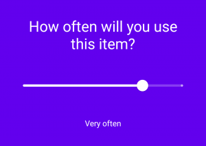
We want to begin here by checking that when the form is loaded, the default state for the frequency labelled is displayed. Here we’ll render our composable with the selected step as the frequency and assert that the “often” label is displayed in our tree.
@Test
fun usageFrequencyDisplaysOftenByDefault() {
    launchContent(
        CreationData(
            selectedStep = CreationStep.FREQUENCY
        )
    )

    InstrumentationRegistry.getInstrumentation().context.getString(R.string.frequency_often)
            .also { label ->
                findAllBySubstring(label).first().assertIsDisplayed()
            }
}
When the slider value is changed, this label will update to represent the new state that is selected by the slider. We’re going to simulate this interaction by using a gesture within our tests. We’ll begin by finding our composable using the findByTag function and then utilising doGesture. With this we need to provide a gesture that we want to perform, so we’ll go ahead and use sendSwipeLeft – this will cause our slider to be swiped and the first value of the slider to be selected, which we will assert using the label.
@Test
fun usageFrequencyUpdatesLabel() {
    launchContent(
            CreationData(
                selectedStep = CreationStep.FREQUENCY
            )
        )

        findByTag("FrequencySlider").doGesture {
            sendSwipeLeft()
        }

        InstrumentationRegistry.getInstrumentation()
            .context.getString(R.string.frequency_hardly)
            .also { label ->
                findAllBySubstring(label).first().assertIsDisplayed()
            }
}
With this first dive into UI testing with Jetpack Compose, it was fun to take a look at how things are working at the moment. I was able to create a collection of different tests for my item creations screen without hitting too many snag along the way.
Some early thoughts so far:
- TestTag feels like a powerful addition to be able to access composables from tests. My only thought is that this could end up polluting composable if overused. It’s understandable that we don’t have the concept of IDs as we do in espresso (due to the composables), but access via something that already exists in the code would be nice. For example, accessing the FAB via an accessibility label would feel more practical.
- Currently there is no way to input text, unless this could be done with something like UiAutomator. I think there will be mixed opinions on this, but in my example for the post I quite like just providing the state to the composable – it likely reduces test times and reduces any chance of flakey tests occurring.
- I plan on digging into the case where when there are multiple strings displayed on the screen, findByText does not work. I will update the post when I find out what is happening here, or when the workaround is no longer needed.
- Because not all components have an enabled state (such as the FAB), we can’t just assert whether that component is enabled or not. Instead I needed to perform a click and assert that the same content was still on the screen (as in, the form hadn’t progressed). Maybe this will be added in future, it would definitely make things easier here!
Overall it felt like I was able to get some tests up and running for my composed content with not too much code. As mentioned, it’s likely that things will change but it’s good to get familiar with how testing might look with Jetpack Compose.
If you’ve played with testing on Compose already, or have any questions on how to get started, then I’d love to hear from you!