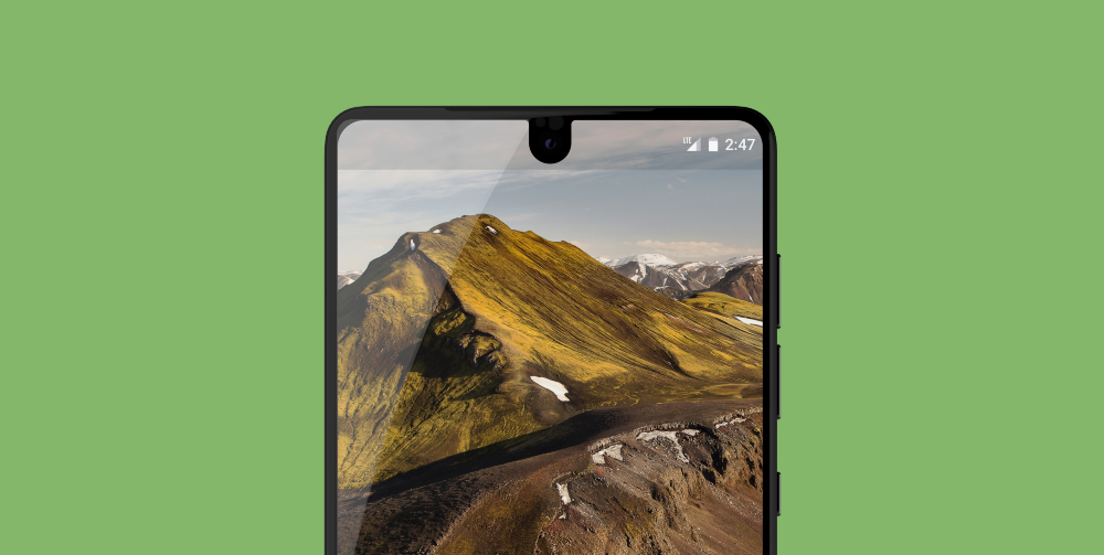
A few days ago the first developer preview of Android P was made available to us. Along with this announcement we were introduced to a number of new features and APIs made available to us in this release of Android. Whilst it is still early days (and there are likely new things / changes to… Continue reading
Posts Tagged → Mobile App Development
Widgets: Hero
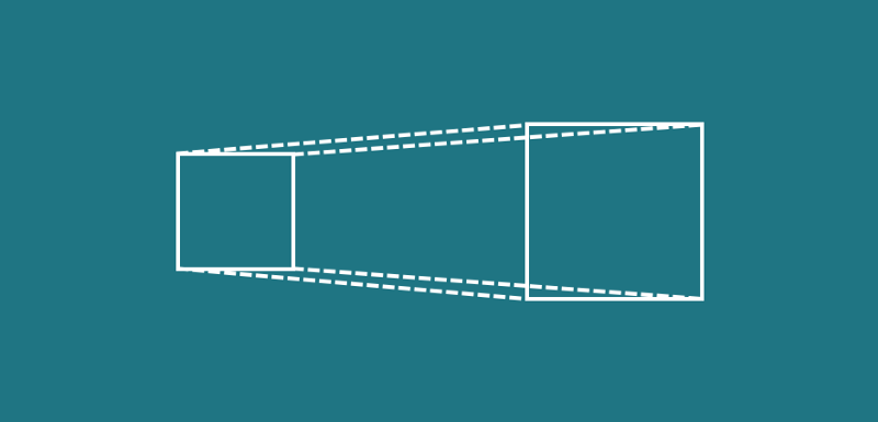
The Hero widget allows us to define that two widgets are related, allowing the system to automatically perform transitional animations for us as we navigate between screens. This allows us to provide a greater experience when transporting users through navigational context, making our app both easier and more pleasant to use. As displayed in the… Continue reading
Widgets: Raised Button
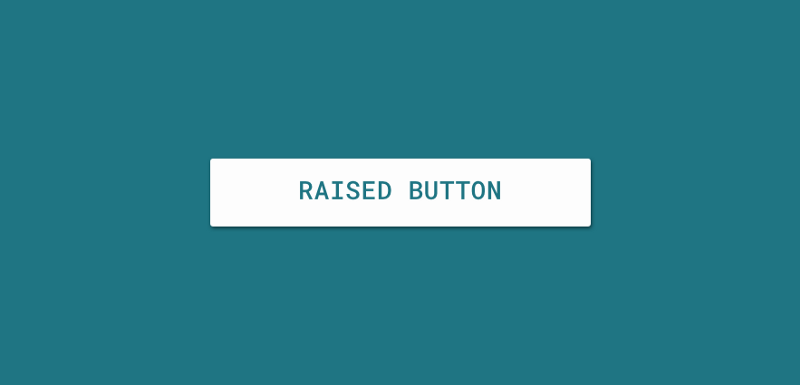
The RaisedButton widget allows us to create a Button that matches the specification defined in the Material Guidelines here. The RaisedButton has a single constructor that allows us to instantiate the widget with a number of different properties. new RaisedButton( child: const Text(‘Connect with Twitter’), color: Theme.of(context).accentColor, elevation: 4.0, splashColor: Colors.blueGrey, onPressed: () { //… Continue reading
Widgets: Container
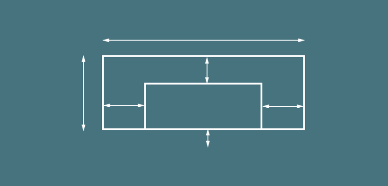
The Container widget is used to contain child widgets whilst also providing the ability to apply some basic styling properties on itself to be applied when laid out on screen. If the container has no children then it will automatically fill the given area on the screen (dependant on constraints), otherwise it will wrap… Continue reading
Understanding layouts in Flutter
When building layouts for our Flutter applications, it’s important to understand how the framework handles the creation of these layouts. Within Flutter, the visual components that you declare are widgets, as well as the layout elements also.The Flutter Framework builds its layout via the composition of widgets, everything that you construct programatically is a widget… Continue reading
Creating your first .dart class
Our first .dart class is going to be pretty simple for example sake. We’re going to run our app and show some simple text on the screen. You’ll notice that the screenshot on the left here displays a simple app that is just showing us some sample text in the center of the screen. Reaching… Continue reading
Creating a Flutter project
In order to create a new Flutter project, you’ll want to begin by opening up IntelliJ IDEA. Creating a new project To create a new project we will need to select File from the menu and hit ‘New Project’. At this point, we will be presented with the new project dialog. At this point you will… Continue reading
Getting setup with Flutter
In order to begin creating mobile apps using Flutter, we need to get setup on our development system. Download the Flutter SDK You can get started by downloading the Flutter SDK from this site. If you’re running a mac, this is simply a case of cloning the repo for Flutter: $ git clone -b alpha https://github.com/flutter/flutter.git… Continue reading
Exploring Background Execution Limits on Android Oreo
Last week came the official announcement of the Android O release. This release of Android comes with some really cool new additions, and in this post I want to look specifically at the new restrictions that have been introduced for background services. If you’re using background services in your app then changes could affect your… Continue reading
