In the last post, we took a look into the new Loading Indicator in the Material 3 expressive package. As we continue to dive into different parts of Material 3 we’ll discover more components that we can plug into our apps. Up next we have the LargeTopAppBar – this composable brings dynamic, scroll-responsive navigation to your Compose apps, giving more space to the top bar area and creating more engaging user experiences. In this post, we’ll explore how to implement and customize the LargeTopAppBar to create fluid, responsive top navigation that adapts to user interaction.
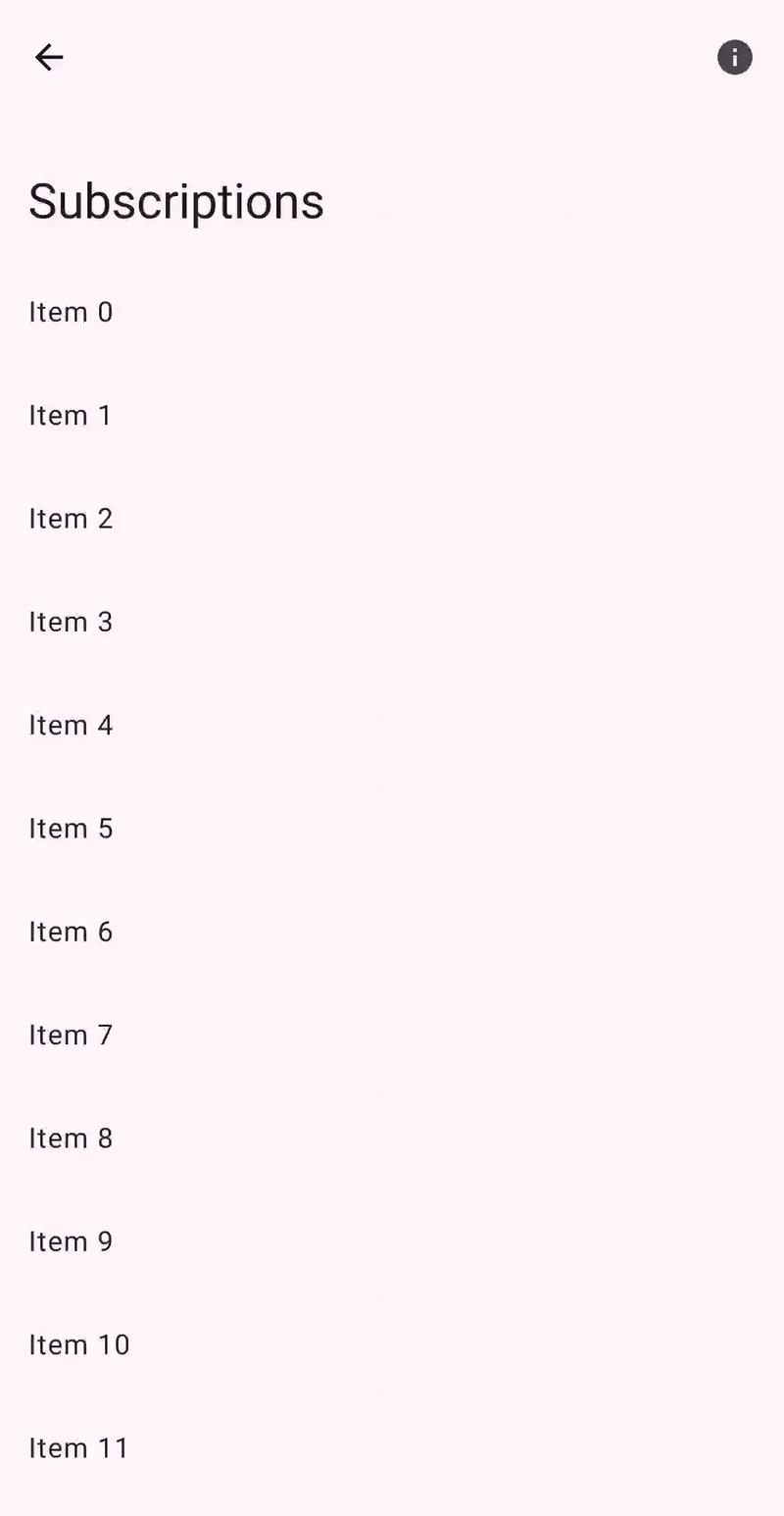
The LargeTopAppBar is a top bar composable that will animate between two distinct states based on the current scroll position. Unlike traditional static app bars, this component creates a more immersive experience by expanding and collapsing as users navigate through the content that is displayed on-screen.
@Composable
fun LargeTopAppBar(
    title: @Composable () -> Unit,
    modifier: Modifier = Modifier,
    navigationIcon: @Composable () -> Unit = {},
    actions: @Composable RowScope.() -> Unit = {},
    expandedHeight: Dp = TopAppBarDefaults.LargeAppBarExpandedHeight,
    collapsedHeight: Dp = TopAppBarDefaults.TopAppBarHeight,
    colors: TopAppBarColors = TopAppBarDefaults.largeTopAppBarColors(),
    scrollBehavior: TopAppBarScrollBehavior? = null
)
What makes this component more immersive is its dual-state nature. It begins in an expanded state, positioning the title beneath the upper row of the app bar, creating a prominent header area. As users scroll through content, the bar gracefully transitions to a collapsed state, maximizing content visibility while maintaining navigation context.
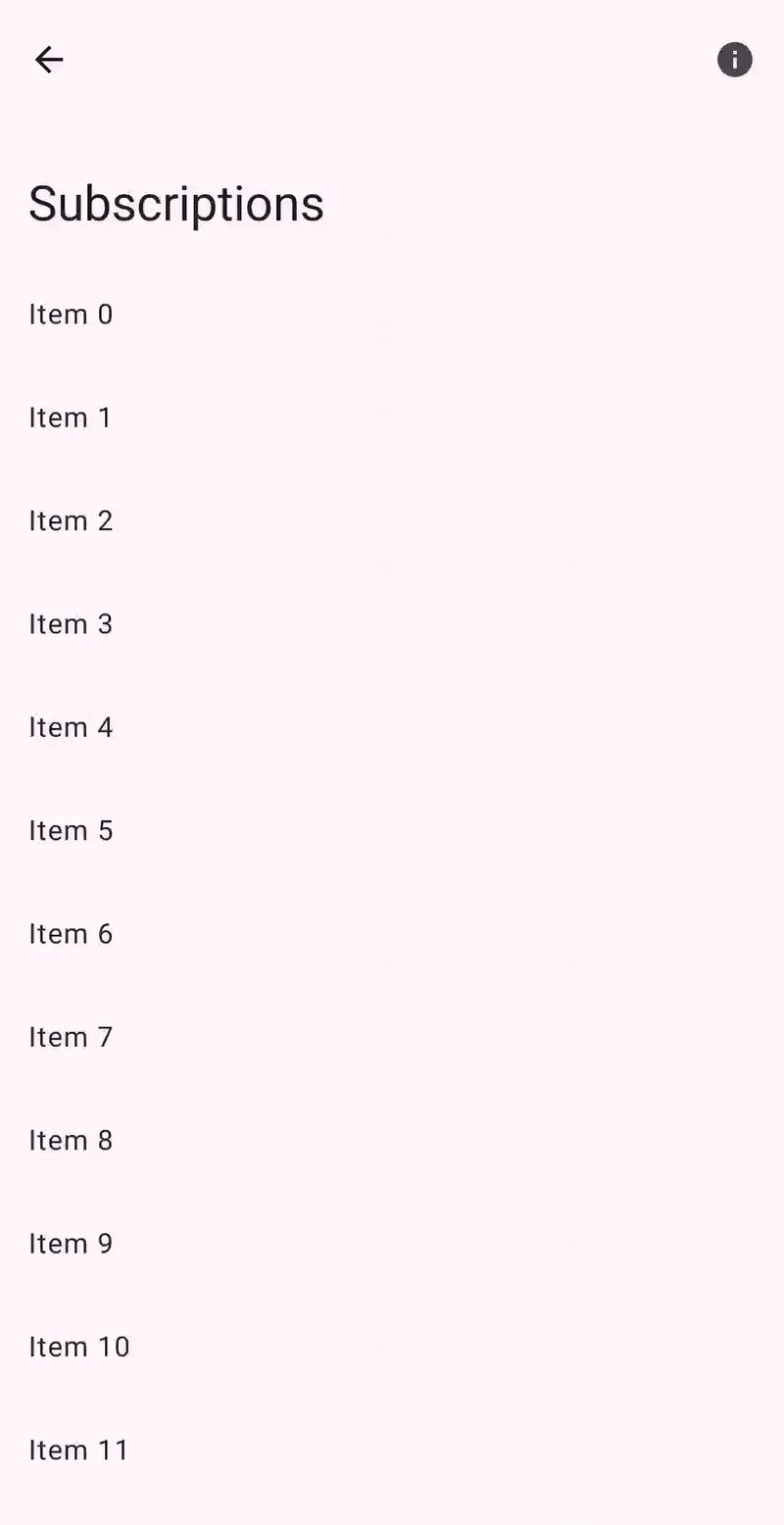
To get started with the LargeTopAppBar, we can simply begin by providing a title to be displayed as the header of the top bar.
LargeTopAppBar(
    title = {
        Text(text = "Subscriptions")
    }
)
Controlling Transitions
One of the most interesting parts of the LargeTopAppBar is its scrollBehavior parameter, which determines how the app bar responds to scroll events. These behaviors give you fine-grained control over when and how the app bar should transition and Material 3 provides several predefined scroll behaviors.
Enter Always
When using the enterAlwaysScrollBehavior, the app bar will shrink instantly on scroll, and will also expand as soon as the user starts scrolling up again on the vertical axis. This means that the app bar will grow and shrink instantly in either direction when there are scroll events that occur.
LargeTopAppBar(
    title = { Text("Subscriptions") },
    scrollBehavior = TopAppBarDefaults.enterAlwaysScrollBehavior()
)
Exit Until Collapsed
When using the exitUntilCollapsedScrollBehaviour, the app bar will shrink instantly on scroll, and will also expand once the user has reached the start of the content on the vertical axis. This means that the while app bar will shrink instantly, it won’t grow again until the last moment.
LargeTopAppBar(
    title = { Text("Subscriptions") },
    scrollBehavior = TopAppBarDefaults.exitUntilCollapsedScrollBehavior()
)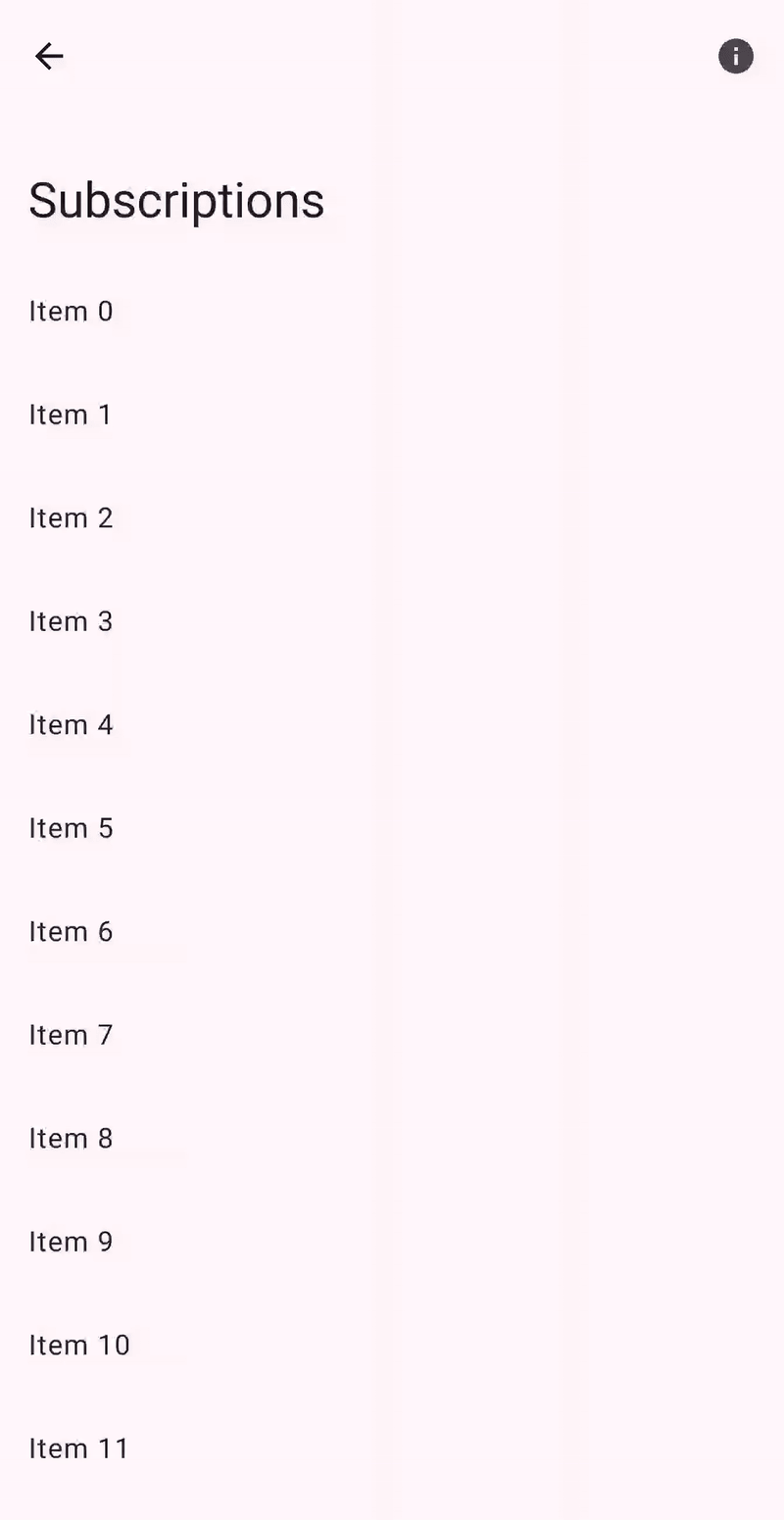
Pinned
When using the pinnedScrollBehaviour, the app bar will remain pinned in its expanded state and will not react to any scroll events that occur. This might be desired if you want the app bar to always display as large, or need to disable the shrinking / expanding transitions for any reason.
LargeTopAppBar(
    title = { Text("Subscriptions") },
    scrollBehavior = TopAppBarDefaults.pinnedScrollBehaviour()
)
Adding App bar Actions
Similar to other app bar implementations, the LargeTopAppBar supports both the navigationIcon and actions properties. These properties allow us to display icons that can be used for navigational purposes at the start of the app bar, or for extended functionality at the end of the app bar.
LargeTopAppBar(
    title = { Text("Subscriptions") },
    navigationIcon = {
        IconButton(onClick = { }) {
            Icon(
                imageVector = Icons.AutoMirrored.Default.ArrowBack,
                contentDescription = "Go back to dashboard"
            )
        }
    },
    actions = {
        IconButton(onClick = { }) {
            Icon(
                imageVector = Icons.Filled.Info,
                contentDescription = "View more information"
            )
        }
    }
)
You may be wondering what happens during transitions between the app bar states. The title will transition around the navigation icon, moving either underneath it in the expanded state or to the right of it in the collapsed state. This ensures that navigation actions (and app bar action) are always accessible regardless of the state that the app bar is in.
Controlling the App Bar Height
We can also control the height of the app bar, both in the expanded and collapsed state. While in the collapsed state it’s more advised for us to follow the standard sizes for app bars, we may want to control how the app bar appears when it is in the expanded state. Controlling this can be done so using the collapsedHeight and expandedHeight arguments.
LargeTopAppBar(
    title = { Text("Subscriptions") },
    collapsedHeight = 56.dp,
    expandedHeight = 180.dp
)
Customising App Bar colors
Using the colors argument, we can override the colors that are used by the app bar. By default, colors will be used for the Material 3 theme that is applied to your composables, but you can override these on an individual basis by using the topAppBarColors function.
LargeTopAppBar(
    title = { Text("Subscriptions") },
    colors = TopAppBarDefaults.topAppBarColors(
        containerColor = MaterialTheme.colorScheme.primaryContainer,
        titleContentColor = MaterialTheme.colorScheme.onPrimaryContainer,
        navigationIconContentColor = MaterialTheme.colorScheme.onPrimaryContainer
    )
)
The LargeTopAppBar allows us to move towards more dynamic app bars, while also giving us space to create more prominent content. By responding to user behaviour, it creates space when needed and gets out of the way when content becomes the focus.
It’s likely that we won’t be utilising the LargeTopAppBar in every single screen of our app, but they’ll be places where it fits in well based on our requirements for a prominent title content. If you’re not already using this in your apps, I’d be interested to hear if you have any plans for utilising it within your compose based features!