There was a lot of exciting news announced at Google I/O this week – one of the things I had been looking forward to was hearing about large screen experiences. While these devices and design principles have existed side-by-side for some time, it’s always felt like support for developers has never quite fully been accessible. However, with some of the announcements at I/O this week, supporting these experiences on larger devices is starting to get more out-of-the-box support.
During the talks around this topic I saw several mentions of the Navigation Rail, a vertical navigation bar which is part of Material Design. After seeing this mentioned I got quite excited about being able to use this in apps, so I dived straight into the Android Material Components library to have a play. In this post I’m going to share those learnings with you so that you can understand how you can use this in your own apps!
What is the Navigation Rail?
As mentioned above, the Navigation Rail is essentially a Vertical Navigation Bar. In applications, you’ve likely used and/or seen the Bottom Navigation Bar – positioned at the bottom of the screen and used to display navigational destinations contained within a horizontal bar. Used to display between 3 and 5 navigation items, the bar allows users to move between different high-level areas of an app.
When it comes to the Bottom Navigation Bar, this works great it most cases. However, when you start to use an app in landscape mode or on a larger device, I feel things don’t seem to work quite as smoothly. For example, the Bottom Navigation spans the whole width of the screen, so as you start to use an application on a device with a wider viewport (such as in landscape) a small chunk of the bottom screen is reserved by this navigation bar – taking up space that could be used be consumable content. Because the Bottom Navigation bar is often paired with a Floating Action Button above it, we end up with this area at the bottom of the screen which is always occupied by these two components. Paired with a Top App Bar, we end up with a restricted content area, contained in-between the top and bottom navigation elements.
With the Navigation Rail, the screen starts to feel a bit more open. Our content no longer becomes sandwiched between these navigation components, but instead is positioned alongside the controller for the destination displayed within the content area. Alongside support between 3 and 7 navigation items, the Navigation Rail also supports a header component. This means that we can contain Floating Action Button inside of this instead of anchoring it to the view – this simplifies the content area of our screen and keeps that space reserved for consumable content.
Adding the dependency
Before we can get started, you’re going to need to add the dependency for the Android Material Components library. The Navigation Rail is only currently available in the latest beta release for 1.4.0.
implementation 'com.google.android.material:material:1.4.0-beta01'Laying out the Navigation Rail
The Navigation Rail takes the form of a NavigationRailView and can be added directly to your XML layout:
<com.google.android.material.navigationrail.NavigationRailView
    android:id="@+id/navigation_rail"
    android:layout_width="wrap_content"
    android:layout_height="match_parent"
    app:headerLayout="@layout/layout_header"
    app:menu="@menu/menu_rail" />
When adding this view to your layout, there are some typical guidelines which should be followed. These most likely depend on what your view hierarchy consists of, but as a general guide:
- The Navigation Rail should sit below the TopBar of the current screen. This Rail should not overlap the top bar or be shown underneath this. Its height should fill the space between the bottom of the top app bar and the bottom of the screen
- The Navigation Rail should be shown at the side of the main content area of the current screen. It should not be shown on top of this content, instead the content area should be shown next to the Navigation Rail.
For examples sake, let’s look an example of how the Navigation Rail would sit inside of a layout:
<androidx.constraintlayout.widget.ConstraintLayout
...
>
<com.google.android.material.appbar.AppBarLayout
android:id="@+id/appbar"
...>
<androidx.appcompat.widget.Toolbar
android:id="@+id/toolbar"
... />
</com.google.android.material.appbar.AppBarLayout>
<include
layout="@layout/content_main"
app:layout_constraintBottom_toBottomOf="parent"
app:layout_constraintEnd_toEndOf="parent"
app:layout_constraintStart_toEndOf="@id/navigation_rail"
app:layout_constraintTop_toBottomOf="@id/appbar" />
<com.google.android.material.navigationrail.NavigationRailView
style="@style/Widget.MaterialComponents.NavigationRailView.Colored.Compact"
android:id="@+id/navigation_rail"
android:layout_width="wrap_content"
android:layout_height="0dp"
app:headerLayout="@layout/layout_rail"
app:layout_constraintBottom_toBottomOf="parent"
app:layout_constraintStart_toStartOf="parent"
app:layout_constraintTop_toBottomOf="@id/appbar"
app:menu="@menu/menu_rail" />
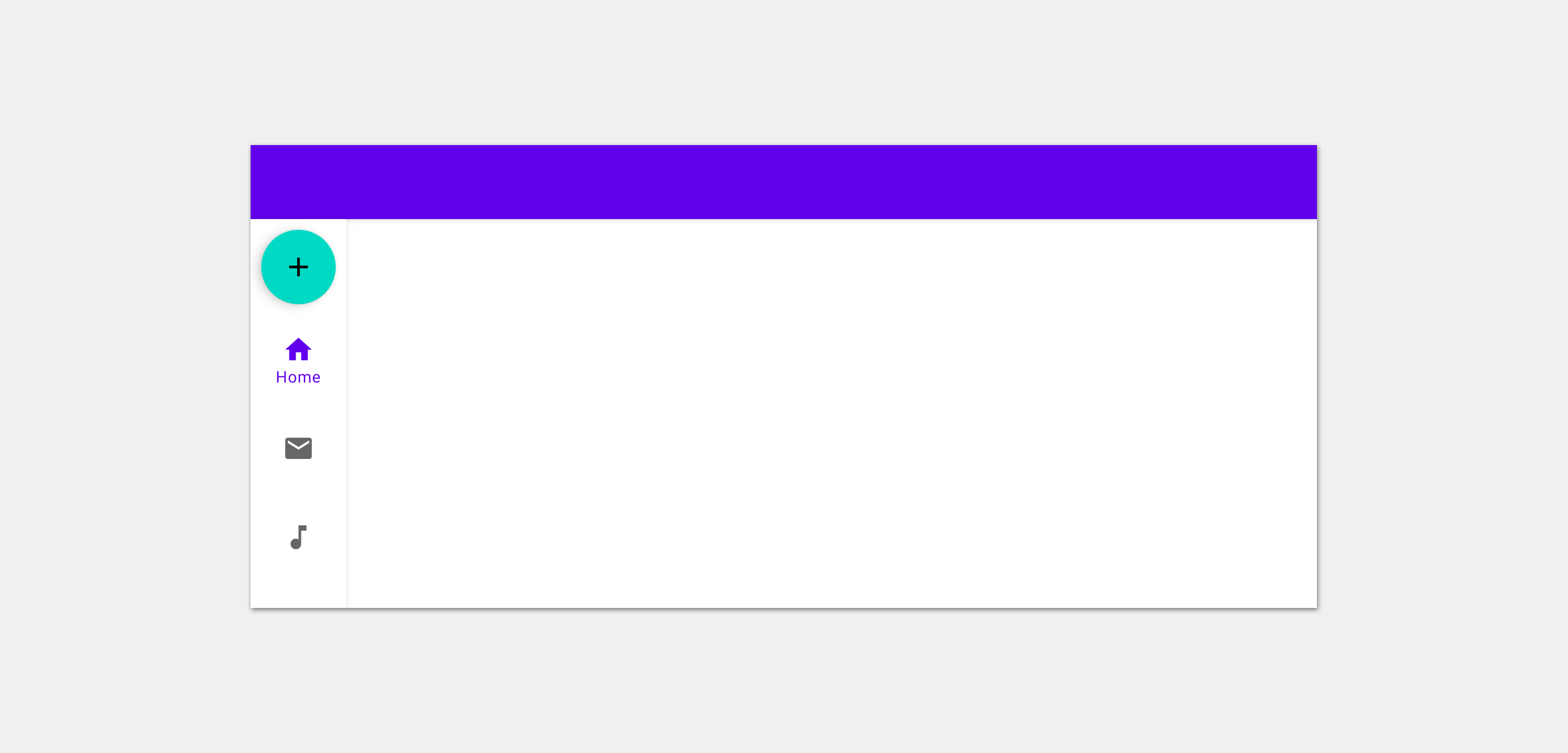
</androidx.constraintlayout.widget.ConstraintLayout>This would give us something that looks like the following result:

Navigation Rail displayed underneath the top bar and at the start of the content area
Displaying a Menu
To display items inside of the Navigation Rail, we need to assign a menu reference using the menu attribute for the NavigationRailView.
<com.google.android.material.navigationrail.NavigationRailView
android:id="@+id/navigation_rail"
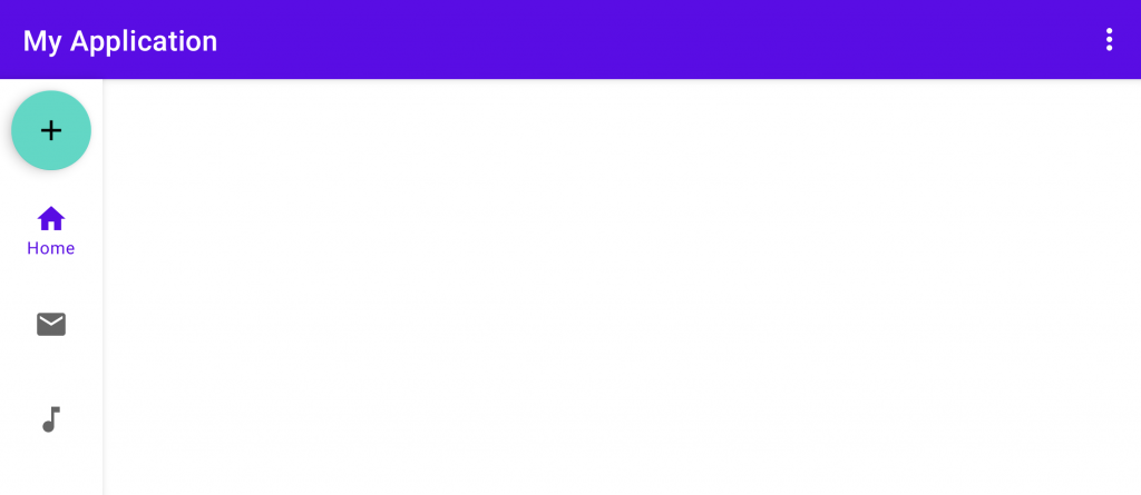
app:menu="@menu/menu_rail" />This menu will look very similar to other menus that you might have seen or created inside of applications. Each item in the menu becomes a destination within our Navigation Rail, with the title being used as the label of the destination along with the icon as the visual representation of the destination. The menu used in the example screenshots of this article look like so:
<menu xmlns:android="http://schemas.android.com/apk/res/android">
    <item
        android:id="@+id/home"
        android:icon="@drawable/ic_baseline_home_24"
        android:title="@string/label_home"/>
    <item
        android:id="@+id/email"
        android:icon="@drawable/ic_baseline_email_24"
        android:title="@string/label_email"/>
    <item
        android:id="@+id/music"
        android:icon="@drawable/ic_baseline_music_note_24"
        android:title="@string/label_music"/>
    <item
        android:id="@+id/gallery"
        android:icon="@drawable/ic_baseline_image_24"
        android:title="@string/label_gallery"/>
</menu>
Adding a Header
Other than showing a menu inside of our Navigation Rail, we can provide a layout reference for the headerLayout attribute of the view.
<com.google.android.material.navigationrail.NavigationRailView
    android:id="@+id/navigation_rail"
    app:headerLayout="@layout/layout_rail"
    ... />
For this layout_rail file we could simply provide a single view component in the form of a FloatingActionButton:
<com.google.android.material.floatingactionbutton.FloatingActionButton
xmlns:android="http://schemas.android.com/apk/res/android"
xmlns:app="http://schemas.android.com/apk/res-auto"
android:layout_width="wrap_content"
android:layout_height="wrap_content"
android:contentDescription="@string/cd_create_item"
app:fabSize="mini"
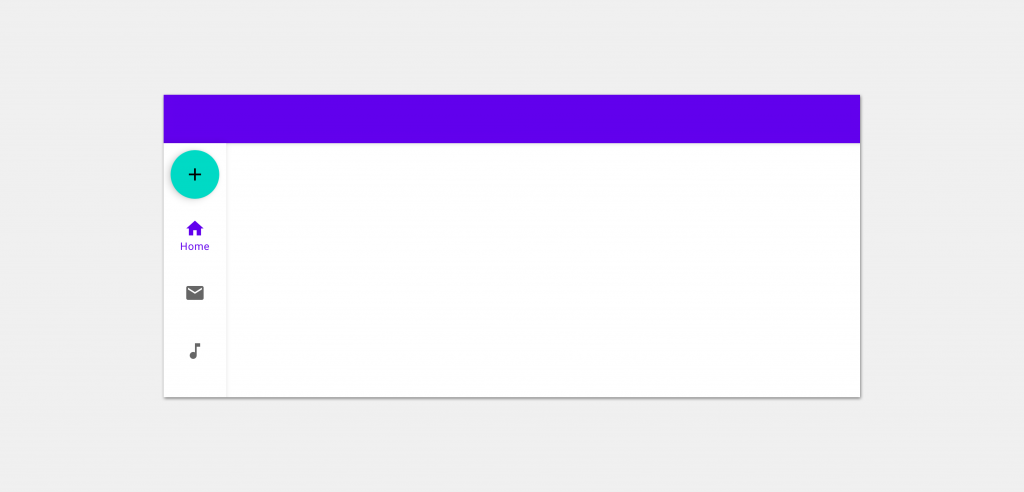
app:srcCompat="@drawable/ic_baseline_add_24" />With this in place, the Navigation Rail would display this Floating Action Button at the top of its container:
Now, an important thing to note is that the Navigation Rail does not have any restrictions in place for the type of views that can be provided for this header layout. For example, you could provide some form of custom Button that you want to use in your Navigation Rail, or an Image component that represents a logo for your application. While either of these are possible, be sure to provide a header that brings value to the user, rather than add any confusion or wasted space within the rail.
Styling the Navigation Rail
When it comes to the appearance of the Navigation Rail, there are several bundled styles which can be used to control how the Navigation Rail is displayed on screen.
We’ll start here with the default style – this will be used by default if you do not declare a style to be applied to the Navigation Rail.
style="@style/Widget.MaterialComponents.NavigationRailView"
With this default style applied, the different parts of the Navigation Rail have the follow attributes applied to them:
- Rail Width: 72dp
- Rail background: colorSurface
- Selected Icon color: colorPrimary
- Unselected Icon color: colorOnSurface (at 60%)
The next style mixes things up a bit and uses the Primary color of our theme as the Surface color for the Rail.
style="@style/Widget.MaterialComponents.NavigationRailView.PrimarySurface"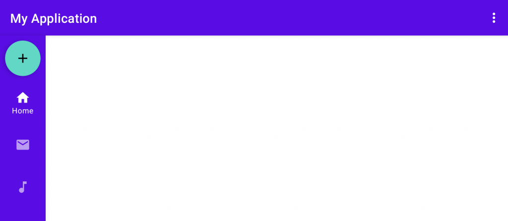
Here we see the width of the Navigation Rail remain the same, but the appearance of the contained components drastically changes via the use of our theme colors.
- Rail Width: 72dp
- Rail background: colorPrimary
- Selected Icon color: colorOnPrimary
- Unselected Icon color: colorOnPrimary (at 60%)
This style definitely makes our Rail feel bolder, matching the theming of the Top App bar that is being used in the screen.
In some cases, we may want our Navigation Rail to take up less width in the screen. If the default width appears to take up more space than is needed, the following style can be used to use a reduced width:
style="@style/Widget.MaterialComponents.NavigationRailView.Compact"
Similar to the initial (and default) style that we looked at, the Rail has the following attributes – with the key difference being the width applied to the view:
- Rail Width: 52dp
- Rail background: colorSurface
- Selected Icon color: colorPrimary
- Unselected Icon color: colorOnSurface (at 60%)
The final supported style provides support for this same compact appearance, but instead using the bolder colors from our theme that we previously saw:
style="@style/Widget.MaterialComponents.NavigationRailView.Colored.Compact"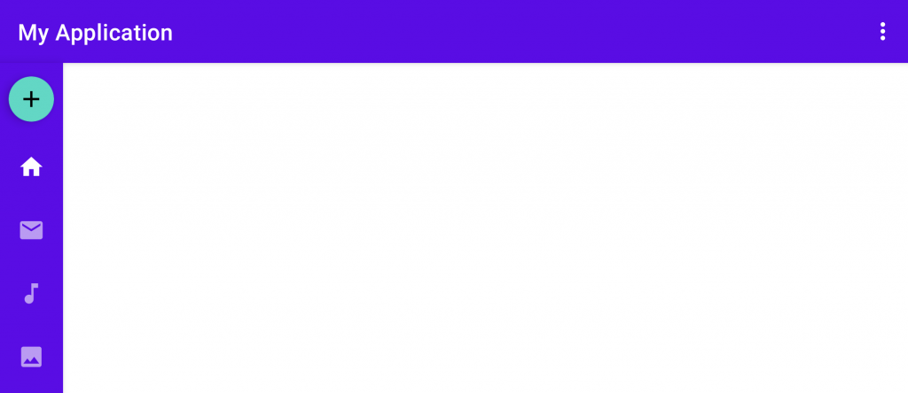
Similar to the PrimarySurface style that we previously covered, the Colored.Compact style uses the same attributes here with the small change of width:
- Rail Width: 52dp
- Rail background: colorPrimary
- Selected Icon color: colorOnPrimary
- Unselected Icon color: colorOnPrimary (at 60%)
Controlling Elevation
By default, the Navigation Rail will display elevation so that it appears layered and separated from the content area of our screen. However, if you wish to manually tweak this value you can do so using the elevation attribute.
<com.google.android.material.navigationrail.NavigationRailView
    ...
    app:elevation="4dp" />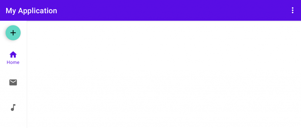
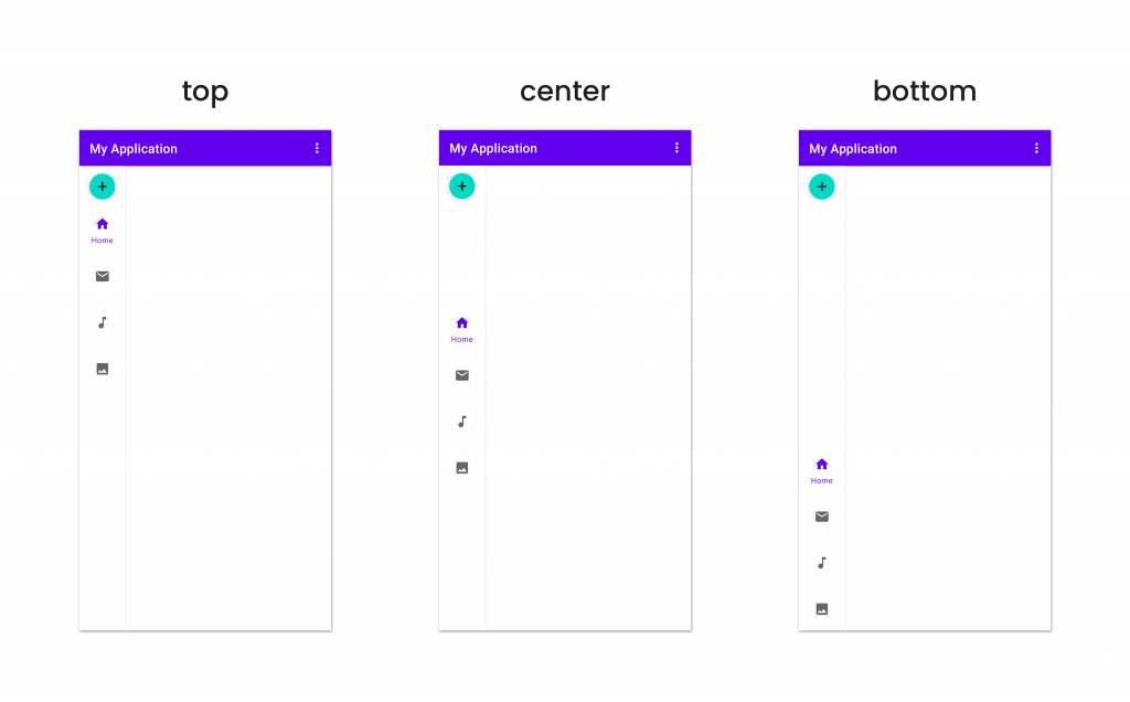
Menu Gravity
When assigning a menu to be displayed within the Rail, we may wish to control the positioning that this has within the container. For this we can use the menuGravity attribute to control the gravity of the menu items.
<com.google.android.material.navigationrail.NavigationRailView
    ...
    app:menuGravity="center" />
This can be set to either top, center or bottom – when applied, the navigation items will be positioned using the available space inside of the Navigation Rail.
Label visibility
In all of the examples above, we’ve seen that the label is only being shown for the currently selected item within the Rail. This is default behaviour for the label visibility and we can control this using the labelVisibilityMode attribute.
<com.google.android.material.navigationrail.NavigationRailView
    ...
    app:labelVisibilityMode="selected" />
This attribute has four different options which can be applied:
- labelled – all menu items will display their label, regardless of the selected state
- unlabelled – no menu items will display their label, regardless of the selected state
- selected – only the currently selected menu item will display its label
- auto – when there are more than 3 items the Rail will use the selected option, otherwise the labelled option will be applied.
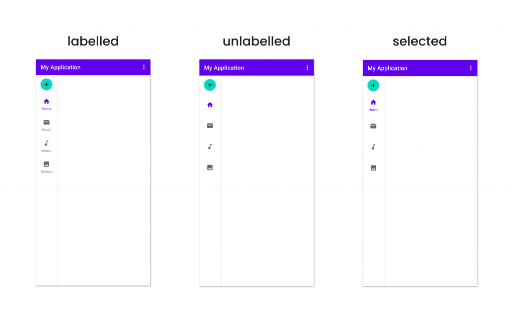
Note: If using the unlabelled option here, it’s important to still prove the title attribute within the menu file for accessibility purposes.
Displaying Badges
One of the interesting features for the Navigation Rail is the ability to display badges on the navigation items – this is helpful if you need to display some form of notice to the user if there are pending notifications for that area of content.
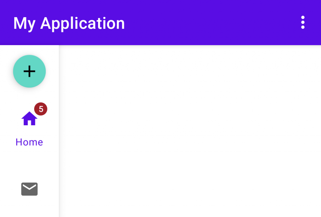
This badge can be displayed individually per-navigation item. To apply a badge we need to utilise the getOrCreateBadge function on our navigation rail, providing the ID for the navigation item that we want to apply a badge to – this function will then return us a BadgeDrawable instance.
var badge = navigationRail.getOrCreateBadge(R.id.home)There is also a getBadge function which returns a nullable reference to a BadgeDrawable, however, getOrCreateBadge helps us to handle the cases where a badge might not yet exist for the given menu ID. Once we have a reference to this BadgeDrawable, we can control its visibility and assign a value to be displayed inside of it:
badge.isVisible = true
badge.number = 5
When we’re done with our badge, we can remove it from our Rail by using the removeBadge function:
navigationRail.removeBadge(menuItemId)Badge Gravity
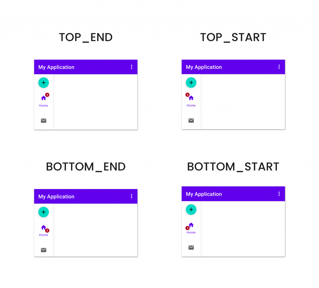
If you want to control the positioning of the badge, relative to the navigation item, then you can do so using the badgeGravity attribute of the BadgeDrawable.
badge.badgeGravity = BadgeDrawable.BOTTOM_STARTThis can be set to one of four different values (TOP_END, TOP_START, BOTTOM_END, BOTTOM_START), with each being used to position the badge within the area of the navigation item.
Badge Color
In the previous examples we can see the badge is using default colors when being displayed – these are actually the colorError and colorOnError values from our application theme. If you wish to override these, or set colors individually per-badge, then you can do so by using the backgroundColor and badgeTextColor on any of the BadgeDrawable references:
badge.backgroundColor = Color.BLACK
badge.badgeTextColor = Color.WHITE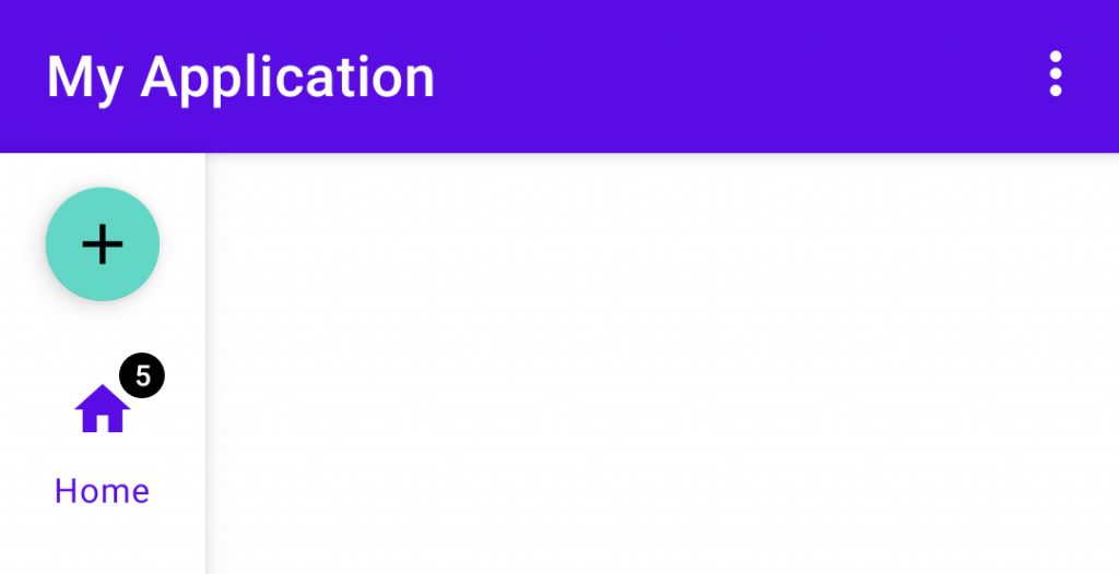
Badge Overflow
By default, a badge will show a maximum of 4 characters – while doing so it will automatically handle any overflow. This means that showing a badge value such as “999999” would result in “999+” being used. As we can see, in some cases this may not look great within our Rail:

If we want to manually adjust the maximum number of characters that are to be displayed within a badge, we can do so using the maxCharacterCount attribute. This will still allow the badge to handle the overflow for us, but more allow us to control the point at which that overflow handling should kick in.
badge.maxCharacterCount = 3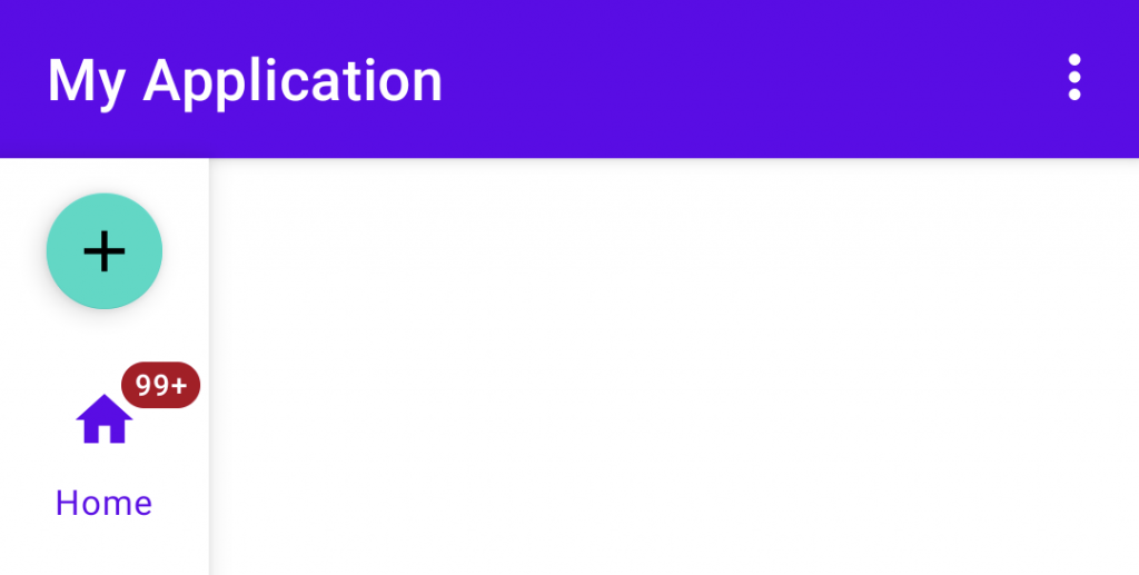
Badge Offset
From the examples displayed above, the navigation badges are displayed outside of the icon area with enough space to not cause any overlapping. In some cases, we may wish to position our badge slightly differently – in these cases both the verticalOffset and horizontalOffset attributes can be used to provide a pixel value offset for our navigation badge.
badge.verticalOffset = verticalOffset
badge.horizontalOffset = horizontalOffset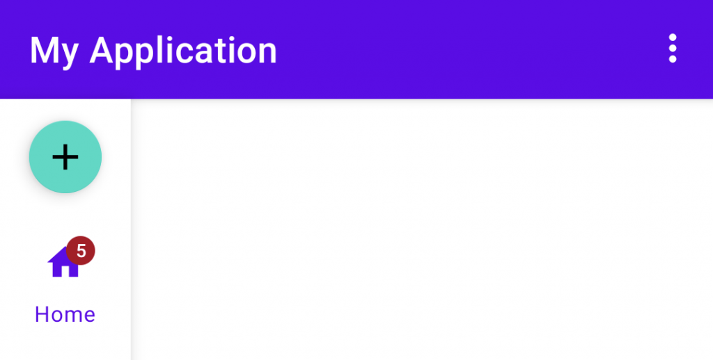
Handling Item Selection
Now that we’ve got our Navigation Rail showing and styled within our application, we’re going to want to handle any interactions with it. Similar to other menu item handling for other components in Android applications, we can set an item selection listener on our Navigation Rail and use this to react to any interactions with menu items – using the ID of the menu item to handle the corresponding menu item.
navigationRail.setOnItemSelectedListener {  menuItem ->
    when (menuItem.itemId) {
        R.id.home -> {
            ...
            true
        }
        else -> false
    }
}
It’s important to note that this item selected listener will only be triggered when an item initially becomes selected – meaning when an item moves from the unselected to selected state. If an item is already selected and reselected by the user, this listener will not be triggered. In these cases where an item is reselected by the user (as in, the item is already selected when it is clicked), a second listener can be used to register for these events.
navigationRail.setOnItemReselectedListener {  menuItem ->
    when (menuItem.itemId) {
        R.id.home -> {

        }
    }
}
Now with this secondary listener in place, we are able to listen for and react to any interactions that place for items that are already in a selected state.
Handling Navigation
When utilising some form of navigation bar, we’re going to want to allow the user to navigation between different views within the current screen. This is a common use case with the BottomNavigationView from the Material Components library – while visually this is slightly different from the Navigation Rail, in terms of behaviour they are very similar.
This similarity got me thinking about how the Navigation Component has support for setting up a BottomNavigationView with a NavController reference. This essentially allows you to navigate across a navigation graph using a BottomNavigationView, I was hoping for similar support when it comes to the Navigation Rail. I was happy to see that in a recent commit, support for this was added to the Navigation Component library. This has not been shipped in a release yet, but I’m hopeful that it will be in the next build so that we can start using this in our apps already 🙌
With this in place you would be able to use the following code to setup a Navigation Rail reference with a NavController:
NavigationUI.setupWithNavController(
    navigationRailView,
    navController
)
Wrapping Up
Phew, that was a lot to take in! I hope from this article you’ve gained enough knowledge around the Navigation Rail to be able to add it to your applications, improving the experiences for you users based on the device / screen they are using! Personally I’m really excited to get this into my apps, as well as start experiencing it for myself in applications that are installed on my device. In the meantime, keep an eye out for a stable release of the Material Components library that contains these changes, along with the next release of the Navigation Component which should hopefully contain the changes required to tie this together with a Navigation Graph 🤞