For the past few years, we’ve been getting to grips with Jetpack Compose and how we can use it to build apps for Handheld and Wear OS devices. Late last year, Composables built for Android TV apps started to surface as Alpha releases and in this series of blog posts, I want to dive into these composables and learn how they can be used to create apps for Android TV.
Looking to learn Jetpack Compose? Check out my course, Practical Jetpack Compose. Get 30% off using the code BLACKFRIDAY.
When building apps for Android TV, we’re going to need to use a mix of layout, representative and interactive components. For many of these situations, we’re going to have access to Material Components, most of which are already available in the Jetpack Compose APIs. However, there are a set of alternative components which have been designed specifically for Android TV apps. In this post I want to look at some of these alternative composables and why we should be using these over the already available variants.
Surface
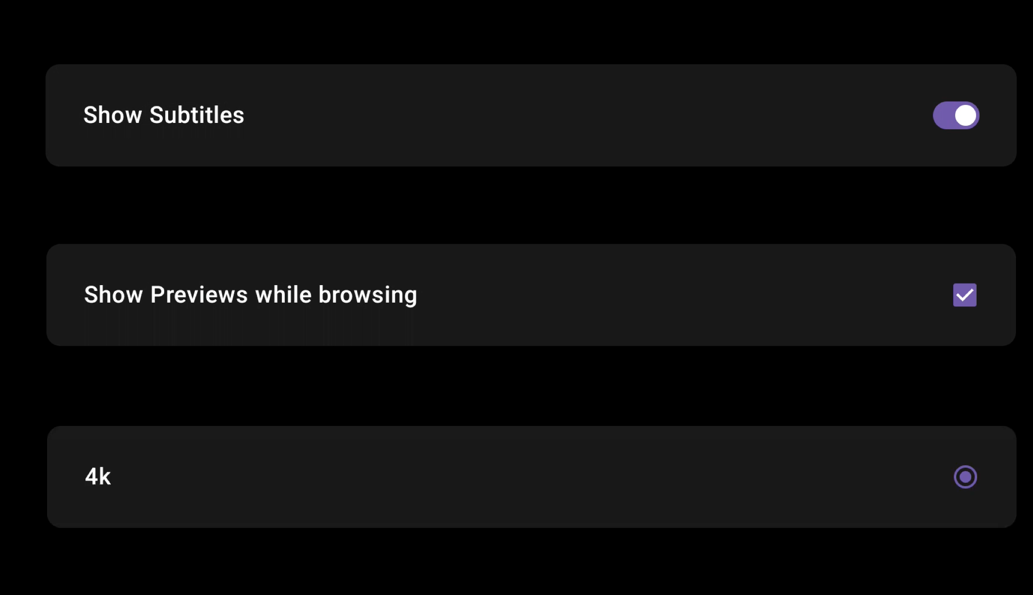
The Surface composable is used to contain focusable content, an example in the case of Android TV is a column of settings items that can be toggled by the user.
As the user navigates through the collection of composables, we can see how the items clearly come in and out of focus. The combination of elevation, color and scale make it immediately clear what item has come into focus within the UI, along with what item is no longer in focus. Due to the composable being used on a TV device, this surface also supports a checked state allowing users to interact with the component as well as allowing the system to style the component based on this current status.
For all of these properties, they can be overriden by using the various arguments of the Surface composable.
@Composable
fun Surface(
    checked: Boolean,
    onCheckedChange: (Boolean) -> Unit,
    modifier: Modifier = Modifier,
    enabled: Boolean = true,
    onLongClick: (() -> Unit)? = null,
    tonalElevation: Dp = Elevation.Level0,
    shape: ToggleableSurfaceShape = ToggleableSurfaceDefaults.shape(),
    colors: ToggleableSurfaceColors = ToggleableSurfaceDefaults.colors(),
    scale: ToggleableSurfaceScale = ToggleableSurfaceDefaults.scale(),
    border: ToggleableSurfaceBorder = ToggleableSurfaceDefaults.border(),
    glow: ToggleableSurfaceGlow = ToggleableSurfaceDefaults.glow(),
    interactionSource: MutableInteractionSource = remember { MutableInteractionSource() },
    content: @Composable (BoxScope.() -> Unit)
)
Now we’ve seen how these composable behaves, we are probably wondering, how does this differ from the Surface composable from the existing compose APIs, why do we need a TV specific variant?
Let’s take a look at the same screen as above, but this time using the non-TV Surface composable.
After watching this short clip, we can see several noticable differences. When focused, it is not immediately clear that the Surface is in fact in focus. The color change is not too different from the original color, along with there being no change to the elevatation of scaling of the component. If you were to look away from your TV and then return to it, it would not be immediately obvious what item was currently focused on screen.
If we look at the composable used for this composition, we are also not given many options to easily provide information to apply any styling in these scenarios.
@Composable
fun Surface(
    modifier: Modifier = Modifier,
    shape: Shape = RectangleShape,
    color: Color = MaterialTheme.colors.surface,
    contentColor: Color = contentColorFor(color),
    border: BorderStroke? = null,
    elevation: Dp = 0.dp,
    content: @Composable () -> Unit
)
On the other hand, the Android TV variant of the Surface provides us with TV specific styling + behaviour out of the box, while also allowing us to easily customise these values. Using this variant removes some friction away from both users and developers when it comes to creating TV experiences.
Switch
Another component that we have a TV specific variant of is the Switch. When it comes to the Switch on TV devices, the component itself along with its status is immediately obvious to the user.
The composable function itself offers some ways to override these values, specifically via the colors argument.
@Composable
fun Switch(
    checked: Boolean,
    onCheckedChange: ((Boolean) -> Unit)?,
    modifier: Modifier = Modifier,
    thumbContent: (@Composable () -> Unit)? = null,
    enabled: Boolean = true,
    colors: SwitchColors = SwitchDefaults.colors(),
    interactionSource: MutableInteractionSource = remember { MutableInteractionSource() },
)
To compare this with the existing Switch composable, lets swap out the Switch in the screen that we saw above.
There are a couple of difference that we can spot here. First of all when it is off state, it is not immediately obvious the the component is infact a switch – while we could override the colors for our surface or switch, we would expect that the component be at least obvious to the user. Once the switch moves to the on state, it is clearer that the component is a switch, but when compared to the visuals of the TV variant, the Switch looks clunky and dated within our TV UI. At this point, we would need to apply a lot of styling to our composable in-order to make it presentable within our project.
The composable function itself does not actually differ too much, the main differences will be spotted when digging into the source code for each of these composables.
@Composable
fun Switch(
    checked: Boolean,
    onCheckedChange: ((Boolean) -> Unit)?,
    modifier: Modifier = Modifier,
    enabled: Boolean = true,
    interactionSource: MutableInteractionSource = remember { MutableInteractionSource() },
    colors: SwitchColors = SwitchDefaults.colors()
)
As we can see here, the Android TV variant of the Switch presents itself better visually for the use-case of TV apps, again reducing the cognitive lode when it comes to recognising components and their state.
Checkbox
Similar to the Switch, there is also a TV variant for the Checkbox. This behaves the same as the Switch we’d find in the standard compose packages.
The main difference here is the theming that is applied to the checkbox – if we switch out the Checkbox for the standard platform composable, we’ll see a big difference visually.
While both composables functions look very similar, the colors used for styling are very different. The TV platform will use the primary theme color for styling, whereas the platform standard composable applies the secondary color – hence why there is such a difference visually.
If digging into the source code for these composables, there are likely to be other subtle differences in their implementations. Even though we can provide overrides to style these components differently, using the TV composable will ensure that we are using a Checkbox that is tailored specifically for TV applications.
Wide Button
While we can use standard composables in TV apps, there are also additional composables that are available to provide extended functionality from what we already have in the platform. One example here is the WideButton composable – this TV composable allows to create an interactive button that is styled more to that of a TV application.
While we can still use the standard Button composable, these text or icon buttons work well in the confined space of a mobile device, but we have a lot more real estate within TV screens – which can make it easy for these smaller buttons to become lost within our UI. The WideButton allows us to get around this by giving us a variety of elements to portray information to the user, as well as fitting in more with the UI of our TV app.
@Composable
fun WideButton(
    onClick: () -> Unit,
    title: @Composable () -> Unit,
    modifier: Modifier = Modifier,
    onLongClick: (() -> Unit)? = null,
    enabled: Boolean = true,
    icon: (@Composable () -> Unit)? = null,
    subtitle: (@Composable () -> Unit)? = null,
    interactionSource: MutableInteractionSource = remember { MutableInteractionSource() },
    background: @Composable () -> Unit = {
        WideButtonDefaults.Background(
            enabled = enabled,
            interactionSource = interactionSource
        )
    },
    scale: ButtonScale = WideButtonDefaults.scale(),
    glow: ButtonGlow = WideButtonDefaults.glow(),
    shape: ButtonShape = WideButtonDefaults.shape(),
    contentColor: WideButtonContentColor = WideButtonDefaults.contentColor(),
    tonalElevation: Dp = Elevation.Level0,
    border: ButtonBorder = WideButtonDefaults.border(),
    contentPadding: PaddingValues = WideButtonDefaults.ContentPadding,
)
In this blog post, we’ve taken a look at some TV specific composable variants and how they can be used to provide tailored experiences within our TV apps. Alongside the ones mentioned in this post, there are other components available in the TV material packages (such as the RadioButton) which also aim to provide variants for use within TV apps. When it comes to this components, it is best for us to default to using the TV material design variants within our apps unless there is a strong reason that makes us unable to. That way, we can ensure our components will also display and behave efficiently within Android TV applications and avoid us needing to reinvent the wheel in these scenarios.