For the past few years, we’ve been getting to grips with Jetpack Compose and how we can use it to build apps for Handheld and Wear OS devices. Late last year, Composables built for Android TV apps started to surface as Alpha releases and in this series of blog posts, I want to dive into these composables and learn how they can be used to create apps for Android TV.
Looking to learn Jetpack Compose? Check out my course, Practical Jetpack Compose
In recent blog posts, we’ve explored how we can use Android TV specific composables to build experiences that are tailored to the UX of TV Apps. One key part of compose is reusability, it becomes so much simpler to build components that can be reused across different parts of our app. When it comes to these TV specific composables, we need to start being more intentional about how we share these components in our apps. While we can technically use these composables in UI that are designed for handheld devices in our TV apps:
- We’re likely going to be in a position where we already have composable UI for handheld devices and are going to want to support TV UI alongside this
- TV specific composables are designed for TV experiences, so leaking them into handheld UI won’t always result in an expected look-and-feel, and vice versa
Regardless of the reasoning, it makes sense to keep these different pieces of UI separated between the different screens that we are building for – that way, we can keep the foundations of these different platforms isolated from one another. However, that doesn’t mean that we can’t share some composables between these two experiences. This is something that I have been asked frequently when talking about Compose for Android TV, so lets take a few moments to look at some quick ideas here.
For this example we’re going to be looking at the case of an existing mobile app, but the same concepts can be applied as to whether you’re working with a new or existing project.
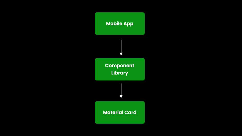
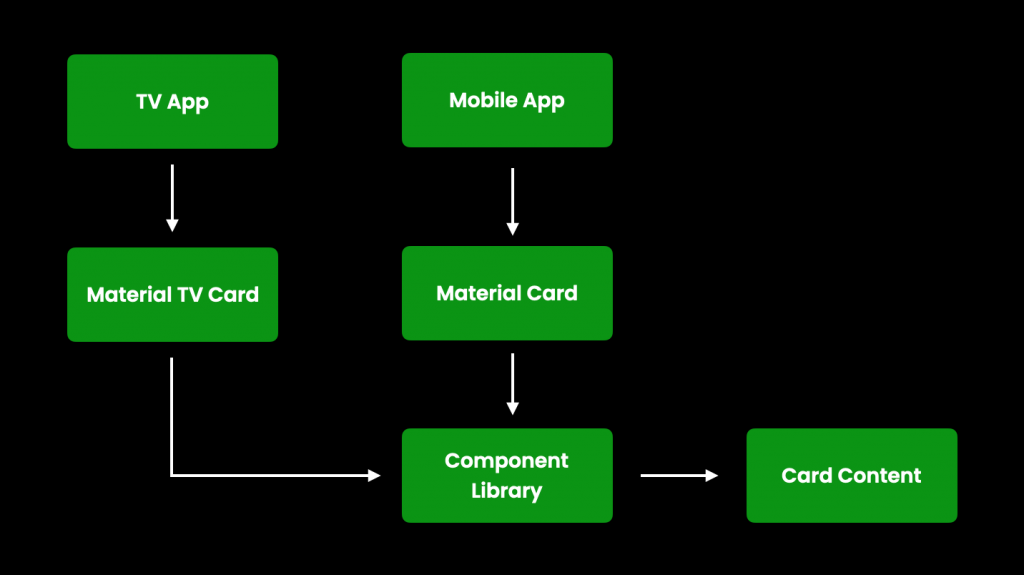
Let’s say in our existing app we have a component library that contains our reusable pieces of UI. Within this library we have component that utilises a Material Card to house some content. Our mobile app is using this card from the shared UI to show content to the user.
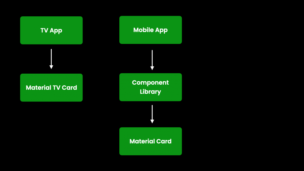
However, we now introduce a TV app to our product offering. Within this TV app we want to utilise the TV composable APIs, so we start using the Material TV card within this app while keeping the use of the standard Material Card in our handheld UI.
Here, each of these Material Cards is going to contain content that we are displaying to the user. If it is the case that this content is going to be the same across each of the card components, one issue here is that we’re likely going to be duplicating some content that is being composed inside of each card. While this is just one example, it’s not likely to be an isolated occurrence. This duplication can result in wasted effort when it comes to maintaining our code, so we’re going to want to find a way to be able to share this content between the two cards.
It might be the case that we are already using a component or shared library in our app, if not, we’ll need to setup some way to share composables between the different parts of our app. Once this is in place, we need to start thinking about what we can share between these card components.
We don’t want to share the cards themselves, because of the difference between their targeted experiences. What we can do is think about the highest level in our component that does not contain any cross-platform dependencies. So while our card implementations are specific to their corresponding platform (TV vs Mobile), it might be the case that the entire content inside of those cards conforms to the standard compose APIs. If this is the case, we can pull out this content into a reusable component inside of our component/shared library.
If there were other contraints that meant the parent item in the Card could not be pulled out as a reusable item, we would simply work our way down the composable hierarchy until we reached something that was reusable (and that makes sense for us to reuse). We would want to find the highest point in the hierarchy that can be extracted for sharing.
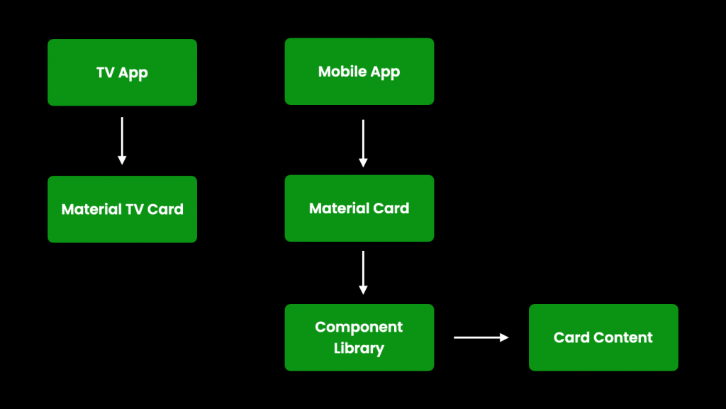
With this composable now decoupled from our handheld implementation, we are in a position to reuse this composable for the content of our TV card. We can now incorporate our shared library into our TV app package, and reuse this card content within our TV specific material card implementation.
In regards to how this might look at an implementation level, we can see that it is a simple concept. Our composables at the TV / Mobile level remain mostly the same, simply adopting the shared composable for their content body.
// Composable uses the Card from the compose TV APIs
@Composable
fun TvMovieCard() {
    Card(...) {
        MySharedContent()
    }
}

// Composable uses the Card from the standard compose APIs
@Composable
fun MovieCard() {
    Card(...) {
        MySharedContent()
    }
}

@Composable
fun MySharedContent() {
    ...
}
At this point, we’ve now configured the content of this card composable so that it can be shared across our TV and Mobile apps, increasing the consistency across our products and reducing any effort when it comes to maintaining this code.
This card is just one example of where we can share content. While we may be restricted in some places due to specific compose APIs being used in different use cases, it’s likely that we’ll be able to follow this same approach where sharing is required elsewhere in our apps.