For the past few years, we’ve been getting to grips with Jetpack Compose and how we can use it to build apps for Handheld and Wear OS devices. Late last year, Composables built for Android TV apps started to surface as Alpha releases and in this series of blog posts, I want to dive into these composables and learn how they can be used to create apps for Android TV.
Looking to learn Jetpack Compose? Check out my course, Practical Jetpack Compose
When it comes to navigating grouped content in apps, we currently have the TabRow available in Jetpack Compose. However, when it comes to building TV apps, we have an alternative TabRow composables that has been built specifically for TV experience apps. In this blog post, we’ll explore the additional APIs here, how we can use them and why they should be used over the traditional TabRow composable APIs.
Why not sponsor this blog and reach thousands of developers worldwide?
Tabbed Content
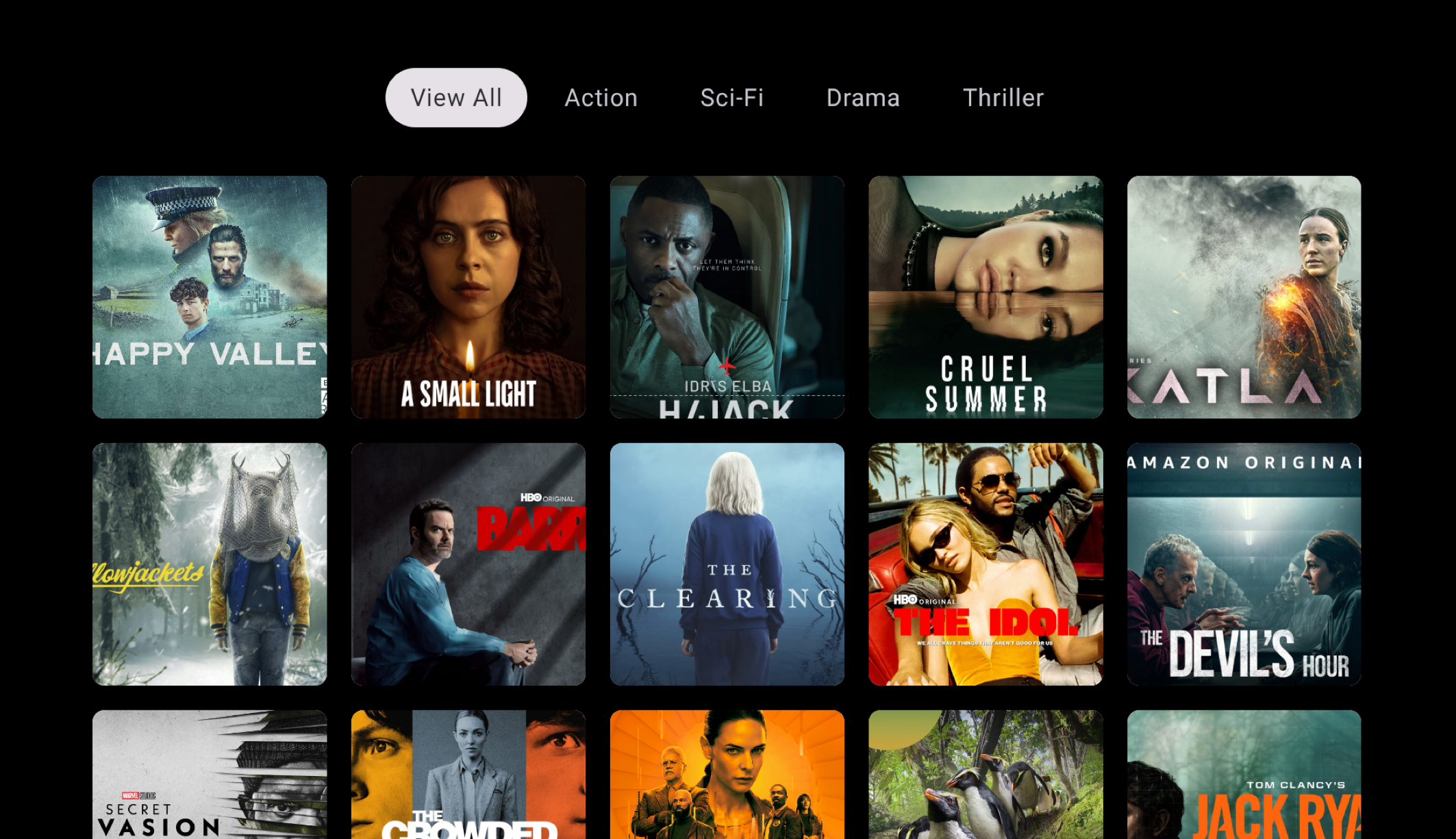
When it comes to navigating categorised content, we can use the TabRow composable to navigate between different sections of content being displayed. In the example below, I am filtering the content based on the currently selected tab.
When browsing TV content, it’s likely they’ll be a lot of content to display. Whether we’re displaying films, shows, games or items available for order – filtering these into sub-categories simplifies navigation for the user, allowing them to get to their chosen content quicker.
If navigating between different screens of an app, you’ll want to use the NavigationDrawer composable, which we’ll come onto in a future blog post.
TabRow Composable
When it comes to displaying tabs, we can use the TabRow composable.
@Composable
fun TabRow(
selectedTabIndex: Int,
modifier: Modifier = Modifier,
containerColor: Color = TabRowDefaults.ContainerColor,
contentColor: Color = TabRowDefaults.contentColor(),
separator: @Composable () -> Unit = { TabRowDefaults.TabSeparator() },
indicator: @Composable (tabPositions: List<DpRect>) -> Unit =
@Composable { tabPositions ->
tabPositions.getOrNull(selectedTabIndex)?.let {
TabRowDefaults.PillIndicator(currentTabPosition = it)
}
},
tabs: @Composable () -> Unit
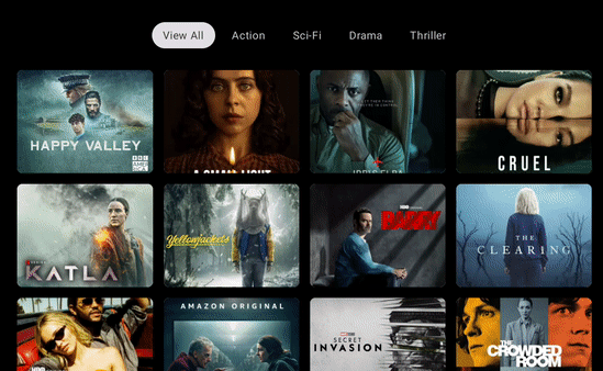
)While this looks very similar to the existing TabRow composable from the compose APIs, but lets see what happens when we plug the existing one into our TV app.
We can see several issues here:
- The styling is completely wrong for the TV app. The standard TabRow composable does not use TV-specific theming, resulting in components that do not fit in with the look-and-feel of a TV app
- The focus states for the selected child are not correct during navigation. While we have the underline indicator that shows the currently selected item, the text content of the tab item is not highlighted
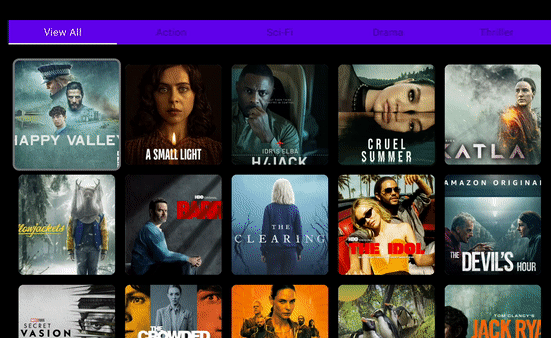
Using the TV TabRow composable ensures that our app is using a TV-specific look-and-feel without needing to apply additional styling to the components.
When it comes to composing the TabRow, we need to provide the index of the currently selected tab, which we can keep a reference to using a remember block.
var selectedTabIndex by remember { mutableIntStateOf(0) }

TabRow(
    selectedTabIndex = selectedTabIndex,
    modifier = Modifier
        .padding(top = 32.dp, bottom = 16.dp)
) {

}
Aside from the selectedTabIndex, we also need to provide the content for the tabs argument. This is the content that is going to display the selectable tabs to the user.
Tab Composable
The Tab composable is used to display each of the individual selectable tabs to the user. We use this when composable the TabRow, composing a Tab for each of the items that we wish to display in the row.
@Composable
fun Tab(
  selected: Boolean,
  onFocus: () -> Unit,
  modifier: Modifier = Modifier,
  onClick: () -> Unit = { },
  enabled: Boolean = true,
  colors: TabColors = TabDefaults.pillIndicatorTabColors(),
  interactionSource: MutableInteractionSource = remember { MutableInteractionSource() },
  content: @Composable RowScope.() -> Unit
)
While this also looks almost identical to the existing Tab composable from the compose APIs, the main difference here is the onFocus argument, which is provided here in place of the onClick argument that is found in the existing Tab composable.
When composing the Tab, we need to provide several arguments.
- selected – whether or not the tab is currently selected. This will impact how the tab is styled within the TabRow. We can use the value of our selectedTabIndex to depict whether the Tab is currently selected
- onFocus – the callback triggered when the Tab comes into focus. When this happens, we’ll want to update the value of our selectedTabIndex state.
- content – the content to be displayed in the tab. Here we’ll simply provide a Text composable that will be used to display the title of the tab
val tabs = listOf("View All", "Action", "Sci-Fi", "Drama", "Thriller")
var selectedTabIndex by remember { mutableIntStateOf(0) }

TabRow(
    selectedTabIndex = selectedTabIndex,
    modifier = Modifier
            .padding(top = 32.dp, bottom = 16.dp)
) {
    tabs.forEachIndexed { index, tab ->
        Tab(
            selected = selectedTabIndex == index,
            onFocus = {
                selectedTabIndex = index
            },
        ) {
            Text(
                modifier = Modifier.padding(horizontal = 16.dp, vertical = 10.dp),
                text = tab
            )
        }
    }
}
Tabs with Content
While we’ve learnt how to individually compose the TabRow, we’re going to want to be composing it alongside other content in our app. For example, composed above content which can be filtered based on the currently selected tab.
In this example, we can simply use the Column composable to compose the TabRow alongside the content area (in this case, a TvLazyVerticalGrid). Here we can then simply filter the content based on the selected category. This could also be done using derived state, but I’m using the kotlin filter function here for simplicity.
val tabs = listOf("View All", "Action", "Sci-Fi", "Drama", "Thriller")
var selectedTabIndex by remember { mutableIntStateOf(0) }
Column(
    ...
) {
    TabRow(...) {
        ...
    }
    TvLazyVerticalGrid(...) {
        val items = if (selectedTabIndex == 0) {
            shows
        } else {
            shows.filter {
                it.category == tabs[selectedTabIndex].lowercase()
            }
        }
        ...
    }
}
In this post, we’ve learnt how to create tabbed navigation for TV apps using Jetpack Compose. We can see from the examples above how using the TV-specific tab composables allow us to create experiences that lean into the TV experience, reducing the effort required from our side during development to achieve these results.
Keep tuned for the next posts where we’ll take a look into navigation drawers for TV and more!