When it comes to the applications we build, there are many different scenarios and constraints that the end product will encounter. On Android we not only have a vast range of devices running the Android OS, each of which could be running one of many versions of Android, but we also have the different OEMs that these versions of Android are shipped on. When accounting for these differences, we spend a lot of engineering time ensuring that our features behave as expected based on these different constraints.
Another key aspect (if not the most important) is the who – these are the users who are interacting the things that we build. Alongside the differences in the technology that we are building for, many of our users are going to have different needs which are often overlooked when creating digital experiences. In this series of articles, we’ll explore how we can adhere to the needs of different users to create a more inclusive experience when building products with Jetpack Compose.
When it comes to Accessibility, Jetpack Compose contains a fundamental concept known as semantics. Over this series of articles, we’re going to be hearing a lot about semantics, so it’s important for us to understand exactly what these are and how we can utilise them to tailor experiences for our users. In this article we’re going to learn about what semantics are, leaving the how to the following articles in this series.
This post is sponsored by Practical Jetpack Compose.

When working with the Android View System, views that we create are clearly defined within the view hierarchy. We have some rectangular space within our user interface that a given view occupies, and that view will hold various properties related to its visual representation and behaviour.
However, when it comes to composables, these are emitted into the UI hierarchy and at that point, we rely on semantics to describe how that composable is to be understood at a semantic level.
Putting semantics aside for a moment, composition initially provides some basic information about how the composable is to be output within the User Interface. This includes information such as:
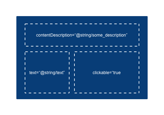
- The background color of the composable
- The textual content of the composable
- The alignment of the composable within its parent container
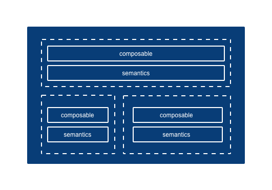
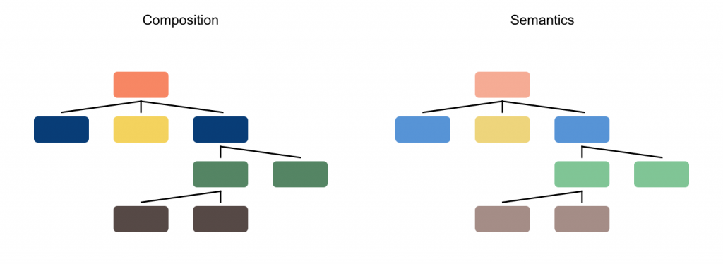
As we can see, this information is focused on the visual representation of our composable. This information needs to be interpreted by the view system, which compose supports by outputting a tree-like structure that describes how the User Interface is to be drawn.
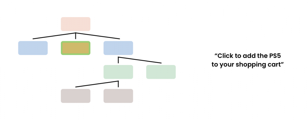
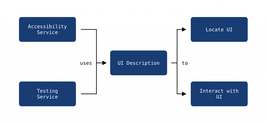
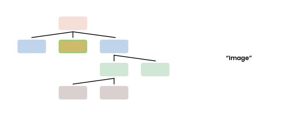
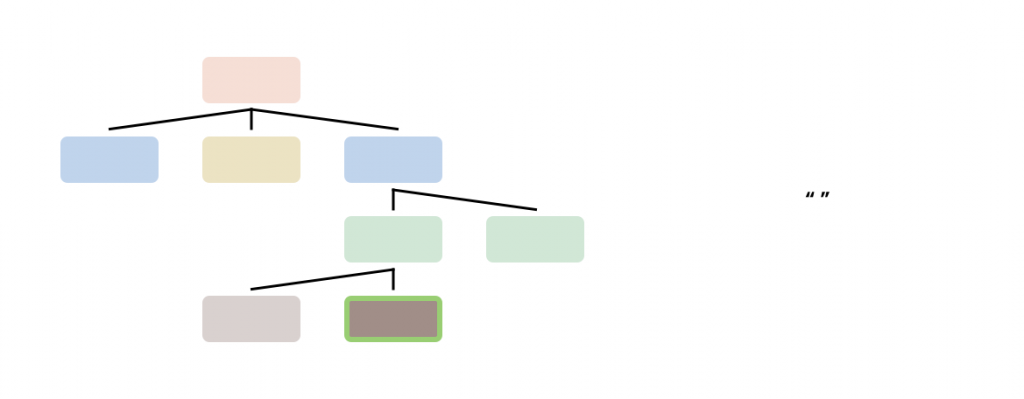
While at this point we have a tree describing the visual representation of our composables, this representation has no semantic meaning. Because of this, services that rely on semantic meaning will not be able to locate or perform interactions with any composables – this is because visual representation alone is not enough information to locate a composable. For this reason, alongside the tree that describes composition, compose also outputs a tree that represents the semantic meanings of our composables. These semantics allow for descriptive information to be provided to services that have other responsibilities outside of drawing the composables on screen.
Each of these trees serve a very different purpose. While the composition tree describes how our UI is to be composed (as in how it is going to be drawn on screen), the semantics tree describes the semantic meaning of these composables – giving meaning to each component that is represented within our UI.
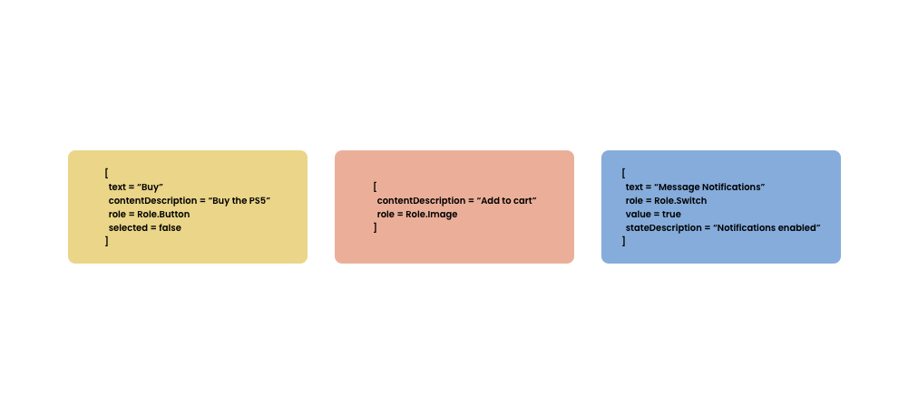
But why do our composables need semantical meaning? For accessibility and testing services within Android, knowing how our composables are being drawn does not provide much useful information. Accessibility services need to describe the components to users – describing how the composable is being drawn on-screen alone is not going to provide enough information to aid the use of our apps. For testing frameworks, again, there will not be enough information to effectively test our composables as we won’t have the required context to locate or interact with a desired component. To alleviate this, services need to know more specific details about these composables – this could be a textual value that is being displayed to the user, or some form of description that describes a visual component within our composable. This way, these services can look at the description of our composables and portray this effectively to the user, as well as provide a way for developers to perform assertions and interactions with specific components within tests.
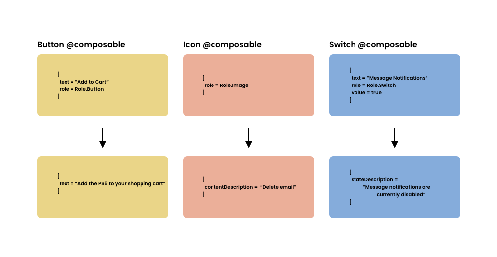
Semantics are a powerful tool when utilised – we can use them to create more descriptive content for a composable, as well as communicate to services precise information about what a component is and what it is used for. This could be altering the content description of a component to provide a more descriptive version of textual content, or communicating that a component is a Switch that is not currently marked as on.
When working with the View-based UI toolkit in Android, our views are clearly defined – from the rectangular space that it occupies, to the various properties that it holds. When it comes to composables, our UI is emitted into the UI hierarchy and at that point, we rely on these descriptions for these services to be able to understand our UI.
The good news is that in a lot of cases, semantic meaning will be automatically applied for us when we are using certain composables. For example, if we use a Text composable to display some text to the user, this will be represented by the text semantic property – this text becomes how this composable is to be described via semantics. This means that when a screen reader is focused on this composable, the description will be read to the user to describe the given composable. In a similar fashion, from the compose testing framework we can use this description to locate a given node in our composable tree. Once the node has been located using this description, we can then perform assertions and interactions on it.
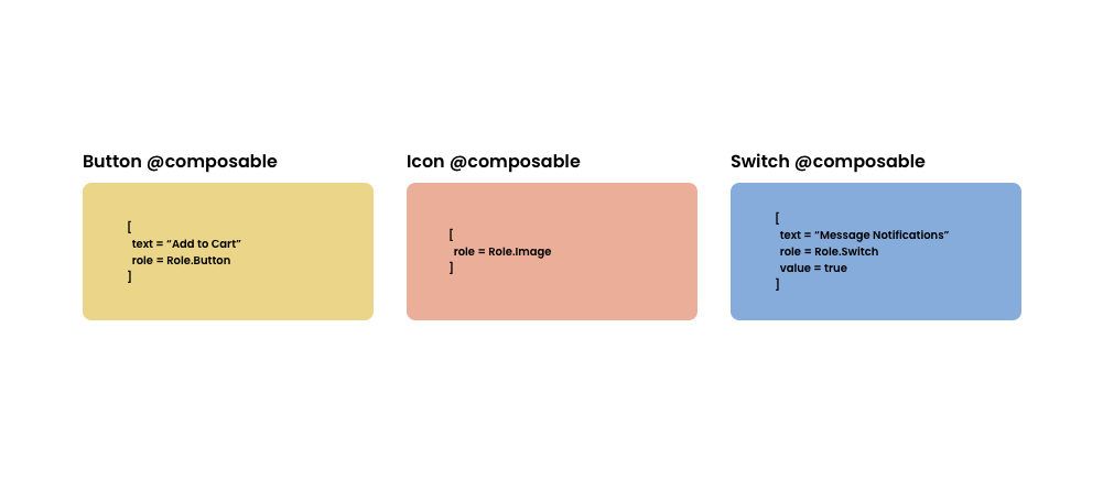
Without this description, it would be difficult for us to locate these within the testing framework. It would also reduce the usability of our app when accessibility features are enabled. While some composables will populate these for you, in some cases you will need to manually provide your own descriptions – for example, in the case of using visual composables such as the Icon or Image, if the visual representation of these adds information that aids the experience of our UI, the screen reader will not being to describe these elements without that description.
The same goes for custom composables, or lower level drawing on the canvas – if you do not provide descriptions that will be used to populate the semantics tree, then the accessibility services will not be able to describe your apps to users. From a testing perspective, you will also experience difficulty when trying to automate the testing of these components.
For a lot of composables, semantics will automatically be inferred from the composable definitions. So if we have a composable that has some text, then talkback will use that to describe the content – the same goes for buttons that are disabled, or checkboxes that are checked. However, in a lot of cases, there are composables that won’t have sufficient semantics to describe elements to users, as well as there being opportunities to build on the default semantics so that we can provide uneven better semantic experience for users using talkback.
And this is where we come in – as a developer, these are the points which we can intervene to improve the accessibility of our composables. We can use semantic properties to add descriptive information to a composable, or build on and improve any existing semantic properties that belong to a composable. Utilising semantics in these ways allow us to build components that can be clearly described to users via accessibility services, as well as making them more accessible to automated testing frameworks.
In this article we’ve learnt what semantics are and why they’re needed when. building composable UI. While some semantics are configured for us by default, we still need to build on these to improve the semantic representation of our composables, as well as add out own semantics in places where they are not provided for us. Over this series of articles we’re going to learn how to utilise semantics when building our composables with accessibility in mind, utilising the different semantic properties that the compose APIs provide for us.